The Resource WIP Thread 3

● ARCHIVED · READ-ONLY
Started by Celianna 1568 posts Page 67 of 79 View original ↗
  1. Ok, ok, chainpostin' like a raving lunatic, but here's a coupla portraits I did! :kaoluv:
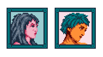
    alice_portraits.png
    Tried a more detailed way of doin' hair, I mean, bla bla bla WHADDYA THINK? :wub :biggrin:
  2. They look very good, Alice_gristle! Any suggestions/critiques I could even think of wouldn't make it any better really XD

    ____
    Perhaps it might be a good idea --to break the chain :p -- to share something I made with Refmaps's rm 2k3 stuff (submitted for an RMN event)... I know it's not perfect, but I'd love to hear all critiques and suggestions you can give me.

    Here it is!
    I increased the image size 4-times for clarity.

    BirdPainting07_a2 4x-scale.png
    The... Image reference, is probably pretty clear :p
  3. @Nenen d'aww I love crows! :kaocry: It looks really nice, I like the sweet plummy background too! :wub Cud you try shaving off a pixel from the back of the neck in pic 2 (the crow looking right)? Just to see if you couldn't make the head look a bit less blocky?

    Also in the last pic, any chance you cud try 'n make the wing-tip sharper? I know you probs don't have room for it, but maybe try?
  4. Suggestion number one is easy enough, and it already looks better... (no use posting it yet I think)
    But I just can't figure out what to do with the outstretched wing, I kinda... was just winging it when I made it :p and didn't like it then, still can't find a satisfactory appearance. I might edit in a few pictures of my tries later on.
  5. I feel ya, bird wings are hard! :kaoswt:

    EDIT: @Nenen also I noticed there's a lone, pale pixel in the middle of the wing. Cud you try 'n smudge it out? I didn't notice it before, but now it kinda draws the eye in!

    Also here's sum moar portraits I did! Meet FABIO, GERHARD, and NILS, three burning hot frost elf (???) bishies! (Names changed to protect privacy!) :kaoluv:
    alice_portraits2.png
    I feel like overdid Fabio's hair and maybe Nils's too, I keep fiddlin' wid them but can't get them to feel quite right. Should I just cut back on detail? I dunno! :kaoswt:
  6. I completed my portrait set! This is CAST IN ORDER OF APPEARANCE! :kaoluv: Sorta.

    Spoiler
    alice_portraitset.png

    Jenny is MC, Borghild is her mentor, then we have three villains, and the rest comprises the happy cheerleading squad! :biggrin: (Colours subject to change!) Elwiga's hair is giving me grey hairs tho, I tried to do a magnificently poofy Baroque 'do AND I FEEL I ALMOST SUCCEEDED. The right side, which is in shadow, is somehow hard for me tho.

    Tips anybody? :kaoswt:
  7. Not going to clog up my resource topic and remembered this thread exists.

    Sprite-0001.png
    Not sure if I should leave the trim soft or try and rough it up.
    Fan of the big cuffs.
  8. He looks like an exhibitionist as is xD
    His special attack is "Flash", which blinds the victim xD
  9. @Holder If you have a character who loves big cuffs, waistcoat, cravat and a swish to the coat, that person is not going to tolerate scruffy trimming - if scruffy is what you meant by "rough it up". If, however, you meant adding just a little more texture to it, then fine.
  10. Avery said:
    He looks like an exhibitionist as is xD
    His special attack is "Flash", which blinds the victim xD
    Lets not tempt me.
    Kes said:
    @Holder If you have a character who loves big cuffs, waistcoat, cravat and a swish to the coat, that person is not going to tolerate scruffy trimming - if scruffy is what you meant by "rough it up". If, however, you meant adding just a little more texture to it, then fine.
    Very prim and proper. Finding it hard to texture without making it look dirty.
  11. Spoiler
    alice_map.png

    I DREW A WORLD MAP! :kaoluv: Inspired by some games I been playin' recently, I wrote up a quick idea about a really oldschool-feeling grindy RPG (working title: ALICE'S GRINDY RPG :biggrin: ). It wud be like 80s dark fantasy with skeleton warriors and death knights and stuff. :wub

    Not sure if I made the map too cluttered tho? Like, this wud not be the actual navigable world map, just something the player cud look at if they forget where places are in relation to each other. And for mood.:kaoluv: Also, colours are a bit, euhm... Like I'm not sure if the green is too garish. :kaoswt2:
  12. @alice_gristle That's a lovely idea, and I like the overall style. I don't think it is too cluttered. Obviously it's not aiming for realism, but based on this I would have a good idea of the terrain to expect, from lightly wooded through to impenetrable forest, with what looks like a swamp thrown in at the Silver Tower.

    As for the green, I think its intensity balances out well with the dark blue of the water and the grey/black of the mountains. You might try reducing the brightness the merest tad and see how that goes.
  13. Kes said:
    You might try reducing the brightness the merest tad and see how that goes.
    It's a good idea and I'll try it, thanks! :kaoluv: Only, atm I want to use the NES palette and there really aren't better greens there. But Imma think about it!
  14. @alice_gristle I am really into this! Something about the colors you chose and the layout of the map itself is giving me this great combination of vibes that remind me of both Zelda for the NES, and Final Fantasy Legend for the Game Boy. I also love the 80s dark fantasy concept.
  15. Work in progress of the minigun weapon.
    I think I've got it sorted:
    Minigun level 1.gif

    The actor is usually meant to wield a Stave for a Mage but my template for this allows for a Minigun weapon for a Sentinel job class.
  16. If that is a minigun I dread to imagine the size of a maxigun
  17. I couldn't think of another name for them. Heavy seemed too vague.
  18. @Holder minigun - when a staff just won't do the job! :biggrin: The gun doesn't really look like a minigun to me tho, it's kinda lacking in the distinctive barrel that I think of when somebody says "minigun"? BUT, it does look like a big, cool, heavy gun tho, so you got that down! :kaoluv: Also, the clothes on that fella! :wub :wub :wub
  19. alice_gristle said:
    @Holder minigun - when a staff just won't do the job! :biggrin: The gun doesn't really look like a minigun to me tho, it's kinda lacking in the distinctive barrel that I think of when somebody says "minigun"? BUT, it does look like a big, cool, heavy gun tho, so you got that down! :kaoluv: Also, the clothes on that fella! :wub :wub :wub
    Battle Mage XD Yeah the weapon itself doesn't fully suit the name, honestly I might go and redo that name. Any large gun will be designed so large lasers, flamethrowers, heavy guns, miniguns and well anything that is bigger than rifle.
    The mages coat was a nightmare to animate but pleased with the results and response has been positive so I'm pleased.
  20. I am making tiles for a cellar area of a fort, so big and heavy. Obviously the ceiling will need a lot of support, so I have made chunky, diamond-shaped columns. The problem is that I am unsure what to do about the rpg maker perspective. At the moment, as you can see, the column is absolutely symmetrical. I have tried adjusting the back half in the sort of way we do with round objects, and frankly it looks ridiculous. Can anyone suggest a solution?
    Thanks.

    COLUMN EXAMPLE.png