The Resource WIP Thread 3
● ARCHIVED · READ-ONLY
-
-
Definitely better :thumbsup-right:
-
@Kitten2021 I've merged your post and its replies with the WIP thread.
-
-
Ok...
I've been working on some statue edits, mostly to practice a bit and to see what looks good before I make something more original --specifically going to be some owl statues/idols/etc.-- that's meant for my game project, but I suppose I'd like some opinions on how well these edits look.
First: Something I mostly made through frankensteining (then editing to make it work better) Originally made the thinner ones (top and right), but then thought to try something a little wider... Which looks better?
(I do dislike the one(s) on the bottom left however, It'd probably be better to rework it's wings...)< thinner | thicker >
Here I just messed around making some outstretched wings, using the original wings as a basis. But after working on left side, decided to just copy, flip, and do some quick minor edits for the right wing...
(EDIT1: Experiment K on the RMN Discord mentioned that the shape is more like an Insect's then a feathery type wing)
EDIT2: The Updated wings.
-
@Nenen, the thinner ones seem more natural and proportioned to my eye! And ya, the updated wings look better! :kaoluv:
-
Here is the speaking portrait for a secondary villain in my game. Would love some general feedback. Feel free to ask any questions as well.
-
@BrickleYourFrickle, first off, supar cool turban! :wub You know I'm a sucker for retro 8-bit portraits you li'l devil? I cud look at pics like this for a living! :biggrin:
Anyway, are you dead set on yo palette here? 'Cuz I'd replace maybe the green or the beige with summat else? As it is, I'm havin' a hard time making out Turbano's mouth properly, dat white is too close to their skin colour. So maybe another green for skin instead of beige? Or replace the green with summat else and rework the mouth? :kaoswt:
Basic shape and outline lookin' really good, you done a fair job there. Nose and mouth blend a bit too much, so I'd fiddle around there, see if I can make it better by leaving a pixel's width between them? Great grin tho! :biggrin: :wub
Also, I'm not sure what the black wiggle under Turbano's left eye is? A strand of hair? A scar? If it's nothing important, cud you try removing it and see how it looks? -
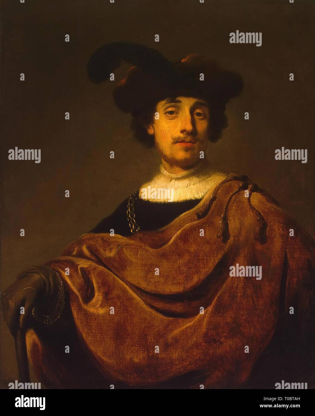
I'm not sure what exactly to call it, but the turban is sort of like one of those big beret-like hats with huge feathers. Kind of like this:@BrickleYourFrickle, first off, supar cool turban! :wub You know I'm a sucker for retro 8-bit portraits you li'l devil? I cud look at pics like this for a living! :biggrin:
Anyway, are you dead set on yo palette here? 'Cuz I'd replace maybe the green or the beige with summat else? As it is, I'm havin' a hard time making out Turbano's mouth properly, dat white is too close to their skin colour. So maybe another green for skin instead of beige? Or replace the green with summat else and rework the mouth? :kaoswt:
Basic shape and outline lookin' really good, you done a fair job there. Nose and mouth blend a bit too much, so I'd fiddle around there, see if I can make it better by leaving a pixel's width between them? Great grin tho! :biggrin: :wub
Also, I'm not sure what the black wiggle under Turbano's left eye is? A strand of hair? A scar? If it's nothing important, cud you try removing it and see how it looks?
She's a harlequin (which appears more prominently in her behavior and battle sprite), so I used the beige as white seemed too bright, plus it would be the same color as her teeth. I could try adding shading around her mouth to separate them though. Mouths are a point of difficulty for me when it comes to illustrating, so I'd like to avoid completely reworking it, but I can at least try.
The thing on her left eye is a bit of face paint that's black to contrast the beige. I could try using the purple there instead. Though, I'm worried that would make it appear like a strand of hair.
I chose green as a shading color for several reasons, mainly because of the limited color palette (copying the NES' color palette - which also means only four colors + black), and to make her seem more 'cold' and 'weird' to contrast how the protagonists use warmer shades for their portraits. I'm not opposed to trying a different color there, but I gotta be honest, I just really like the green & purple lol.
I agree that the nose and mouth should be separated a bit more, though. Unfortunately her grin is too close to it. But you mentioned separating them by a pixel-width. I'll try that and see how it works.
I'm away from my computer at the moment, but once I get home, I'll try out some of what you suggested and edit my post with the results below.
Thank you for the response. -
That's a landsknecht hat.I'm not sure what exactly to call it, but the turban is sort of like one of those big beret-like hats with huge feathers. Kind of like this:
The thing is that it's directly connected to her eye...and it's the same color...so anyone looking at the picture has no way to know that it's not part of her, like, hugely mutated and deformed eye.The thing on her left eye is a bit of face paint that's black to contrast the beige.
I don't know what your overall character style is and what the other faces look like for comparison, but it looks like her smile goes really far up the left side of her face. Like, mouths don't naturally curve up that far...it seems like if she opened her mouth, her head might hinge in half :wink: -
@BrickleYourFrickle, trust me sweetheart, on this scale, a single pixel is HUGE.:kaoluv:Also yes kinda what @ATT_Turan said, you cud shave off a pixel at the left corner of her mouth to make it not seem over-wide.
Oh hey, maybe you cud try a paler shade of purple to replace the beige? See how that works out? Trust me sweetie, you doin' alright tho! :wub I'm picky but the pic is pretty good, honest! -
@BrickleYourFrickle, trust me sweetheart, on this scale, a single pixel is HUGE.:kaoluv:Also yes kinda what @ATT_Turan said, you cud shave off a pixel at the left corner of her mouth to make it not seem over-wide.
Oh hey, maybe you cud try a paler shade of purple to replace the beige? See how that works out? Trust me sweetie, you doin' alright tho! :wub I'm picky but the pic is pretty good, honest!Replying instead of editing, I doubt editing my post would notify you lol.That's a landsknecht hat.
The thing is that it's directly connected to her eye...and it's the same color...so anyone looking at the picture has no way to know that it's not part of her, like, hugely mutated and deformed eye.
I don't know what your overall character style is and what the other faces look like for comparison, but it looks like her smile goes really far up the left side of her face. Like, mouths don't naturally curve up that far...it seems like if she opened her mouth, her head might hinge in half :wink:
Anyway, just got home, here's what I came up with:
I did away with the green shading. I decided to add the green to her landsknecht hat to keep it in her design, though I bent the four color limitation. But that's fine.
I also separated the nose and mouth, and changed the hard black pixel to the shading color, so now it more resembles a dimple, but still maintains her 'maniacal grin'.
I'm a little iffy about the coloration on the eye-paint-tattoo-thing, so let me know if it looks fine, or should be changed. -
@BrickleYourFrickle I think that looks a lot better. The mouth is way better, and the eyes are much more recognizably symmetric.
I'm still leery about the tattoo, the fact that it's the same color as her hair and there's only one pixel separating them makes it look like a weirdly-shaped tuft of hair on her face.
I know you're trying to limit yourself to four colors, but that might be a place to deviate from that, or move it further along her cheek or...something. Heck, make it the green. -
I separated the tattoo and the hat. I think green makes it look too much like some kind of slime leaking out her eye lol.@BrickleYourFrickle I think that looks a lot better. The mouth is way better, and the eyes are much more recognizably symmetric.
I'm still leery about the tattoo, the fact that it's the same color as her hair and there's only one pixel separating them makes it look like a weirdly-shaped tuft of hair on her face.
I know you're trying to limit yourself to four colors, but that might be a place to deviate from that, or move it further along her cheek or...something. Heck, make it the green.
Also in this version, I used a slightly more saturated red for the shading because it popped a bit more. If you think it looks bad, let me know.
Oh, and I added a strand of hair, because I thought it looked good.
Edit: I also made this version, replacing the green with the same red used for the shading. It looks pretty simple, but works IMO. It also lets me stick to my 4 color rule.
-
@BrickleYourFrickle, your edits so far are a big improvement! But, is it okay if I do some simple edits of my own to yo portrait? I just wanna illustrate summat, it's faster than explainin' with words. :biggrin:
-
go ahead.@BrickleYourFrickle, your edits so far are a big improvement! But, is it okay if I do some simple edits of my own to yo portrait? I just wanna illustrate summat, it's faster than explainin' with words. :biggrin:
-
@BrickleYourFrickle, so here goes...
I kinda forgot what I wanted to say tho. :biggrin: I made this yesterday evening, shouldn't have slept on it. :kaoswt2: Anyway, I took yo original purple and green colour scheme and just replaced her skin tone with a paler green, 'cuz it goes better wid green shading PLUS it brings out her grin more. Also splashed on some bolder shading 'cuz, uh, forget why...
I think with yo latest versions, the cheek tattoo is still kinda like, umm, iffy?:kaoswt: Kinda like @ATT_Turan said. I made it smaller, so it doesn't hog half her face... and then for some reason I made it green?! :kaoswt2: I shoulda kept it purple, I think!
Anyway, I think my main point was that you can stick to green if ya willing to forgo the GOTTA HAVE REALISTIC SKIN COLOURS or summat?
EDIT: OH YEAH and I cleaned up some stray pixels. Looks better I think? -
Gotta say, I really like what you've done here, especially with the shading. Thank you. I don't want to just copy your work here, but rest assured I'm taking notes on how you did some things, and hopefully it'll lead to a better outcome.@BrickleYourFrickle, so here goes...
View attachment 237941
I kinda forgot what I wanted to say tho. :biggrin: I made this yesterday evening, shouldn't have slept on it. :kaoswt2: Anyway, I took yo original purple and green colour scheme and just replaced her skin tone with a paler green, 'cuz it goes better wid green shading PLUS it brings out her grin more. Also splashed on some bolder shading 'cuz, uh, forget why...
I think with yo latest versions, the cheek tattoo is still kinda like, umm, iffy?:kaoswt: Kinda like @ATT_Turan said. I made it smaller, so it doesn't hog half her face... and then for some reason I made it green?! :kaoswt2: I shoulda kept it purple, I think!
Anyway, I think my main point was that you can stick to green if ya willing to forgo the GOTTA HAVE REALISTIC SKIN COLOURS or summat?
EDIT: OH YEAH and I cleaned up some stray pixels. Looks better I think?
And I see what you mean with the green and purple. It looks good. I might try using both the normal skin color palette, and the green palette, and just take some time to see what works better in-practice. -
@BrickleYourFrickle, just an aside, I think it's totally fine if you copy my work, I copy everyone's work all the time! :kaoswt: Monkey lern best by copyin'! :wub :biggrin:
-
Nobody been here in a while? :kaoswt2: Anyway HERE'S A NUDE GIRL! :biggrin: I mean, I tried to draw a 24px tall naked body, what do y'all think?
Naked lady inside
You can kinda see my progress here, first I doodled Miss No. 1 and then went on from there. First I wanted to make her body thicker and stronger-lookin', (2 and 3), then I tried fiddlin' with bust and leg size (4 and 5), then I ended up with Miss No. 6. How am I doin'? :kaoswt:
Not sure about bust size yet, might want it smaller like on No. 5, but I'm pretty sure I want strong bear-wrestlin' thighs on her. Any pointers? :wub
Oh yea, she s'posed to be an SV battler! Colours ain't fixed either, jus' something I started with.
EDIT:
Miss No. 7. I worked in an additional shade of red to improve her midsection/bust region. Also touched up her hair and face. HOW SHE LOOKIN' WHAT :kaoluv: