Game & Map Screenshots 12

● ARCHIVED · READ-ONLY
Started by slimmmeiske2 1772 posts Page 79 of 89 View original ↗
  1. I'm pretty new to RPGMaker, and I grabbed MZ a while back, and I've been working on a game called Ondor.

    I'm currently learning how to make each type of map as I go (Probably not the best idea, but I feel it's working for me), and after a couple tutorials, this is my first attempt at an outdoorsy scene. I would honestly like any and all recommendations/feedback/ and criticism that I can get for this map!
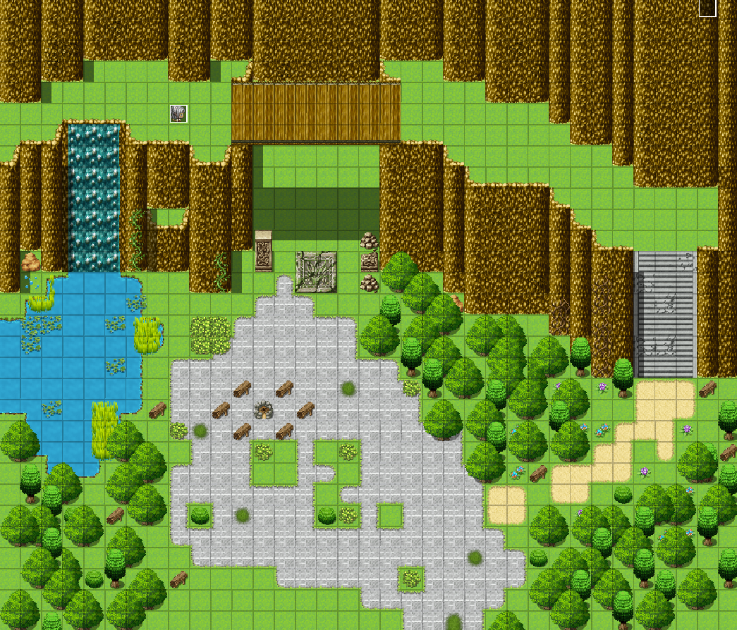
    Screenshot 2025-02-06 101106.png
  2. Secretroom 3.png

    2025 will be the year where I tackle my headache areas from the game. Underwater maps, next to interesting desert maps are definitly part of that.
  3. I've been struggling with these two rooms recently, any tips or suggestions to make it more atmospheric? I'm trying to center the shading/lighting around the open windows a little bit and I'm looking for an "abandoned" vibe.

    ((tiled in RPG Maker XP))
    Small Living Room/Kitchen/Dining area:
    Screenshot 2025-02-06 191602.png
    Bedroom:
    Screenshot 2025-02-06 191630.png

    some assets are still a little unfinished/subject to change but this is what I have so far
  4. EdensDevlog said:
    I would honestly like any and all recommendations


    Three things that I think are pretty obvious mistakes.

    1) Your waterfall doesn't come from anywhere. At the top of every waterfall there must be a river feeding it.
    2) The steps should end a number of tiles below the cliff base, so as to convey the depth. In your map they look like a ladder.
    3) In the top left you have a half level cliff, but similar to the steps you haven't accounted for the perspective. Either top should be pushed back a tile (upwards) or the base should be brought forward (downwards).
  5. @coucassi I am OBSESSED with this map.
  6. I've come back to finish my Huntley Hall game after a rather long hiatus!
    Most of the basic game is show here, but there are still some unfinished parts, a few bugs, and missing story elements..
    I'd appreciate any general impressions of the graphics style and gameplay overall.


    Does it look interesting at all? I was obviously going for a certain graphic style.
    What do you think needs improved? Any realistic suggestions would be welcome... Considering that I'm not great at graphics (as can be seen).
  7. miezew said:
    I've been struggling with these two rooms recently, any tips or suggestions to make it more atmospheric? I'm trying to center the shading/lighting around the open windows a little bit and I'm looking for an "abandoned" vibe.

    ((tiled in RPG Maker XP))
    Small Living Room/Kitchen/Dining area:
    View attachment 330812
    Bedroom:
    View attachment 330813

    some assets are still a little unfinished/subject to change but this is what I have so far
    I'd say both scenes look more 'lived in' than abandoned.
    Are you looking at using semi-transparent overlays or fogs for the lighting effects?
    Is the light going to come through the window and move or shimmer?

    Have you thought of putting a shimmering or blinking lighting effect around the lamp in the bedroom? A 'light on the blink' may suggest that it is old and in disrepair.
  8. Some screenshots from my game. I've mostly spent my time doing exterior grass areas and moving XP/VX sprites around to accommodate for my character sprites (tables, bookshelves, etc.), as well as making micro changes to menu scripts. I've also composed some music for the game as well.
    I'll mostly have to focus on writing now on, as I have a good framework for how mapping and battles work (I'm using a SRPG tactical system that I've set up to work depending on day/week).
    Interior (Morning and Evening)
    nw_2GtIBlEisk.png
    Place to chat with party members when outside battle.
    nw_CCbaynnK9s.png
    Evening
    Camp Exterior
    nw_SdQ4mRuvAM.png
    nw_hZu8vegUEG.png
    City Exterior Tiling Test
    nw_UVZk7whVGG.png
    For the city, I think it would be cool to have a sense of verticality.
    nw_5CGeZijE7R.png
    Credit to Sturmfels' "Voluspa Tiles" for the city walls design. I've remade them to fit with a 32 pixel grid.
    UI
    nw_bwrD0Xin41.png
    Rough sketch of portrait layout I have in mind
    nw_ex24Tnt0LG.png
  9. Experimenting with parallax mapping. Tilesets are PandaMaru and FSM. Would love to hear your opinions and suggestions.
    Spoiler
    Map012.png

    I added an overlay layer so the trees are partially invisible when the character is behind.

    Spoiler
    Screenshot 2025-02-18 090941.png
  10. When I first posted this it was just the dock area. The map is far more fleshed out now. There's still work to do, but I'm very proud of this. This will be the final iteration of this map that I post here.

    RECENT PROGRESS: I've done most of the shadows. Added subtle ground textures. I had to eyeball most of them.

    TO DO: Not all of the shadows have been added, and general clutter needs adding. Signs and lamp posts will be added at some point. Ground texture variants will also be a future feature. The textures on the upper cliffs will need a lot of work.

    REQUEST: Please critique the shadows (with the exception of the sea level shadows, the chimneys and the mini house).
    Karnadia 5.jpg
    Backlogs/Progress
    1740223114346.pngHouses.jpgKarnadia 3.jpg
  11. Spent 2 days to arrange this crowd >_< Mostly just randomly generating and copy-pasting characters. My control button surely aged a lot during that.

    I wish that new maker would allow to just place any sprites like that anywhere in the game and use layers to cover them with new ones.

    photo_2025-02-23_00-19-23.jpg
  12. @Lomaxient Lovely dock map area! I actually really the houses, the varying outer walls - especially the wood ones really match the dock theme.

    Only thing I'd add is maybe to add a softer transition between the water surface and the pier wall. Now it looks like the pier is standing on top of the water.

    @ElvenNeko Very cool! I know how much of an effort putting together that crowd must have been :rswt
  13. Dust said:
    Only thing I'd add is maybe to add a softer transition between the water surface and the pier wall.
    Absolutely! The water on all my maps are place holders. Eventually, I want it animated, so there's no point dealing with it while I'm still working in the image editor. For now I'm just concentrating on land and buildings. The next pass will be shadows, then general clutter. I imagine it will be several months before water gets tackled.
  14. saving the world, one sample map at a time9liij1.jpg
  15. just a regular wip corridor, on 1920x1080 resolution
    1740572259316.png
    gates of heaven
    1740577594320.jpeg
    chilling on seaside made this yesterday evening
    Spoiler
  16. It would seem that windowskin editing is more intricate than I thought.

    Also, is this the right place for this sort of ramdom post, or should I leave it to my status posts?
  17. It’s a screenshot! I’d say it goes. You might be able to get some specific feedback on the window skin itself if you post the resource in the Resource WIP thread tho. @transcendnature
  18. Ah thanks, yeah I just need to search how to actually do it right
  19. Been a while since I've posted in this thread! Mapping is not my strong suit, but I'm trying to improve and wanted to share some dungeon room ideas. Open to any feedback!

    I'm definitely going for a NES-era Zelda feel with smaller individual rooms. But I'm trying to avoid the maps looking too basic or repetitive due to smaller size and simple tileset.

    index.php

    More Maps
    mz_map_2_new.gif
    mz_bestiary.gif
  20. Maps :)
    map1.jpgmap2.jpgmap3.jpg
    some of my first maps. It's my first time really doing pixel art and I'm still not sure what to do with a lot of the empty space in the first one, so any feedback is highly appreciated :v)