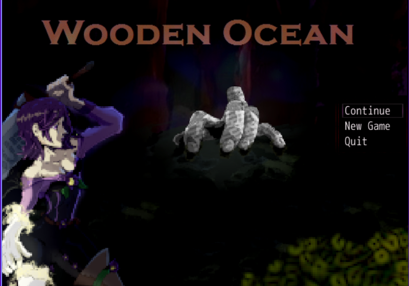
New mode 7 title screen.
Game & Map Screenshots 12
● ARCHIVED · READ-ONLY
-
-
big image
-
I made the environment using Blender, then I imported the render into GIMP where I did the dithering and stuff to make it look like something out of an 90's CD-ROM game.@Neonzumi Did you try some kinda new technique or summat? :kaoswt: The environments look so different between yo last two posts! First it's kind of a flat 2D world that I been used to seein' from ya, then whoopsie, it's a much more 3D style world? I think the 3D thingy looks good, but what did you do?
-
@Neonzumi it really brings yo 2D environments to life, I think!:kaoluv: I hafta admit yo 2D ones seem kinda confusing at times, 'cuz I'm havin' trouble discerning elevation and stuff... but no such problem wid yo 3D! :wub
-


Another day, another strange hub world to explore. -
It's usually the little things that feel a bit rewarding to alter a bit to me. Slight changed to my title screen but I think I got it looking better? Still a bit off in some ways but.
The logo before.
And the logo after.
Again, it still looks off with the vibe I am trying to go for here but I think the new text feels like it 'pops' out more while retaining the colors of the old one? I wanted to get this fixed for a while. -
The new logo is definitely much better. It does bother me that the moon isn't a circle and that the options are off-center, so I hope you fix those as well!It's usually the little things that feel a bit rewarding to alter a bit to me. Slight changed to my title screen but I think I got it looking better? Still a bit off in some ways but.
View attachment 366171 The logo before.
View attachment 366172 And the logo after.
Again, it still looks off with the vibe I am trying to go for here but I think the new text feels like it 'pops' out more while retaining the colors of the old one? I wanted to get this fixed for a while. -
Some of my new game art images in anime style for various locations (I haven't uploaded the latest version of the game with these changes).
-
The new logo is definitely much better. It does bother me that the moon isn't a circle and that the options are off-center, so I hope you fix those as well!
I did fix the options after this thankfully. And that was kind of how the moon looked when I got that copyright free image. But it was the only moon I could find that didn't look cartoonish and matched the other layers well. -
Some screenshots from my upcoming minimalist RPG, miniquest:
-
laughing at this
-
I'm new to posting, is this right?
I used kokororeflections.com, RTP, and Gimp to make this.