@Lomaxient You have good variation in the height of the land. That is a great start to having a more organic feel to your forest.
Game & Map Screenshots 12
● ARCHIVED · READ-ONLY
-
-
Booo! Not enough shares here! This is my favourite corner of the forums!!! Where did everybody go?
Hopefully this is slightly less boring than more trees. It's far from finished! Loads of shadows, clutter and detailing to add. It's been nearly 2 months since my last post. Very sad to see I'm still the most recent post.
Anyhoo, pirate town. -
@Lomaxient I suspect the thinness is in part because I've noticed that a lot of people are working on data base/battle system type stuff which doesn't generate much in the way of maps.
Structurally I like what you're doing there, but I do have a couple of queries.
Tonally it's all very similar - the ships, the walkways, the cliffs, the buildings. As the walkways are already in grave disrepair (how likely is that, in a working dock area?) I'd perhaps give them a green tinge; too many years exposure to the water. Even if you decide they're fine, I think you need to find something to allow greater visual differentiation. Though perhaps depressing dilapidation is the look you're going for?
The other thing is, I don't believe the main part of your club building. You have one tile on the platform and then 3 or 4 tiles deep the building appears to be hanging over water with no support. -
All points are well received. I think I will tone down the cracks, add some moss/algae and certainly give the club a base to stand on. I am going for a more run down dilapidated look, albeit still functional.@Lomaxient I suspect the thinness is in part because I've noticed that a lot of people are working on data base/battle system type stuff which doesn't generate much in the way of maps.
Structurally I like what you're doing there, but I do have a couple of queries.
Tonally it's all very similar - the ships, the walkways, the cliffs, the buildings. As the walkways are already in grave disrepair (how likely is that, in a working dock area?) I'd perhaps give them a green tinge; too many years exposure to the water. Even if you decide they're fine, I think you need to find something to allow greater visual differentiation. Though perhaps depressing dilapidation is the look you're going for?
The other thing is, I don't believe the main part of your club building. You have one tile on the platform and then 3 or 4 tiles deep the building appears to be hanging over water with no support.
With that said, I'm trying to create the whole game world and bring them to a uniform standard. I'm deliberately not polishing the individual maps, so that once everything is built I can tune them all up to the same standard and style. I don't expect to perfect my maps for another year or so. -
@Lomaxient That's a reasonable plan. The only thing I would suggest is that it is important not to leave so much for the end that it becomes one enormous slog. There is a delicate balance to be made between avoiding spending all your time polishing like mad now, and then having to change it if you alter the art direction later on, and leaving it so that it's overwhelming when it's on top of all the other end game tasks you have to do.
-
I'm here with a question! I have a hedge maze as part of the 'exploring a vampire's spooky castle' section of my game and I feel like it needs something visually. Was wondering if you guys can help! There's no random battles in the maze, but getting touched by one of the pumpkin dudes will start a battle. I have that overgrown rose thing going on in the greenhouse and much of the castle, but didn't know whether to continue it through the maze or if that would be too much visual noise. (I've been known to go overboard with the noise). So, what do you guys suggest?
Video to see it in motion with fog and such.
Full map picture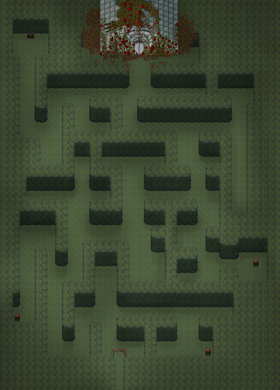
Hopefully the suggestion isn't 'get better at shadows' because it's impossible for me at this point. :LZSlol: -
@fop I really like this. I think I would spread the roses just a bit farther into the maze, but only very little. And I don't think I would put the roses on top of the entrance since it seems a bit odd to have them just in that one spot and then nothing until you get to the end.
But again, I really like this and the fact that you can't see the whole maze as you are navigating it. -
@fop In addition to what ZombieKidzRule suggests, have you thought of breaking up the grass a bit? It is totally uniform, no weed, no patch of slightly longer grass, no fallen leaf or twig, nothing. It doesn't have to be vast amounts, but as the grass is tonally very close to the hedge, it does tend to blend into one at the moment.
-
@ZombieKidzRule Thank you! I'll do that. :D
@Kes Omg I didn't even think about the ground for some reason!! Let me work on the ground a bit and I'll post an update.
Thanks to both! -
I was in the mood of mapping a bit and ended up with this thing:
-
now that's a pretty sight :wub
-
@fop , I love the hedge maze idea! I agree with Zombie about spreading the roses out throughout the maze. You could even potentially use them to indicate if the player is going the right way--more roses, right path. I'm looking forward to seeing the update with more ground variation!
@Nicke , very pretty! The background you chose matches the map perfectly. I love how you've put a partially-visible tree down below the cliff line, it really helps to remind the player that there's more mountain that way! -
3D to 2D REVOLUTION!! - please watch (still experimenting before creating a proper tutorial and assets)
I have felt a bit beat down endlessly mapping in 2D. Pixel art is such a chore. I'm a very visually focused person and I'm just not feeling the results of many of my maps. While I don't have any ambition to create a 3D game, I've always been a 3D artist. It's high time I bit the bullet and polished my 3D skills to their former glory. The thought of creating every asset in 3D was too daunting, especially given the amount of work I've put into 2D level creation. Working in 2D, the limitations on creative freedom & the time consumption are just too much to bear.
I hope this isn't too out of place. It's almost a tutorial, but this is the very early days of a new approach. This could be the start of something wonderful. It's just a seed. I hope you can imagine where this might go. There's some wrong info in this. I'm still working things out.
I know this looks weird and it's technical, long & maybe boring. I really think I'm on to something special though. This is the seed of something so good. It works, it's free. I hope to give the project away as an asset, but I'm still ironing out the kinks. It's gonna be well wicked!
-
 The house is from Bougainvillea, I didn't make it. Ressources used also include Celianna, Pandamaru and Avery.
 -
@Saneterre Those are nice assets, but the trick, in my opinion, to combining assets from a range of resources is ensuring consistency.
You have a house which is blazing out light. It could only do that at night. In daylight those windows would be dark, or at most slightly 'warm' in colour. The rest of your map appears to be in daylight, making a disconnect with the house.
Could I suggest that you substitute the windows and door panes with something darker/almost black? If the house didn't come with those, then do a simple edit in GIMP or whatever image program you use.
If, on the other hand, this is meant to be a night time map, then you will have to do some sort of screen tint. This would be the simplest solution. An alternative would be to create an edited version of those trees and other assets by e.g. adjusting brightness, saturation etc., so that they all look night time and then do your screen tint. That, however, is a lot more work. -
The house does come with black windows so I guess I can just change them. Thanks for the input.
-
Gotta disagree with Kes, I think that looks beaut. Some of the flowers might be a bit off, but apart from that.The house does come with black windows so I guess I can just change them. Thanks for the input.
-
Unfortunately, @Kes, Bourgainvillea prevents editing of his materials (the cabin). So @Saneterre can only use what he finds on the site.
I do agree about the weirdness of the lights being on during the day, unless they hate sunlight. XD -
I don't have a problem with the windows being brightly lit even though it's daylight. While yes, real windows tend to look dark by day, I think it makes good visual shorthand for "someone is in this house." The player could easily differentiate the houses they can enter from the houses that they can't based on if the windows were bright or dark.
To me, the thing that makes the house really stand out from its surroundings is how saturated the wood is compared to the trees, and how much less detailed the roof shingles are than the leaves near them. But if Bourgainvillea prohibits edits, there's not much to be done about that. All in all, I think it's very cute! I love the variety of flowers. -
Thank you all for your comments.
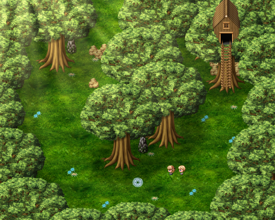
I've tried a map forest using Avery's ressources essentially. I' not that happy with the rocks. Don't mind the symbol at the bottom, it's there purely for gameplay reason.
The map