Game & Map Screenshots 12

● ARCHIVED · READ-ONLY
Started by slimmmeiske2 1772 posts Page 61 of 89 View original ↗
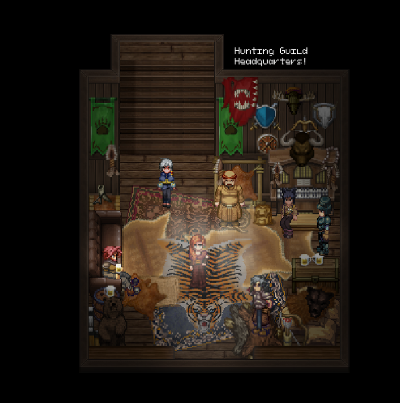
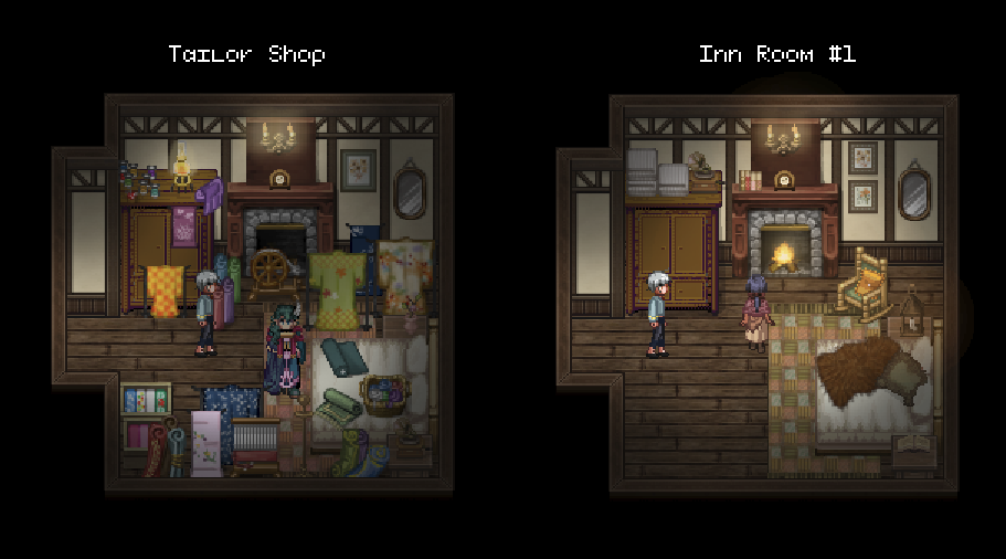
  1. I'll drop some Inn maps in the thread! The place is supposed to have this cozy, rustic vibe while also being a little quirky. This inn hosts the headquarters of the hunting guild, who I've written to be a comic-relief group of goofs, so their room is a lot. There's also a tailor who got snowed in to the town and has just given up and set up shop from his inn room.

    Apologies as always for any pixel distortion. My laptop screen is zoomed by default and I've still got to find a way to get better screenshots... (Actually, if anyone has some guidance on that, I'd be grateful.)

    Inn: Glacier Lodge
    inn-tavern-main.png
    huntng-guild.png
    inn-rooms.png
    output-RFY145.gif


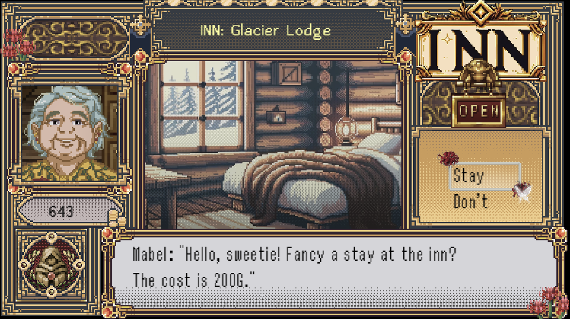
    As well as my WIP inn UI!
    inn-menu.png
  2. @fop looks super good, strong late SNES era vibes!:kaoluv: The maps feel almost a little too rich, but I'm not really complainin!
  3. Since this popped up on the recent posts so I actually remembered it exists lemme post some maps! I'm not sure if I ever showed these before. If I did, excuse me:

    Maps, who would've thought
    Map044-min.png
    Map173-min.png
    Map-min.png
    Map177-min.png
    Map189-min.png
    Map012-min.png
    Map047-min.png
    Map096-min.png
    Map105-min.png
    Map029-min.png
    Map102-min.png
    Map002-min.png
    Map007-min.png
  4. @fop Love the overall appearance of your world and the larger character size. Looks great.

    @SGHarlekin Looking very nice.

    As an aside, lately I have started noticing one thing about shadows and it certainly isn't limited to your examples and I don't know why I have suddenly started noticing it.

    Look at how all the trees have circular shadows around them. Like the sun is shining from directly overhead, I guess? But then look at the shadows for other things, like buildings where the shadow is only on one side.

    Now, I have almost ZERO experience mapping anything beyond a couple tutorials I followed and some simple maps for experimenting. So I have NO idea how shadows typically work by default or what it takes to modify them.

    But I just wanted to mention the shadow inconsistency because I am noticing it more and more. But it definitely isn't anything that is going to stop me from enjoying a game.
  5. ZombieKidzRule said:
    @fop Love the overall appearance of your world and the larger character size. Looks great.

    @SGHarlekin Looking very nice.

    As an aside, lately I have started noticing one thing about shadows and it certainly isn't limited to your examples and I don't know why I have suddenly started noticing it.

    Look at how all the trees have circular shadows around them. Like the sun is shining from directly overhead, I guess? But then look at the shadows for other things, like buildings where the shadow is only on one side.

    Now, I have almost ZERO experience mapping anything beyond a couple tutorials I followed and some simple maps for experimenting. So I have NO idea how shadows typically work by default or what it takes to modify them.

    But I just wanted to mention the shadow inconsistency because I am noticing it more and more. But it definitely isn't anything that is going to stop me from enjoying a game.
    It's a detail almost no player will ever notice. WIth different assets come different shadows. The default RM shadow are just that. Use them or don't. Personally I just use a plugin that just removes all autoshadows. Unless you want to get into parallax mapping and/or make a whole bunch of extra shadow tiles (for which you essentially have no space on the sheets with almost any premium tileset) you're stuck with this. It's a tradeoff I'm willing to take in exchange for much better looking assets.
  6. @SGHarlekin Really like those maps, especially the way you play with elevation! Also those yellow crystals have such a pretty contrast with the bg in that cave map.

    @ZombieKidzRule Thank you! :LZYcat:

    @alice_gristle I think I get what you mean by 'too rich,' but could you elaborate? Certain areas have a lot of visual noise by design, but I do have a tinge of the 'too much' gene in me so I'd love to hear more of your thoughts! :LZSproud: Thanks!
  7. @fop the too-much gene is manageable, if it's makin' you put out maps like these! :kaoluv: Sooo, cud we maybe work on the hunting guild map a li'l bit? Nothin' too drastic, maybe just take out a few adornments above the organ, see how you like that? I wud maybe try removing the big bull head and the bow, see if that makes the map a li'l less busy?

    I took another look and I really think the rest of the maps are fine! :wub How 'bout that inn menu screen tho? Cud you test it without the funky red flowers in the upper left and lower right corners? As it is, that screen is like ALL THE ORNAMENTS EVER IN ALL THE PLACES, and while I loooove ornaments, I kinda feel like I can't breathe. :kaoswt: Also, can we do away wid the cross thingies wid blue centres on either side of the inn title?

    The portrait is adorably straight outta 70s LotR tho, and yo font is just sweet! :wub
  8. @alice_gristle I'll keep your suggestions in my edit notes! Thanks for the input. :LZYcat:

    Also yeah I was trying to go for the vibe of my favorite PC-98 game UIs with the inn menu hehe. It has definitely got some heavy ornamentation! I'll tone it down a bit, but the flowers are across all my menu screens so I'll probably just find a way to incorporate them more naturally without doing away with them completely.
  9. The game (1280*800)...

    1709075963513.png

    versus the map!

    index.php

    XP RTP but at a modern resolution >>>>> :kaoluv:
  10. I dreaded the day I would post here...
    Any tips would be great appreciated.
    Map018.png
  11. I mean it's supposed to have a surreal vibe to it... right? Maybe overlay some shadows so that the small number of objects stand out even more? Or have faint reflections of the ceiling lights (fluorescent I assume?) on the floor...?
  12. I haven't added lighting yet. I had wanted to get a base down.
  13. @TRIDIUM it feels huge, empty and boxy. I'd definitely make it a bit smaller, maybe add a bit more clutter. And maybe you can adjust the outline a little bit. Maybe start out smaller and get wider towards the end or vice versa.
    Also the pillars look kind of weird to me (probably because they are so streched?). Though maybe that is on purpose? What was that about the map aiming for a surreal feel?
  14. To clarify before this derails: my comment/assumption about the intent of the map being "surreal" was based on playing @TRIDIUM 's early demo project. I mean if the intent of the map is that it is huge, empty, and boxy, then that's what it is so...
  15. Yes, it's supposed to be somewhat surreal.

    The main issue I have is that I'm using the ARPG plugin, so there has to be room for the player to move around and fight enemies.

    The pillars are not stretched, but if they look bad I can change them.
  16. @TRIDIUM
    I think one of the reasons why the pillars look a bit odd is that you haven't yet put in your shadows, so they lack any sense of depth. That will be changed when the shadows arrive.

    The other reason is that the colour of the floor and ceiling are absolutely identical (I even checked the HTML notation number just to be sure). This makes it very difficult for the top of the pillar to be clearly distinguished from the floor - the outline separating them is thin and even if it were a bit thicker the human eye would still have the same problem. One way to solve this is to make the ceiling and the centre of the pillar a few shades darker if you want the colours to be closely aligned.

    And the forum software is cursing my UK spelling, but I'm sure you'll be fine with it.
  17. Mhm, I don't think the color of the pillar top is the issue. I saw the outline just fine. More like my brain really expected them to be circle round and this oval shape kind of throws me off, I guess.

    Being an ARPG battle map constrains the clutter you can use, but doesn't mean there can't be any. You could put some trash on the floor in another (not yet cleaned) area, or some more vending machines in the corner.
    Or you go full on surreal and embrace the the weird feel. Make it bigger. Remove the walls. Remove the clutter. Just endless rows of pillars. I'd say make the map loop, but I don't know how this will work with the ARPG.
  18. Sorry Square-Enix, you can't sue me. This means of fast travel is the legally distinct "Bokocho", and has no relation to your trademarked property. :aswt:

  19. One of the maps I'm working on for my project. Can't wait to make many more.

    1000001522.png
  20. @Sirionsmusic Good start to your map. I do, though, have a query and a suggestion.

    The query is this. It might be because this is a screenshot and so it might be different in-game, but the top corners of all your rounded cliffs have a little white piece which fills in the grid square.

    My suggestion concerns your paths. At the moment a number of them come up almost to the bridge, and then there is a little gap as if the people have done a little jump to get onto the bridge and so have not worn out a path. You often see the same problem with paths going up to doors. This effect is inevitable if you just use the autotiles in the normal way. However, with Shift+click mapping that is eliminated. The path can go right up to the bridge.
    In case you are not familiar with this technique, here is a link to an excellent tutorial. Don't worry that the tutorial is for VX Ace, the technique is the same for all engines. Once you've got a grip of this, all sorts of things become so much easier. The link is to a particular post rather than the beginning of the thread as in this post the lost images have been recovered. It's therefore much easier to understand.