Mechas!!!
Game & Map Screenshots 12
● ARCHIVED · READ-ONLY
-
-
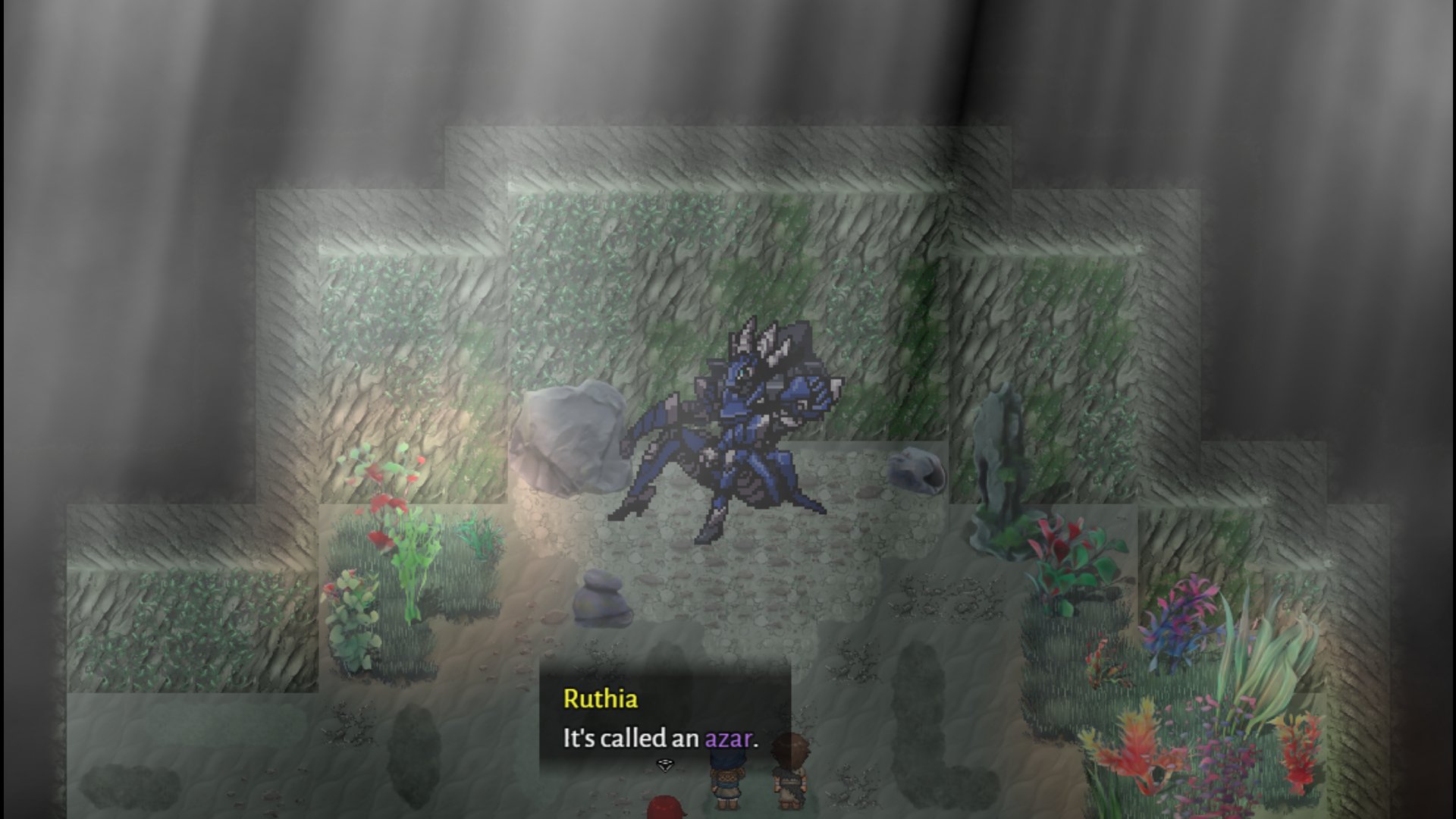
Mechas with HIGH HEELS :wub :kaoluv: :wub The different apparent resolution between the mecha and its surroundings bothers me a bit tho, is that a work in progress?
-
Mechas with HIGH HEELS :wub :kaoluv: :wub The different apparent resolution between the mecha and its surroundings bothers me a bit tho, is that a work in progress?
Thanks! Actually the game is complete and released. -
@rue669 Oh sweet! :kaoluv: I'm actually lookin' for something to review for my li'l game review blog! :biggrin: Wud you be interested? You can check the blog in my sig!
-
Yes, I would! That would be really cool.@rue669 Oh sweet! :kaoluv: I'm actually lookin' for something to review for my li'l game review blog! :biggrin: Wud you be interested? You can check the blog in my sig!
-
=VIDEO REMOVED=
Will later post screenshots and/or youtube clips -
@Synrec Is this the whole of the title screen, or is it just the section with the options on it? If this is the entire screen, then it doesn't particularly grab my attention, and if it is the just the game options then how does it relate to the rest of the screen with the title?
As an aside, just providing a Twitter link instead of showing it here means that anyone who wants to comment has to accept Twitter's junk and tracking or go through hoops to avoid it. (I go through the hoops) It might do your Twitter count good, but it could also be discouraging feedback. -
Thanks for the feedback especially with regards to the tracking thing should I do a reddit upload instead?@Synrec Is this the whole of the title screen, or is it just the section with the options on it? If this is the entire screen, then it doesn't particularly grab my attention, and if it is the just the game options then how does it relate to the rest of the screen with the title?
As an aside, just providing a Twitter link instead of showing it here means that anyone who wants to comment has to accept Twitter's junk and tracking or go through hoops to avoid it. (I go through the hoops) It might do your Twitter count good, but it could also be discouraging feedback.
It relates to the gates and void theme of the game. The game's story eventually leads to "Voidlings" invading the world through gates that lead to randomly generated maps as a core theme of the game and which show up randomly in the world. The main aspect of progression is through the Hunter's Hall however in which the city citizens can place requests and you can take them based on prior completed missions (Similar to rune factory but without the relationship building thing) -
@Synrec That sounds really interesting, but I wouldn't have got any of that from the title screen.
-
Why not simply click Attach Files beneath the text box where you write a post and upload the screenshot? That's what you see everyone else in the thread has done (except for a few with YouTube videos showing gameplay).Thanks for the feedback especially with regards to the tracking thing should I do a reddit upload instead?
As far as the actual screen, it's fine in an abstract way. As Kes said, it really doesn't impart any information about what the theme of the game will be (or even its graphical style). And that's okay, if it's what you want, there are professional games like that.
But it doesn't leave us a lot to offer feedback on. The font is neat. -
Thanks and the video file was too large at 47 MBWhy not simply click Attach Files beneath the text box where you write a post and upload the screenshot? That's what you see everyone else in the thread has done (except for a few with YouTube videos showing gameplay).
As far as the actual screen, it's fine in an abstract way. As Kes said, it really doesn't impart any information about what the theme of the game will be (or even its graphical style). And that's okay, if it's what you want, there are professional games like that.
But it doesn't leave us a lot to offer feedback on. The font is neat. -
For something like your looping title screen, an animated GIF would've done fine :smile:Thanks and the video file was too large at 47 MB
Unless you were showing animations going into submenus and back out and such, in which case, yeah - YouTube embedded link is the way to go.
Good luck with your project! -
Hey, all... what do you think about this map interior?
i changed a bit perspective on horizontally map and add floor, thx for advice before.
My inspiration is ambience color from "Burnhouse Lane" (via RPG Maker can do this visually).
*Use parallax map editing and Galv Layer plugin. :ywink:
-
@AquariusKawaii96 Nice atmosphere. There is, however, one small but important mapping issue. The wardrobe etc. on the back wall look like they might have to be suspended from the wall. They need to be moved down about half a tile so that they more obviously sit on the ground. To illustrate what I mean, here is a screen shot of a very simple interior. Have a look at the cupboard top right corner.
cupbaord placement example
This does not have to result in any blocking of your pathway. Simply set the bottom section to O passability and the sprite can walk straight past it. -
I’ll be honest. I wouldn’t have noticed anything off unless @Kes said something. And I had to zoom the map to really see what the issue is.
It looks like everything on the back wall is partially in the wall. If you look at the bottom of the stands for the skeleton and the dressing form, the oval bottoms seem to go into the wall.
And if you look at the bottom of all the other objects compared to their tops, there isn’t enough of the bottom of the object on the floor. So it looks like some of the object is in the wall.
Again, this isn‘t anything I would have noticed on my own since I was taking in the overall appearance of the room.
I think this looks great! -
-
An unfinished inn from an unfinished area of an unfinished town!
I'll be honest, I am uhhhh not good at perspective. You could call this baby's first isometric building and I'm trying to blend it in with other buildings in a more typical top-down style and... I am almost certainly off on angles.
My question is, would you notice that as a player and would it bother you too bad? It's more zoomed in in-game and so you wouldn't ever see the building fully on screen at one time.
in-game zoom amount -
It looks lovely to me, at least a glance! :kaoluv: Really good work and an adorable style, honey! Thing is tho, if this cutie is isometric and everything else is not, it's gonna stick out! :kaoswt: Also, stuff like that notice board will look odd unless you align them to conform with the building.
-
@alice_gristle
I'm trying a thing where I'm mixing iso and top-down that, yeah, is a little odd-looking. But I kind of like it to be honest... it reminds me of those PSP remakes of the star ocean games.
This is super unfinished, but I'm going to get better at blending the two styles the more I do it, I think. -
It actually looks pretty okay, sweetie! :kaoluv: I guess my only nit at this point is that you gotta make the town accessories (like that notice board) align with their respective buildings! :biggrin:
ALSO HOT WOW YOUR FROZEN WATERFALL :wub :wub :wub