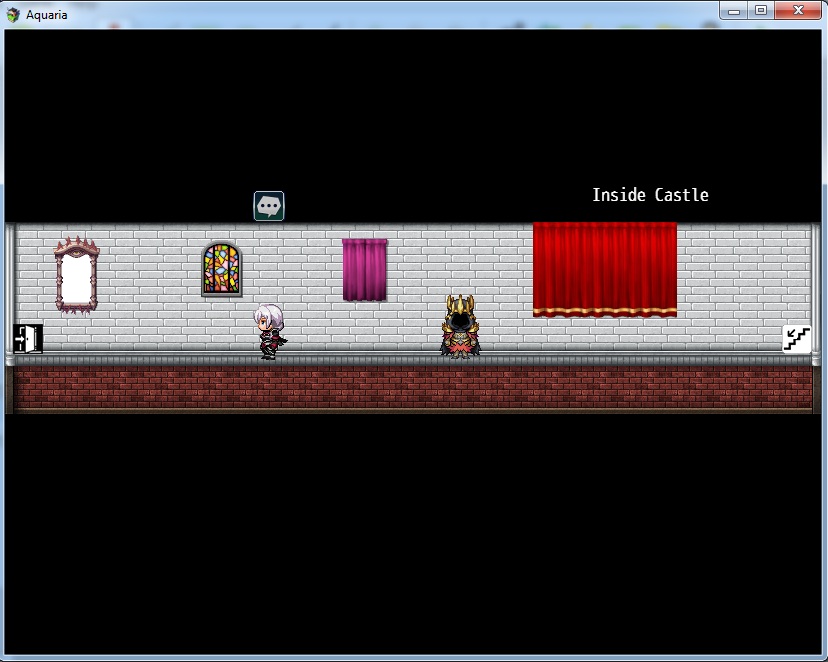
So I was inspired by the game "the cat lady" for horizontal map. What do you think about the horizontal map in rpg maker? Is there an example of a rpg maker finished game with a map format like this? (The cat lady/burnhouse lane). Beside using Galv Layer Graphic Plugin or Parallax Map, any advice for Type Horizontal Map like this?
Game & Map Screenshots 12
● ARCHIVED · READ-ONLY
-
-
I think you should add at least a floor tile going across. It might look more natural that way.
-
@AquariusKawaii96 I think having 3 distinctly different window styles in one short piece of wall doesn't really work. It means that there is no coherence in the map. What is a church window doing in the same room as 2 domestic windows, one of which (right) is much more opulent looking than the other (central)? The drawn curtains imply that this is night, but there is enough external light for the colours in the church window to be visible, so there is an apparent contradiction there. And the mirror looks like it's just been put there to fill a space.
I also agree with StrawberryFlower's comment about the floor. I thought the sprite was floating until I worked out what was probably happening. -
@Kes This is interesting because I wouldn’t automatically assume the covered things are windows. They could be things on the wall that are covered for some reason. Yet a scary mirror isn’t…hmmm…Danger?
But I agree about the lighting.
Also, to me, the “…” bubble seems oddly placed and the stairs and exit seem out of place visually, unless those are just place holders.
I also agree with maybe a floor time.
But I still like the overall design. -
While I continue to debate on what to do with the town map of scrapping it entirely for a different concept or just try to alter it without losing the idea, I am slowly working on revamping a Forest Dungeon I have. AKA the first dungeon I made in the game. Top is the original entrance to it and bottom is the revamp. I apologize for the events being all over the place there. I am still editing the Revamp and had to move them to sprite it but thought it'd be good to show the difference here. The big forest itself would be harder but I thought it'd be good to show it off.
Current idea is to get the base of the revamp down and probably add some more stuff in the background. Maybe hills, rivers, or paths that are inaccessible but show more beyond it.
Just some ideas. But I am slowly revamping this old map.
-
Interesting. I like the look of the bottom version more, but the top makes me think forest clearing while the bottom makes me think larger forest path. I would expect the bottom one to actually be bigger, meaning you spend more time walking through it while the top seems more like a self contained clearing.
Not sure if that makes sense. I have never been a fan of those trees in the top, but it gives a different feel. More zoomed in feeling maybe?
Regardless, I like them both. I am not a harsh critic since my mapping is terrible. -
I think you might be better off with a mixture of both. The RTP has very limited trees, and if you are not planning to add user made tiles to your tileset, using both the "tree wall" and the tree to create the illusion of a dense yet mixed forest is probably your best bet.
On the blog is a mapping forests tutorial by me that might help you:
Mapping Forests | The Official RPG Maker Blog
And if you use google translate, you might also find Maru's helpful:
[Mapping] Wald - RPG Maker MV - Dein Projekt - Dein Spiel - Deine Community
I quickly made something what I thought that might resemble what you are going for with that mix:
-
I think you might be better off with a mixture of both. The RTP has very limited trees, and if you are not planning to add user made tiles to your tileset, using both the "tree wall" and the tree to create the illusion of a dense yet mixed forest is probably your best bet.
On the blog is a mapping forests tutorial by me that might help you:
Mapping Forests | The Official RPG Maker Blog
And if you use google translate, you might also find Maru's helpful:
[Mapping] Wald - RPG Maker MV - Dein Projekt - Dein Spiel - Deine Community
I quickly made something what I thought that might resemble what you are going for with that mix:
View attachment 253371
I know the tree walls aren't the most liked which is why this version I did I omitted them. Though they do look good like this together. -
It's been a while since I did a new map... Here's what I made for a "Cemetery/Crypt" type dungeon.
And here's how it looks in game:
(Note: Does anyone else have the problem of videos on here just not working?) -
@SGHarlekin The video works fine for me. I have often noticed that the first time I try to play one of my own videos I have difficulties, but then it's okay.
I want to commend the lighting etc., which just transforms that map into a different class. Congrats. -
Thanks! I was glad that the lighting and stuff worked as well as it did, because as you can clearly see, the in editor map doesn't have the required atmosphere whatsoever.@SGHarlekin The video works fine for me. I have often noticed that the first time I try to play one of my own videos I have difficulties, but then it's okay.
I want to commend the lighting etc., which just transforms that map into a different class. Congrats. -
Working on my first ever game project. It’s a puzzle and combat focused game, nothing major.
It’s non-commercial so I am using the RTP and the only thing I’ll customize is the character and enemy sprites and maybe the UI boxes. I’m just here to make a game and be proud that I made a thing from start to finish and hopefully people find it decently fun.
Someone did give me the advice that since I’m using RTP, I should at least focus on making sure my maps are good. So I wanted to get some feedback on the current two I have done. As the game goes on, the maps are gonna become bigger and have more complicated puzzles so these two are on the smaller and simpler side to ease the player into how the game works
Just let me know what you think and what I could add or change to make them better. I figured I’d ask now so I can use the feedback I get to help me when designing the rest of the maps
-
@Tuna_tuna I have moved your posts into the Game & Map Screenshots thread.
I you want to create a thread for your game, please check the pinned Rules & Guidelines thread in the Games in Development forum and create a new thread with all the required information. -
@Tuna_tuna I suck at mapping so my responses are usually not very critical. Just generally, I say congrats and great job at making a couple really big maps! I especially like the underground one.
With that said, this reminds me of the biggest thing I generally dislike about default RPG Maker assets. Everything is go square. The square borders of everything is unappealing to me personally.
But I also know that trying to change that requires new, rounded tiles which I couldn’t even begin to dream of how to make/edit.
So again, I will just say that I really like these. It looks like you put a lot of work and effort into these! -
@Tuna_tuna It seems like you have some trouble with consistent wall heights and generally you have a lot of empty space on your maps. Always remember, the player will have to walk all the way through your maps, and if you want to make such large maps, they need to be filled with enough interaction and exploration to make that worthwile :)
I probably sound like I am just advertising my own stuff, but I don't wanna rewrite what I said in my tutorials xD
Here is a breakdown of how I personally approach maps:
Making a map
You might find these three from the blog helpful, especially about the wall heights for cliffs:
Mapping Forests | The Official RPG Maker Blog How to Map a Desert | The Official RPG Maker Blog Tips and Tricks: Mapping Cliffs | The Official RPG Maker Blog
You are off to a good start, but I think some of the tips in those tutorials might help you improve :) -
(2020 - The very first screenshot of the first area I made.)
(2023 - Updated version of area 1 to match with my current art style.)
I've recently noticed that my art has been improving a lot since I started development of my game. So I took it upon myself to redo the first few maps of Protyo Forest, just it could match up with the current art style of mine.
~Neonzumi -
View attachment 253562
(2020 - The very first screenshot of the first area I made.)
View attachment 253563
(2023 - Updated version of area 1 to match with my current art style.)
I've recently noticed that my art has been improving a lot since I started development of my game. So I took it upon myself to redo the first few maps of Protyo Forest, just it could match up with the current art style of mine.
~Neonzumi
The hazy effect really helps! -
[embedded media]
Ever since I started streaming game dev, progress has really improved at a much faster pace. :LZSexcite: -
I decided to show off the entirety of the original versus revamp of this forest dungeon map I made for a comparison here. May tweak the Revamp dungeon a bit but I kind of like it more than what I originally had? The tough part would be changing all the cutscenes and whatnot but it may be worth it in the long run. Though any other critiques or other details to add would be nice.
Basically decided to add some new maps to give more focus to those sections. The small river and the abandoned temple, mainly.
Original vs Revamp dungeon map. -
Floor 2 of the cemetery/crypt Dungeon!