The Resource WIP Thread 3

● ARCHIVED · READ-ONLY
Started by Celianna 1568 posts Page 69 of 79 View original ↗
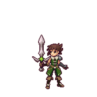
  1. Early design with main weapon.
    Trying to get a look of a main character.
    Idle.png
  2. @Holder
    I just love those boots. In fact I like the whole outfit, though I do have a query. Why the bare upper arms? That's a highly vulnerable part of the body.
  3. Kes said:
    @Holder
    I just love those boots. In fact I like the whole outfit, though I do have a query. Why the bare upper arms? That's a highly vulnerable part of the body.
    I received a request a while ago when I was doing my bases for a long sleeveless coat swordsman. The armour on the left arm I added just for a little protection.
    Once finished I might make a variation with more armour.
  4. @Holder clothes looking fire as usual, sweetie! :kaoluv: I really like yo choice of green, it looks stylish! The sword cross-guard overlaps with the chara's shoulder tho, makes it look like they have some really weird shoulder armour. Any chance you cud shorten the cross-guard on the sword?
  5. alice_gristle said:
    @Holder clothes looking fire as usual, sweetie! :kaoluv: I really like yo choice of green, it looks stylish! The sword cross-guard overlaps with the chara's shoulder tho, makes it look like they have some really weird shoulder armour. Any chance you cud shorten the cross-guard on the sword?
    Aw thanks, happy with how the rest of the frames are going. making good progress with it.

    For the weapon it's visual equipment I create my stuff for, so any 1 handed sword or shield can be used depending on what the user has equipped.

    1681773313584.png
    I'll keep it in mind as I'm checking how it looks with all the poses, as it might be a bit too pokey in the arm at certain positions.
  6. Spoiler
    alice_dialoguetest.png

    I'm makin' a short adventure game, this is an early test screen.:kaoswt: Developing relationships is central in the game, and the MC has a magic gem that changes colour to indicate how people feel about her. Tryin' out this dialogue screen with full-body portraits and the gem represented at the top.

    So whaddya think? Is the gem display thingy too big? Too small? Poor design? Summat else to improve? :kaophew: Also, the background landscape is a proto, not sure what to do with that yet. My other alternative is just having whatever map the player is on in the background, but with a darkened overlay. So far I like this specialised background more! :wub
  7. @alice_gristle I think the backgrounds are cute and focus the scene better so keep those I say.

    A for the gem , on its own it's fine but combined with the rather large text box 'neutral' it's a little overkill, imo
  8. @alice_gristle For the dialogue, I would have expected it to read "tender an apology" rather than "tether an apology". Is that an Americanism? I am also wondering if it might not be better if the figure on the left were not dressed in exactly the same shade as the gem + neutral + window skin. I quite like the colour, but there is an awful lot of it.
  9. @Finnuval, I think you're right... I wuz planning to have both a visual and a verbal clue as to what the relationship level was, so to speak, but Imma look into makin' it less in-yo-face. Or maybe I cud just remove the gem indicator from the dialogue screen entirely, and just add it somewhere on the map? Like... player walks up to an NPC, and the gem pops up, indicating current relationship level? Imma hafta think about this! :kaophew:

    @Kes, naaa that's a typo! :biggrin: Not actual in-game dialogue, just a placeholder to see what the screen looks like! As for colour, I'm workin' on a limited palette (you guessed it) so I'm a li'l constrained on what I can use. Maybe I dispose of the gem indicator and change the windowskin colour...? Gonna hafta run tests!

    Thanks you both! :kaoluv:

    EDIT:

    PIC SPAM!
    alice_colourtest1.png

    alice_colourtest2.png

    alice_colourtest3.png

    alice_colourtest4.png

    alice_colourtest5.png

    alice_colourtest6.png

    alice_colourtest7.png

    I did some quick colour tests!:kaoluv: It's the same scene but without the gem indicator, and I even managed to fix my typo! (Starting from No. 2 anyway...) :biggrin: Sooo, I tried some of my available colours as the windowskin background, some light, some dark. Lastly is my original mauve, which I still think is superior! But, like I said, now without the gem. Thoughts y'all?

    EDIT NO.2:

    PIC SPAM PROLIFERATES!
    alice_dialoguetest2.png

    Okay, okay, just this one thing, then Imma shut up! :biggrin: This is a test screen wid a different type of gem indicator, this time a lot smaller and put in a corner. Mauve is still on, but the background was touched up some!
  10. @alice_gristle i like the mauve however the dark purple/blue has a higher readability while keeping the same feelz, imo.

    I think the smaller gem indicator is good. Less in your face but still providing the necessary information to the player
  11. @Finnuval I see! Imma think about the purple! Thank you, dear! :wub
  12. @alice_gristle I too think the purple has a lot going for it. The greens less so, especially version 1. I actively like the gem and Neutral over on the side. It feels balanced there.
  13. @Kes alright! Imma test some darker aesthetics! Windowskins are, thankfully, really easy to switch! :kaoluv: Thank you for the feedback, sweetheart!
  14. Sprite-0161.png
    Costume sketching for my next battler. Dark blue is the metal armour parts(apart from the cloth between the fighters legs)
    Thoughts on these and which one should I go with?
    Weapons:
    Wizard/Psychic > Wand/Mask(Anything face sorta covering related)
    Fighter/Cleric > Knuckle(big fist on left hand)/Mace
  15. @Holder personally I prefer the design on the right. Tho both look equally good and thematically similar so... Flip a coin? xD
  16. Finnuval said:
    @Holder personally I prefer the design on the right. Tho both look equally good and thematically similar so... Flip a coin? xD
    It's nice to get an overall feel of what people would go towards before I invest a lot of time into a battler.
    For these two, I wanted to get a split between a female role. Feminine spell caster or a tough hard hitter.
  17. Holder said:
    It's nice to get an overall feel of what people would go towards before I invest a lot of time into a battler.
    For these two, I wanted to get a split between a female role. Feminine spell caster or a tough hard hitter.
    Idk if it's intentional or not but they both have a bit of an Arabian/deserty feel to them. Honestly I think both are very useful and would be great. The left one would be the more traditional pick while the right one is even more strong female character (to me anyway).

    And yeah I can totally see where you're coming from however I honestly think in this case between the two it doesn't really make a difference as I am pretty sure both would be very much welcomed in any sprawling rpg.

    Edit:
    @Holder let me put it this way : of I was playing a game and I'd reach this desert kingdom and these two where the daughters of the local lord and he'd offer me aid but I'd have to pick between them forgoing the other I'd prolly agonize over it for a long while as they look as if they both are different enough yet equal - if that makes any sense.

    Sorry if that still doesn't help tho ;)
  18. Finnuval said:
    Idk if it's intentional or not but they both have a bit of an Arabian/deserty feel to them. Honestly I think both are very useful and would be great. The left one would be the more traditional pick while the right one is even more strong female character (to me anyway).

    And yeah I can totally see where you're coming from however I honestly think in this case between the two it doesn't really make a difference as I am pretty sure both would be very much welcomed in any sprawling rpg.

    Edit:
    @Holder let me put it this way : of I was playing a game and I'd reach this desert kingdom and these two where the daughters of the local lord and he'd offer me aid but I'd have to pick between them forgoing the other I'd prolly agonize over it for a long while as they look as if they both are different enough yet equal - if that makes any sense.

    Sorry if that still doesn't help tho ;)
    No that's perfect. In fact I hope someone would do that scenario. That's in a strange way how I've got to think when doing these, because it's not for me.
    Cheers that input has actually really helped.
  19. I'm a bit late to the discussion, but I'm torn between the 2 because I would want both characters. If I could only have one choice, though, then it would be the one on the right. In part that's because although I love the pose and coat on the left, I am not a great fan of what looks like it's going to be bikini armour.
  20. Kes said:
    I'm a bit late to the discussion, but I'm torn between the 2 because I would want both characters. If I could only have one choice, though, then it would be the one on the right. In part that's because although I love the pose and coat on the left, I am not a great fan of what looks like it's going to be bikini armour.
    Not late at all, been working on enemy item drop icons in the mean time.
    Its sort of like panel armour plates, with cloth hanging from them.

    I think what I'll do is keep both designs and whichever seems to form easier I'll do first. So pleased that both have been well received.