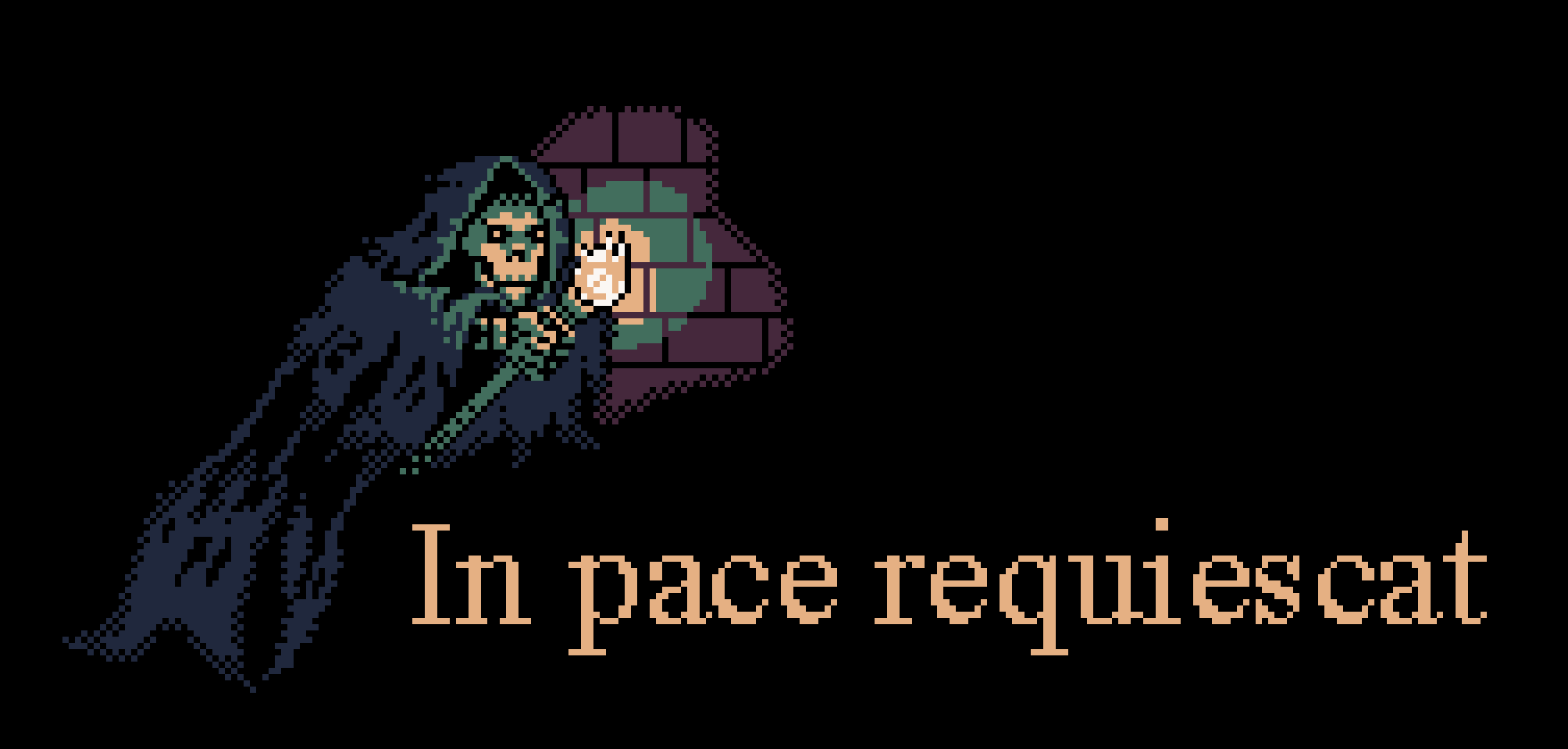
Was bored... made a literary reference completely by accident (which could also double as a nice game over screen now that I think about it :D ). 10 completely useless Bastrophian points to anyone who can name the reference X3 . Also, wouldent mind any constructive feed back either! Thank you all in advance!
The Resource WIP Thread 3
● ARCHIVED · READ-ONLY
-
-
I have question about MZ's face generator.

Am I supposed to move the nose up when the character's mouth is like this? Which one is right for this kind of angle? -
@Mr. Detective
just from looking at it i would say the right one(green eyes silver hair), looks better regarding the nose. -
@Dopan Thanks.
Actually, I'm gonna move the earrings up a bit. Still looks good, I hope?Y-4 on the left, default on the right. -
Yeah looks good^^@Dopan Thanks.
Actually, I'm gonna move the earrings up a bit. Still looks good, I hope?Y-4 on the left, default on the right.
..the only thing was the nose didnt look like it was in the right Place on the older (blond)Example. #1,144
(thats just my oppinnion regarding the symmetrie)
But for earings both of the new Images look good, even if i preffer the Blond Example on the earrings,where they are placed "more up" ^^ -
I like to create tileset items and battle backgrounds for rpgmaker by using renders from 3d assets.
So far I created some concept examples and willing to expand them to full suitable recources for rpgmaker MV (MZ).
But before I continue I like to get some feed-back and possible tips from the community for it.
The concept examples are a few buildings and a battlebackground loosely inspired on some Star Wars buildings.
Since I created them orignally in 3d they are fairly easy to adjust and a lot of styles are possible (even isometric).
Do let me know what you think and what style / theme would be suitable.
[ spoiler ][ /spoiler ]
-
Trying to add new face parts to the male section. Please tell me how I should move them. :kaojoy:
Default position.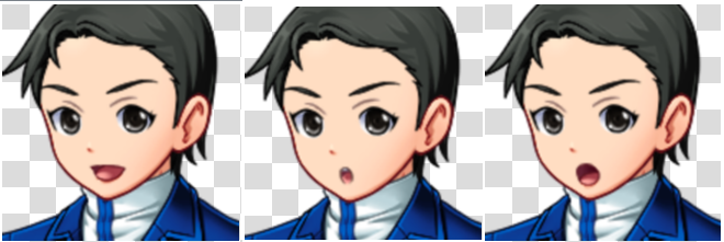
So that's how it looks when I have the nose and mouth at default position. Which should I readjust? Nose, mouth, or both? About how many units x or y, should I readjust them? -
@Mr. Detective
All faces are good, except the middle one.
The mouth position seems a bit weird (?).
Maybe you can adjust it a little to the left and a bit down to make it more centered
(it doesn't have to be dead center, because his face still facing to the side :D)
Anyway, I want to make a music resource thread,
using the music I've created years ago (but I fixed it to sound better).
Here's the music:
Honestly I'm quite satisfied with the music.
I'm concerned about the video thumbnail and the video itself.
I want to use it as a preview, but I want to make it look as interesting as possible.
Do you think it's interesting enough?
*Credit to @Mr. Trivel for custom ui plugin -
@EpicFILE So only move the mouth by, I guess, maybe 2 units... You don't think the last one looks strange as well? The first one might be okay, though I'm tempted to move that one, too. But the third one also feels like it's also in an odd position, no?
No problem with the nose's position? -
@Mr. Detective
There's no problem on nose position, it's how it supposed
to look like when he's facing sideways.
Honestly I don't see anything wrong with the third one
until you mention it. The position is correct.
But maybe you can tilt the mouth image about 45 degree (or less)
to make it more aligned with the nose.
Open mouth is a bit tilted


-
@EpicFILE I moved the mouth to the left by 3 units, but not down. Thought it'd be too close to the chin.
X-3, Y=0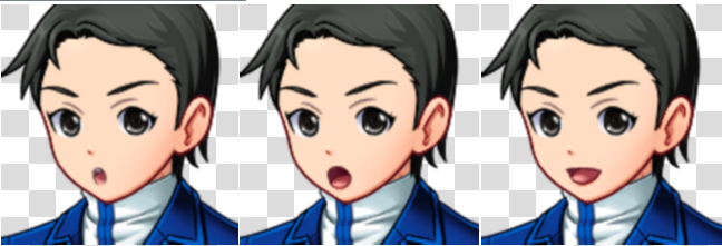
Guess this is okay? :3 -
@Mr. Detective
I think it looks good already. :D -
-
@Dutchmountain I’ve merger your thread with the WIP thread.
-
Hi!
So I want to rework character arts for my game.
Here's the old art.
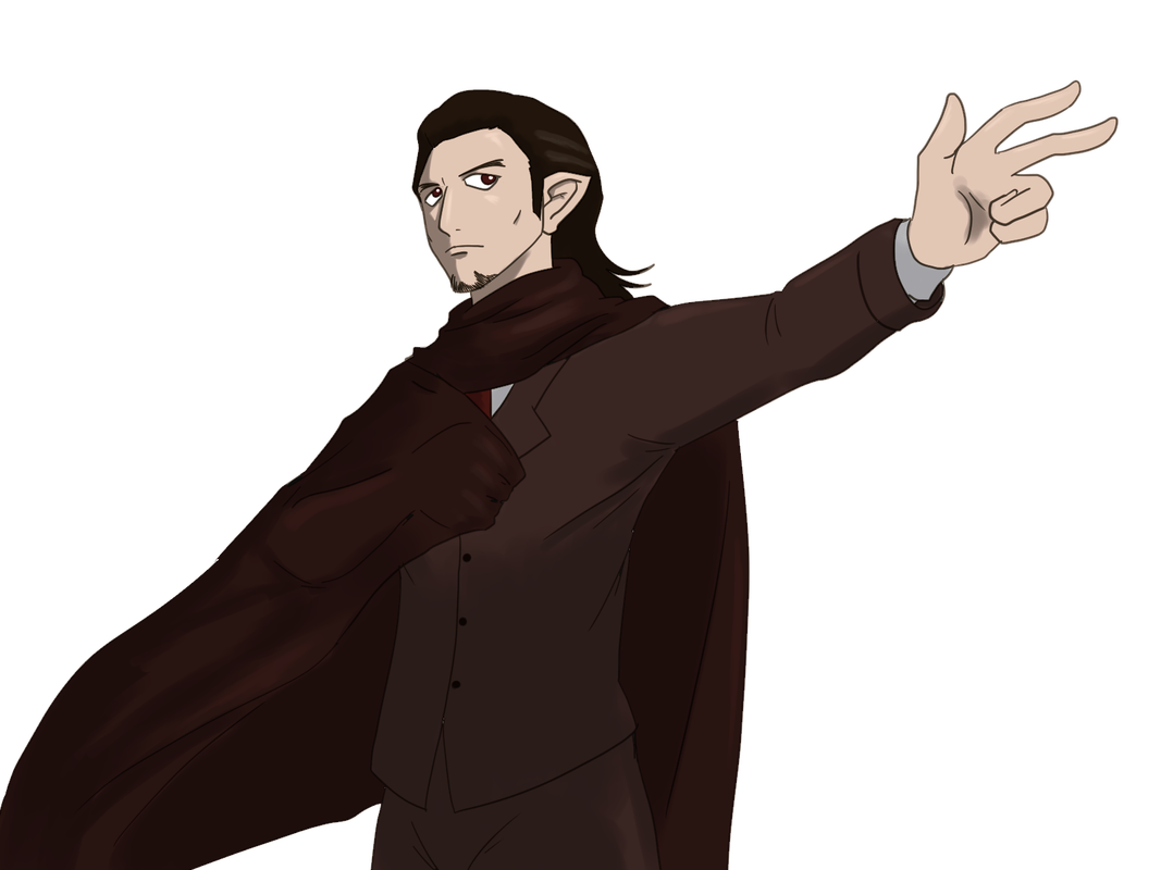
The hand holding the cloak seems a bit weird,
so I want to fix it on the new one.
The new one is pretty much still a WIP
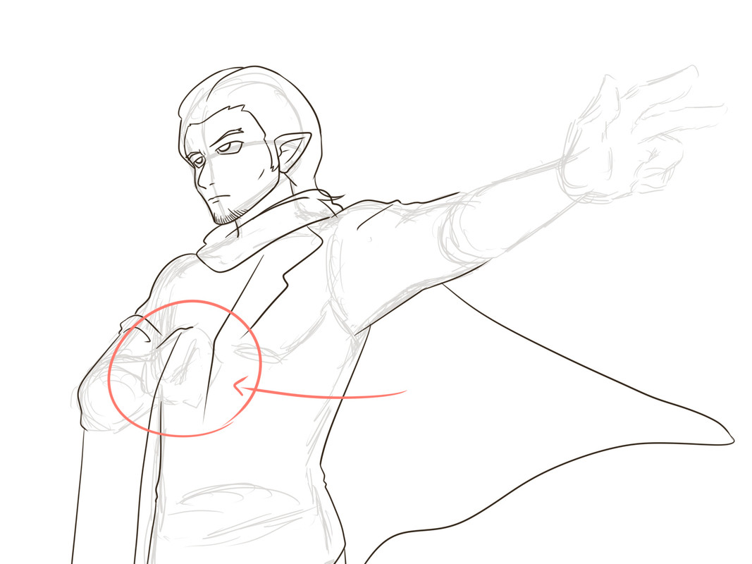
I'm curious how a hand holding a cloak looks like (the red circled part)?
Does it look like that, or it looks like the old one?
Or maybe it looks like something else? -
I hate my thrusters... I try to get some ISO poses *facepalms* It's like the two angles are good but I should decide which angle I got to choose from but... I think trusters should be easier to move than mid section.
-
(If this is in the wrong category, feel free to move it. It's my first time here.)
Hello! I'm making a big game with the RPG Maker MV engine. It's my first time making my own assets, and I was wondering if anyone knew more about shadowing for a top-down view. For context, it's a 16x16 tileset upscaled to 48x48. For the past few hours, I've been researching how to shadow properly, and I've come to the conclusion that you definitely need to add saturation, not just shadow. However, I'm not entirely sure how to apply this shadowing on a top down game, if it's different for interiors, and so on. I've attached two examples below, if they're both wrong please do tell me. :) Also, should there be any shadow on the floor when working with B-D tilesets, or is it preference? Any tips are appreciated. -
Currently working on a custom windowskin. Can't say it's going well. XD
WIP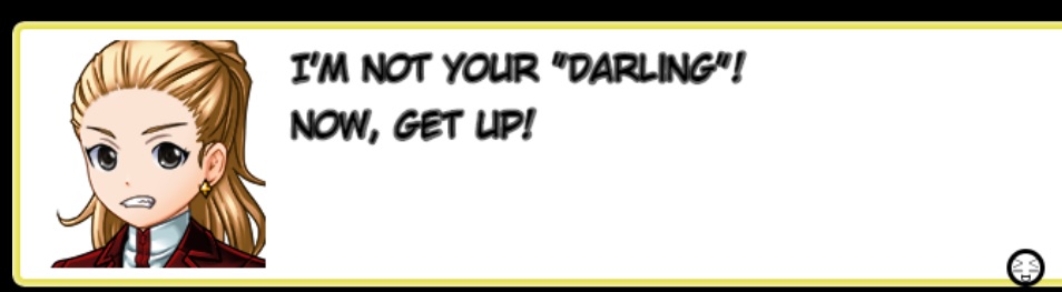
What I'd like to do is have the border being yellow (perhaps darker yellow), and the inside be white with black texts. I don't know if it's the font choice or what but doesn't turn out as well as I expected. T_T Also, that emoji at the middle is supposed to replace the arrow of the message window. Guess it needs more colors, but I am not sure how to go about it yet.
At first, I was planning to have brown-ish border with dark yellow box (kind of like those old yellow pages). That didn't work so I changed to this. Any advice, feedback would be greatly appreciated! X3 -
Hi y'all, my name Alice, I like knights and flowers. I'm also tryin' to do some pixul art for my game. It's not always going so well, so maybe y'all can help me sometime? :biggrin:
I'm making NES-style graphics, using the NES palette, but I'm not trying to be super authentic like doing all the colour restriction stuff NES has going on... Mostly 'coz I dun understand it. :biggrin: Anyway, what I got here is some portraits and, uh, pictures, so check me out?
PORTRAITS
So here's a few portraits I did. And yeah I know the lady's nose looks funny... Anyway, I've been trying to come up with nice frames or borders for these portraits, and this is what I've ended up with for now. What do you think? Do they look okay? And if ya got any advice on doing faces with, oh, about 26x34 pixels and three or four colours, I'm all ears!
PICTURES
And here's some pictures. I was thinking my game could have kinda like storybook cutscenes, where you have like a page from a book, and these could be illustrations pertaining to the game's events and stuff, and then there'd be text to go with them. Like in a picture book, y'annerstan?
Anyway, just about any advice you got for me would be appreciated. I'm really struggling with landscapes in particular, since I want to use the NES palette and I still kinda want to limit the number of colours used in a pic... -
I posted this on the profile posts page without knowing there was a thread for this, anyway, this is my first parallaxing attempt, I'm planning on using my own resources for a project and I don't like making tiles XD
Please tell me what you think (This isn't the full map)
[embedded media]
better version