The Resource WIP Thread 3

● ARCHIVED · READ-ONLY
Started by Celianna 1568 posts Page 57 of 79 View original ↗


  1. I get and feel too that my man should adjust his body again. It's not really compatible.
    And yes, I just considered it tightly again.
    Yes, I have to move a little more forward.

    xsx.JPG


    Okay, I mistakenly considered the inner leg, walking sideways It is not natural because the legs are drawn wrong, I will renovate.
    I am solving the problem of walking.My side walk seems bad and am working on it.
    I'm fixing my legs and newbie to look simple.
    Sharm said:
    I'm not sure about the step being too long, I think I'd need to look at the animation in a longer loop than what is being shown in the video. You can always just try it and if you don't like it better, you can always revert to the original.

    241181cc5a0a87fee1c6505aa2b03343.jpg
  2. @Sharm Thanks for the feedback! I'll definitely think about it as I write more music, for Catty Lands or otherwise.
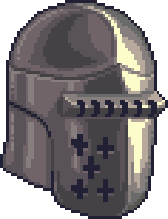
  3. Tried doing a complex reflective object this time, did I nail it? :3 any and all feed back is much appreciated!

    Edit: ..in particular, Im not sure about the top left part of the helmet...it just seemed to me that that area was darker...Im not sure if my perception of it was correct.

    EDIT: Someone on discord told me its probably the reflection of something.... I thought it might be that. Its kind of hard for me to tell whats a reflection and what light hitting the shiny object :< . hemet.png
  4. Looks great, I'm also looking for an armor prototype.
    PixelHeart said:
    Tried doing a complex reflective object this time, did I nail it? :3 any and all feed back is much appreciated!

    Edit: ..in particular, Im not sure about the top left part of the helmet...it just seemed to me that that area was darker...Im not sure if my perception of it was correct.

    EDIT: Someone on discord told me its probably the reflection of something.... I thought it might be that. Its kind of hard for me to tell whats a reflection and what light hitting the shiny object :< . View attachment 162451
  5. Oh, very nice! My suggestions for fixing it up are to hard to describe, I'll use an edit this time.
    helmetedit.png
    So, you were right about the shadows not being as dark as the reference, so I added a new shade, then took everything on the shaded part and shifted it one step darker. I changed the curve of the ridge to better match the reference, with a less shallow curve and more room for the forehead. The top's shadows were hard to pinpoint if you just go by the reference image, but that's where real world knowledge is helpful. It's mostly a ball shape, and if you light a ball from that direction, you'll get more of a swoosh than a circle, and if you know that you can see it in the reference. I removed a few spots of what I guess is reflected light along the outline, as it was in places where there wouldn't be any reflected light. I did, however, add a bit of extra highlights on a few edges. This isn't reflected light, it's ridge lighting, it's a way of making a sharp corner stand out and look sharper. I did a similar thing in some places with shadows instead of highlights, adding some extra darkness to firm up the edge. If you look closely at the reference image, it's there along the bilateral ridge. I could probably do more tweaking like this, but this was just a quick edit, it's not perfect, just an idea. Oh, and I changed the color ramp. Your greys were all over the place in hue, so I made a ramp where it shifts from yellow to purple gradually.

    You did a really good job with this, it's quite shiny! Most of what I changed are things I picked up from experience, not observation, and you really nailed the execution of everything based on observation. I'd say this is a success.
  6. Need advice This is my work
    Which one is better
    4341af1e556873d734f83cc8d96ec48f.jpg
    cfb8023b444bc8a93f2adf0bf9832c41.jpg
  7. Body of 1, face of 2. You should use a much darker outline and more contrast between shade and the main color when making sprites, it's really hard to see what you've drawn even when zoomed in, and the sprite will get completely lost when placed on a map. They can only get away with a lack of outlines for sprites in hyper light drifter because the entire game is designed around it, using maps with large swatches of flat color and almost no details or shading.
  8. @Sharm - UGH! X3 Your colors are perfect!....or way better then mine anyway. To be fair though, I didint manualy pick mine, I was just using Asperite's default palette, but I see what you mean that my ramps were all over the place. Also, I was second guessing my variants ridge too...I thought it was too shallow as well. I think thats the part I found most challenging, since thats where most of the highlight/shine hits, and then abruptly changes to a darker color....like, I wasint sure how I should transition it, especially knowing that the ridge would cast a shadow too.... anyway, its encouraging that hear that my variant was mostly a good product :D ! Thank you so much again for your feedback!
  9. So I briefly thought that I would color the edges of the characters like this, but to the point, I have no idea how to make the characters look jagged and smooth if I use more colors. Or you could show a small example. That I can use it would be great.
    Sharm said:
    Body of 1, face of 2. You should use a much darker outline and more contrast between shade and the main color when making sprites, it's really hard to see what you've drawn even when zoomed in, and the sprite will get completely lost when placed on a map. They can only get away with a lack of outlines for sprites in hyper light drifter because the entire game is designed around it, using maps with large swatches of flat color and almost no details or shading.
  10. I don't understand what you mean by making the characters look jagged and smooth. I can't do an edit with the example images, I'd need a cleaner version to work with. It doesn't necessarily need to have more colors, it's just that the colors you've chosen to work with are far too similar to each other.
  11. Based on your advice, I tried to modify. The color is dark outside and inside is bright.
    If you help fix it to make it look better That would be great
    73e18951148b60c351d10f222164057c.png
    Sharm said:
    I don't understand what you mean by making the characters look jagged and smooth. I can't do an edit with the example images, I'd need a cleaner version to work with. It doesn't necessarily need to have more colors, it's just that the colors you've chosen to work with are far too similar to each other.
  12. This is just a quick edit to give you an idea of what I'm talking about. You shouldn't use it to work from, since it's very quick and very messy and not complete at all. I tweaked some anatomy while I was at it. You can go a lot darker than this with outlines if you want, and you might need to, depending on the style of your tileset, this is just one option. BTW, I noticed you have a lot of stray semi transparent pixels. You'll want to clean those up before you finalize this.

    73e18951148b60c351d10f222164057c.png
  13. Yes, I can see, I will try to adjust as suggested again. :LZSoops: :LZScheeze:
    Sharm said:
    This is just a quick edit to give you an idea of what I'm talking about. You shouldn't use it to work from, since it's very quick and very messy and not complete at all. I tweaked some anatomy while I was at it. You can go a lot darker than this with outlines if you want, and you might need to, depending on the style of your tileset, this is just one option. BTW, I noticed you have a lot of stray semi transparent pixels. You'll want to clean those up before you finalize this.

    View attachment 162625
  14. What parts should I improve? Here again, thanks for your advice. I might bother you too much
    According to the master, my breasts were wrong, so I corrected them according to your prototype and they looked great But I have a character with a big bust. That is the reason I remain the same
    I want beautiful legs. How do I fix it?
    3dfd99cef4d7c5f7df8a695757179d7e.png
  15. Yup, that's better. To make the legs more appealing, they need to have more curves. You just need to add a little muscle in the right places. If you're having trouble, try looking up some reference images and see how it works on a real person.

    The main problems you have right now are a lack of knowledge of anatomy. That's too big of a subject to cover here, and I'm not interested in teaching a course on it (I have too much to learn myself anyway). We can help you tweak it a little bit more, but it's fast reaching the point where if you want to improve it, you need to put in more work.
  16. Edit again I tried adjusting my legs again. Yes, not sure if this works.
    de47b294f0d12215b95c9ce4c1283aaf.png
  17. manface.png

    I know this one might have anatomy probs, but mainly I was trying to do something in a cell shaded style, does this fit that style... Im still kind of studying it, using LoZ BOTW screen caps as references.... Thank you for any feedback! X3
  18. Made some covers for my games.

    RPG Maker Tw0FaceGames Cover-Collection.png

    EDIT: New version without title menu.

    RPG Maker Tw0FaceGames Cover-Collection 2.0.png
  19. @Tw0Face
    I always think it is an art all by itself doing the art box, so additional leaflets/manuals/printed maps. I like it because playing on computer a game you like and having some side artifacts in the material world of it feels great; liked pulled off the game. I remember my bro having the map of Hyrule from Legend of Zelda on his wall and me clinging on my original Fallout box and vault-tech manual (rules) That and Diablo II XD

    Sadly, we miss a lot those old days where we had physical copies.
  20. @Marquise* I feel you. Back in the days, when I was a kid, I used to read the manual first and look at the pictures to get in the right mood before playing a game. And it was always nice to have posters of my favorite games on the wall.