Welcome! That's not what I meant when I said bring the stairs out, I was talking about the mapping, but I really love the prettier staircase.
It looks like you're struggling a lot with understanding the RPG perspective that you're working with here. Not surprising, it's a really difficult one, which causes a problem for a lot of artists. I personally took a very long time and lots of explaining and made lots of tiles before it finally clicked. Here's some resources that might help.
This style guide is for the Liberated Pixel Cup, but it explains a few things in simple terms and I found the 3D model images extremely helpful in having a few things finally make sense.
Here's a really nice and short thread on TIGSource that has a few methods of short cutting your way into something that looks mostly right (neither is right, but it's closer).
These two by Cyangmou are a little technical, but the visuals are great for understanding how 3D works in 2D. I find this method extremely useful in figuring why something isn't working and fixing it. My method of doing proportions is slightly different than any of the examples, but seeing it this way made me finally understand why it's called 3/4th's perspective and allowed me to figure out my own path.
I hope you don't mind me doing an edit. It's not really so much of an attempt to improve, it's really more just me trying to sort out what's going on with the perspective. There's a little lighting too, because that helps me sort out where things are and what they might represent and your version doesn't seem to have a consistent light source. I moved a few things around a little bit to show how you have to use changes in positioning to indicate the correct depth of something. The pillars in particular are problematic, since they show the tops but don't take up any floor space. They're a lot like the stairs on that point. I couldn't quite make sense of the top wall, just too many things competing to exist in the same space, but I tried to fix it up a little.
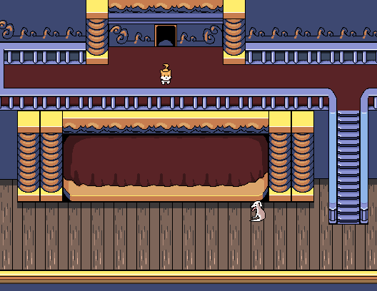
So, things to note. Things that go on the floor need to take up space on the floor. That means that things like stairs, columns, archways, and other such things might be attached to the wall, but they also need to stick out the appropriate distance. If they don't you lose the illusion of depth, which is already difficult to show in this perspective. To be honest, you don't have to be very accurate with stairs. It's annoying to go up and down long stairs in game, so players will give you a lot more leeway there. Just as long as it sticks out a little bit you can usually get away with it being short. If a wall or column or cliff face is three tiles high, that means the things that are supposed to be the same height will also be three tiles high. This is why I moved the wall up, and why the stage curtain is so much shorter (probably still not short enough). To match the height of the columns the wall face and curtain plus transom length needed to be only 3 tiles. If you wanted to map it differently, have the stage not stick out at all, then you'd need to take the top parts off the column and adjust a few other things. Personally, I think the stage looks better sticking out a bit. What else. Oh, right. I changed a bunch of the shading around, making a light top and a really bright corner edge to indicate the traditional top and a bit front facing light source. This means pretty much all of the shadows are incorrect. Sorry. Some of the choices I made were stylistic, so don't feel the need to copy exactly, but hopefully it gives you a better understanding of how color can indicate form. Word of warning, I was really rough about the "fixes" for the light source and I didn't do all of them. You might end up doing something else and I didn't want to spend too much time on something that didn't matter. (At that point. I have a bad habit of spending time on things that will be deleted.) Um, changed the spindles to be round instead of flat. Changed the lighting on the stair rail. A really small but important change was to lengthen the top highlight from the middle floor tile just slightly. The original has an implied line going on, really making it seem like that's exactly where the tile line is.
I hope you find it helpful and that I didn't overstep. This is a great start, I look forward to seeing what you do with it.


