Thank you for your advice is very valuable and I see what you mean, I will try to take into account, actually I have progressed a little since + 1 year and old tiles begin to be incompatible, for the colors is "my big problem" I try to improve myself but I always had difficulties, finally these screens are also little old, occasionally I will try to show more recent, I make a pack of these tilesets under the snow for example and modified some drawings, also started to make nice interiors !
Thanks again.
The Resource WIP Thread 3
● ARCHIVED · READ-ONLY
-
-
I needed a book about the size of MV's default resolution. Which seems easy to find, except that I need it to be pixels instead of painted.
So, I attempted to make my own, and I'm not TOO pleased with how it turned out. :/

-
I'm not getting what a lot of the shadows are supposed to be representing. Maybe you need to get in a bit tighter and use your reference more closely. I'm not a fan of flipping up the edges of the pages, and I think you can do more with the spine. Something really interesting you could do is use a textured artistic dither to smooth the transition between the different shadow colors. If you do it right it'll look like paper texture.
-
@Sharm - My reference was actually this: https://opengameart.org/content/book-animation
So it didn't help TOO much. It just seemed simple. The pages came from this one: https://opengameart.org/content/open-book
The painted-ness of the large books made it difficult for me to tell what was going on. o.o -
Using other people's interpretations of an object is a good way to learn about their interpretation methods, but it shouldn't be used as a replacement for a reference to the object itself. If you do a google search for "Open Book" and you'll find some really nice real photos. Interpreting that stuff is where it gets hard, I struggled with that for a long time myself. Maybe focus on one element of the object at a time like the silhouette, or blocking out shadows/highlights, or adding the layered pages texture on the sides, ect.
-
Been excited/dreading to try to make a convertible car and redrawing interior but I think this is a good start any opinions? It's the 1965 mustang btw at least my lookalike version
updated
-
I think you should change the angle of the gradient on the windshield to go the other direction, similar to the angle of the hood's gradient. Cars are hard!
-
I think you should change the angle of the gradient on the windshield to go the other direction, similar to the angle of the hood's gradient. Cars are hard!
Thanks for the advice and yes they are. I've seen other styles I admire so much more than this rtp like style but haven't an idea how to pull it off to noobish. -
SpoilerSpoiler
I've just started working on some artwork for the characters in my game. I've dabbled with drawing in the past, but never done anything serious, colored, or done much with a tablet. So I'm pretty new to this. I feel like I can never quite get the lines and proportions how I want them, but I'm fairly happy with my progress so far. I'm looking to get some feedback on anything I can improve on.
Also, 2nd guy isn't going to remain shirtless. I was just trying to practice the anatomy so I can get the proportions right. I might re-do his hair... I was trying to keep it simple but not sure I like it. :dizzy: -
so, i figured i would try to make some clothing and armor icons now; and that i should start trying to do a simple t-shirt. This is a far as I got... Are there any special tricks to making cloth look folded or creased? and what else should i consider for something like this?
@Laetabilis holy crap! lol i didn't realize i was posting my shirt icon below your half naked drawing... haha! I'd say your face proportions look fine for the most part (coming from a guy that can only really draw stick figures). Anime characters can have almost any proportions and still look like anime characters. I.E. - Final Fantasy tactics... They didn't even have NOSES! :p. If it were me, I would go a little harder on the shades around the jawline, nose, and eye sockets; on the first one. Give it more depth. Also, maybe soften out the hard angle on the chin and jaw. On the bottom portrait, It looks almost like the guys nose bridge begins under the eyes instead of between them. Also, maybe some shade under the brow so that it looks like he has a brow. Even that, is only if i'm actively looking for something to complain about. It's much better than I could hope to pull off! :) -
@MakerZeroOne
Lol hey it's not like I drew the naughty bits! I figured I could get feedback on the body proportions too. :p
For me the problem isn't so much making them look like proportionate anime characters, but rather making them look how I want them to look. Like with the jawline, I experimented with it quite a bit and when I rounded it he looked younger than I wanted. I can see your point on the shading for both though and I will give that a try. Thanks for the feedback! :D:thumbsup-right:
Also, for your shirt, I would recommend just Googling a white T-Shirt and looking at how the shading works. You'll notice that at the highest point of the fold, or the point closest to the light source, it will be white. Where the shading happens is typically where the cloth angles and creates a shadow/obstructs the light source. You probably need a gradient in the shading as well. Hope that helps.
EDIT: Here's an update on the 1st one:
Spoiler -
@Laetabilis - yeah, i don't have anything to add about muscular body proportions, because i'm pretty much a fatass, struggling just to gain some basic muscle tone :/ The shading looks much better, but Sharm could probably give you better advice than I could. One final thing... Is he snarling or smiling? is that an "I'm going to rip your head off" smile, or a "I'm so effing happy to see you." smile; or an "Oh yeah, I am THE !" smile?
When turn it back on, i will definitely try again with the shirt; and maybe try to angle it so that it looks more... natural. looking at it again, now; that thing looks like...bad. just bad. i would definitely not wear that t-shirt. -
One final thing... Is he snarling or smiling? is that an "I'm going to rip your head off" smile, or a "I'm so effing happy to see you." smile; or an "Oh yeah, I am THE !" smile?
He's just grinning lol. A teeth-clenched wide grin I would say. -
Hi guys. I've made these sprites and I'm proud of them, but I realised they're too big. I've downsized the first one (left) and am working on the second (now naked) one. Please don't mind the third.Spoiler
I feel they're still too big. What do you guys think? -
I don't know, a door can be made taller and windows moved easier than redrawing a sprite I think, and you're close enough in scale with those that this doesn't bother me. I like the size. Comparing to just the house isn't really enough to answer this question. Do you have other things to compare the scale with, like the trees or any furniture?
-
Hi Sharm, thanks for your comment! Unfortunately I haven't made any furniture yet..
Is this better?
Spoiler -
Yes, it does. Hmm, I don't know, the scale is a bit inconsistent over all, so the slightly too large sprites don't really look out of place, but I agree that smaller would fit better. Maybe what you need to do is start out with blocks of color or a stick figure to check the size with, and then build the sprite after you have it where you want.
I just reread your first post about this and realized that the sprites are supposed to be a different scale, but honestly to me the look to be the same scale, just people with different heights. If you want to go small enough to look just right you should probably go even smaller than the girl on the left. I think you should also go bolder with the size and style of the chimney.
When you get to furniture you'll need to be way more careful with the scale. Outdoor stuff can be fudged quite a bit and still look right, but the wrong sized chair next to a sprite is just going to look wrong. Try to draw them on the same document with an example sprite so you can see the scale you're trying for, it'll help a lot. -
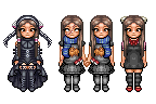
I was asked if I had made a large template for MV, and so I played around a little just to see how it would look like.
And made some dress ups^^

-
That looks so good! I think there needs to be a little bit of shoulder movement.
-
@Avery I have to say that that's the nicest character sprite I've seen in months. I made a similar sprite base for my VX Ace game, but it wasn't nearly as smooth or clean.
Very well done! If I had to nitpick- it looks like the hands are glued to her hips. Some separate movement could do them some good, I think.