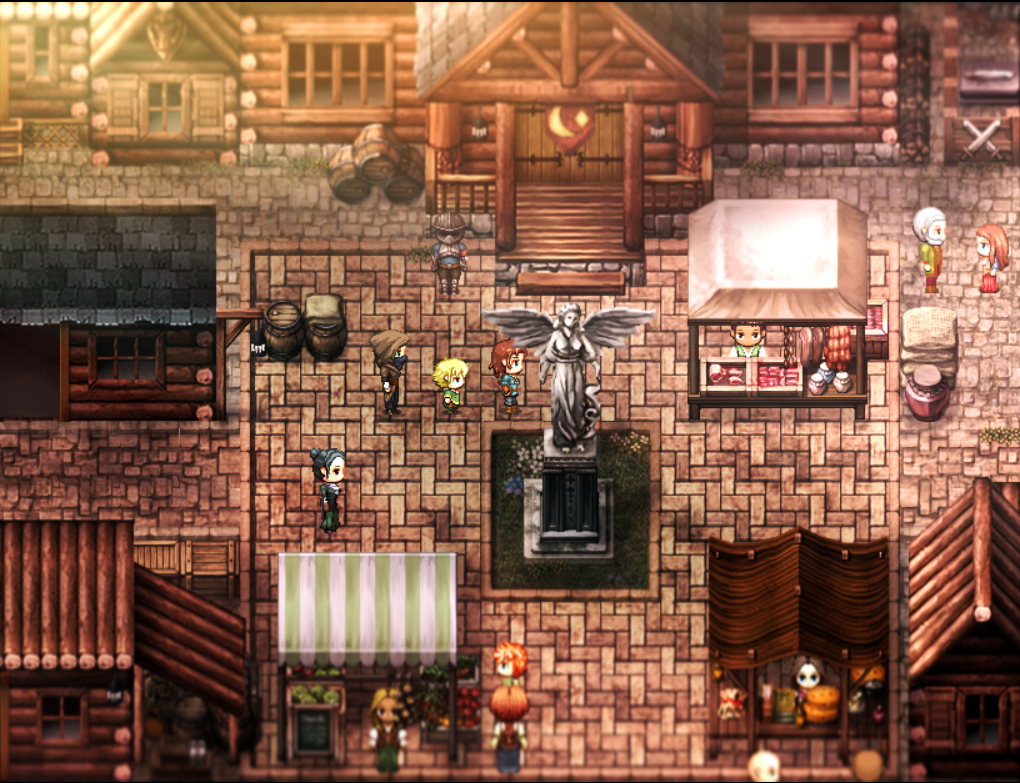
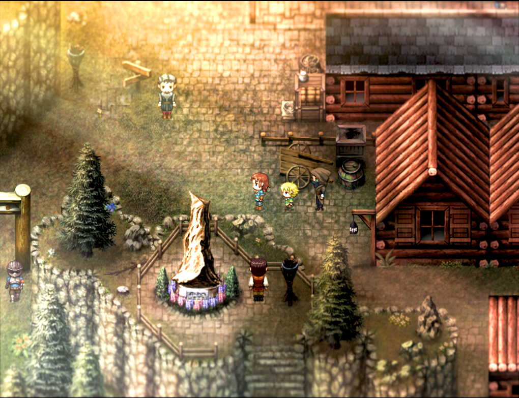
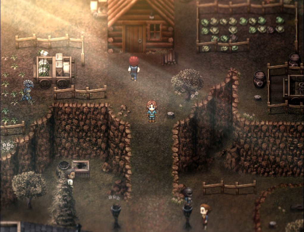
I've been tweaking some areas around the town of Dawnbreak. The town acts like a hub for the rest of the game so it's important it has notable areas of interest for the player to get easily familiar with it. There's also a few sections at night that trigger sidequests to be done during the day, but still pondering whether I want the full "DQ approach" to having fully explorable towns at night (would be a lot of work!):

Game & Map Screenshots 12
● ARCHIVED · READ-ONLY
-
-
I just checked your game's steam page, I am EXTREMELY HYPED to play this. Your trailer looked amazing, menus? Minimalist, easy to read. Sprites? Amazing, story? I want to know more. Those screenshots? Fantastic. I can't wait to see more from you. :kaojoy:I've been tweaking some areas around the town of Dawnbreak. The town acts like a hub for the rest of the game so it's important it has notable areas of interest for the player to get easily familiar with it. There's also a few sections at night that trigger sidequests to be done during the day, but still pondering whether I want the full "DQ approach" to having fully explorable towns at night (would be a lot of work!):
View attachment 347664View attachment 347665View attachment 347663View attachment 347666
I must ask though, how did you get the slight blur effect on your screen boders? It looks really good. -
Hi @ValentinaSama67 ,
Thanks for that wonderful feedback, I'm so pleased you feel this way. :kaothx:
The blur you're asking about is using the filters available through pixi. I think there are a couple of free available plugins that do this, but this one was our own. I found this on the forums. Thanks again! -
That's a beautiful map! I see you put a lot of work there.I've been tweaking some areas around the town of Dawnbreak. The town acts like a hub for the rest of the game so it's important it has notable areas of interest for the player to get easily familiar with it. There's also a few sections at night that trigger sidequests to be done during the day, but still pondering whether I want the full "DQ approach" to having fully explorable towns at night (would be a lot of work!):
View attachment 347664View attachment 347665View attachment 347663View attachment 347666
Nicely done bro! -
Playing around with some effects.
-
"There's nothing that is more fun than jumping around from mushroom to mushroom", said Colby after she leapt through a bunch of colorful fungi to get to where she needs to go.
Here is a new colorful area that I made for my game, "Cheddar Con Carne: Colby's ODDyssey."


-
Map Design it is a bigger challenge than it looks :3
Here are a few examples of my maps, and the principles I followed:
Map 1:
View attachment 349158
Map 2:
View attachment 349159
Map 3:
View attachment 349160
Map 1 is a house that had recently been burglarised.
Firstly, to make it obvious that it's a house, I compartmentalised the space (separating it into rooms), and adding dedicated units (like beds, stoves, etc). To make it clear that something happened and to guide the player there, the end room (where the burglary took place) had been marked with footprints and a saw. It is also visible as you enter the house, making the player quickly interested.
My main self-critique is that the floorboards of the main room and bedrooms are different, which could communicate unnecessary information. Perhaps only changing the floor of the robbed room would make it better stand out.
Map 2 is Mycelia, a village inhabited by Fly Muscaria (a race of Mushrooms). It is located in a cave.
To make it easy for the player to navigate, but also give it a feeling of haphazardness, there is a broken, yet visible pathway. I also kept the space small and compact to increase the information density, without adding unnecessary detail. The abundance of mushrooms growing and grass on the ground communicates the presence of life somewhere, and it has something to do with Mushrooms. Finally, the house on the top is physically further away than the other two, and has a different colour scheme to communicate that that particular house is different in some way.
That being said, I feel like I may have added too much detail: the large amount of floor decorations could be seen as clutter. There are also stone steps randomly placed which don't need to be there.
Map 3 is actually an example of what not to do. It is the beginning of an area called Crystal Fields.
Because of RPGMaker MV's 999 map limit, I have been merging zones together to avoid reaching that limit (my game is going to be a very big story). However, I have found plenty of drawbacks:
- The area does not convey much information. It is mostly an intermediate zone. Despite that, it is a very large map, where travelling across it could take ~1 minute when it really should only need ~10-20 seconds.
- There are some elements which may communicate information that's unecessary. For example, the log on the left side does not serve any role, apart from decoration, but there is also no context to imply that it's unimportant. The left-side also has a fence below the stall, but does not serve any purpose.
That being said, I do feel like I have some things right, like on the right side, there is an egg (which carry items), which is inaccessible by the normal route, which could encourage exploration. In absolute terms, the map does have a fair amount of interesting elements, like stalls, a building and a bench.
What I really need to do is to greatly reduce the size of the map, and cut out unnecessary elements.
I would love to hear your thoughts on my self-critique and also hear your feedback ;D ♥ -
Got one question, why the wall height on map 1 (top middle) is different compared to the other rooms?Map Design it is a bigger challenge than it looks :3
Here are a few examples of my maps, and the principles I followed:
Map 1:
View attachment 349158
Map 2:
View attachment 349159
Map 3:
View attachment 349160
Map 1 is a house that had recently been burglarised.
Firstly, to make it obvious that it's a house, I compartmentalised the space (separating it into rooms), and adding dedicated units (like beds, stoves, etc). To make it clear that something happened and to guide the player there, the end room (where the burglary took place) had been marked with footprints and a saw. It is also visible as you enter the house, making the player quickly interested.
My main self-critique is that the floorboards of the main room and bedrooms are different, which could communicate unnecessary information. Perhaps only changing the floor of the robbed room would make it better stand out.
Map 2 is Mycelia, a village inhabited by Fly Muscaria (a race of Mushrooms). It is located in a cave.
To make it easy for the player to navigate, but also give it a feeling of haphazardness, there is a broken, yet visible pathway. I also kept the space small and compact to increase the information density, without adding unnecessary detail. The abundance of mushrooms growing and grass on the ground communicates the presence of life somewhere, and it has something to do with Mushrooms. Finally, the house on the top is physically further away than the other two, and has a different colour scheme to communicate that that particular house is different in some way.
That being said, I feel like I may have added too much detail: the large amount of floor decorations could be seen as clutter. There are also stone steps randomly placed which don't need to be there.
Map 3 is actually an example of what not to do. It is the beginning of an area called Crystal Fields.
Because of RPGMaker MV's 999 map limit, I have been merging zones together to avoid reaching that limit (my game is going to be a very big story). However, I have found plenty of drawbacks:
- The area does not convey much information. It is mostly an intermediate zone. Despite that, it is a very large map, where travelling across it could take ~1 minute when it really should only need ~10-20 seconds.
- There are some elements which may communicate information that's unecessary. For example, the log on the left side does not serve any role, apart from decoration, but there is also no context to imply that it's unimportant. The left-side also has a fence below the stall, but does not serve any purpose.
That being said, I do feel like I have some things right, like on the right side, there is an egg (which carry items), which is inaccessible by the normal route, which could encourage exploration. In absolute terms, the map does have a fair amount of interesting elements, like stalls, a building and a bench.
What I really need to do is to greatly reduce the size of the map, and cut out unnecessary elements.
I would love to hear your thoughts on my self-critique and also hear your feedback ;D ♥
The other rooms height seems only 1 block but the top middle room height seems 2 blocks. -
You're right, I didn't notice that. For consistency, I will make the walls the same height throughout the house (probably 2 blocks).Got one question, why the wall height on map 1 (top middle) is different compared to the other rooms?
The other rooms height seems only 1 block but the top middle room height seems 2 blocks. -
I've been working on some areas close toward the end of the game - just a lot of various snow stuff.
-
@thepsyche GORGEOUS, so pretty!!!!! Your game is one of the best-looking RPG Maker games I've seen around.
-
Thanks for saying that! I'm glad you think so, there are lots of great looking RM games coming out lately!@thepsyche GORGEOUS, so pretty!!!!! Your game is one of the best-looking RPG Maker games I've seen around.
-
A simple test map to see the measurements of the capabilities of VX ace, Xp along with MV.
-
Oh my god! I've not been around for a bit. Just wanted to check in for some inspiration. Numerous posts here are blocked from UK citizens. I know political speech is frowned upon in this forum, but I hope this gets a pass. This is insane! We're sharing 2D pixel art maps, not lude material. I'm beyond angry right now. This level of UK censorship from the Online Safety Act is disgusting.
-
A map I've been working on. :)
-
I'm going for an untamed snow covered forest theme and I added the cliffs since I drew inspiration from Trials of Mana's outdoor areas and remembered how cliffs were used to act like walls. How did I do -
@MythrilKnight There's a couple of height issues for the cliffs (it fluctuates from 1 tile high to 2 to 3 at several points), and I would also add some trees grass, rocks etc. to the cliffs themselves as well, as they're pretty empty now.
-
Got a bit of a video, showcasing an arena.
-
Thanks, I can see where your are coming from@MythrilKnight There's a couple of height issues for the cliffs (it fluctuates from 1 tile high to 2 to 3 at several points), and I would also add some trees grass, rocks etc. to the cliffs themselves as well, as they're pretty empty now.
-
I've recently finished a map for the 3rd chapter of my game, "Cheddar Con Carne: Colby's ODDyssey":


