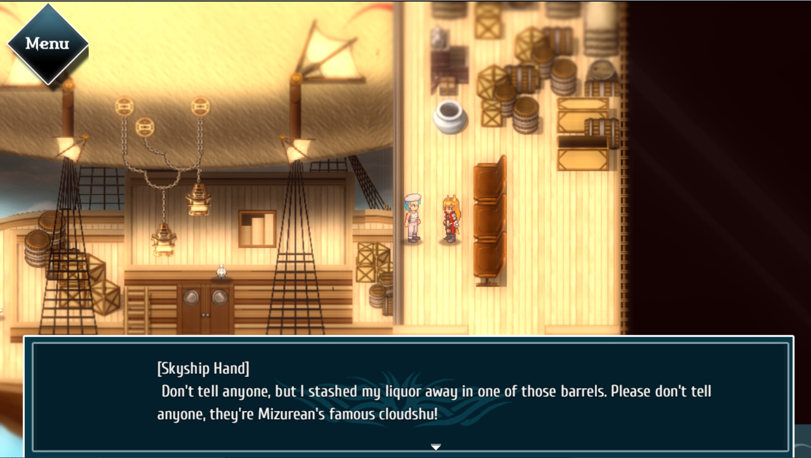
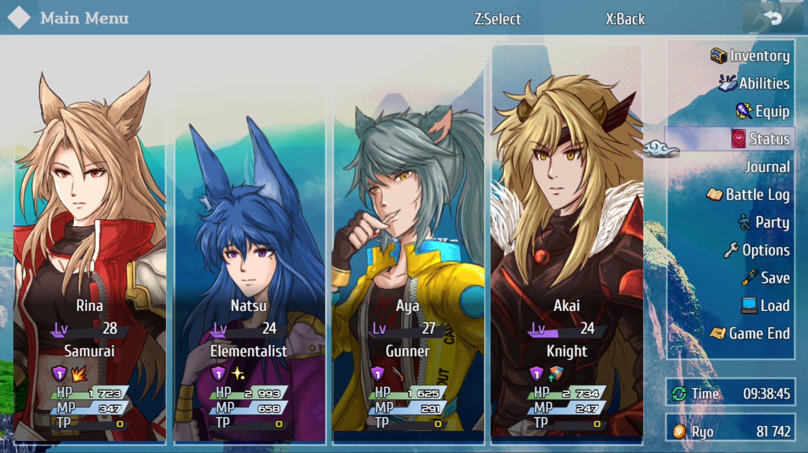
More screens from Tenko. My pet project is 90% complete and just a mirror-finish polish before it comes out in July next year.
Game & Map Screenshots 12
● ARCHIVED · READ-ONLY
-
-
@PixelLuchi I have a couple of queries.
Top barrel right hand side, the bottom looks like it's been wiped out by the crate graphic.
I was somewhat puzzled by the whole perspective thing. I've been trying to work out where the back of the boat and the back of the airballoon are. I thought at first that perhaps the jetty on the right was so high that those elements were underneath it, but that didn't work because the balloon needs unimpreded movement to rise. Also the shadows are all wrong.
I am also puzzled by the light(?) arrangement hanging down. Presumably they are fixed to the balloon, but again that's not a possibility because it would weaken the skin and you wouldn't particularly want heat sources near there. So how are they fixed, especially where the chain curves into an arc? -
Made a quick winter themed map (took 1 hour) using @Caz 's awesome Pixel Fantasy MZ tiles, which you can find here: https://cazwolf.itch.io/pixel-fantasy-tiles-mz
These tiles are meant to replace the MZ RTP one day and they look so much better than the default ones.
Also edited one of the trees to make it Halloween-like (for fun!), it's very easy to spot it.
No parallax, no fancy lighting effects, not even tileset rearranging, just regular editor mapping with custom tiles, with a fetish for secret passages apparently.
Also added an outhouse because @Kes games influenced my mapping a bit.
-
Do you mean only my outhouses had any effect?
-
In terms of mapping, even your clever use of side/upper entrances for houses to add variety, and your general common sense, especially in towns, you never place tiles randomly, there's always a reason and it's something I like.Do you mean only my outhouses had any effect?
You also tend to have a realistic approach sometimes, in terms of maps (mostly towns) and it's something unusual and unique in RM games.
I would go as far as saying that you're pretty good at world building and many of your town maps clearly show this skill of yours. -
@Dalph Thank you for your kind words.
-
Its Saturday, so you know what that means..
-
The first part of the Faery Forest, the first area players will explore when they leave the first town of my game. Raised areas are meant to have chests to open. And the three flowers in the center are placeholders for a quest.
-
@Katallina I'm having real problems with your perspective and how you've done your raised areas.
I am not sure what tile set you are using, but I would be very surprised if it didn't have proper 'ending' tiles. It looks as if you have only used the central tile of the cliff face.
Going by the top edge, these cliffs are a bit rounded. The ending tile, both right and left, will be curved to match that
I am unable to detect any side or top edge tiles for your raised areas, so it looks like there is a sudden wall to nowhere. It may be that the low hedge/paler long grass tiles are supposed to indicate that, but look at where they meet the top cliffs. If the raised are is supposed to meet the back wall in this area
you cannot have cliffs of the same height which are supposed to be to the side of raised area.
But any hope of suggesting that that is truly a raised area is undone by your shadows. If that is raised, then the back cliffs cannot throw a shadow onto it.
The shadows of this area are equally undermining your wish to show a raised area, but for a different reason.
The autoshadow is only for the cliff tiles. But if this is raised, then there would be a shadow going the whole length of the side. The same is true for the area in the top left corner. -
@Kes Thanks very much for taking a look at my map and taking the time to give feedback. I immediately fixed those shadows. (Hopefully! I'm legally blind and depth perception is not my strong suit.)
As for the tops of the cliffs, they were done using a tile that lets me layer black on top of another patterned tile with the goal of giving the area a more textured edge rather than a flat edge. The set I used here is Fairy Tale Forest by Kokoro Reflections. As far as I can see, there are a bunch of different textures to use for walls / cliffs with patterns, but they're not set up with the three piece structure that is in the type of cliffs in the RTP.
I'll need to fiddle around with that and try some different options. (Grass instead of darkness, making things more straight, adding an extra block to the cliffs so they appear taller than the ones that lead to treasure, etc.)
Have a great day! :)
Editing to add another go at this:
-
@Katallina I do, in fact, have that tileset but haven't used it yet, which is why I didn't recognise it. I've now looked at it and realised that part of the problem is that what you are using to make the 'cliffs' is in fact a hedge tile. Unless the top is the 'ceiling' part of that tile you leave the player having to believe that a hedge can support a whole area of land.
That tileset, as far as I can see, does not actually have a cliff tile, so I'm using other tilesets to illustrate what I mean.
First, the areas that run into another cliff.
The raised area needs a distinct side. Then where it joins the back cliff, you need to use a bottom cliff tile for the join. The cliffs either side must be on the same ground level as the raised bit. So if your raised area is 2 tiles high, then it needs to join the back cliff 2 tiles up.
For areas which are free standing e.g. bottom right corner.
The side tiles are not just a visual issue. At the moment the player could go up your steps to what is supposed to be a higher level and from there walk straight onto the path which is supposed to be at the original, lower level. A side tile would not allow them to do that.
Just in case you are unsure, to allow the player to walk to the edge but not go over, use the Passage (4-dir) setting on the tilesets tab of the data base and click the edges of the whatever you are using for your cliff tops. -
Cultists from the depths:
Inside the labyrinth there are great entities that go beyond our hero's comprehension. Argos, the Stargazer is one of them. Its followers pray for vision and enlightenment.
Environmental puzzles and hazards:
The labyrinth itself hides and protects its secrets.
-
@fiddleling I still like yo style a lot, the li'l cyclops dudes are adorable! :wub The Argos map is a tiny bit confusin' to me tho, did you mean the central area to be like... higher or lower in elevation compared to the surroundings? Or is it jus' fenced off? I wud fiddle with that slightly to make it clearer! :kaoluv:
-
Hey fam!
I've just created a prototype for a Cluedo like game using the AI-NPC plugin that i've been building for a few months.
In this game you must discover who killed the owner of the mansion by finding clues in the map and talking freely to the AI-characters in the game.
Not a great designer and i never played with Parallax mapping or with lightning plugins. Any tips to create a proper mood for this game based on lightning?
Any other generic feedback will be very appreciated. Don't hold any punches.
-
Hi there @S3mz just letting you know I merged your MZ Feedback (that section is for feedback on the engine) Thread into the Map Feedback thread in General Discussion.
-
Hello! I am currently trying to make a map that looks good in game. I know the limits
of what can be done, but right now there are features on the in game map like blotches, lines
and discolorations. my map is 400 by 400, and the size of the gimp file is 544/416 which im told
is the optimal setting for maps for Ace. Any tips would be greatly appreciated. This project means
a lot to me and I want it to look it's best (within reason( -
@Thanquol180 I have moved your “games in development” thread submission to the game & map screenshots thread since it was a single screenshot from a game.
-
Hi. i've been working on this map for quite a while now but somehow I'm not really happy with it. Any pointers or comments would be really welcome. Thanks in advance.
Spoiler -
This map was initially completed a while back, but it's been consistently coming up in new scenes, so I thought it'd be fun to put it side by side with all its iterations.
-
@Qed963 Here are a few things I noticed.
Shadows are inconsistent. For example look at your towers. The top part throws a shadow e.g. the one at the top casts a shadow across the walkway. However, they should also be casting a shadow on the wall as well. Without that, there is a lack of depth. Another instance is that some of your shadows imply a light source from the bottom left (again your towers are an example). However, the mini-battlements on the top of the towers strongly suggest a light source from the top left. This leaves the eye confused.
I can see that the soldiers gain access to the top of the towers via the trapdoors - although until I zoomed in I must admit I thought they looked more like doors - but how do they gain access to the walkways? Do they leap over the towers' battlements? As you have a heavy cannon on one and stores on the other you need to suggest a plausible way that they got there and can be reached quickly. Perhaps a door in the castle wall at the end of the walkway?
Visually, though, I think the main problem is your path. The edges are too definite, the change from one texture to another is too abrupt. That needs to be softened in some way. The tiles imply that this is a constructed path. We assume that over time the sand/earth has encroached. How plausible is that? Would it not be more likely that it would accumulate in areas where no one regularly walked? At the very least I would expect to see more visible evidence of the path leading up to the building on the left and the practice area on the right.
As a general rule, windows in defensive towers would not be glazed. You need to be able to shoot arrows at any invaders, or pour boiling oil on them. If you do decide to keep them you will need to adjust how much of the window panes are visible on the edge ones. They come more or less right to the front of the opening, making them look like they are stuck to the side of the tower rather than being at the back of a recess.
I hope all this does not sound discouraging. You have the basics down well. It's attention to the logic of the map which I am advocating, not a massive rework.