Game & Map Screenshots 12

● ARCHIVED · READ-ONLY
Started by slimmmeiske2 1772 posts Page 4 of 89 View original ↗
  1. my first attempt at parallaxing for my intro cutscene, I might have gone a little wild with the cluttering but was good fun at least and learnt some stuff along the way. Thats whats important.

    [/ISPOILER]
    parallax 2.png
    [/ISPOILER]
  2. Beewo said:
    my first attempt at parallaxing for my intro cutscene, I might have gone a little wild with the cluttering but was good fun at least and learnt some stuff along the way.

    [ISPOILER][/ISPOILER]
    i can't see the map
  3. Oddball said:
    i can't see the map
    Had some troubles with the spoiler system :eswt: I figure it out at some future point.
  4. Some more shots of the flowery mansion I posted before! Now I just need to make the NPC sprites for this area.

    A Few Images
    An office. There's an animated waterfall behind the windows and rain falling that you can't see in the pic.

    office.PNG

    Just a little transition hallway that joins most of the mansion rooms. I particularly like the unicorn painting because the owners of the mansion are kind of unicorn fairy people.

    hallway.PNG


    Finally, the master bedroom! I had to zoom way out to show the whole thing, but this map is usually zoomed the same amount as the one above.

    bedroom.PNG

    Lighting/shadows are definitely NOT my strong suit, so just assume that the current lighting in the screenshots is placeholder until I can learn to do better.
  5. @fop those are gorgeous. Especially liking the last map
  6. OOOOOOOH *GIRLY SQUEAL* I love giant trees in fiction

    Though you need to put the edge pieces on the cliff, it looks weird without them
  7. Beewo said:
    my first attempt at parallaxing for my intro cutscene, I might have gone a little wild with the cluttering but was good fun at least and learnt some stuff along the way. Thats whats important.
    Hey! I think this looks really good! When / if you move into more shadow and lighting work, I think this could end up looking epic!

    I thought it would be fun to do a BTS video. I might play around with the format in future.

  8. I've been experimenting for a bit to find the visual concept I wanted to go for my project, I've settled finally for a side-scrolling view similar of the one on Darkest Dungeon and started worked on it for a bit this is just a test, the art is subject to change and probably (hopefully) it will end looking better, but still this is a concept proof: A siege camp that will be the start of the prologe of my game.

    Spoiler
    fcc47b00676d844c074a61eb84574f79.jpg

    P.S.: (This is made using Ultra Mode 7)
  9. @Hadria, looks real nice! For concept art, it's WOW and SO finished-lookin'! :wub Is that a dark lord castle they besieging? :biggrin:
  10. alice_gristle said:
    @Hadria, looks real nice! For concept art, it's WOW and SO finished-lookin'! :wub Is that a dark lord castle they besieging? :biggrin:
    Exactly :kaothx: Lots of games are about defeating the demon lord, mine takes place after his defeat, so the tutorial is the siege on the demon lord's tower.
  11. I know some people have seen bits of these already, but I have been encouraged to share them here, so here we go.

    Two interiors for two of the quest related buildings in The Brothers - The Hunting Lodge and the Bounty Office.

    Taken in-game. No parallax mapping.

    Hunting Lodge.pngToll Bar.png
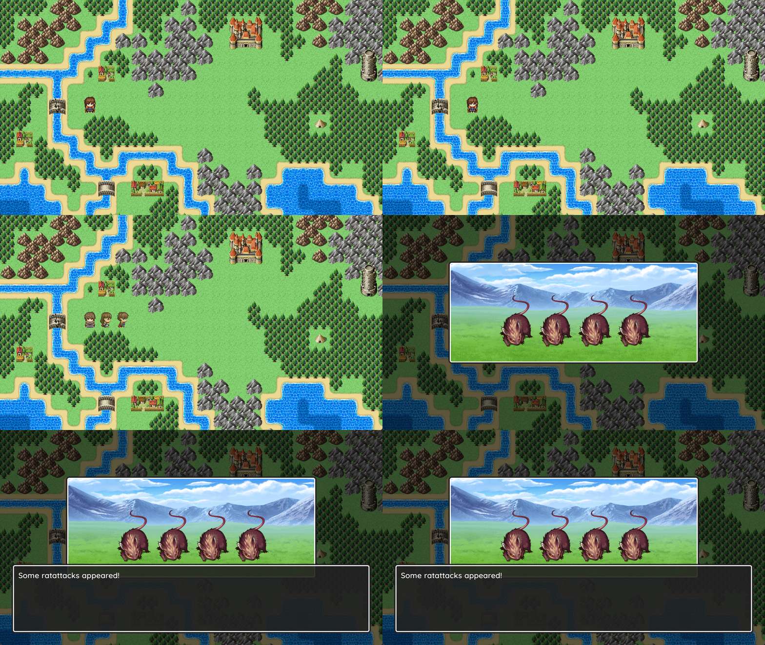
  12. Taking a short break from my normal battle system project to try something styled after Dragon Quest.

    Dragon-Quest-MZGif.gif
    Dragon-Quest-MZ-02.png

    I based this off of the Nintendo Switch port of Dragon Quest III, with some tweaks to suit my preferences. It's still a work in progress, but I think I have the general feel down.

    Dragon Quest III for Switch battle screenshot:

    Spoiler
    Dragon-Quest-Nintendo-Switch.png
  13. @Kenen Really like this. Good work.
  14. After like a million years, I can finally contribute to the thread again. Here's my redesigned Mountain Village forest map, and a screenshot showing a pine tree shadow overlay I made (I know, I know, the shadows don't match up to the trees, but there's A T M O S P H E R E)
  15. Ok. Take two
    Screenshot (20).png

    Edit: crap. just noticed the old floor still behind the metal racks after posting. other than that, how does it look?
  16. 幻夜图书馆
    客房对话.png
  17. Trying to make different tilsets match more, inside is a bit dark but I suppose that makes sense anyway.

    Outside
    outside.PNG

    Inside
    bar.PNG
  18. fop said:
    Some more shots of the flowery mansion I posted before! Now I just need to make the NPC sprites for this area.

    A Few Images
    An office. There's an animated waterfall behind the windows and rain falling that you can't see in the pic.

    View attachment 223463

    Just a little transition hallway that joins most of the mansion rooms. I particularly like the unicorn painting because the owners of the mansion are kind of unicorn fairy people.

    View attachment 223464


    Finally, the master bedroom! I had to zoom way out to show the whole thing, but this map is usually zoomed the same amount as the one above.

    View attachment 223466

    Lighting/shadows are definitely NOT my strong suit, so just assume that the current lighting in the screenshots is placeholder until I can learn to do better.
    Looks great, I love the sprites
  19. debugroom.jpg
    Behold! The entrance to my debug room!

    One thing y'all may notice is the perspective. By using the UltraMode7 plugin, I adjusted the viewpoint very slightly so that the map is no longer a rectangle but an isosceles trapezoid. Because the view of the map is distorted, actors and events appear popped out and invokes a sense of 3D. When you "feel" that the things in the world can pop out, you add some soul into it.

    This has one weakness, and that anything that isn't an actor or event will also appear as flat with the map- you can notice this with the pillars. The answer to this is simple and applied to the buildings: Make buildings out of events. This way, they too will pop out, and the more things that pop out at a time, the more alive it feels.

    There are things that this method has to address to be effective, but my art focus is in making character and effects assets at this time, so I'll consider this an opportunity to receive feedback.
  20. MarxMayhem said:
    View attachment 224509
    Behold! The entrance to my debug room!

    One thing y'all may notice is the perspective. By using the UltraMode7 plugin, I adjusted the viewpoint very slightly so that the map is no longer a rectangle but an isosceles trapezoid. Because the view of the map is distorted, actors and events appear popped out and invokes a sense of 3D. When you "feel" that the things in the world can pop out, you add some soul into it.

    This has one weakness, and that anything that isn't an actor or event will also appear as flat with the map- you can notice this with the pillars. The answer to this is simple and applied to the buildings: Make buildings out of events. This way, they too will pop out, and the more things that pop out at a time, the more alive it feels.

    There are things that this method has to address to be effective, but my art focus is in making character and effects assets at this time, so I'll consider this an opportunity to receive feedback.
    Do you run into issue with layers not responding to players properly in tileset B?