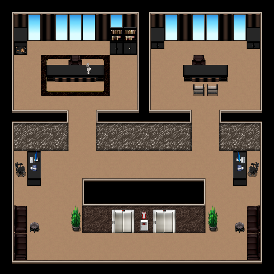
This is the second map of my game, it is an executive office suite. I know things look a little off center, didn't want the agency's chairman and vice chairman to have the same size offices, also having the vice chair's desk at 4 tiles did pose a problem as to where to put his chair. The map is 20x20, the tileset is KR's Skyscraper tileset.
Game & Map Screenshots 12
● ARCHIVED · READ-ONLY
-
-
@Gunmetal_Dreams - it looks cool and modern, what is your game about?
As a suggestion, I think having different carpeting around elevator doors and in the offices might spruce it up a bit so it doesn't look all brown. -
It's a sci-fi, it follows (among others) two agents from what can be described as the FBI and CIA all rolled into one. As they investigate a series of happenings.@Gunmetal_Dreams - it looks cool and modern, what is your game about?
As a suggestion, I think having different carpeting around elevator doors and in the offices might spruce it up a bit so it doesn't look all brown.
Thanks for the critique, did think about doing a carpet around the elevators, also I forgot to put the guest chairs in the chairman's office. -
@Gunmetal_Dreams I think it would also make the 2 offices look more imposing if the lower section were a bit smaller. The chairman's office would more likely have an additional smaller table with a couple of chairs to give the illusion/impression of friendly conversation at times. I'd also put a couple of potted plants in front of the large sections between the windows of that office - not the same as those in the outer, less important, area.
-
The map just only serves 1 to 2 cutscenes:
-
@superkoopa omg I just noticed those li'l white birds at the top of your houses! Complete Disney vibeness! :kaoluv: Will there be musical numbers in yo game? Please say yes! :biggrin:
-
@alice_gristle YES! lol honestly, that would be interesting trying to implement.
-
Hello! I wanted to get some feedback on my maps, I'm new to pixel art and game creation in general but I'm not sure on how to make my maps fit the atmosphere, Should I try making my own assets or different shading techniques? thank you.
-
@usouu It would help if you edited your post to include a fairly full description of the atmosphere you are trying to create, otherwise no one can say if you have succeeded or not, nor which elements might be tweaked to get it nearer your vision.
-
@usouu basically what @Kes said, altho as it is, I kinda dig yo maps! They give off a creepy vibe and wud totally fit into a horror game. Usually I'd recommend to use less empty space and add in a li'l bit of detail and stuff, but in these maps, the emptiness and the queer light actually work kinda well! :kaoluv: ...if "strange and horrible" is the vibe you goin' for, that is! :biggrin:
-
@Kes @alice_gristle Sorry I forgot to include that!!! It is a horror game! I'm just worried that too much empty space wont make it feel creepy or fleshed out enough :)
-
...
-
@usouu Overall I like the appearance and atmosphere of your maps. I am not very good at mapping so I am not super critical.
But one thing that stood out is in the first two maps, you have a couple of objects that seem to be standing on the bottom portion of the back walls. I think they need to be moved slightly down.
But I could just be looking at it wrong. -
Instead of working on what I should be, I think I will instead pat myself on the back for figuring out a trivial implementation and take a screenshot to celebrate.
Hell On Earth: Hedge Maze Entrance -
@sunnyFVA There is one thing which I think would benefit from having a tweak. The hedge has quite ugly black lines on two of the edges, which I don't think work. They show up because the original tile (if it's what I think it is) was not made for isometric and so those lines never appear in the middle of the hedge we can see, they were always at the ends.
For clarity, these are the lines I mean.
-
That is exactly correct! These are undoctored MV RTP tiles, so they're a little suspect in this prototyping phase. I tell myself that putting effort into puppeteering the RTP is "experimenting to develop a purposeful final asset standard", but it's mostly just a lot of fun.@sunnyFVA There is one thing which I think would benefit from having a tweak. The hedge has quite ugly black lines on two of the edges, which I don't think work. They show up because the original tile (if it's what I think it is) was not made for isometric and so those lines never appear in the middle of the hedge we can see, they were always at the ends.
For clarity, these are the lines I mean.
View attachment 262448 -
A map of an early village from my new project.
Forest Village (unnamed as of now). -
@tropical8878 wow that looks really well made. Great job! What tileset did you use?
-
@tropical8878 Looks good!
Guess I'll post a couple of maps I made here as well, from 2 different projects (one of them is from the prototype I have out).
Spoiler
-
@rpgLord69 I'm sorry, after you spoiled me with the maps in your Nymph Tale game, these just don't do it for me anymore.