Game & Map Screenshots 12

● ARCHIVED · READ-ONLY
Started by slimmmeiske2 1772 posts Page 38 of 89 View original ↗
  1. @Willibab I think you totally captured the classic old FF feel. Is that an ATB bar? But you also have battler icons on top?

    @superkoopa It's very colorful and has a dreamy haze to it. If that's what you are going for, then you've captured it pretty well.

    I am terrible at mapping, but I am happy with my plugin editing work:

    Yanfly's Victory Aftermath Edit:ScreenShot_ItemDrop.jpg
    ScreenShot_LevelUp.jpg
  2. @TESTOSTERONE That looks very neat. Was that a complex edit?
  3. @Willibab except for the saturation level being higher and the obvious crisper look I think you pretty much nailed it. Nice job
  4. Kes said:
    @TESTOSTERONE That looks very neat. Was that a complex edit?
    Thanks Kes. There were some tears shed figuring it out.
  5. TESTOSTERONE said:
    @Willibab I think you totally captured the classic old FF feel. Is that an ATB bar? But you also have battler icons on top?
    Yeah, forgot I was testing out CTB. Not sure what to fill that side with anyway, there is too much room xD They actually work together too.
    Finnuval said:
    @Willibab except for the saturation level being higher and the obvious crisper look I think you pretty much nailed it. Nice job
    I always struggle with colors, must have changed it a 100 times by now xD
  6. @sleeperer Honestly I was more inspired by the secret of Mana and Golden Sun with that map, though Legend of Mana is a beautiful game, to even be mentioned in the same breath as that game is an honor. You're totally right about the gamma and contrast, I was using a different monitor today and noticed that the image was way too intense.

    @TESTOSTERONE Thank you very much for your kind comment, I appreciate it!
  7. Parallax map contains window reflection light and shadow on top of the cabinet. There should be shadow of bed and chair, but a bit difficult. So, I think this is enough. Any suggestion for improvement?

    Vira's Room
    room-vira-show-vira.png

    @superkoopa nice work! Keep it up!
  8. @sleeperer That's coming along nicely. I would like to make 2 suggestions, based on what your lamp is doing.

    The light that it is casting would not, I think, be quite as you have shown it.

    The top of the wardrobe is higher than the lamp. Therefore the light cannot fall onto the top to illuminate even the front corner. The shadow against the wall is perfectly plausible. I would suggest leaving that and putting the whole of the top in shadow.

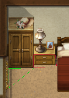
    The second suggestion is about what happens in front of the lamp. In the snip below I have enclosed an area by a red line. Because the lamp is behind the edge of the cabinet, that cabinet would itself be in shadow and would likely cast a shadow on the floor as well.
    Untitled.png

    Likewise, the lamp is behind the front edge of the wardrobe, so again it would not be able to illuminate anything like as much as you have shown. Like the cabinet, the wardrobe would be throwing a shadow onto the floor. I have shown the approximate shape by a green line.
  9. @Kes @sleeperer Unless the shadow in the corner above the wardrobe is supposed to be from the light coming through the window. I couldn’t tell If the lamp was even on.

    I actually thought the light in the room was solely from the windows, which I like the appearance of, so I wondered about other shadows that should also be present.

    As a player, if you just had the light from the windows with no shadows visible, I doubt I would notice anything off.

    I guess I don’t focus that closely. But I really like the overall appearance.
  10. Hi @Kes thank you so much for your thought and taking time to make those red and green lines. It's quite useful. I think I need more practice to feel the perspective.

    @ZombieKidzRule Hi, thank you! The light comes from the lamp on the table. It can be turned off tho. Here is the picture without the lamp light. The light comes from the windows. The different is slightly, but it is noticeable enough for the player gets the effect.
    Spoiler
    1682590370058.png
  11. @sleeperer Ah, yes. Even I, with my non-artistic, heathen eyes can see that difference. Thanks!
  12. ...
  13. ANUXd6e.png
    I've recently finished the title screen for my game. I made the map using Blender and I did the skybox and web-based dithering in GIMP. I'm really pleased with how this map turned out. It really gives off that pre-rendered 90's vibe, doesn't it?
  14. xabileug said:
    what plugins you use? i want an FF1 FF2 style too!
    All made with Hud Maker Ultra by SRDude. I also use Moghunter's Battlehud to change the positions of the various windows.

    It's a pretty easy program to use once you get the hang of it.
  15. Since RPG Maker Unite isn't probably coming soon, I decided to try to use Unity for map creation. All ground layers were rendered using HDRP in Unity (I used Gimp and Photoshop to make changes. The cobblestone was actually high def rocks that I used a Mosaic filter on). Other assets, including character, rendered in Daz Studio.
    Snapshot - 1.pngSnapshot - 3.pngSnapshot - 2.pngSnapshot - 5.png
  16. @jigida70 Interesting maps, and I like the way you have done the cobblestones.

    I do, however, have a query about the first map.
    The well you have used doesn't seem to fit properly. It might be the size, or maybe the perspective isn't quite right. Either way, the supports for the roof are far too short for the tiles to be a roof - you'd never be able to manoeuvre your way under it to draw water. If the tiles are meant to be a cover, then it still doesn't work as a cover would be over the whole of the well opening. There is also a thin brown line inside the well where I would expect either darkness or the hint of water.
  17. Kes said:
    @jigida70 Interesting maps, and I like the way you have done the cobblestones.

    I do, however, have a query about the first map.
    The well you have used doesn't seem to fit properly. It might be the size, or maybe the perspective isn't quite right. Either way, the supports for the roof are far too short for the tiles to be a roof - you'd never be able to manoeuvre your way under it to draw water. If the tiles are meant to be a cover, then it still doesn't work as a cover would be over the whole of the well opening. There is also a thin brown line inside the well where I would expect either darkness or the hint of water.
    Thank you for the feedback. I'm not too happy about the well myself. When I redo this map, I'm going to export it as an fbx from Unity, then render it in Daz so I can get a better angle on it and get the shadows. The main thing though, is the angle. I did all ground renders at an 85 degree angle, and most of the other stuff at around 60 degrees. For some reason though, I did the well at 85.
  18. Here's my game over screen for the Cube Trail. The blank spot in the bottom middle is where the game over menu goes.

    GameOver.png
  19. ...