Game & Map Screenshots 12

● ARCHIVED · READ-ONLY
Started by slimmmeiske2 1772 posts Page 23 of 89 View original ↗
  1. Hello, here are two screenshots of my map with Germanic theme. A small town at the top and a reference to a famous painting of German Romanticism at the bottom!
    IMAGES
    Sans titre 7.pngSans titre 8.png
  2. Screen shot for one of many side-quest. It tells the story of hans and gretel = (Han and giselle) but of course with a twist.

    Screen shot
    302680554_5239558726143238_4354939056064693985_n.jpg
  3. before.png
    I could finally start replacing my placeholders with actual graphics. What you see is one of the puzzles that locks a door.
    The buttons glow and move when "pressed" for player feedback and I made sure they have a different brightness so even colorblind people can see what is selected.
    Since I go for a very clean pixelated style here the difference is not as much as I hoped it to be, but I really like the result, especially the lock and the bolts. Pressing the keys and get their feedback is also very fun now :3
  4. Slow but steady progress as I'm working on the first map of the game, just gotta stop the horses from going where they shouldnt now and do some event animations for the soldiers training elsewhere on the map.
  5. @Beewo Nice, compact maps. I would like, though, to make a couple of suggestions.

    Left map showing the furnace. The City Wall only has a tiny bit of shadow (because the engine doesn't recognise roof tiles for autoshadow purposes) and the building to the left of the smithy (archery practice area, same reason - roof tiles) seems not to have any shadow at all. Nor does the smithy itself.

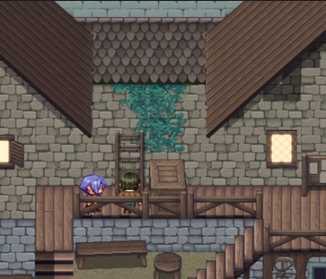
    Right hand map, this section
    1672644363383.png

    This is going to be a bit complicated to explain. Unless that middle section is on a hillock (and there is no indication that it is) the height of the grey wall must be the same as the grey wall to the left, otherwise you are saying that middle section is, in fact, lower than the rest - which doesn't make sense.

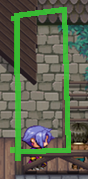
    If the two sections of gable wall really are sticking out from the back of the house then again you have a shadows problem. At the moment it looks totally flat and messes up perspective in several ways. The problem area, apart from the base line, is here.
    1672644798780.png

    The section of building on the left should be throwing a shadow on the back wall.
    Next, like cliffs, you need to show that the back wall is on a different line than the front wall. You therefore need to deepen the little platform the characters are standing on by the depth of the roof line.
  6. I feel like your background is a bit too busy for your actual menu, though I like the look on its own.
    You might wanna try to add a semi trasparent box behind the numbers, maybe a solid box and border to the faces and the other overlays in solid instead of slightly transparent as well. That would still keep the image visible, but would make it a lot easier to read the numbers :)

    I also noticed that three of your icons don't match the other ones in your selection, so I took the liberty to remake them in the XP/VX style:
    MenuIconsVXP_Avery.png
    The terms of use for them are the same as in my icon thread.
  7. Avery said:
    I feel like your background is a bit too busy for your actual menu, though I like the look on its own.
    You might wanna try to add a semi trasparent box behind the numbers, maybe a solid box and border to the faces and the other overlays in solid instead of slightly transparent as well. That would still keep the image visible, but would make it a lot easier to read the numbers :)

    I also noticed that three of your icons don't match the other ones in your selection, so I took the liberty to remake them in the XP/VX style:
    View attachment 249509
    The terms of use for them are the same as in my icon thread.
    Thanks for the interest, but I won't be using them for they were some kind of placeholders by default. Plus, the third bar in the settings icon looks grayish because it's disabled so to say.

    Instead of making the tabs and labels solid, I will try making them less translucent first. I suspect I exaggerated by making them 30% or 40% translucent back then. Curiously, I can read most of the texts easily except for a couple of characters right where you can find the stats because they have no box or sprite as a background. My mistake.
  8. Beewo said:
    Slow but steady progress as I'm working on the first map of the game, just gotta stop the horses from going where they shouldnt now and do some event animations for the soldiers training elsewhere on the map.
    This looks so fun to explore! I love all the different levels like that.
  9. Making a lot of progress and things are fun.
  10. Weremole said:
    Making a lot of progress and things are fun.
    Started thinking on Narshe and South Figaro all of a sudden...
  11. Between this two map which is better?
    Screenshot_7.pngScreenshot_8.png

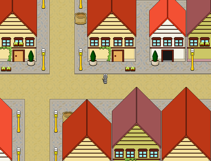
    I'm making a game with my brother and he wanted me to make a park map so after after looking at some park images i got inspired to make the map with lots of trees but he wants me to make a map like the map with less trees so i made it even though i don't have any inspection but he wants a map like that but i feel like my map is better I don't know what else to put in the map with less trees to make it better this is park for taking a walk I think i have to go with the less trees because he wants to so can someone give advice on how to make it better
  12. Why don't you do a mix of both? The parks in my town usually have trees on the border where the streets are, and in the center of the park, there's a glade where people can relax on the grass or play some badminton. Or play on the playground with their kids.
  13. yeah trees on outside, the playground without trees or very minimal on inside.
  14. Weremole said:
    Making a lot of progress and things are fun.
    omg I love this style so much, very nostalgic
  15. Map011.png

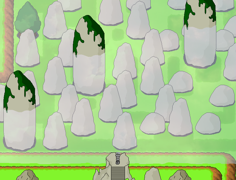
    Here's a small forest section where I plan to have some kind of "find some herbs" quest. It's a fairly busy map, which is intentional. You're supposed to search them after all :D
  16. @SGHarlekin looks good tho I would argue it is a little too orderly, not chaotic enough for a forest map. Especially the grass isnt 'natural' enough to me because it's all the same in patches that seem more planted then wildgrowth.

    Having some more plants it more layers of different grass patched in there would remedy that.
  17. @SGHarlekin In addition to Finnuval's point (could I suggest lots of small weeds?) there is also a problem with this section
    1673506285094.png

    The middle tree of that group is far too close to the cliff. There is no room for the branches at the back as it is almost flush to the cliff face.
  18. @sskurai I've merged your thread with the Game Map & Screenshots thread. If you need feedback on maps, please post here in the future.
  19. Big Battle!
    lol.png
    Looks like a dance off lol