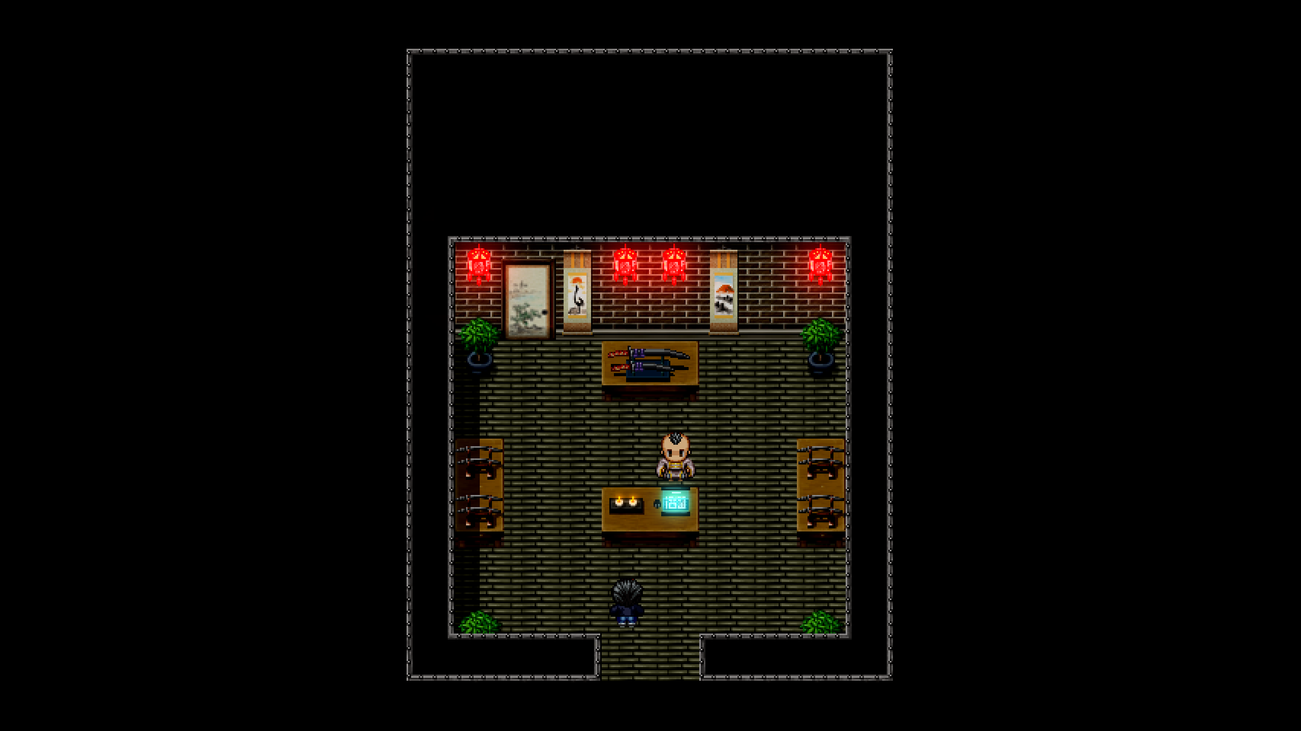
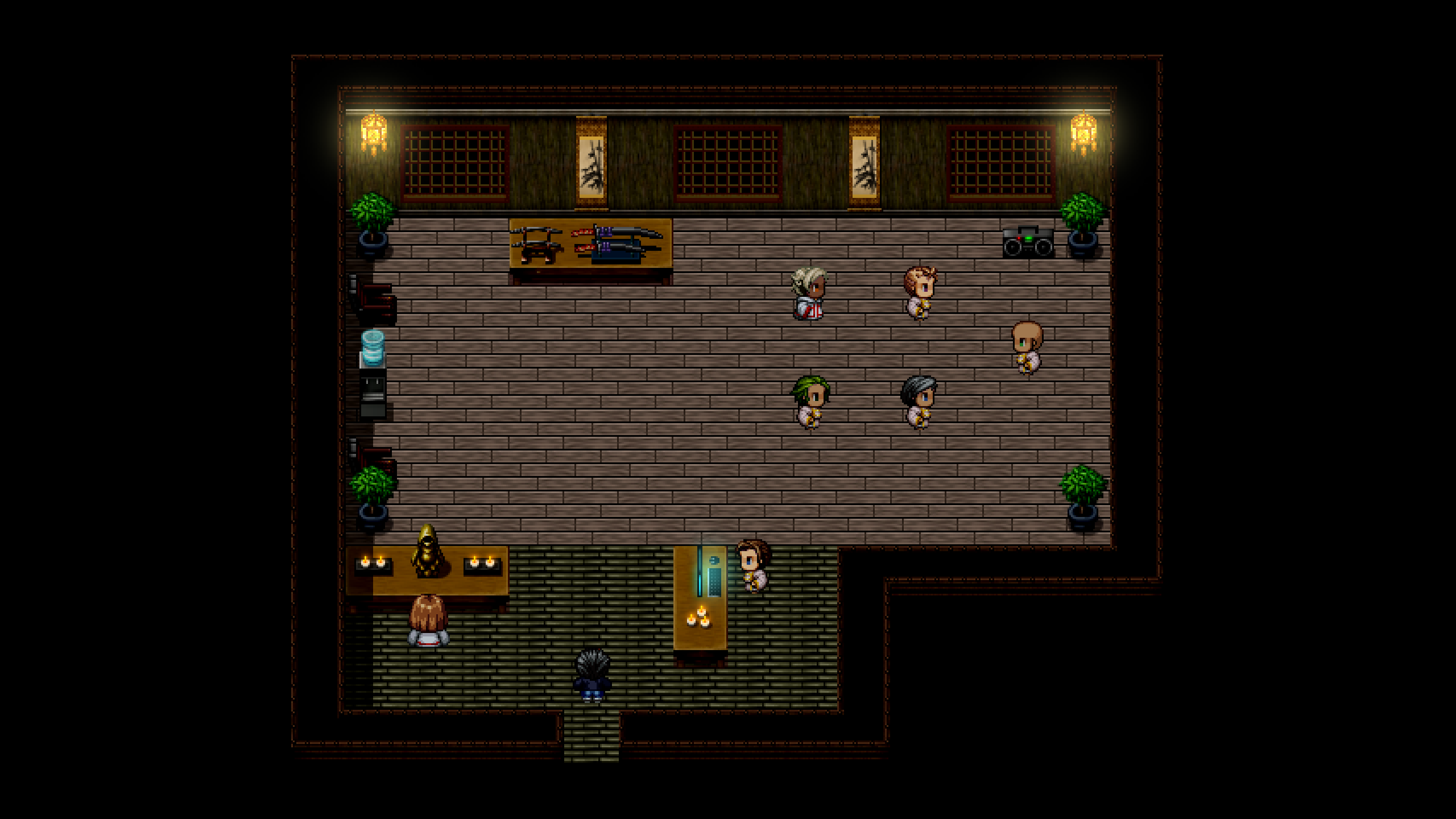
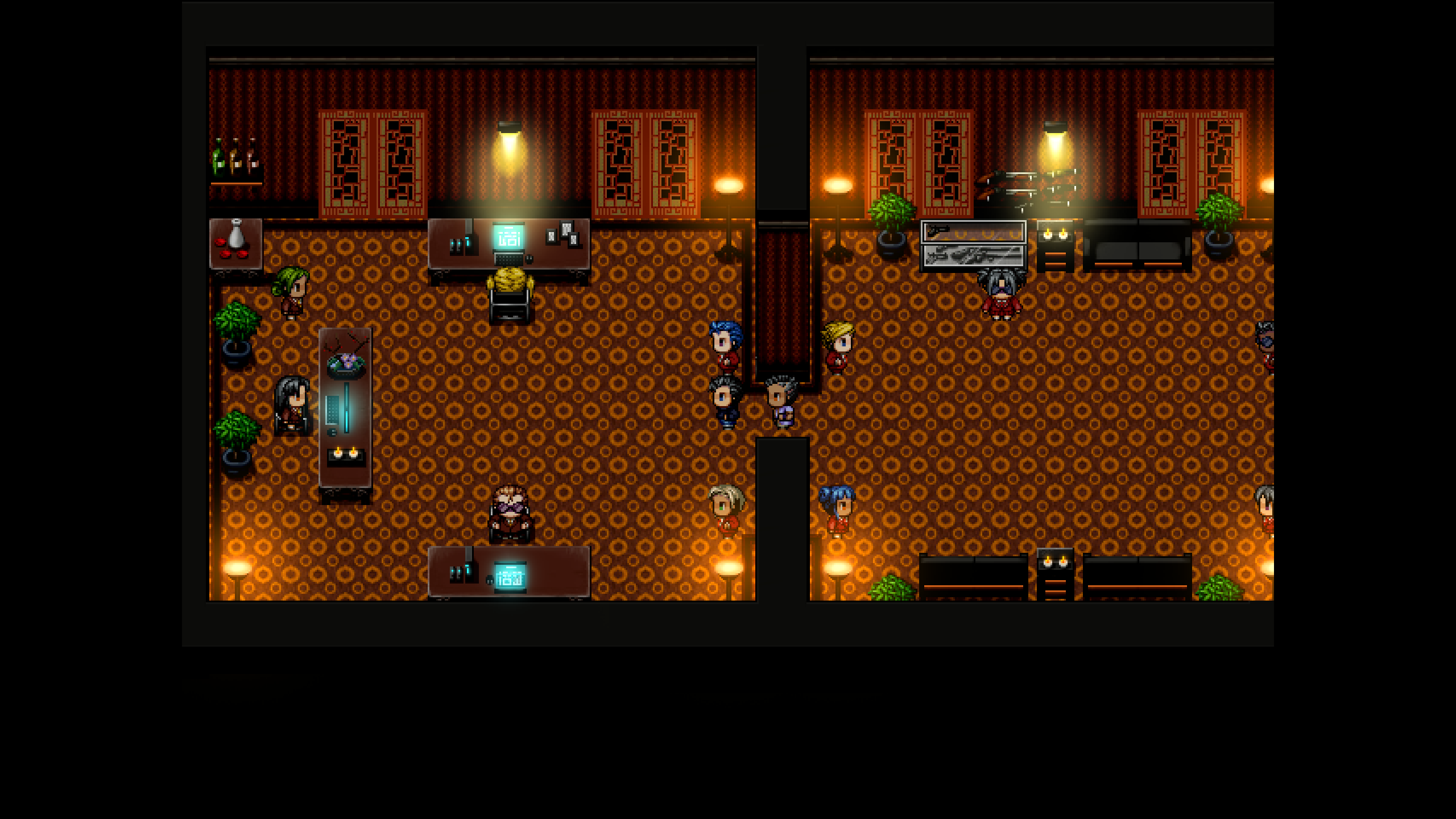
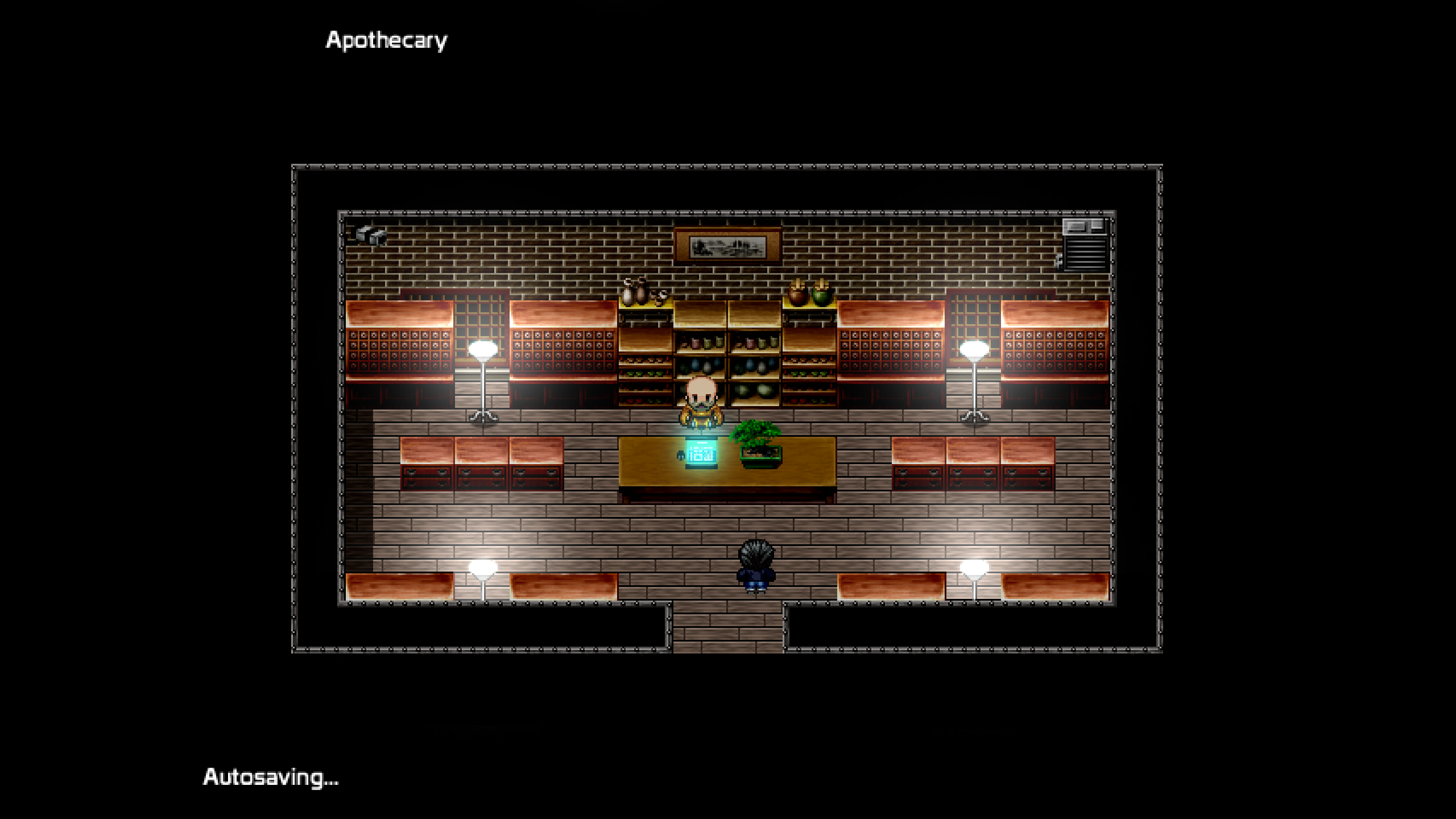
Behold my images! (Note: these maps are subject to change.)
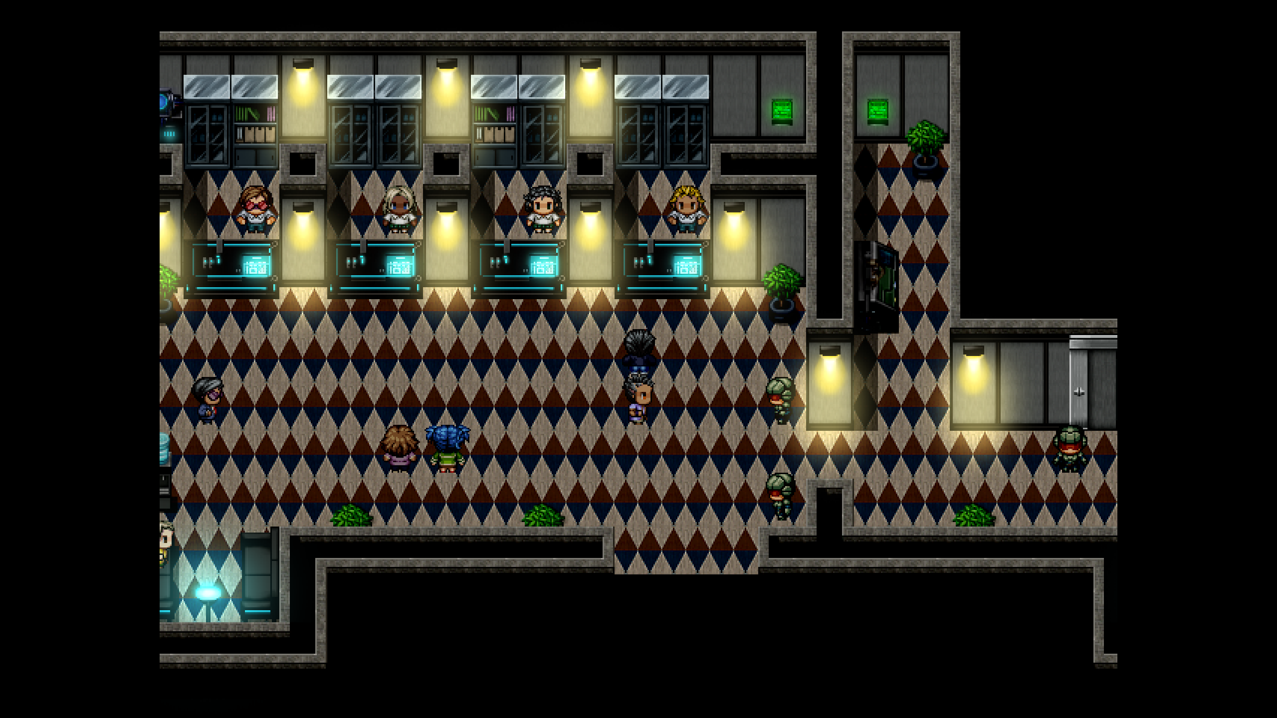
Game & Map Screenshots 12
● ARCHIVED · READ-ONLY
-
-
Do these transitions look okay?
The horizontal black transition is for moving between maps, and the vertical white transition is for using the teleportation spell. Do you notice any problems with them at all? Visuals, audio, wait time, etc?
-
Do these transitions look okay?
The horizontal black transition is for moving between maps, and the vertical white transition is for using the teleportation spell. Do you notice any problems with them at all? Visuals, audio, wait time, etc?
awww they're lovely! I think it really fits the retro-charme :) -
This is the biggest part of a forest, i'm working on for my game. It links to a lot of places, like the dwarven city, the faeries hidden village, that is located at the end of a secret path... so, i wanna know if the map, at least, can evoke a little of the feeling it should.
Big Forest of Destiny
I reduced the quality of the picture to avoid upload issues, and this is not how it looks in game of course, there's a lot of events over the map, like enemies, chests, magical barriers the visual ones, like fog and sun light, and the resolution of 640x480 will show just a small portion of it.
This is a in game picture, i know that it's difficult to tell without seeing the game running, but the sun light changes the intensity dynamically and there is a fog layer also.
What do you guys think? There's to much going on? It's lacking something?
That's my first time sharing a screenshot and i don't see really well :LZYcheeze: so please don't mind the quality of the work. -
Do these transitions look okay?
The horizontal black transition is for moving between maps, and the vertical white transition is for using the teleportation spell. Do you notice any problems with them at all? Visuals, audio, wait time, etc?
I think they're beautiful!
Maybe, just the vertical white one is a bit ahead of it's time for an old school feel. But this is just my opinion, and overall your game is looking great! -
Name that enemy! -
Boxboxer -
-
Boxing BoxName that enemy!
-
-
A screencap from my first project, let me know what you guys think!
Also I don't know if this is the right thread but here's some battle gifs as well!
-
@TakaTheTown Sadly the whole of the central part of your screens are taken up with "ad by gif.com". While it is possible to peer through the opaque square, it does make it difficult to give an informed opinion.
-
@Iron_Brew Apollo Crate or Cassius Crate
-
My apologies, went and updated the post with a different host hopefully they should be more visible!@TakaTheTown Sadly the whole of the central part of your screens are taken up with "ad by gif.com". While it is possible to peer through the opaque square, it does make it difficult to give an informed opinion.
-
@TakaTheTown I like the screenshot, though I think there is a bit of a problem with the water. You have a large waterfall and a big pool to receive the water, but just a few tiles down the river bed becomes only 1 tile wide. A river bed that narrow would not be able to take away such a large quantity of water.
I like the first battle scene, and a nice visual 'shock wave' sort of effect. I am less keen on the second - the way the background trees suddenly go whizzing past looks odd, imo. -
Thank you for the critique! Regarding the scrolling on the latter, would it help if I added in a slower scrolling portion at the beginning only for it to speed up later? Just trying to think of solutions short of implementing full scale parallax acceleration.@TakaTheTown I like the screenshot, though I think there is a bit of a problem with the water. You have a large waterfall and a big pool to receive the water, but just a few tiles down the river bed becomes only 1 tile wide. A river bed that narrow would not be able to take away such a large quantity of water.
I like the first battle scene, and a nice visual 'shock wave' sort of effect. I am less keen on the second - the way the background trees suddenly go whizzing past looks odd, imo. -
@TakaTheTown The only way to know if that works is to try it.
-
I'm quite pleased with how my project has been going so far.
-
A quick Day/Night comparison for some world map tiles:
Screenshots -
@Former_Sky Just a couple of suggestions to tidy things up a bit.
In the campfire scene, I'd have the sprites closer to the fire, otherwise it looks like they've had an argument - though perhaps they have, in which case leave them where they are. It might also help to have some indication of belongings e.g. a sack which could pass as a back pack, a sleeping mat, just something to give a hint that this is a real stopping point.
When I'm planning what houses look like on the exterior, I always try and imagine what the interior would have to be like for that to work. Using that criterion, have a look at the chimney on the house on the right. It would of necessity have to be above the fire place, but that fireplace would have to be right next to the front door. This helps explain why it looks odd where it is. I'd move it up to the top of the roof. As a general rule anyway, chimneys rarely come out of the middle of the roof, they come out at the top.
@cddeat03 I think you need to edit the cliff faces as well, because having them the same brightness for both day and night doesn't work, imo.
As for the corn and earth patches, I don't think just making them darker (which in the case of the earth patch on the right actually makes it stand out more clearly) is the best method. Perhaps try some desaturation and reduced brightness?