Game & Map Screenshots 11

● ARCHIVED · READ-ONLY
Started by Celianna 2067 posts Page 72 of 104 View original ↗
  1. Mr. Detective said:
    @Inksword It always bug me how many RPG Maker maps simply neglect something simple: a door for the bathroom. You should add some windows, too.
    The lack of windows were on purpose to make it feel more claustrophobic and small, but I'll admit I couldn't find a good vertical door tile when I was first poking around. I should take another look though. Thanks for the comment!!
  2. Finnuval said:
    @Prescott Nice map. Has a very natural yet guided pathing to it. Impossible to truly get lost in yet gives the Idea you could- very good mapping!
    I learned watching a GDC talk about map design in I think Unreal Tournament(?) a very effective method of squinting your eyes to make sure paths are recognizable. I can track exactly where the main path is doing that but I can't track the secret ones for treasure and such, which is exactly how it should be! ;)

    Mr. Detective said:
    Guh...! Making outdoor nature maps is as difficult as I thought, if not even more...
    This is my attempt at sort of a forest and mountain map. Will polish it more but would like to get feedback on the overall layout first. XP

    Forest/Mountain Descend
    Untitled.png
    The tree/plant variation is pretty good here, the art styles maybe clash a little bit but it isn't too noticeable. I would recommend making the path on the bottom leading out and to the right extend below the tops of the trees on the bottom as well as the top of the cliff on the bottom right. You can accomplish that with either shift-clicking if you're on VX(A)/MV or by using manual layers if you're in MZ. It'll make it look a bit more natural.

    The biggest problem there however is your elevation. The lower cliff has both a 3 and 2 tile elevation which can be interpreted as a slope easily enough, but the cliff above (the central one) has a 3 tile elevation as well even though it blends right into the grass that is supposed to be 5-6 tiles below instead of just 3. If you extend that middle cliff wall to 6 tiles so that it can actually go down into the lower level, then finally to the ground floor, it will look more natural.

    Elevation is one of the biggest problems that plagues new map designers, so don't feel too bad. It can take a while to get down correctly but it's good that you are making small maps like this to experiment first.

    Here's a visual example of what I'm talking about, as I realize it can be a little confusing in just text.
    1618724328792.png
  3. Prescott said:
    I learned watching a GDC talk about map design in I think Unreal Tournament(?) a very effective method of squinting your eyes to make sure paths are recognizable. I can track exactly where the main path is doing that but I can't track the secret ones for treasure and such, which is exactly how it should be! ;)
    Yup that is one of the best tricks to do it xD
  4. @Prescott - That's an impressive looking mountain range, I bet that took quite a bit of time! My one critique would be that it does look a bit homogenous. Without some form of a unique landmarks, it might be a bit easy for the player to get a lost. Take that with a grain of salt though; your pathways flow nicely, so it might feel easier to navigate while playing. I imagine whatever is hidden beneath the sensors can also help the player find their bearings, assuming these are some kind of unique locations.

    I spent my weekend finishing a boss fight with Anubis, God of the Dead. Keep in mind it's still a work in progress, but feedback is always appreciated.

  5. Ace of Spades said:
    @Prescott - That's an impressive looking mountain range, I bet that took quite a bit of time! My one critique would be that it does look a bit homogenous. Without some form of a unique landmarks, it might be a bit easy for the player to get a lost. Take that with a grain of salt though; your pathways flow nicely, so it might feel easier to navigate while playing. I imagine whatever is hidden beneath the sensors can also help the player find their bearings, assuming these are some kind of unique locations.

    I spent my weekend finishing a boss fight with Anubis, God of the Dead. Keep in mind it's still a work in progress, but feedback is always appreciated.


    That's so cool. I always hoped the Maker would have this type of battle system. I bet this was a lot of work. The characters sprites are awesome, too. I definitely have to keep an eye out for your game.
  6. Hello everyone! This is the game I'm developing and can show the development progress.
    This will be a "traditional" horror game.:rwink:
    I will continue to work on it!
    1618931176671.png
    ※This is not the final game screen
    I found that the door needs to be fixed ......:rswt
  7. Fully parallaxed map of my protag's home/office
    Home.png

    any feedback is welcome :)
  8. @Finnuval Really love the vibe of the map and the lighting is top-notch. :D My biggest problem is that the living room is too big/too empty right now. Maybe you can add a fancy dining table to fill it up?
    Some other nitpicks: I'd add one of those potted plants to the hallway and change the single bed to a double bed. Also, since you added a bathroom, it's bit strange there's no bathtub in it.
    The kitchen and office are perfect as is. :)
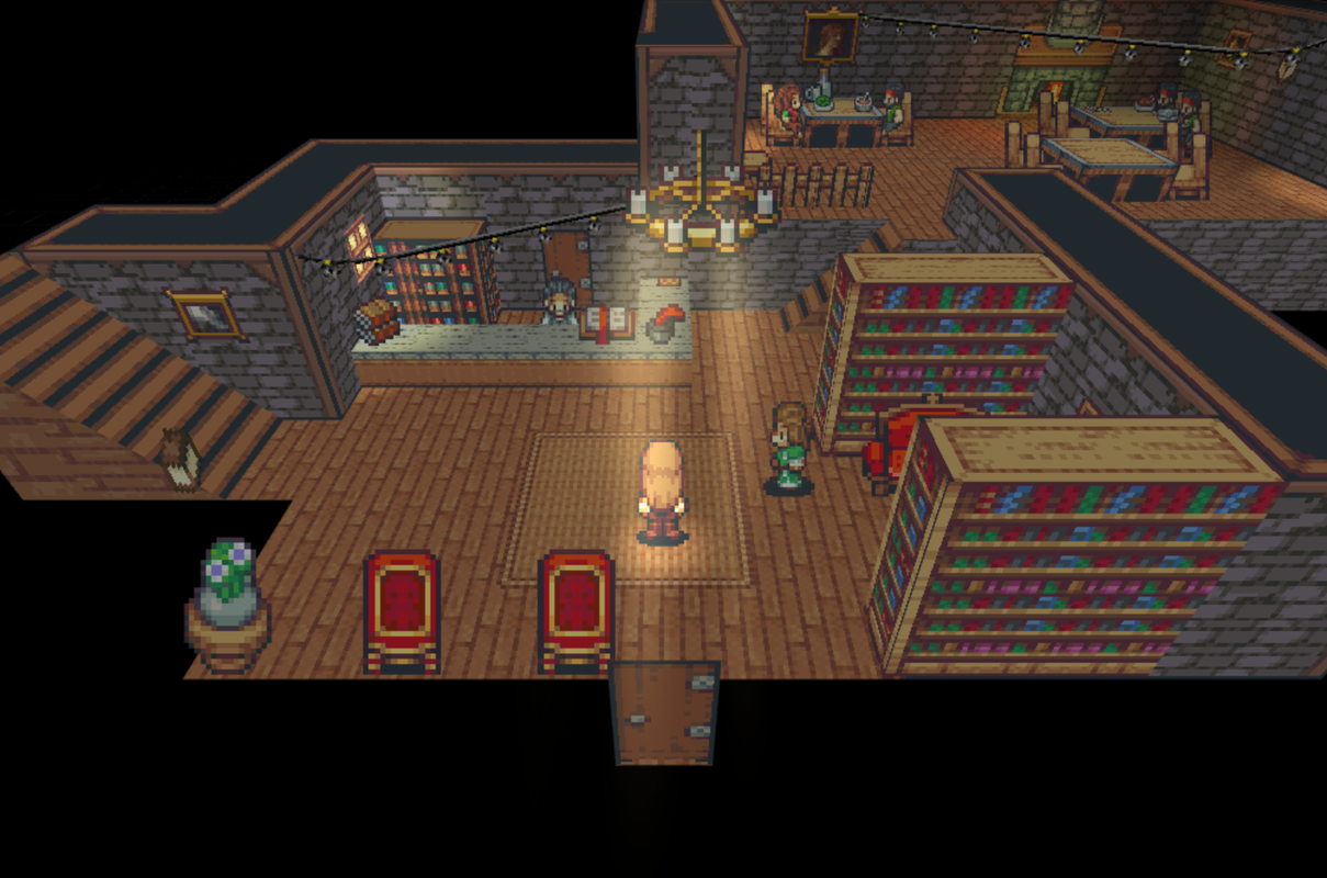
  9. Screenshot-2021-04-18-at-19-32-48.png

    Rest your weary legs in the Dancing Fox Inn!
  10. @gRaViJa I kinda like the 3D environments with 2D sprites, reminds me of Breath of Fire IV. The 3D stairs have given me some serious nostalgia; really looks like something from the PS1. lol.

    I like it.
  11. @Prescott Thanks for the feedback. I didn't intend the for cliffs to be that high, though. Maybe it'd make more sense if I increase the bottom cliff by 1 more tile?
  12. @slimmmeiske2 thanks! The extra potted plant = yes im adding one right now! As for the single bed, that's gonna Stay cause its kinda tied into the character. As for the Bath, i agree but i couldnt find a decent tub that would fit the periode/aesthetic :(
    The living room is a bit empty agree, tho ill need some room for cutscenes ill see what i can do about it.

    Thanks for the feedback :)
  13. Got around to mapping again after months of not doing it. Thinking of moving the green mountain range down a tile or two to help with the open space a bit. World Hub map btw.Map002.png
  14. map of a Mansion exterior. Any & all feedback is appreciated :)

    Mansion copy.jpg
  15. @Finnuval Looks amazing! The only thing that stands out to me as odd is rows of the trees in front, for some reason. They look good, but something is off to me, maybe it's because they're all the same size?
  16. I
    jonthefox said:
    @Finnuval Looks amazing! The only thing that stands out to me as odd is rows of the trees in front, for some reason. They look good, but something is off to me, maybe it's because they're all the same size?
    Think its the way they disappears behind the hedge - not sure hoe to fix that tho :/
  17. I'm trying to make a mountain area. How does this look?
  18. Mr. Detective said:
    @Prescott Thanks for the feedback. I didn't intend the for cliffs to be that high, though. Maybe it'd make more sense if I increase the bottom cliff by 1 more tile?
    That could certainly help! You don't have to make the initial cliffs that high either, you could decrease the elevation altogether or even add little pieces coming off of it to make it seem less like a sudden steep wall jutting out of the ground.

    jonthefox said:
    I'm trying to make a mountain area. How does this look?
    Not too shabby! You've got good clutter placement. What are the dark parts supposed to represent, in your mind, out of curiosity? I find that sometimes people just put those down without really knowing what they are there for. To me it looks like sections of the dirt where people or creatures have dug in just below the surface, so it's a little darker. Usually that would mean it is a bit wetter though, in which case the trees being dead would be curious. Your map design should not just look cool but serve a purpose as to showing the players what the region is like and the history of what happened in that location, so that's just something to keep in mind :)
    A nice little trick to help things look a bit more natural is to place the top tile of the trees right up against the top of those clifftops (the mountain floor tile), and basically allude to the bottom part of the tree being underneath it. The perspective of RPG Maker graphics is not entirely top-down, it's at an angle, so there is technically one more space that someone could walk underneath that cliff tile, even if the player can't. Keeping that in mind can help increase the believability of your maps quite a lot, even indoor ones!

    Luxray Gaming said:
    Got around to mapping again after months of not doing it. Thinking of moving the green mountain range down a tile or two to help with the open space a bit. World Hub map btw.View attachment 187142
    That would definitely help a lot, but I think a better option might be to just make the map itself smaller. If you've got a lot of unused space it is better to condense things for the players' sake. If you've got a specific scale in mind of the distances between these things, it can be better to stick to that, but you might need to add a couple more points of interest in between, perhaps a small market/outpost. Without knowing exactly how large your world is when it is to-scale it is hard to recommend changes, but there are a few ideas to help you out :)
    I will note that it looks strange where the grass goes into sand and then to rock. You might be able to fix that by putting the default grass tile underneath that grass overlay autotile but I'm not super sure as I don't have RPG Maker on-hand at the moment.
    The shoreline also has that dark line around it, which is because, unfortunately, that type of water only works with the darker sand color. I'd just swap it out to make it look a bit more natural :) That might help the grass to stone transition as well, since it might look a bit more like rough dirt with the contrasting colors up there, but it'll look like sand nearby the water.
    The top of the overworld has a straight line of mountains and I would suggest changing that up a little bit. The overall flow of everything else on your map and how natural it looks is pretty good but that super straight line of mountains looks very out of place, so maybe making some variation in the Y axis could help.
    This one is more personal preference, but I would extend the lava down below the volcano tile. The bottom of the volcano will still be stuck to solid land and it will make it look like the lava just curves around the back side of it instead of there being a big square behind it.

    Ace of Spades said:
    @Prescott - That's an impressive looking mountain range, I bet that took quite a bit of time! My one critique would be that it does look a bit homogenous. Without some form of a unique landmarks, it might be a bit easy for the player to get a lost. Take that with a grain of salt though; your pathways flow nicely, so it might feel easier to navigate while playing. I imagine whatever is hidden beneath the sensors can also help the player find their bearings, assuming these are some kind of unique locations.
    That is a great thought. The water and flag in the bottom right map will serve as waypoints, and the censored areas will serve the same purpose in the next two. Going right from that bottom map will see a couple dungeon entrances as well as a unique land feature. That honestly happened by mistake though, as have a lot of great things while making this game, and a few more mountain maps I'll be making in the future have no such markers so I'll be sure to include things like that!
    There is one main path and a bunch of short paths that will likely have some enemies roaming them in order to get to treasure, but they aren't ever so convoluted that it will be hard to find the way back to the main path. That's my goal, at least!
  19. @Prescott thank you for the feedback! Honestly, the dark parts were mostly a result of no A2 tile looking like it fit right in the area, so I figured this kind of austere landscape would have some thicker dirt or whatever. I don't know if there's a way to edit something so that it would look like there's a kind of path, which would be dirt...even though the rest of the place is also dirt...
  20. Wanted to share the current map of the first town and get some feedback!
    Note that i plan to change the assest to a 16x16 style so things will look different graphics wise, i'm more just focused on the map itself.
    Here is the lower half of the map. (ignore cutscene purgatory)
    Screen Shot 2021-04-26 at 6.56.07 AM.png

    And here is the upper half of the map:
    Screen Shot 2021-04-26 at 6.59.04 AM.png
    Any tips? Plan to add lighting once assets are finished?

    Also how are these house interiors? do the stairs look ok?Screen Shot 2021-04-26 at 7.00.05 AM.png
    Screen Shot 2021-04-26 at 7.00.22 AM.png
    Screen Shot 2021-04-26 at 6.59.45 AM.png