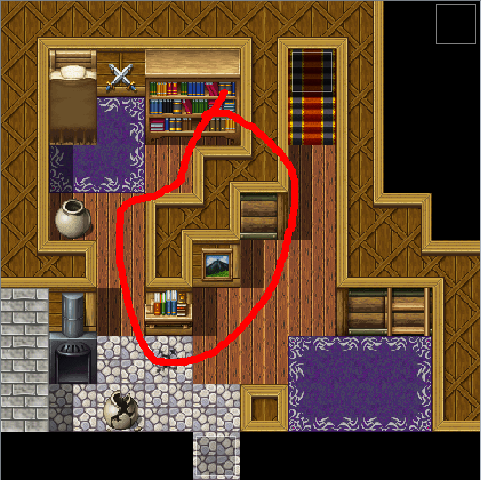
It looks nice but this part marked in red seems unnecessary. Why are the walls zigzag-y like that? And the walls look too short. I think two tiles high would look better. Apart from that I think the rest looks good.
Game & Map Screenshots 11
● ARCHIVED · READ-ONLY
-
-
A winter landscape from the upcoming release of my game Numina. The screen shows the snowy lands of Capella. Most of its inhabitants live in a huge city called Cor - protected from the cold by magic.
-
Some new screenies from my project. Quick Game mode is ready and features 8 different enemies with their own background an music theme. Highscore list and main menu is also implemented. I'll make the story mode later on. I could think of a small demo in the near future to let you guys test out the Quick Game mode at least.
-
Nice Tetris!Some new screenies from my project. Quick Game mode is ready and features 8 different enemies with their own background an music theme. Highscore list and main menu is also implemented. I'll make the story mode later on. I could think of a small demo in the near future to let you guys test out the Quick Game mode at least.
View attachment 187924
View attachment 187925
View attachment 187926
Though I think it had some kinda copyright issue with it, you'll have to look into it with more depth. Considered it for my project and ran into some copyright ambiguity and just scraped it all together. -
Thanks a lot. :LZSjoy:Nice Tetris!
Though I think it had some kinda copyright issue with it, you'll have to look into it with more depth. Considered it for my project and ran into some copyright ambiguity and just scraped it all together.
I'd be surprised if you could copyright gameplay, though. If it were, Final Fantasy could have its whole turn-based battle system copyrighted, which would make RPG Maker illegal. -
Thanks a lot. :LZSjoy:
I'd be surprised if you could copyright gameplay, though. If it were, Final Fantasy could have its whole turn-based battle system copyrighted, which would make RPG Maker illegal.
Tetris Copyright Decision Shows How Complicated Copyright for Games Can Be
It's a complex topic and the article is 9 years old. The game also is really similar too.
I agree with how if mechanics were copyright blocked, lots of games would be illegal. -
Wanted to share the current map of the first town and get some feedback!
Note that i plan to change the assest to a 16x16 style so things will look different graphics wise, i'm more just focused on the map itself.
Here is the lower half of the map. (ignore cutscene purgatory)
View attachment 187547
And here is the upper half of the map:
View attachment 187548
Any tips? Plan to add lighting once assets are finished?
Also how are these house interiors? do the stairs look ok?View attachment 187549
View attachment 187550
View attachment 187551
I've got a lot of constructive feedback for you to help improve your mapping :)
First map:
- The stairs going down into the town are 1 tile to long. The cliff walls are two tiles, right? Therefore, the stairs should be two tiles.
- The buildings almost look flat. They have no depth to them. Consider expanding the roofs out another tile back to add some depth to them depending on how big of a building they are, go 1-3 tiles extra.
- The waterfront on the left and bottom of the map are extremely straight, I would loosen it up a bit to give a more natural feel (unless of course it is more man-made).
- The stone building on the bottom right has a weird wall thing going on. It might just be a matter of preference but I think it would look better if it was one continuous wall with a door on top. You should be able to get this effect by either shift-clicking the black tile on top of the wall if it isn't working automatically (or putting it on a different layer depending on the engine you're using).
- I generally like the layout of it, it looks very pretty.
- The biggest criticism here I have are the stairs, again. Make sure they are the right height compared to the walls they climb.
- The autoshadows on the left of that middle staircase look a little weird, too. The stairs would be pretty much at the same height as the wall, so it shouldn't be casting a shadow on it (well, a very minor one but not easily replicated in the engine itself).
- You also have a problem with the walls, again. Going over them once more should get rid of those random wall edge pieces and make it look more cohesive. Look at a real corner of a wall and you'll see why that looks a bit funky.
- Other than that though, this looks just fine. I'm a little curious as to why there are two random pots on the left and right of that path and I assume it is to prevent the player from leaving that map? They can sneak behind the trees below the pots, too. There is no harm in just making the player turn around if you don't want them to go somewhere instead of placing a strange object in their way.
- This is where you could improve a lot. I see a lot of people using only one tile for the walls in their interiors but it really doesn't make sense when you put it into perspective. Your character is one tile tall. If the walls are one tile tall, that would mean they are scraping their head against the ceiling. It also makes the perspective a little weird for things like the bookcase and the oven, since they are objects that are two tiles high and technically could not exist in that house unless there was a hole in the roof.
- Your stairs are at the right height here if you changed the wall to two tiles high. If you think about the way a normal house works, the second story is essentially the ceiling of the first story, so stairs that lead up exactly to it mean there isn't a bunch of empty space (around 6 feet, judging by the character sprite) in between the two floors.
- A lot of people do their stairs differently. I prefer mine to go above the ceiling tile and show a bit of the next floor, and it helps me figure out the space better as well. The way you're doing it is perfectly fine though and I'd say that's the way most people do it. I also find that putting at least one tile of wall next to stairs can really help show the height to help with the perspective better, but here it looks alright!
- People also do their ceilings differently, some don't use them at all and just opt for black, some like to fill the entire rest of the map with the ceiling tile. The way I do it is I wrap the ceiling tile around the entire map and then leave the rest black, with enough space around the outsides so that the player is always in the center of the map. It seems like you're kind of stuck between worlds and so it makes the ceiling look a bit awkward. It isn't a huge deal though.
- Like someone else pointed out, very few houses have diagonal walls like this one does. To be conservative, you could just take the wall on the top right and move it down a tile, to make that wall two tiles long. I think that would look nice.
- The last thing I would suggest changing on this map is moving the bed down one tile. When it is up by the wall like that it gives the appearance that it is literally part of the wall. Unfortunately, the default bed tile doesn't go right up against the wall and will have to go below it, but it looks way better that way than it does being inside the wall from the perspective that RPG Maker is in.
Here, you have the bed in the correct place and the walls are all two tiles high. This map is really solid looking to be honest and there isn't really anything I could critique off the top of my head. I like how there is a stool right next to the closet. It makes me think of someone sitting down as they pull their clothes on or off.
Fifth map:
- Again, the walls are short. The bed's in the right place, though!
- The suit of armor is meant to be a stand, not a hanger, so it should go on the ground instead of on the wall.
- The juxtaposition of the incredibly fancy bed and rug and the fact that this room looks pretty drab, not having a window or nice flooring, is a little weird. It looks to me like it might be some sort of royal guard's chambers, but maybe either sprucing it up just a little bit or taking down the fanciness just a notch would suit it a bit more. Of course I don't know your story/lore so this is just a suggestion.
Tetris Copyright Decision Shows How Complicated Copyright for Games Can Be
It's a complex topic and the article is 9 years old. The game also is really similar too.
I agree with how if mechanics were copyright blocked, lots of games would be illegal.
Off topic, but it seems pretty clear that the only things copyrightable by Tetris from that article and the copyright case are the block shapes and the grid size, neither of which @Tw0Face is using.
In this case, the judge seems to have erred on the side of defining the rules broadly. She described the unprotectable rules as:
“A puzzle game where a user manipulates pieces composed of square blocks, each made into a different geometric shapes, that fall from the top of the game board to the bottom where pieces accumulate. The user is given a new piece after the current one reaches the bottom of the available game space. While a piece is falling, the user rotates it in order to fit it in with the accumulated pieces. That object of the puzzle is to fill all spaces along a horizontal line. If that is accomplished, the line is erased, points are earned, and more of the game board is available for play. But if the pieces accumulate and reach the top of the screen, then the game is over.” -
Another headache with mapping. XO Was trying out some of Pandamaru's cliff tiles. More complicated than I thought. Not sure if I used them properly. XP
SS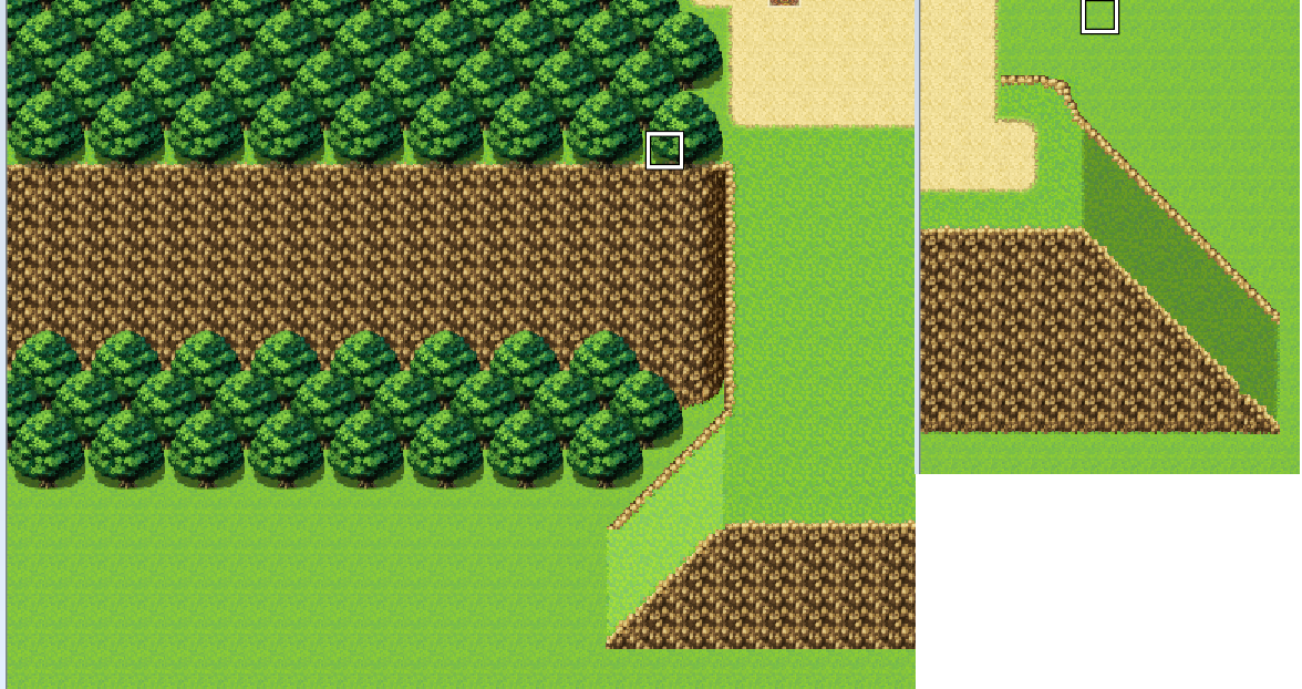
Ah, yeah. I should put some cliff tiles on the top left of the right picture.
@LittenDev For your second map, something about those top tiles bother me... I just can't put my finger on them. They just look... odd. -
Some new screenies from my project. Quick Game mode is ready and features 8 different enemies with their own background an music theme. Highscore list and main menu is also implemented. I'll make the story mode later on. I could think of a small demo in the near future to let you guys test out the Quick Game mode at least.
View attachment 187924
View attachment 187925
View attachment 187926
Woah, this looks amazing! I'm intrigued. -
While the main point of view in "This Life is a Dream" is not isometric I was messing around with the possibility (UltraMode7) and thought it looked really cool. I figured I'd take a nice pic before undoing the settings. After seeing how good it looks, however, I will most likely need to re-visit the concept for at least one "dream" in the game! I'll post pics of this same area later, when it's finished being populated, in its proper non-isometric view (as well as some new Iso pics, why not?) if anyone wants to see the comparison. (Maybe I'll just do a full POV comparisons demo? Might not be the best example map though. :p)
-K
1920x1080 -
Too many trees?
TREES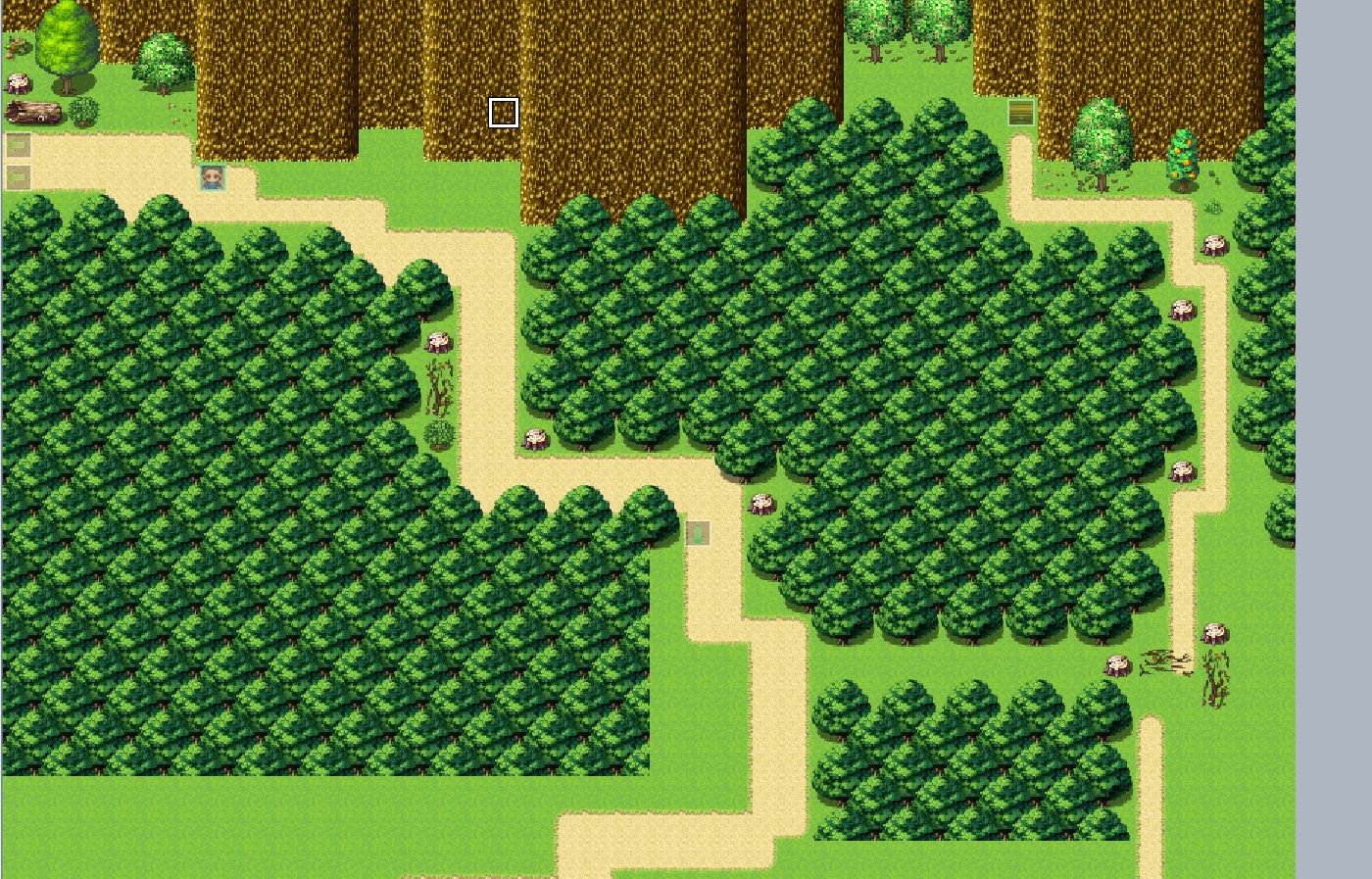
-
@Mr. Detective
Depends on how big your games resolution is. If the player can see big chunks of trees while walking around on the map, you might wanna break it up a little. Add little clearings, or differently coloured trees.
Like this
Also, you might wanna stick to one source for you trees. At least per map. The clumped together (MACK?) trees don't really match well with the big RTP edit tree and the (i think) Pandamaru trees. -
@Mr. Detective The clumped trees will probably be fine from the player's perspective depending on resolution and aspect ratio, if anything I'd say there's too many stumps 90% of the terrain detail on your map are stumps there and they're very close together for some reason. It's like someone went down the road and randomly decided to cut down a tree, just one, every few steps. Since you're mostly using RTP there, adding some of the dirt detail and some bushes would probably make it look better.
If you do want to break up the tree clumps, you could always put visible but inaccessible tiny clearings in the clumps where you can have butterflies and rabbits wandering about for window dressing. Don't think that's particularly necessary because it doesn't look like the type of map a player would stay for long, more of a transition. -
This is how it looks like in game. Resolution is 1280x720.
Spoiler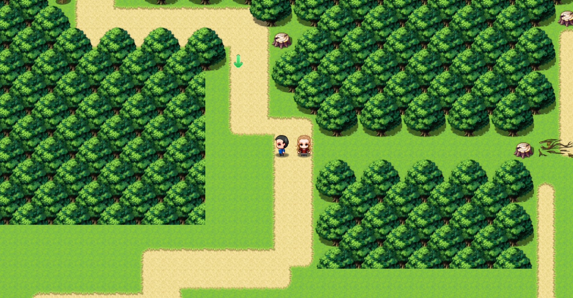
The tree stumps were supposed to show that people have been cutting down trees that grow outside the walking path. Guess that didn't communicate very well. XD The area on the right is a secret path that leads to the treasure chest. Unfortunately, it's too obvious and I'll have to try to hide it better. =w=
That's a good way to break up the trees, though. I'll try that. -
@Mr. Detective Hmm, yeah, with 16: 9 the trees do look a little much without anything to break it up. Not really the end of the world if it's just an in-between map, though.
For the stumps, do you mean it's to show that they're trying to keep the path clear? If so a little more space between the road and the trees might make the stumps look less random, as it stands the places where they decide to cut down a tree or leave a tree seems arbitrary, and it's not as though those trees grew over night.
I'd logic it out as: if someone is trying to keep the trees away from the road, they'd make sure that there's no trees within at least 1-2 'tile(s)' from the road, and this in turn would allow you to break up the stumps up a bit.
As for the side path, you could probably manage to make it a bit more hidden by widening the map and using trees the player would have to walk behind to hide the route, with a couple of small clearings as sign posts. -
I'd like some advice on my first town. I'm a novice at game-making and the map looks off to me, but I don't know how to make it better...
Credits to FSM Town of Beginnings and I copied two buildings from the sample map because I really liked them.
First map -
@ShiningPhoibe Personally, I'd mix things up a bit, make the ground look a lil' more interesting and natural looking by adding patches of longer grass, perhaps dirt or mud. Grass, unless it's someone's prize winning lawn, is never perfect and uniform. Maybe throw in a couple of more large plants such as flowers of tiny bushes.
I'd also connect the buildings across the river, as well as that warehouse\storage area to the road. Even if no stone road is built, people would create natural dirt paths by simply walking along the shortest route, there would be no grass where people walked the most.
Other than that, you could perhaps hide the edge of the map with trees, cliffs, decorative buildings (things the player can't enter) or walls, just so the player doesn't think they can leave the town from any map edge; unless they can do that, of course.
Good work on the two larger buildings north of the river, they look pretty good. It's also nice that you've tried to make all of the buildings a decent size rather than those super skinny things you so often see in RPG Maker games. I like it! -
Thanks for the advice!@ShiningPhoibe Personally, I'd mix things up a bit, make the ground look a lil' more interesting and natural looking by adding patches of longer grass, perhaps dirt or mud. Grass, unless it's someone's prize winning lawn, is never perfect and uniform. Maybe throw in a couple of more large plants such as flowers of tiny bushes.
I'd also connect the buildings across the river, as well as that warehouse\storage area to the road. Even if no stone road is built, people would create natural dirt paths by simply walking along the shortest route, there would be no grass where people walked the most.
Other than that, you could perhaps hide the edge of the map with trees, cliffs, decorative buildings (things the player can't enter) or walls, just so the player doesn't think they can leave the town from any map edge; unless they can do that, of course.
Good work on the two larger buildings north of the river, they look pretty good. It's also nice that you've tried to make all of the buildings a decent size rather than those super skinny things you so often see in RPG Maker games. I like it! -
Any critique would be welcome.
This is how it looks in-game. The purpose of the video was to show how the route to the end of the level was pretty straightforward but you went out of your way you could find treasure.
The music changes when in the forest (the part that turns darker), but I forgot to edit it when I made the video because for some reason the software I used to record what's on the desktop doesn't record music running on the background, so I have to edit it.
There's also animals and enemies that make the map look more lively, but the screenshot doesn't show it. -
@ShiningPhoibe
It's very big, very empty, very flat.
I'd shove everything together a bit. Get some different elevation.
And also cover the edges up, cause I hate when you go to the edge and then don't transfer to a different map.
Also make the path smaller, and take it to every house. Cause as it is you have a huge road, like you'd find in a big city or a highway, and then just grass. Like there should be dirt paths at least, where people walk every day.
Also imo it looks a bit weird that all the bottom houses are the same size.
So I remade and edited your map... I may have gone a taaaaad bit overboard... Especially with the trees lol. It's been a while since I made a map with FSM and I got really into it. Completely different feel to your map but, well... I'm not really sure what settig you were going for. And I have like 2% skill in mapping like, grassy plains. So woodsy mountain/hill village is what ended up happening!
Here it is. Use it as inspiration, or not, whatever you want.I removed one of the houses cause... I dunno It looked better. And it didn't have a door so I assumed it was just decoration.
Also 50% size cause I didn't feel like logging into imgur and the image was to big to just upload into the message directly.