Game & Map Screenshots 11

● ARCHIVED · READ-ONLY
Started by Celianna 2067 posts Page 68 of 104 View original ↗
  1. akoniti said:
    @TheGentlemanLoser personally I feel POP! and RTP tiles do indeed clash from a resolution perspective.
    appreciate that but like...either they're both 1x1 or both 2x2 or 4x4 or w/e (pretty sure neither one is 4x4), like right? like it's not a feeling thing, it's a thing people with better eyes than me can objectively see (and which I'm definitely worrying about too much but eh)
  2. @TheGentlemanLoser, it looks like those VEXEDENIGMA tiles are, uhh, 32x32 pixels or so, while whtdragon's are maybe 64x64? Buuut, you can take a tile from both and put them in GIMP or wherever and check how many pixels it is? And yeah, personally I go nuts if I see different resolution tiles gettin' mixed. :biggrin: :biggrin:

    @Lee Sang, looks pretty sweet, honey! :biggrin: I like yo character design, makes it look like somethin' outta Swedish children's books!
  3. @Lee Sang lovely atmosphere! Love the tree shades and contrast with the red leaves.
  4. halloween_test_img.png
    I just made this image for my game, a flashback that the main character has of a costume party. I don't know if I should use it or not however, mostly because of quality control.

    If you would be so kind, please tell me if I should keep it... or delete it.
  5. Keep it for there are many people like me who can't even make such fine artwork.
    It's your work and your style, the only one that can say no to your work is yourself.
    Such is my philosophy.:wink:
  6. orochi2k said:
    Keep it for there are many people like me who can't even make such fine artwork.
    It's your work and your style, the only one that can say no to your work is yourself.
    Such is my philosophy.:wink:
    Yeah, I just get really worried about that kind of stuff when I see all the talented people on here.
  7. Keep keep keep
  8. I think you should keep it because nobodys style is the "proper" way to draw, its unique to the person so you should probably keep it
  9. Tarzanthecat said:
    View attachment 181125
    I just made this image for my game, a flashback that the main character has of a costume party. I don't know if I should use it or not however, mostly because of quality control.

    If you would be so kind, please tell me if I should keep it... or delete it.
    I think you should keep. Your style is quite distinct and flashback pics are always nice to include in your game.
  10. @Tarzanthecat Please post game development related images here. Thanks.
  11. Here are a few from my upcoming game Garage Ninja. These are from Magic Kingdom City.
    Spoiler
    Untitled Project (Time 0_00_39;19).jpgUntitled Project (Time 0_04_46;08).jpgUntitled Project (Time 0_00_49;08).jpgGarage Ninja_ The Game 2_27_2021 11_55_56 PM (2).pngGarage Ninja_ The Game 2_27_2021 11_57_22 PM.png
  12. The maps in Effervesce Fallacy™ are condensed, and full of action! :biggrin: This was a game design decision made early in development to eliminate unnecessary padding that is present in a lot of RPGs and to enhance the experience on touch screen devices by not having any screen scrolling present. A lot of care went into the maps, such as consistency, and intelligent restriction of player movement.

    We've experimented with larger, and more natural-looking maps, but they lacked the charm of the classic games that we're familiar with.

    Spoiler
    Effervesce Fallacy™ (6).png Dropbox - Error - Simplify your life Dropbox - Error - Simplify your life Dropbox - Error - Simplify your life Effervesce Fallacy™ (10).png
  13. Tarzanthecat said:
    View attachment 181125
    I just made this image for my game, a flashback that the main character has of a costume party. I don't know if I should use it or not however, mostly because of quality control.

    If you would be so kind, please tell me if I should keep it... or delete it.

    first off never delete your work believe in yourself bla bla bla

    second style can make up for even a BIG deficit in technical ability, and this has LOTS of style
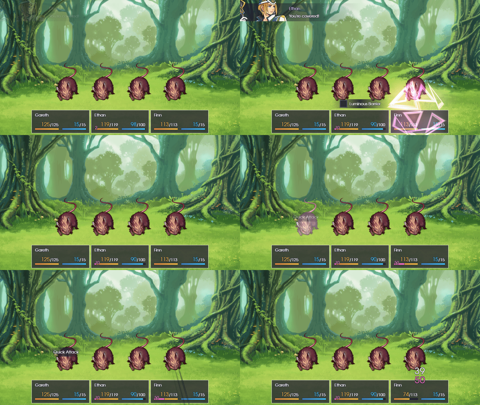
  14. Working on a very simple barrier / temporary HP system.

  15. Haven't uploaded anything here in a while. Here's some shots from a city I've worked on a bit. Not finished yet. I think other city areas will be other mapped zones.
    Wayland Preview
    W001.pngW002.pngW003.png
    *Edit* Added video of a different location.
    Video
  16. @SoftCloud, looks interesting, but why is everything white-washed? Love the steampunkish sci-fi vibe!
  17. @alice_gristle It's to add a foggy environment :D It's paired with some varying light rain effect.
  18. Kenen your UI is just so clean and sharp dude. It's great!
    Looks good Softcloud!
    That fog effect might be a tad bit too much though.

    Early spring and the snow still hasn't melted!

    Untitled-22.png
  19. @Stapleton ooh I love the layering here! It looks so pretty! Edit:
    Moreover the HUD you've implemented it quite refined. This is really good work. Quite inspiring!

    EDIT#2: @Stapleton @alice_gristle Thank you for your comments. I lowered the fog down and it looks much better now. :kaojoy:
  20. Thank you for the kind words SoftCloud! Keep up the good work on your project!