Game & Map Screenshots 11

● ARCHIVED · READ-ONLY
Started by Celianna 2067 posts Page 67 of 104 View original ↗
  1. MBN8yA4.png

    Port town.

    It's a sort of symbolic recreation of one of the first maps I ever made, using RMXP RTP, hence the diagonal paving and the sea wall. Sadly I don't have that map to hand.


    @AshleyLacure that looks incredible!
  2. AshleyLacure said:
    Little Revelations update...
    RV08.png

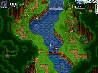
    Lilika Forest
    RV12.png
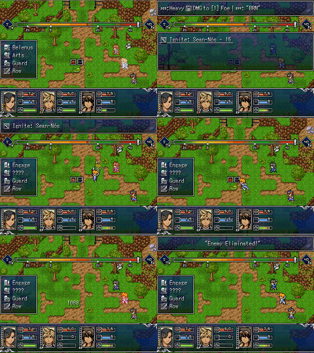
    More Lilika Forest w/ friends this time... updated HUD and yes I'm lazy so speech bubble indicates you can talk to an NPC and have more engaging dialogue.

    ezgifcomgifmaker2.gif
    Showcasing the Special Abilities... who doesn't like attacks named after Irish Gigs. Also please excuse the quality.

    It's amazing how are you turning something so nostalgic (RPG Maker 2003 RTP) into something very beautiful and unique, and something very original :)

    Bonus: Dope mapping skills!
  3. Hi guys!
    Arturo is here


    I'm new over here, so, I want to receive some advices about one of the maps that I recently made.

    Feel free to tell me everything, I want to read all your opinions and advices about how to improve the designs of my maps.

    MAP002.png

    As you see, it's a very simple forest, with default graphics and some free resources taken from the internet. I added a free flesh threes, because the forest is slightly corrupted. Those demons are enemies, I'm using ABS (I will change the sprites of the enemies later).
  4. Albatran said:


    Hi guys!
    Arturo is here


    I'm new over here, so, I want to receive some advices about one of the maps that I recently made.

    Feel free to tell me everything, I want to read all your opinions and advices about how to improve the designs of my maps.

    View attachment 179555

    As you see, it's a very simple forest, with default graphics and some free resources taken from the internet. I added a free flesh threes, because the forest is slightly corrupted. Those demons are enemies, I'm using ABS (I will change the sprites of the enemies later).
    The art styles of the trees seem to clash a little bit. Variety can be good but not when there are opposing art styles. There is a very high density of detail in those autumn trees, but the green ones lack that, having a bit more of a painterly look. I will say though, that your tree placement is pretty good, and it looks natural for the most part.
    Your path is also strange as well. If your path is not man-made, it might be better to add some grass surrounding those areas that are meant to be paths, just to make it look a bit more natural. If that's not a possibility, for instance if all the grass from this forest has been "corrupted away," that might be a bit easier to pass off. I know it's hard getting great paths down when your tiles are a bit limited and you are going for a certain style.
    On the bottom, you've got a good thing going for directing a path to another map, making it so that the players can only go in one spot. I would say that if you add another tree at the bottom left, just the top tiles of it, to go over those weird plants, it would look a bit more natural instead of looking explicitly like the only reason that those are there is to guide the player. Doing something similar up top, making it so that the player can only get out that way, is something you should do as well, since right now the player can explore the entire top horizontal line of the map.

    Here's my map! I worked on this for a very long time and I still have 5 more like it to go.
    It is the path from the Komura region to the Grizz region. To the top is Komura, and to the bottom is Yorough Town in Grizz. To the left and right, the mountain range continues, leading to some dungeons, side quests, and a character you can recruit to your party!
    The Grizz mountains, called the Glilnor Range, are an intense area, full of brutal cliffsides and strong monsters. Most Grizz people do not travel through these mountains if they don't have to, and they even banish the worst of their criminals up there as punishment.
    The bottom right is blank because the player will never see it. There are a few parts that look a bit weird, as far as the cliff sides just shooting straight down, but keep in mind that in the player's perspective, it doesn't look as weird.

    6cc7294373decf52.png

    As a little bonus, here is a kind of "time lapse" of the development of the map:
    Spoiler
    cd282ac889f5febf.jpeg
  5. This is my first good advice received by a user.

    I feel so grateful to read all the text, I'm new with the map making, so I'm constantly improving and searching for good alternatives.

    Thanks for your advices, they are so useful and your map looks very good. I always try to make the maps looks "natural" or not weird, but sometimes I don't know how to give a different look to the maps. With the maps that you show me, gives me an idea, I will show it later.

    Another thing is, I don't like to make super bigger maps, because my games are simple, with the time the simplicity will be converted in something better. More detailed maps, more events, more interactions. For now, I want to practice, learn, and make soft stuff with the default graphics. Thanks again for your advices, goodbye!
  6. Albatran said:
    This is my first good advice received by a user.

    I feel so grateful to read all the text, I'm new with the map making, so I'm constantly improving and searching for good alternatives.

    Thanks for your advices, they are so useful and your map looks very good. I always try to make the maps looks "natural" or not weird, but sometimes I don't know how to give a different look to the maps. With the maps that you show me, gives me an idea, I will show it later.

    Another thing is, I don't like to make super bigger maps, because my games are simple, with the time the simplicity will be converted in something better. More detailed maps, more events, more interactions. For now, I want to practice, learn, and make soft stuff with the default graphics. Thanks again for your advices, goodbye!
    I really wish they'd remove the option to color text on these forums, because this is what your post looks like to those of us using dark theme:

    Spoiler
    k9dcduf.png

    In short, you probably shouldn't use color tags in your messages.
  7. Oh ok hahaha excuse me.

    Yes I see, the text when you send it turns black, not blue lmao
  8. I think it's because blue and red are "mod" text colors (if memory serves, blue is a warning/notice ("hey by the way you posted this in the wrong sub-forum") while red is more extreme (which I've not actually seen for myself)).

    Font color discussion aside, I might as well post a screenshot from the cutscene I'm working on for the cutscene contest.
    Spoiler
    ValenScreenshot01.pngTileset is FSM, using QMap and some VisuStella plugins
  9. Ellie Jane said:
    MBN8yA4.png

    Port town.

    It's a sort of symbolic recreation of one of the first maps I ever made, using RMXP RTP, hence the diagonal paving and the sea wall. Sadly I don't have that map to hand.


    @AshleyLacure that looks incredible!

    masterlobo said:
    It's amazing how are you turning something so nostalgic (RPG Maker 2003 RTP) into something very beautiful and unique, and something very original :)

    Bonus: Dope mapping skills!
    Thank you both for the encouragement, really happy with the way the games turning out.

    @Ellie Jane - Gorgeous port map, love the entire composition.
  10. Hey all. I've been working on a new battle window that can be accessed during any actor's command input. It's used to display the actor's parameters and passive abilities, to make them easy to review during the actor's turn. I thought I'd post this here as a means of taking a break from tweaking it, though it's very much a work in progress. The icons are placeholders because I struggle with icons a bit.

    I plan on adding a different, more streamlined window to display status effects and their descriptions, so that's why status effects aren't shown in this window.

    UnitInfoScreen.png

    Editing this with a quick video to show it in action:

  11. That looks great Kenen
  12. Okay, here you go guys, mod here with no idea of the best place to post this, haha! (So don't feel bad if you're ever uncertain where to post.)

    I'm trying to decide on icon style and thought I'd get some opinions on it. For some background, here are some screenshots from the game to get an idea of style:

    The title screen shows the character art from the graphics pack I'm using.
    Title Screen
    Title Screen.png

    This map is a sample of the style of the tiles.
    Sample of Tiles
    Tiles.png

    I found this backpack and desaturated a bit, felt it went well with the character art.

    Recolored Backpack
    inventoryBackground.png

    My dilemma is that I downloaded some other items from the same artist as the backpack to try out for icons. I think the coloring could stand to be desaturated as well. But, I could use these and go with an icon style to more match the character art. The problem here is being limited in what I could use for items. The benefit is less time spent making icons myself.

    Icon2.png

    Or, I could go with icons I make myself more in the style of the tileset. Benefit is not needing to purchase more graphics, as well as I am not limited to what is available in this style. Problem is, more time spent making icons myself.

    So, I'm curious what you all think about which way to go. (Also note, I'll probably pick a different shade of blue for the background, I just haven't found one that I like yet.)
    Icon1.png

    edit: Completely forgot to credit the character/tile work. It is from the set Downtown Dungeon Starter Kit by MalibuDarby.
  13. I always found being limited in a style bad and good in some ways.

    If you are limited on the icons you have then you can build your world around that and it takes a lot of thinking out of game making.
    Not to mention the time saved.

    If the limitation is too great then it will only cost more time down the road when you try matching the style for more icons or completely replacing them with your own anyway.
  14. @mlogan, I'd prob make the icons myself, but that's me, I love making stuff and I don't ever consider it time wasted, even if I end up not using the graphics in my game. Sooo... yeah. Oh, love your overall style, btw! :biggrin:
  15. mlogan said:
    So, I'm curious what you all think about which way to go.

    Tough call. My immediate preference would be the pixel icons you created, and I also think they'd be the way to go in terms of matching the tiles. (BTW, I love the shade of blue used for the menu and booths in the tiles. I would start there re: a different shade of blue for the icons).

    In terms of the other style, I scaled the ones you attached down to 32px in Photoshop. They reproduced well enough, but the bow didn't reproduce well due to being too thin. But, you could always get creative and crop the bow which would allow you to not shrink it so much.

    There's also something to be said for taking some help from the premade art and getting a head start on the rest of your project. Icons can especially be a chore, and these don't have to be your forever icons. They can just be your right now icons while you focus on other aspects of your project.

    TLDR: I would probably choose the pixel style in the long-term, but there's nothing wrong with using the premade art as an inbetween until you find the time or motivation to go down the icon creation rabbit hole.
  16. First off, I feel terrible for forgetting to credit the art - the character art and tiles are from MalibuDarby's Downtown Dungeon Starter Kit pack. (I've edited/added a lot of things myself though, so not all of what you see in the diner is in the pack.) But I love the style of this pack!

    @Stapleton I totally get that about limitations. Sometimes setting limitations can really make you think outside the box.

    @alice_gristle I don't really consider it time wasted either, just more of it will be needed, lol. Also, thanks for making me realize I needed to add art credits!

    @Kenen The premade graphic icons are already at 32 pixels, I just had it zoomed in when I took a screenshot. But yeah, the skinny bow is only one issue of resizing the graphics. Also, I'll definitely try out that shade of blue.

    I think y'all have convinced me about moving forward with making the pixel style ones. I'd rather be able to add to them as I decide on new weapons/puzzle items/etc rather than forgo things just because of a lack of icon for it. Thanks for all the input!
  17. Kenen said:
    Hey all. I've been working on a new battle window that can be accessed during any actor's command input. It's used to display the actor's parameters and passive abilities, to make them easy to review during the actor's turn. I thought I'd post this here as a means of taking a break from tweaking it, though it's very much a work in progress. The icons are placeholders because I struggle with icons a bit.

    I plan on adding a different, more streamlined window to display status effects and their descriptions, so that's why status effects aren't shown in this window.

    View attachment 180228

    Editing this with a quick video to show it in action:


    Damn, that UI looks clean AF. Great job!
  18. hey I want to know if I can use these graphics together (none of this is my work as of yet but I'll be editing it; credits embedded in image)

    thingy.png

    I don't mean the styles, though, that's at least somewhat subjective*: I mean the pixel resolution which isn't. years ago I was (rightly) shamed for including two pixel resolutions in the same screenshot, objects/sprites that were 2x2 on the same map as objects 1x1; this is something I've been pretty paranoid about ever since because I literally could not perceive the difference until it was pointed out by outside criticism orz
    mlogan said:
    Okay, here you go guys, mod here with no idea of the best place to post this, haha! (So don't feel bad if you're ever uncertain where to post.)
    this seemed the least inappropriate place and I didn't want to start a thread just for this so thank you for saying that, I had been dithering over where to place this

    * its an atmospheric horror game so everything is going to be under layers of lighting, fog, and weather effects 88% of the time anyway
  19. @TheGentlemanLoser personally I feel POP! and RTP tiles do indeed clash from a resolution perspective.
  20. Here's a map from my project.

    Desktop 2-24-2021 12-12-50 AM-898.png