Game & Map Screenshots 11

● ARCHIVED · READ-ONLY
Started by Celianna 2067 posts Page 66 of 104 View original ↗
  1. 1612379457936.png
    Just something I made in MZ to distract myself. Btw, is there a way to take a full screenshot of the map in game?
  2. Archeia said:
    Take everything with a grain of salt.

    Major Problems with the UI:
    Right now the UI feels haphazardly put together. Major problems I can see from the get-go:
    1. The text is unreadable
    2. The colors are too harsh.
    3. The portrait art bleeds out of the edges.
    4. Lack of unifying theme that tells anything about your game.
    First tip, give yourself "guaranteed margins." Here is an example:
    Spoiler
    View attachment 178194

    Now, the distance from the edge of the screen should generally be off limits. If possible, windows would be touching the edges of it, but any window or contents should generally NOT be inside this area.

    However, I feel it is important to stress that while this is a rule of thumb, it is not an unbreakable law that is set in stone or anything. If there is a legitimate need to allow a window and/or it’s contents to exceed these invisible borders (especially if it was during a transition or something similar) then that takes precedence.

    I guess, in general, windows should not exceed these boundaries while at rest.
    Like the windows, this space would be coherent in between all the menu screens.

    Reasoning: this will give the menus a feel of spaciousness instead of being claustrophobic! It allows itself a fair amount of tolerance for composition as while windows/contents would not normally exceed such boundaries, the same is not true for other visual elements. (arrow cursors pointing offscreen, inactive windows hiding away, etc)

    Second Tip: Standardization of common elements.
    A UI has to work as a whole and has a unifying theme and it's the job of your UI artist to mention this in the first place. Ideally you want to do the following:
    1. Determine the core visual styles of your UI. Basically you have common elements that blocks out information that gives a pattern for your players to extract information from.
    2. Have a standard font type, size and colors that helps convey important information to your player. Normally you have the header type font, standard font (mostly for dialogue and bulk of the readable information and so on.
    3. Remember, Menu and Battle UI has to be consistent to unify and give a professional look to your game. One cannot stand out without the other. Without knowing how your general main menu UIs look like, it's hard to suggest the exact issues of your battle UI.
    My general suggestion is to put individual windows on the character facesets. Examples of what I mean:

    Spoiler
    View attachment 178196View attachment 178198
    View attachment 178199
    View attachment 178197


    Thank you that’s awesome feedback. I’ll definitely look into asking for changes.
  3. I haven't posted here in ages. It's been what, six years? Lovely images, everyone :D

    bandicam 2021-01-30 10-46-41-390.png

    bandicam 2021-01-30 23-04-49-226.png

    Still using good 'ol VX.
  4. While I figure out how to take screenshots of the maps with the events on it, here is the beach town I've been working on:

    Apparently the image generated by the maker when you save the map as image is too large, so here's a print of the image.

    I'm aware that a few tiles look odd but in game they look fine. I have no idea they look out of order in the maker.

    Beach Town XP RTP on RMMZ
    1612465606677.png
  5. Phase 1 of the plan.... Built a giant steampunk TV in space... :LZSexcite:
  6. Here's a map of the one and only kingdom in my game: The Holy Kingdom of Manahill

    I like how it turned out :)


    The waterfalls have water foam (through events) in-game, so they don't look "cut-off" as they do in the map shot.
  7. PixelLuchi said:
    I haven't posted here in ages. It's been what, six years? Lovely images, everyone :D

    Mmm, those are some tasty maps. I really like your use of a few spots of flora and fauna—not overbearing at all, but not scarce either.
  8. @masterlobo, I really like yo colour scheme, sweetie! I can't for some reason get a closer look, but I like the trees and flowers as well... The houses look all identical, and I'm not 100% I like that, but I guess it could be good... like, if the people of Manahill all live in tyranny and everybody's expected to conform to strict rules and all that? Otherwise nice work! I'm really hot on yo game's graphical style on the whole! :biggrin:

    @guking, that beach fort looks really nice! Like from a pirate adventure, yeah? Yo beach town looks clean and nice, too, just the place for a stroll! The pier looks maybe a bit tacked-on, tho? Would it look better if it started earlier, d'you think? Like right by those palms?
  9. @alice_gristle Indeed the pier looks terrible there haha. I think I will discard it as a whole an add something else, tho. I guess I could make a Port Town with a nice pier. The only reason I'm using MZ is because it has more than layers then XP, lol. (and it is really easy to mix and match XP tiles)
  10. alice_gristle said:
    @masterlobo, I really like yo colour scheme, sweetie! I can't for some reason get a closer look, but I like the trees and flowers as well... The houses look all identical, and I'm not 100% I like that, but I guess it could be good... like, if the people of Manahill all live in tyranny and everybody's expected to conform to strict rules and all that? Otherwise nice work! I'm really hot on yo game's graphical style on the whole! :biggrin:

    Tyvm :)

    And you nailed it, it is a "perfect" city ruled by tyranny. In fact the whole game starts with you getting kicked out of the city
  11. Hello all, realy lot of good work and maps ! Another map of a healer house in campaign, realy wip this one but it's already cool :D bye Capture d’écran 2021-02-09 192001.jpg
  12. New Mountain Village mine map for Battle Castle! Instead of going down the well, you now end up going into this previously flooded mine. It's like 99% complete, there's a third cultist who hasn't been included yet.

    Spoiler
  13. @cthulhusquid, I kinda like the long, straight tunnel type of design... Makes me less nervous since I know I'm gonna clear the whole place basically by just going straight ahead. :biggrin:
  14. Hey, first time posting, my first ever project that i started half a year ago dont really know what to add

    Screenshots are here!
    Screenshot_1.png
    Screenshot_3.png
    Screenshot_2.png
  15. Working on a battle hud. Wonder if I should have some sort of background at the back of the hud or leave it as is.

    1212.png

    Still working on it, but it's close to how the end product will look like. Each character will have a different colored box. I can also either get rid of the background boxes entirely, or just have a black background that's slightly transparent.

    @foolyg Doesn't really make sense to put a locker in front of a window like, I think.

    Edit: Now that I tested using different colors, I see that it's not a good idea. Having red, pink, or green background in the boxes will blend in with the HP/TP gauges and the heart symbol. Can't use yellow, either.
  16. Mr. Detective said:
    Working on a battle hud. Wonder if I should have some sort of background at the back of the hud or leave it as is.

    1212.png

    Still working on it, but it's close to how the end product will look like. Each character will have a different colored box. I can also either get rid of the background boxes entirely, or just have a black background that's slightly transparent.

    @foolyg Doesn't really make sense to put a locker in front of a window like, I think.

    Edit: Now that I tested using different colors, I see that it's not a good idea. Having red, pink, or green background in the boxes will blend in with the HP/TP gauges and the heart symbol. Can't use yellow, either.

    That's a cool looking hud! I do think you may end up needing a background (dim'd perhaps?), otherwise the white text may get lost in the brighter/white battle bbgs (like snowy areas).

    Also, side-note, I lol'd pretty hard at your signature gif
  17. Hello!!

    This is a Screen Evolution time of my game Legend of Heroen!

    Evolution-Casa Aesierth .png

    first one, its from the first demo made in pure RTP
    The second its from the full version RM2k
    The third one, its from the remastered demo version in 2k3

    You can download them too :)

    Hope u enjoy this evolution screenshot.
  18. Screenshot-2021-02-07-at-19-39-52.png

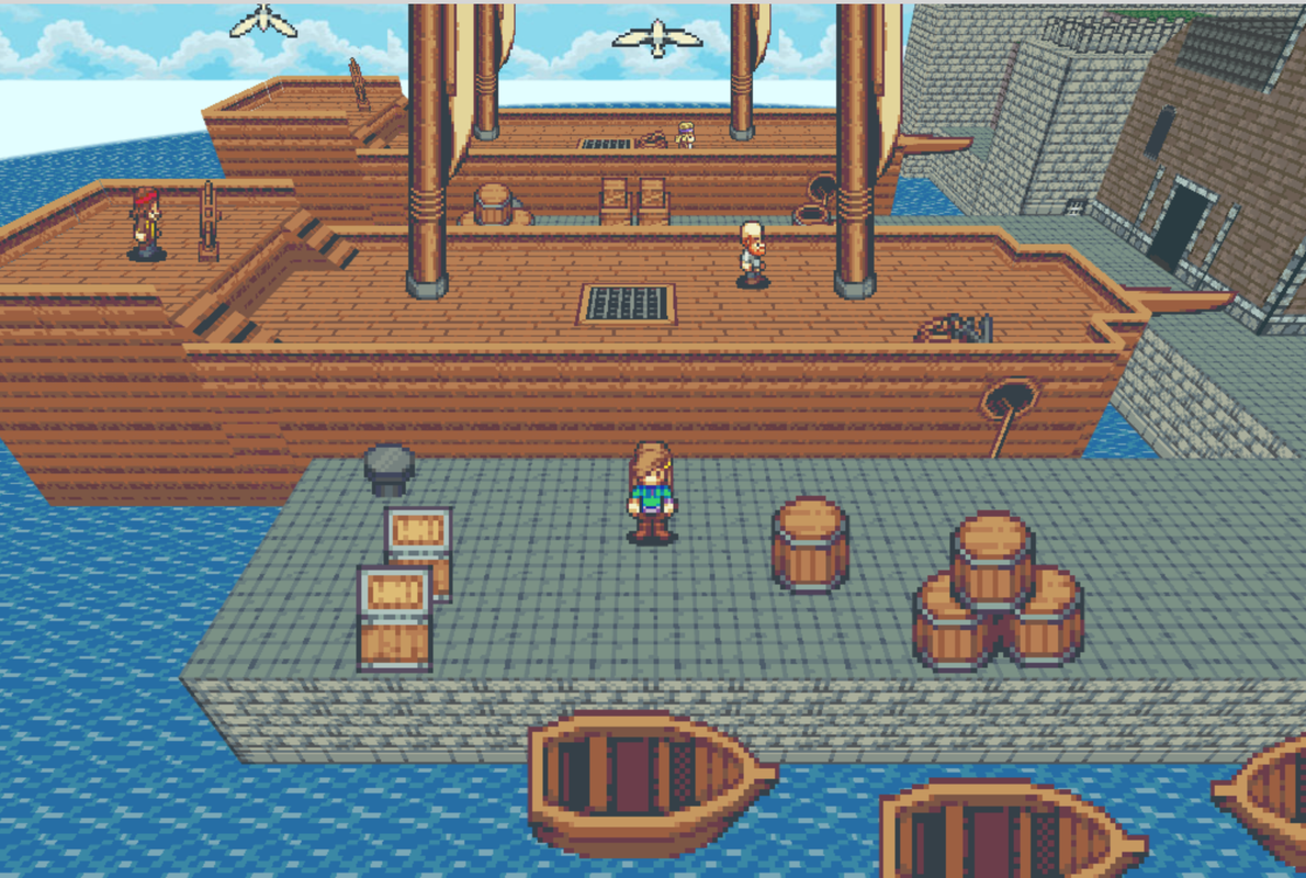
    A little view from the harbour.
  19. Little Revelations update...
    RV08.png

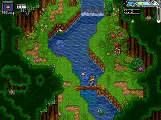
    Lilika Forest
    RV12.png
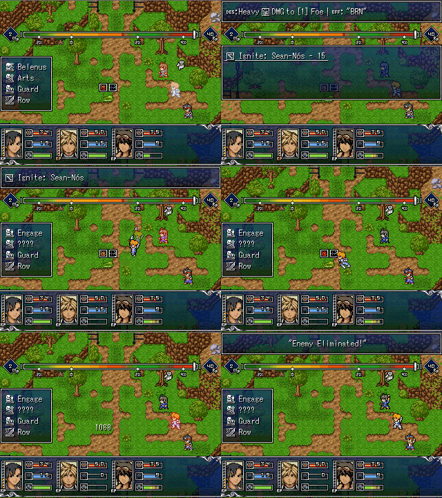
    More Lilika Forest w/ friends this time... updated HUD and yes I'm lazy so speech bubble indicates you can talk to an NPC and have more engaging dialogue.

    ezgifcomgifmaker2.gif
    Showcasing the Special Abilities... who doesn't like attacks named after Irish Gigs. Also please excuse the quality.
  20. @mephet thank you for your opinion, recently I changed the world map like D&D style but i really don't like it and delete it maybe i'll add Worldmap again and if i add i will mind your advice :)