Game & Map Screenshots 11

● ARCHIVED · READ-ONLY
Started by Celianna 2067 posts Page 55 of 104 View original ↗
  1. I have a WIP starting town map...I need some ideas for the layout for the rest of the map lol. The top right is the entrance to a cave dungeon, w/ a few parts blocked off (see top area aka small cave entrance) until you beat certain parts of the dungeon. Towards the top left of the map goes to another map (Cliffside), where the intro happens. Strange how the sky didn't show up in the screenshot. Please view this in its native resolution.:kaophew:

    The bigger house on the left is the blacksmith (crafting+shop). Then there are those 2 smaller houses, which I haven't really put to use lore-wise yet, as in I'm not sure who's gonna live there lol.
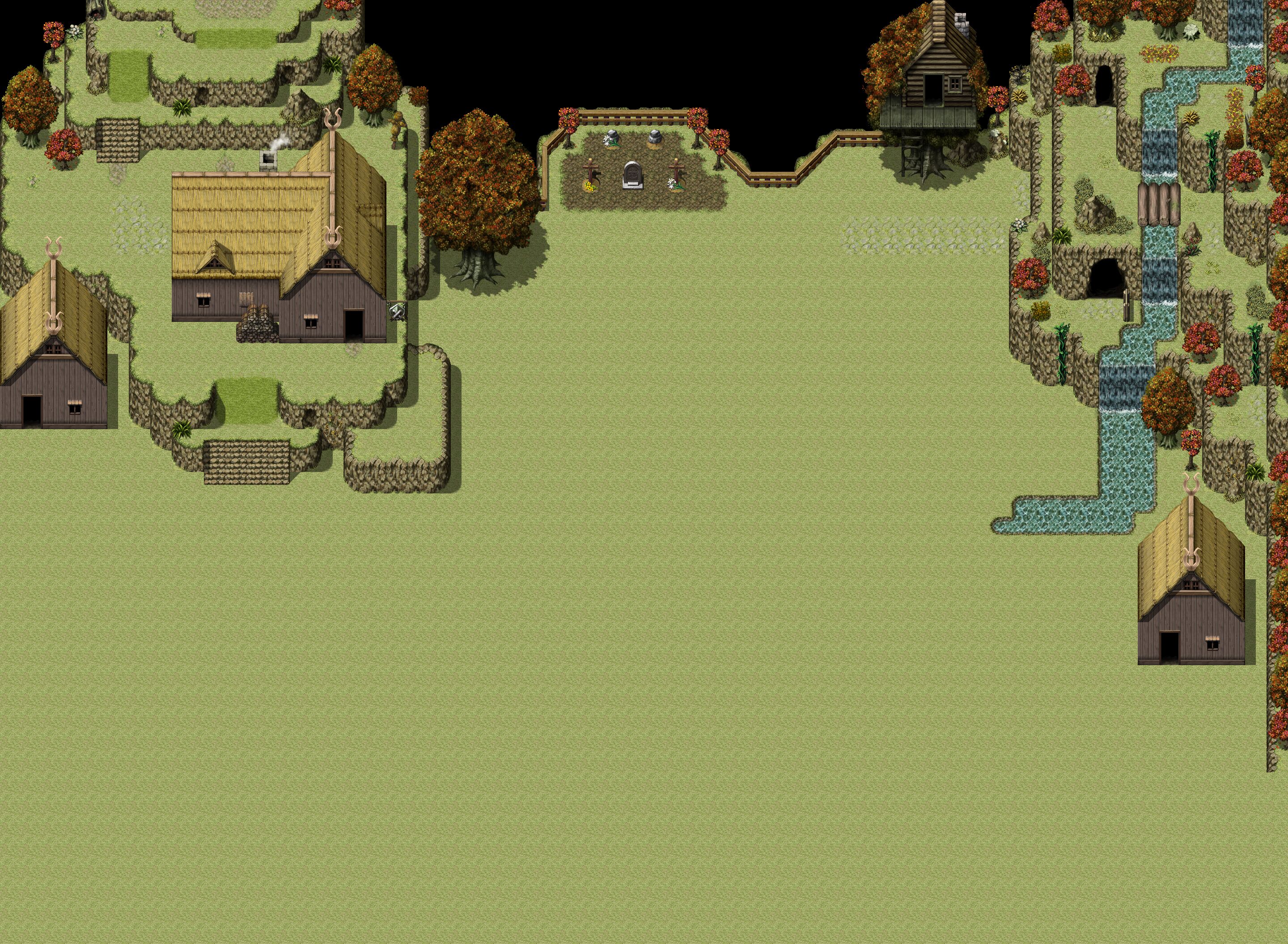
    Town.jpg
  2. here a video and an img about the crusader which i want to use in my new project as main hero.. i think i am allready near to put all frames on the right position and to resize without looking to bad..

    Screenshot_2.png
    the video shows different size tests
    (the big one is the default size)


    i tried to make it fit with the chibi style of other chars

    here is where i got the assets from..
    it allows even diagonal movement and also has fighting poses..
    (it uses 15 frames by default instead of the 3 frames MV uses)
    Isometric: Mini-Crusader by Remos
    what do you think , does this fit into the Chibi Style?

    ( also pls dont care about the black lines , these will be deleted with more accurate frame img edits)
  3. Hey I'm brand new to RPGmaker, decided to make a for-fun project for myself. I have about 75% of the maps I want for my first chapter, and want to start working on making NPC's, but I'm having trouble with the character generator. Let me know what you think.
  4. @SAmaster I think for your forests, you should either go w/ the black "ceiling" or the trees, but not both at the same time in the same place. Look at the top right of your Woods map and the middle-left of Woods 2. It looks kinda weird to have trees sticking out from a black background imo.
  5. @SAmaster

    Firstly, your interiors are very big, square, and empty.

    In the church (chapel?), the giant stained glass window and altar set up in the background is gorgeous, but a lot of what the player will see in the church is just floor and carpet, maybe some chairs.
    I'd cut out a lot of the sides of the map. Maybe take out 2 rows of chairs and 1 row of pillars on each side, and put walls there. Also the small windows look weird with the big ones.
    Very Rough paint edit that might improve it?
    Church.png
    There's still too much boring samey space with the seats, but I'm not too sure what to do with that while keeping it looking super grand and impressive.

    The... Inn? I feel like it might be an inn. Cause of the many tiny rooms with the commoner-ish beds.
    Anyway, it has so many rooms and hallways that are just empty. Like 50% of it is empty hallway.
    I'm not even sure where to begin with improving it but... Try to remove as many hallways as possible. And remove some of the extra rooms.

    I really like the town map with the train.

    The other one, again, big, empty spaces.
    And same with the little, side area by the castle(?) with the little pond thing. Too much grass with nothing to break it up, very square.

    As for the forest maps... They're a bit of a mess.
    I'd reccommend keeping the wall type trees the same height and not putting anything in the black leaf/ceiling tiles. Treat them like wall tiles and make rooms. And keep the smaller trees and bushes and stuff inside the rooms.

    As a general advice. I'd reccomend doing your mapping in 100% zoom. And playtest how it feels to wander around your maps often.
    I think a common piece of advice is; There should always be something interesting for the player to look at.

    I hope I helped.
  6. @Frostrom Well I wanted the taller trees I could get, but I also rather dislike the black space in between the leaves. If there was a way to do the leaves so they don't have black voids I'd probably do that.

    @Elissario Thankfully I have a second floor map for the church that lest you get a look at the bottom floor and the stained glass windows, so you can have a better look at them from up there. I wanted the church to be oversized to show that religion is very important in the setting- so the church is the biggest building in the town. You are right, I think I could serve to indent the walls a little bit.

    I felt the mansion was too large- I had trouble coming up with rooms for the upper and lower floors. The beds there are meant to be servant quarters.

    The big building on the top left is meant to be the church. I tried to get around the town being too blocky with some curved roads on the corners and some side streets. I don't really know how to make it less of a square though given how RPGmaker works.

    I've played around with the maps a lot with the playtesting, and I think they look much better from the zoomed in view, thanks for the advice.
  7. SAmaster said:
    The big building on the top left is meant to be the church. I tried to get around the town being too blocky with some curved roads on the corners and some side streets. I don't really know how to make it less of a square though given how RPGmaker works.
    Take a look at other people's maps in this thread for some inspiration. For example, look at @Frostorm's town map, even though it's a WIP. There's literally only 1 square looking thing in his map (the small square cliff sticking out next to the stairs in the middle/left of the map), but I suspect that part is still being worked on. The rest of his map looks very natural/organic. Also, make use of elevation a bit, perhaps not as much as in @Frostorm's map since that's a mountain village, but having a 1 tile elevation change here and there helps a ton.
  8. @Pootscooter

    I want it to be at the edge of a cliff. I could maybe add some more verticality at the margins though- maybe on the bottom.
  9. hinola said:
    Map progression
    from one week of mapping to 3 month later

    Domain Name Check & Register, Free Trusted SSL Certificates for Site & Hosting (you can move your mouse over the picture to see the difference)

    It's not 3 months of mapping of course, just some additions from time to time.
    Nice! Similar layout to how I did it (dungeon on the right, town stuff on the left lol). How did you get the scrolling before/after image thingy btw?
  10. Thanks

    The layout is quite instinctive, I just put that as it came
    I made the web page myself for the scrolling before/after
  11. So I need some ideas on what to put in this section of the map, which I've dubbed the "Golden Grove". It also has an entrance to the B1 floor of the beginner dungeon (there are 3 floors w/ various access points and sections you can only get to via certain entrances).
    SouthEast.jpeg

    Edit: Also, thoughts on the new Title font?
    1605584089467.png
  12. Experiment to animate the background of a battle scene. (RPGMMZ)
  13. Frostorm said:
    So I need some ideas on what to put in this section of the map, which I've dubbed the "Golden Grove". It also has an entrance to the B1 floor of the beginner dungeon (there are 3 floors w/ various access points and sections you can only get to via certain entrances).
    View attachment 168108

    Edit: Also, thoughts on the new Title font?
    View attachment 168147
    Flowers? Small rocks? Small trees?
    From Wikipedia, " A grove is a small group of trees with minimal or no undergrowth ". So there would be trees but no bushes or anything like that, mainly small stuff.
  14. cthulhusquid said:
    Flowers? Small rocks? Small trees?
    From Wikipedia, " A grove is a small group of trees with minimal or no undergrowth ". So there would be trees but no bushes or anything like that, mainly small stuff.
    That map has actually been worked on a lot since I posted that pic. Current state:
    GoldenGrove.png

    I just need to add a bit more on the top left corner. Also, do you see the chest? hehe
  15. Frostorm said:
    That map has actually been worked on a lot since I posted that pic. Current state:
    View attachment 168465

    I just need to add a bit more on the top left corner. Also, do you see the chest? hehe
    the chest is made of wood and steel? than i see it, but wont spoil here..

    for the top left corner you could use some grass and bushes, also you could add some little animals randomly moving to fill up the image..


  16. Finished it just in time for Screen Shot Saturday. :LZSexcite:
  17. Hello people,

    I've been working on creating an art style that combines pixel art with realistic elements using shadows, textures, and non-RTP assets. Since I'm not really an artist, I'd love to hear your comments about the general look of this art style and, especially, if I got the shadows right.

    Here's a YouTube video of the map. Thanks!

  18. @tonytank1
    Damn that's actually pretty incredible, huge old-school psp vibes I love it and you pulled it off really well! :kaoluv: Reminds me of one game in particular I can't remember the name of!

    My only real gripes are maybe the desaturation of the "backside" of the roof feels off (if that's meant to be the shadow I think the value should be turned down a bit <3), the grass-covered stairs don't seem to fit the grass, and I think the tree trunk's shadow is on the wrong side of the trunk xD! Those shadows are on point for this style tho seriously, and I feel are really consistent which is the most important IMO. :kaopride:

    If we were being really nitpicky I guess the shadow of that one tree left of the house would affect the corner of the house slightly to make it blend better, and I think the sw most tree's shadow isn't quite touching the base (or the ground color is making a weird "gap" appearance)?