Game & Map Screenshots 10

● ARCHIVED · READ-ONLY
Started by Celianna 1970 posts Page 97 of 99 View original ↗
  1. I posted a far less completed version of this a while back - but... progress!

    This is actually four separate maps, but one of my goals is to have all my maps "fit" together. Not using an actual world map, except as a reference to where stuff should go.

    Kurch_6-9-19.png

    Bottom Half, Left Third: Starting Village
    Bottom Half, Middle Third: First Field area you can explore.
    Top Half, Middle Third: This is an area that requires a quest item to access. Here, you fight... the Rabbit from Monty Python's Quest for the Holy Grail... and it's a brutal, optional fight...
    Entire Right Third: Second Field area, it's a mountain with a camp near the base, so you can rest/buy stuff. Caves near the top lead to the first dungeon.

    Maps need further decorating, but are pretty much done structurally, aside from some minor touchups.
  2. @AsuranFish As a whole it does seem to fit together as you intend though the beach areas (at least i think that's what they are) seem a bit out of place because the transition is a little to harsh, imo.
    I would suggest you also post the individual maps though so you can get good feedback on them too (unless you're not looking for that of course)
  3. @mathmaster74 okay so I can see a few things not 'right' with this map...
    62222730_347865655925805_7796142868111818752_n.jpg

    Green circle : I would move this tree down a bit, it sticks out a bit weird to me.
    Puple & dark purple : the shadows don't match... some go East while others fall more North East which gives a weird overall visual. (okay I might be the only one that thinks this)
    Red : these houses are way to small in comparison with the other buildings and their angle is to symmetrical and sharp, imo.

    Also the maps is pretty dayum empty. It could do with a lot more detailing especially in the grassy areas and around the edges of the map. Oh and the outhouse needs to be moved a bit to the back of the house, no one wants one of those near their front door ;)

    On the positive side : I like your town lay-out with most of the buildings centered around the fountain and the little bridge and the dirt where ppl walk though i think you could ad some more of that as there are still paths ppl would logically take that have no wear & tear now.
  4. So I think im just about finished with my magicshop/apothecary, does anyone have any thoughts? I'm especially not sure about the shadows. theres the ground floor shop, the upstairs living area, and the garden.
  5. @CheekyChelldos This is just my personal opinion, so feel free to ignore it~
    2nd Floor
    La la la~.png

    The one in the red rectangle is where I found the shadows to be weird. It doesn't really correspond with the light source that you put in the room. I find the placement of the object in the blue rectangle to be... hmm... out of place? It also somewhat limits the space for the player to move. I think it is better to remove it entirely. Also, I think it would be better if you put some windows on the second floor as well. Unless there are some side windows that won't show in the map. If there are, then the placement of the shadow will be different altogether.

    I'll edit my post later and try to go into more detail once I got home...
  6. Constance said:
    @CheekyChelldos This is just my personal opinion, so feel free to ignore it~
    thank you, I think I may replace the stone candle holders with windows. I'll move some things around and update

    edit: is there any trick to making a side window? im trying different things but nothing looks right
  7. how's this?
  8. @CheekyChelldos I'd remove the shadows on the walls in the small corridor. They look odd.
    The rest looks fine, as far as the shadow tool can go.
  9. Just wanted to post the new title screen for the game I'm working on:

  10. @EthanFox Looking really good! Personally I would leave the character bust out for a cleaner feel but thats Just me. :)
  11. @CheekyChelldos
    2nd Floor Remake
    Dulula.png

    Hmm... I was thinking something along this line... That is if you want the windows to be on the left and bottom side... No need to show it... Just make some light that originates from that direction to indicate that there are some windows over there... This is for evening lighting by the way...

    I just tried to make it using some basic RTP. The lantern is from PandaMaru tilesets though... and for some reason, I cannot find that cat tileset you used... You can ignore some of the object shadows, should've deleted those...
  12. I really liked making this scene of mine! So much fun working with action lines and moving the pictures around.

  13. bYKkOVb.png

    IaEf2a7.png

    Sneak peak into a mid-late game area of OHMIC that can be visited for training/level grinding if the player so chooses; the name is Magma Fields. It's not 100% complete (planning on adding some more small details), though it's roughly about where I want it.

    The 2nd map, as you might have noticed, has a few ropes that lead to two items and an optional high-level Fopperij (Mimic-style enemy) to fight for lots of cash and high-end loot, if the player so chooses.
  14. Testing a new light/shadow effect on maps, I appreciate the feedback!

    jVdXNQS.png

    Thank You!
  15. zacheatscrackers said:
    Spoiler
    bYKkOVb.png

    IaEf2a7.png

    Sneak peak into a mid-late game area of OHMIC that can be visited for training/level grinding if the player so chooses; the name is Magma Fields. It's not 100% complete (planning on adding some more small details), though it's roughly about where I want it.

    The 2nd map, as you might have noticed, has a few ropes that lead to two items and an optional high-level Fopperij (Mimic-style enemy) to fight for lots of cash and high-end loot, if the player so chooses.

    I hope you have plans for some lighting over the top of these maps because the repetitive tile work makes it really hard on the eyes. I understand the use of the RTP but I think the use of magma tiles for the cliffs and cliff tops instead of just the ground later makes but it way too harsh visually.
  16. @Lycanimuss I like the tone and range of your lighting.
    Only thing that comes to mind is that it illuminates parts that are not under direct lighting, like the top of some roofs.

    And don't forget to add shadows!
  17. I changed the map a bit, now there's more than one exit and she looks more happy.

    Prisca.png
  18. VisitorsFromDreams said:
    I hope you have plans for some lighting over the top of these maps because the repetitive tile work makes it really hard on the eyes. I understand the use of the RTP but I think the use of magma tiles for the cliffs and cliff tops instead of just the ground later makes but it way too harsh visually.

    I could easily darken the ledges/walls on the second map a tad, if that helps; I can understand why the brightness could make it difficult to look at. I took the liberty of removing some of the rocks in the complete version (which I'm happy to post if anyone is interested), as well, so it's not quite as repetitive. Appreciate the feedback ^^
  19. @Lycanimuss I haven't seen any screenshot with really nice lighting effect like yours recently. I can rate 11/10 for the quality of your screenshot lol
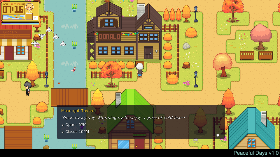
    Btw, I'm working on tileset for Autumn season in my game.
    D8_LPY3U4AEsO1N.png:large