Game & Map Screenshots 10

● ARCHIVED · READ-ONLY
Started by Celianna 1970 posts Page 98 of 99 View original ↗
  1. dsiver144 said:
    @Lycanimuss I haven't seen any screenshot with really nice lighting effect like yours recently. I can rate 11/10 for the quality of your screenshot lol
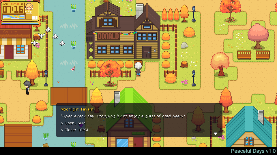
    Btw, I'm working on tileset for Autumn season in my game.
    Spoiler
    D8_LPY3U4AEsO1N.png:large

    I cant say I am a fan of the NPC sprite designs BUT the tile sets look brilliant and im excited to say for the first time ever on these forums I love how clean your UI is and how simple and legible your font choices are!
  2. @VisitorsFromDreams Thanks so much for the great feedback. I put so much time on drawing the tileset. The sprite for NPC is temporary, I will update more in the future :D
  3. dsiver144 said:
    @VisitorsFromDreams Thanks so much for the great feedback. I put so much time on drawing the tileset. The sprite for NPC is temporary, I will update more in the future :D

    If I had one piece of UI feedback it would be that the text box "next" indicator doesnt visually tie in well with the text. I think if the light grey outline was replaced with the same yellow as the location title (or if it had no outline at all) and if you give it the same 1 pixel drop shadow the rest of the text has itd look pretty damn perfect. :thumbsup-left:
  4. Thanks again for pointing it out for me, I always need these feedback like this :D
  5. Hi everyone some advices and feedbacks please.
    c89pi8B.png
  6. @Dusttt It would help people if you said which aspect(s) you particularly wanted feedback on, otherwise where to start?
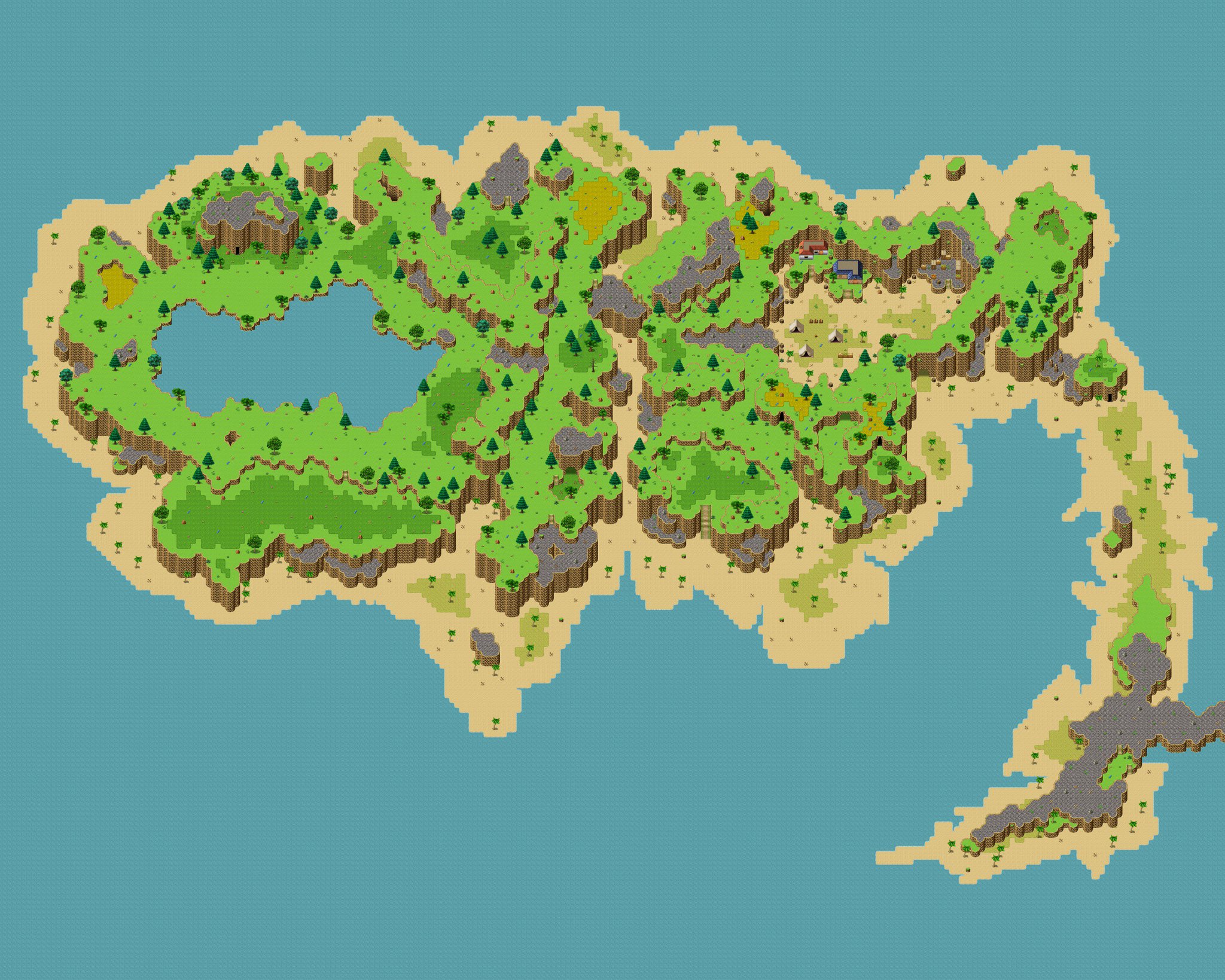
  7. Well... Got several maps that need some feedback...
    All of these are just basic concept though... No lighting, weird shadows, and more~
    I would appreciate it if you could give your opinion on the layout and composition of the map~

    Credits to:
    • Avery (Tileset)
    • Cyanide (Tileset)
    • Pandamaru (Tileset)
    • Whtdragon (Tileset)
    • FSM - Woods and Cave (Tileset)
    • FSM - Town of Beginnings (Tileset)

    Basic Concept
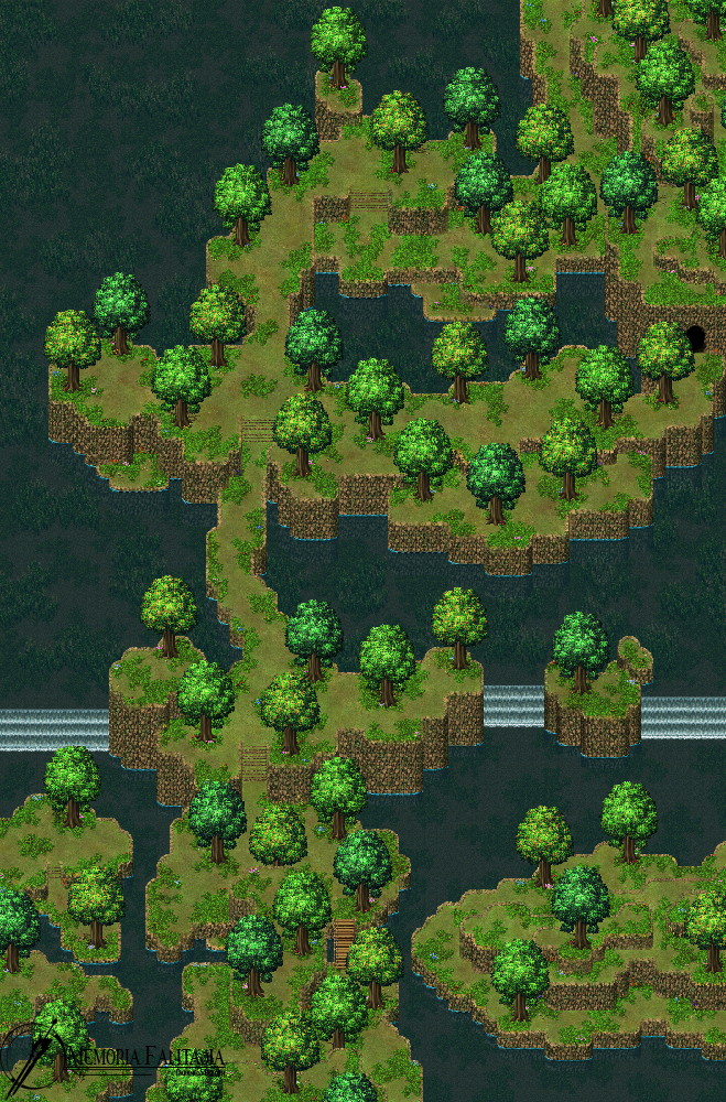
    Valstein Forest - Map 5.png
    Well, this map is part of the Valstein Forest that I made a few days ago. There is a lot of water, yes, mostly because there is a great waterfall located northwest of this map, where I am planning to create a large body of water with a few small 'island' jutting here and there...
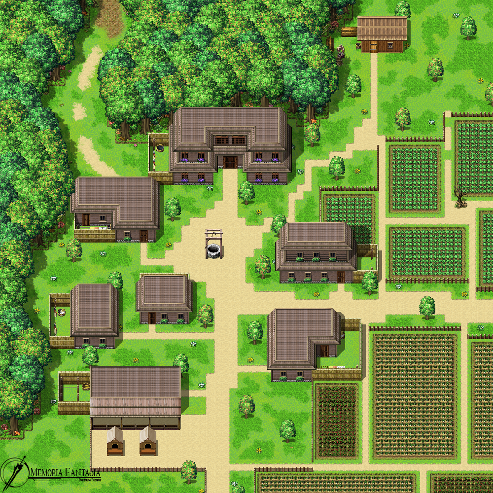
    Village.png
    A basic concept for a village I have yet to name. Located near a medium-sized woods called "Elkwood", because of the large population of elk inhabiting the woods. Which is to say, their main source of income is by trading elk pelts and other animals product they get from hunting. Some of the villagers also own some fields which they use mostly to grow berries, radish, cabbage and such, for eating and trading purpose. While the village is in good condition, it is, in fact, a bit underdeveloped. This is because the village is located in an unfavorable terrain near the border of a hostile Kingdom border, and so the government is a bit reluctant to develop it in fear of an enemy attack.
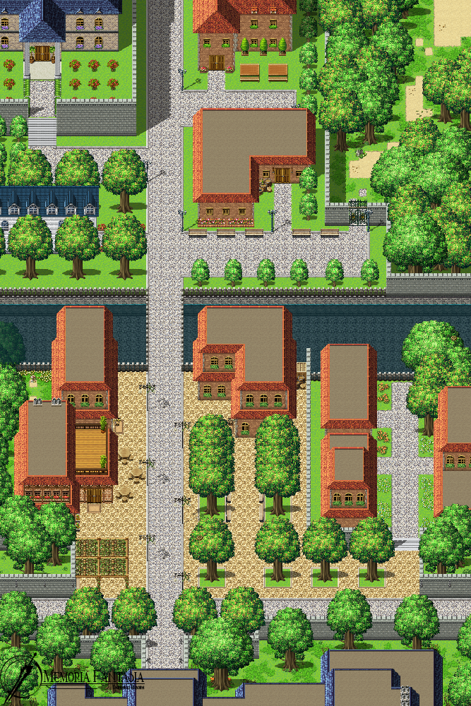
    Town.png
    A small outer part of the Town of Coalfell. Located a few hours away from the capital, this simple town is created surrounding a military academy. Most of the inhabitants work as staff administrator of the academy. Some choose to open up a tailor shop, weapon shop, inn, or curio shop. Students and some staff of the academy lived in the dormitory provided to them, which differs from one to another by their class of nobles and commoners. Since they're located in the central area of the kingdom, the Town itself is quite developed, having magic lamps around the street and more advanced facilities compared to most.
    And here's the mini bedroom I made~ With all lighting and shadow done...
    But I came upon one problem. My screen resolution will be 1104 x 624, but the room is kinda small so the screen will look pretty empty. I basically need your advice on what can be done to fill the screen without increasing the size of the room.

    Mini Room~
    Little Room.png
    A bedroom for a little girl. Since the girl's family live in a rural area, they don't have much in the way of architecture. The whole building in the neighborhood is built with wooden material. Her father and mother work as a merchant, so they got a bit of money to spend. The magic lamp on the left low-table could be turned on and off. The orb on the right side is actually a music box (globe?) and will give off a bit of light once you turn it on. The windows in this room are located on the right side, which is why that area is a bit brighter than the rest of the room. This scene is for nighttime, so the light is not so bright.

    Once again, I'll appreciate any feedback that you can give~

    Psst~! Be gentle!
  8. Was remaking message system today for my game. Does it look okay guys? >w<
    xuSV6Sa.gif
  9. I would appreciate a light and night mode textbox option. I think just the transparent black makes it harder to read for me, considering the game itself is very bright.

    And maybe show the entire portrait above the waist? Looks a little odd floating above the text box like that. But it's nice otherwise!
  10. Np3tzeC.png
    Sneak peak at a major mid-game battle in OHMIC, against Adam and Eve Alazne, the head of a notorious drug cartel and his top enforcer, respectively.
  11. @Celianna Thanks very much for the feedback, especially from you my fav artist.
    I will add an option to choose between light and dark mode at you said. And why I just show the portrait on that weird position is my drawing ability is limited, I just can draw something like that now, but everything can be replaced easily in the future with new graphics and a few line of codes. Thanks again!
  12. I *finally* have something to show you~ (After 2 years of constant procrastination and nothingness)
    Spoiler
    Untitled-11.png

    I got most of the resources seen here from nicnubill (That I edited). Some are the MV defaults and the character is made from scratch by me (I'm never doing that again. Hopefully I saved it as a base so I don't have to go through it again)

    Any feedback on this map is appreciated! ^^
  13. @Hyouryuu-Na I had to turn the screen brightness up quite a bit to make out what was on that map. I think you may have slightly overdone the dimness. I get that you wanted a dark room, but the player still has to be able to see their way around. I also think that you would be better making that map less wide. Each tile represents about 3 feet (taking a single bed as the template for that) so the chalkboard alone will be heading up to 20 feet wide. No teacher is ever going to be able to utilise that sort of space, and wouldn't be able to control such a dispersed class. It also leaves you with a prodigous amount of empty space. I would suggest bringing the desks in closer together and making the whole thing more compact.
  14. @Kes Thank you pointing those out!
    My monitor has pretty high brightness settings so I didn't really notice the dimness. But there's an option to increase or decrease the brightness of the game so that should be fine.

    The furniture are all doodads so I had no idea how large the room should be while I drew the room in the editor. Then I realized it after I put in the doodads. But I decided to keep it as is and post it here so everyone can tell me what I should do to fix it. Thanks again!

    Edit: I should note that all these doodads and characters are 2x (approx.) of the default MV stuff. Does the room still seem sort of wide? Maybe I should reduce the part of one desk and chair from the side... I haven't really spent time on mapping and I really lack experience on that.

    Edit edit: So I took reference from an actual Japanese classroom (should've done that before)... I was just unconsciously taking reference from my own classroom at school which is very huge that fits 100 people in it lol
  15. Okay, I'm gonna say it. I had to talk about this on stream earlier today, so I'm doing it again.

    Go turn all the lights off in your room. Light a candle. See how much of your room you can see? Most of it. PLEASE MAKE YOUR LIGHT SOURCES MUCH BRIGHTER!


    Sorry, just had to get that off my chest. Having had a ton of blackouts in the past half year and having to use candles as a light source, I'm well and truly over the whole "OMG BLACK ROOM WITH TEENY TINY LIGHT SOURCE JUST BARELY SURROUNDING YOUR CHARACTER" epidemic. I promise you, players will be more spooped by being able to see that something was there to be scared of, than just going "wait, there was something there? where, though? I didn't see anything...?"
  16. @Ksi Yeah, you're right ^^ I've never really thought about the mapping or graphical part of my game before. I was always so busy thinking about the plot and how to pull an event off and such... I too can't really see anything but darkness on my phone from that ss. Thanks for pointing that out!
  17. I put about 50 or so hours into this map. It's 250x200 tiles so the zoom out really doesn't do it any justice. I have since changed the bottom right corner a bit so that the rocky cliff no longer goes off the map. This isn't for any particular project but was merely an outlet for my creative itch. You are also to walk over and under any bridge sections and they function as intended. For example, the entrance to the little village, you can enter it through the beach areas. but also walk on top in the grassy areas. Maybe I'll use this for some sort of project int he future.
    D8-CTJMXkBAYm6K.jpg:large
  18. @InFecTioN Your image doesn't show. Could you please try and reupload it.
    Thanks.
  19. @InFecTioN @Kes I can see it...
    Using Firefox on desktop.
  20. @cabfe That's what I'm using and all I get is:
    upload_2019-6-24_10-53-46.png and it doesn't reload when I select that option.