@Emanzi This thread is for getting feedback on maps, screenshots of menus etc. It is not for feedback on sprites and busts. I suggest you start a thread in Resource Support which is geared up for that type of feedback.
Game & Map Screenshots 10
● ARCHIVED · READ-ONLY
-
-
@Kes sorry, my bad. I'll start my own thread.
-
Exams, exams and exams but never too tired to test some new environment assets
Rockyplains -
Are those pvgames tiles??
-
They are
-
Working on the world map for my most recent project. Made several iterations, but so far this is the one I'm happiest with.
Image
It only covers one country/region, and is more a level select screen than anything else (hence why it's only one screen wide. The idea was that the geography is the way it is as a result of a catastrophic flood that took place at least a thousand years before the story begins (a supernatural act that came from that temple in the upper left), and the region in general is meant to be somewhat post-apocalyptic but recovering. Not sure how well that comes across here, though.
I'm also not 100% happy with the dungeon placement. The intended gameplay order is Temple -> City -> Broken Castle -> Forest -> Desert Town -> Mountain, but while I'm mostly content with how the Desert Town and Mountain are placed it looks like the Forest is meant to come first and then the Broken Castle. I'm not sure how to rectify that without sacrificing the castle's coastal placement (or just reversing the Forest and Castle's order).
And finally I'm not entirely happy with the mountain placement, but other than extending the sea I'm at a loss as to how to make it clear that the map ends at the edges without a lot of mountains.
It's also worth noting that this is more just to get a feel for where everything's placed/the regional geography. The final version of the map is likely to have some graphical edits for a more somber feel. -
@Davekron I would soften those sun beams - I think they are far to strongly defined. Sun beams are much more diffuse, and you would have to have a really weird cloud formation to get so many very narrow beams so close together as you do just to the left of the wolf.
-
Working on the demo-project for my plugin-pack named Immersion for MV.
What do you think guys? About the light on the map and his transition (is everything on the same map-id)
(Use your headphone for a better experience!)
-
@Kvothe This thread is principally about graphics - maps, menu layouts, title screens etc. You seem to be asking for feedback on the music side of that sequence. If that is the case, this is not the place for it.
-
@Kes : Isn't the case, I was asking for feedback in general, I've just metioned the needed of headphone for a better experience. Let me change that (I guess that I've made some confusion about it )
-
@Kvothe The effects work very well. The effect as you move through the different light sources are very natural, to the point I didn't really notice them the first time because it just looked right. And with that background music, I was just feeling the mood of the setting.
@Davekron I'm glad to see what others are doing with new resources from @Jesse - PVGames. I do have to agree with the previous comment that the sunbeams overpower it, and actually distract from seeing what is actually a nice map.
So far, I have been playing more with the buildings, and not so much the cliffs. I have so much love for these new resources.
ScreenshotsOutside The House


In-Game Transitions
Built with lots of layers being changed out through player touch events using @Galv 's layers plugin. -
@Zyphli - I am glad you are enjoying the resources! You have done some great things with them :)
Question though, why do the characters (the sitting lady and the shirtless guy) look so blurry? Also, looks like some of the objects are a bit blurry, too (which I know all of these things are not, so maybe some sort of editing made them blurry, or perhaps image compression or something?)
And a minor bit of feedback: Since you are already using Galv's layer plugin, why not use that for the water layer too and animate it? If you use two layers of the water, one on the bottom moving one direction, and a second layer atop that one one moving in another and at a lower opacity, you can create a really neat moving water effect. I think you know how to do that since you already have the clouds moving :) -
Thanks for pointing out the blurriness. I had image compression set to max in the GIMP exports, that was making them blurry. Wasn't really noticeable in game on my small laptop.
- Actually, I re-exported with no compression, and no change. But when I re-downloaded from Web, it had been converted to jpg, and comparing the two, the web copy is more blurry than what I originally exported to imgur.
I hadn't done anything I liked for animating the water yet. I'll go try that out. Thanks again. -
@Zyphli I just looked at the settings I used for water in The Last Journey, maybe give them a try and see if you like the effect?
LAYER 0 PVWater -0.25 0 255 0 0 0 0
LAYER 1 PVWater 0.25 .25 80 0 0 0 0 -
Thanks @Jesse - PVGames , I love it.
Including a quick clip of the results for anyone that wants to see the effect.
Animated Parallax Water -
Okay, first time posting as I've been lurking around these forums for quite some time and soaking in all the terrific knowledge, but never actually jumping in...here goes!
This is a map for a Weekly Game Jam project I'm working on this week. The theme is "Strange Garden". All the assets are from incredible artists like Cyanide, PandaMaru, and others. There's an interior house map as well. The game will of course have full credit to all the artists and will be free to play. It's basically a thematic/narrative-driven game with a small farming system. It's due in like, uh, a couple days, so cross your fingers that I finish in time!!
Spoiler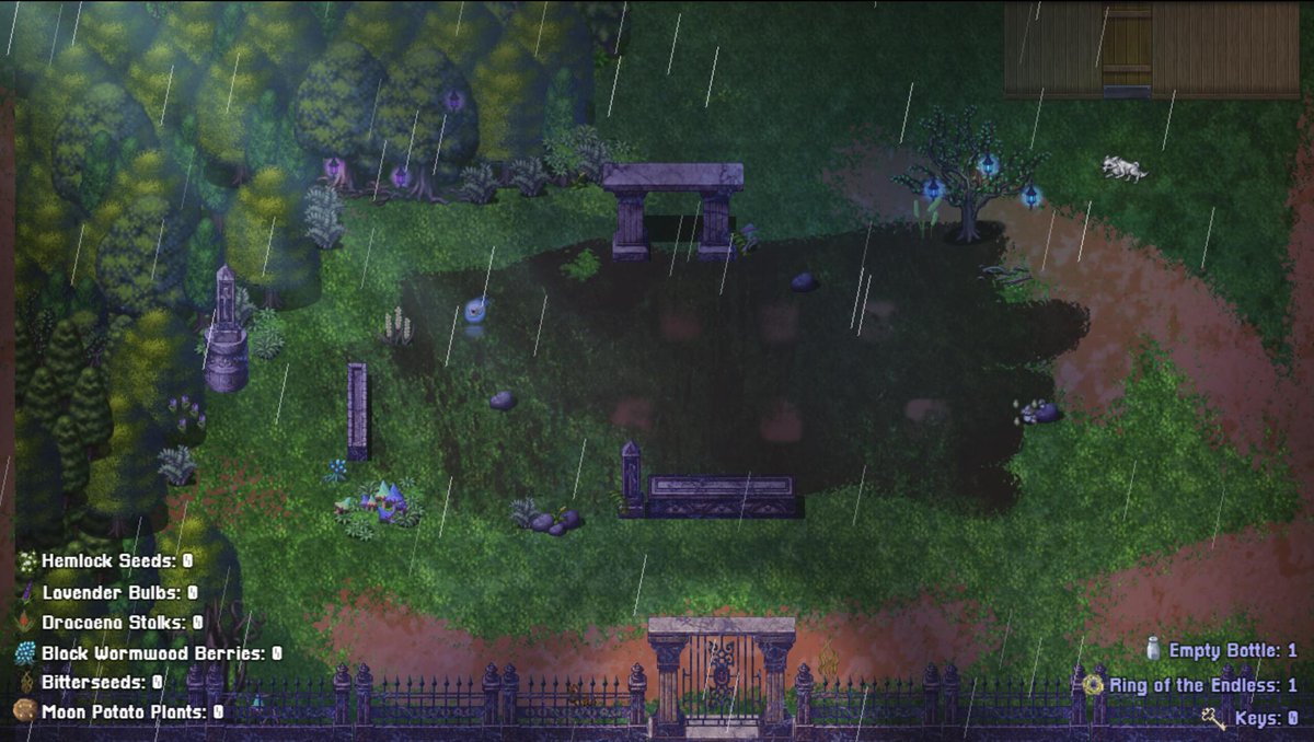
-
After 7 hecking tries at this world map, I think I have something I'm fairly satisfied with:
World Map #7
Some more backstory: each of the four dungeons (ruined castle, forest, desert, and mountain) host one of the world's four crystals, built by the local civilization to beat back the flood that ruined the world to begin with. In light of that, I tried to place the dungeons so that each of the four crystals covered a reasonable part of the world. The forest and ruins look a little close to each other, but for the latter the big tree is the entrance, while I imagine the actual crystal is somewhere in the forest's bottom-left part.
Those dirt mountains surrounding the forest are "fake" mountains, created when the flood uprooted all that dirt and dumped it elsewhere. I imagine something similar happened with those rock hills in the mountain area and those hills between the temple area, the hills behind the temple, and the hills between the temple and the city.
Once again this is more a layout thing than anything else. Mostly putting this here for some last-minute feedback before moving on to the graphics editing part of things.
Apologies for not commenting on anything else anyone's posted up until now; I just can't think of anything to say other than a generic, unhelpful "looks good, guis!!!1" -
After 7 hecking tries at this world map, I think I have something I'm fairly satisfied with:
World Map #7
I think it's fine but I feel that you need more empty space, all the locations are very close to each other. Usually you want the player to travel a bit before reaching in a new place of the world map.
---------------------------
Spoiler
I'm making a 3 floors apartments building but Pop Horror only comes with a front side ladder, so I made some edits in the original tiles and tried to make everything fit together. -
Spoiler
I'm making a 3 floors apartments building but Pop Horror only comes with a front side ladder, so I made some edits in the original tiles and tried to make everything fit together.[/QUOTE]
I LOVE this. The color palette is great and the tiles look fantastic. -
Hey there people, long time without posting anything again, been really busy learning how to code and recently started experimenting with javascript, so im making an old school dungeon crawler/pen and paper rpg system and its a lot of fun!
Think of dwarf fortress + wizardry.
Dungeon Crawling/Pen and Paper RPG system