A screenshot of work-in-progress game: Dark Days Of Rising Sun. Planning to relase it on Linux/Win/Mac.
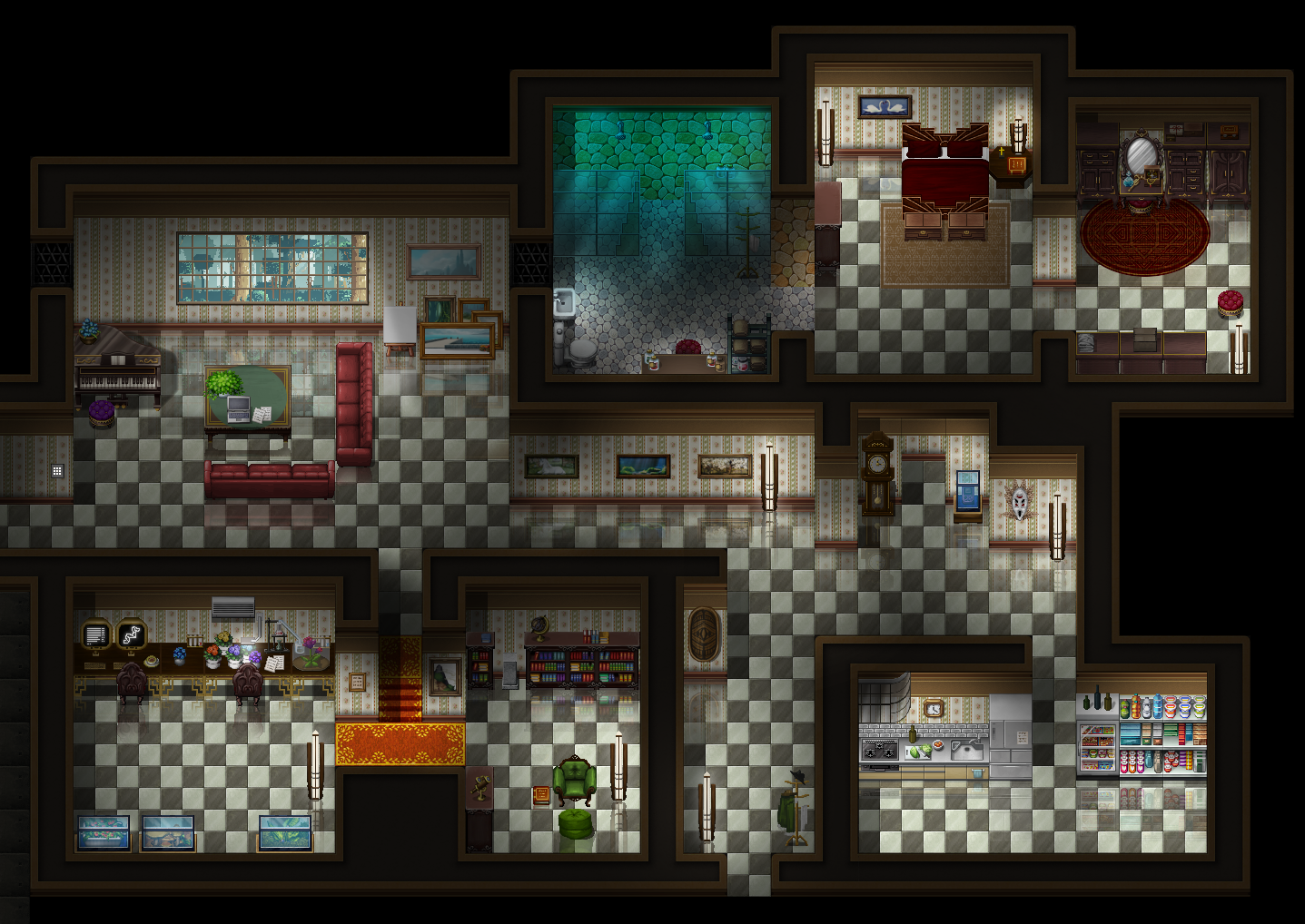
Game & Map Screenshots 10
● ARCHIVED · READ-ONLY
-
-
Thanks for your feedback, friends. I'm terrible at editing tiles, but I would love to make it a two-tile tall support for the bridge.
Spoiler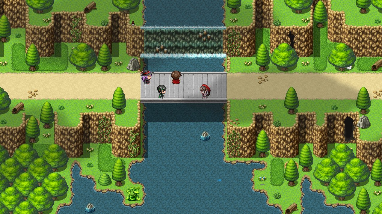
I also learned that apparently Khas' Ultra Lighting for MV removes all shadows in game, and I don't think it has any plugin support to disable it in-game. I probably will have to end up making the bridge support tiles since I won't be able to depend on auto/pen shadow it seems. -
@SOC I'm glad you made a clear pathway, I think that suits your map a lot better.
-
@SOC one thing you could also try if your going to edit some support for the bridge is to perhaps use only the diagonal bit in the corners.
-
Would someone mind perspective checking me? And/or general compositional advice. (It's currently still in literal basic shapes, but I want the structure of it to resemble gothic revival architecture!)
Spoiler
-
Playing with the new Mythos Reawakening tiles. I'm rather enjoying them.
It looks like the beginning of a Who Done It story.

But it doesn't look like it ends well.

-
@AmieLK the front towers appear to be shorter then the back ones. Front go 1 tile in, back ones 2 tiles.
Same goes for the center piece... 2 tiles from the back edge, 1 tile from the front edge.
The front roof also appears to be below the main building instead of equal to it (If that makes sense).
Now this can be fully intentional and with details filled in it might look spot on but cubical like this it feels a bit off :)
One tip when it comes to checking perspective yourself is to look at it upside-down as it helps you see the shapes in its composition in a more neutral way. Outside of that there is not much to say about it (yet) though I might have made the outer towers a little bigger in general.
@Zyphli Looking good. Only nit-picking thing I can add is it's a bit too colorful and would benefit from some darker lighting/shading to make it appear more 'gritty' but that's 100% personal preference :D -
@Finnuval How's this? :D (The upside down trick was VERY useful, thank you!!)
Spoiler
Still gotta add window details and doors and stuff, but. Not too bad, I think! -
@AmieLK looking good :) only the angled roof bit in the front (what probably is the en trance) still looks a little weird, imo.
As for the trick: ikr! Very old trick but one of the best there is :D
Loving the overall design. Color will decide greatly what mood it Will have in the end but the basis is very nice. -
@Finnuval Alright, Finn. One more for tonight. I thiiink I fixed the wonky entry. Perspective grid says the original one was correct, but I agree with you. It looks weird.
Without further ado:
Spoiler
Texturing of the walls/roofing/etc pending upon painting~
Edit: I only JUST realized i forgot to add depth to the flat horizontal railings and the little half-circle windows. bALLS. that'll be a job for Future Amie. -
@AmieLK looking much better, imo. And yeah our brain sometimes works a bit funny is in that regard where something is correct but seems off.
-

My animation for traveling to alternate dimensions. -
@The Mighty Palm looks good. All i can think of that might make it even better is adding some particles being sucked into the rift when the character dematerialisazes at the start of the blinking
Edit : alternativly slowing down/drawing out the dematerialisazation -
Been a while since I posted any map in this. Currently working on a scene inside a small camp that is set up to defend against potential monster attacks, and is located in a high cliff area. It's part of a larger map, but the camp itself fits on a single screen... (the non-soldier people are the player + recruitable characters)

-
@Milennin Looks good so far, maybe rearrange the baricades to the west to make more of a walloff as there seems to be a 3 tile wide opening and a holde below it.
Topic:
Didn't get much done this month, but managed to make a new Userinterface. (the old one got some negative feedback for being too large)
-
I am working on a simple puzzel where the player has to follow directions on the ground in order to not get lost. Hey, not the most original puzzle in the world I admit, but a nice little throw-away to keep the player occupied. If you saw this arrow on the ground, would you go to the left or the right?

-
@Canini It could actually be either way depending on how you use symbols/images in your game as it both reminds me of a sword (making me go right or a bird making me go left... sorry if that doesn't help but there you have it :D
-
@Canini Yeah I can also see that going both ways. The little, tail things om the vertical line both makes it feel like its pointing left (like, a crossbow or bow aiming that wat), and that youre trying to indicate a giant arrow right.
But you could always have the first arrow of the puzzle lead to an instant dead end if you follow it the wrong way. -
Okay!! Lines for the castlegrounds/castle are more or less done. Vita sprite included in there for size reference. I need this castle to have a wow-factor to it. I want it to be breathtaking. I also want to be able to use different colour schemes for when it's welcoming, vs. when it's threatening.
Anyway, any critique, suggestions, or ideas would be welcome!
Spoiler
-
Amie, make the palette bright and colourful for when it's welcoming, and purple/red when it's menacing. Colour theory is extremely fascinating, but it is really hard to get down right.
So, I'm working on a horror game (sort of) and I wanted opinions on whether having a miniature hub map was a good idea or not, or if there's anything else I'm missing from the design.
Here's what it looks like without any of my shader nonsense; for visibility's sake.
Spoiler
And here it is with all the shaders, lighting, several parallax clouds, all the fun things I shouldn't be allowed to do. (I'm going to add the shadows to the other two buildings later)
Spoiler