Game & Map Screenshots 10

● ARCHIVED · READ-ONLY
Started by Celianna 1970 posts Page 88 of 99 View original ↗
  1. @Canini if you want to go the extra mile, define the correct orientation of the arrow somewhere else, like in an inscription or on a sprite. that way the player sees it on its side here and immediately knows where it goes.

    @MoonMoonGames i love tiny maps, i love hub maps, and i double-love tiny hub maps (especially this one you've got going on here). if it were me, though, i'd make it a little more closed-in by vegetation. parallax mapping for that is a plus, though not required. and since it is horror, the look and feel of it can go either way- cozy safe haven, or claustrophobic middle of nowhere.

    yanyway
    papa's working on a new tileset, so pardon mister blank templateman.

    2eeedch.png
  2. fykqMx.jpg
    These are the latest images about my game.
    Tactical RPG & Puzzle: OutSchool: <--snip-->
    Screenshots
    X%2FXmWW.jpg
    29ZjGQ.jpg
    96eiEY.jpg
    4yU6yL.jpg
    xJmpVc.jpg Get it on play store : <--snip-->
  3. @kenjivn14 Please do not use this thread to advertise your game. Create a game thread in Commercial Games, having read the Rules and Guidelines first. I have removed your links, as this is not the place for them.
  4. The Mighty Palm: I agree with Finnuval's assessment in that there's something not quite polished about the "particles" of the sucking-in animation because of the framerate. I think maybe you might want to try other animations, like flashes of lines/circles or something, if you can't determine a way to do the dissolve effect.
    Everything else is lovely.

    Dx7pqEJ.png
    hi i love doing transparent water.
    It's not terribly obvious from a still image, but there's supposed to be a waterfall on that far edge there. Here's a gif version of it, but it's not perfect because of the overlay.
  5. Capture.PNG

    I revamped the character creation process for my game Eternal Dreamers. Inclusion and diversity has always been important to me, and I want to see that reflected in the game. To that end, I made two primary changes:
    • Removal of the sex selection: before, players were forced to choose between male and female player avatars. Now they don't have to worry about making that choice, able to simply choose whichever appearance they identify with best
    • Wild arrangement of avatar options: white male is the known default for most character creators, but why? Asking myself that question, I decided to forgo this archaic order, instead opting for a wild arrangement of all sex and ethnicity options. Everyone is equal, and no one comes first. That is reflected in the titling of these options as well, as they use letters over numbers
    These are small changes that did not require much effort on my part, but that I think can make a huge difference to the player. I urge everyone with a character creation system in place to take similar steps. It will be worthwhile!
  6. So while I'm studying for exams, I've started messing around with the MV RTP again. I'm finding that maps look quite a bit better if I combine elements from both the Sci-Fi and the Fantasy tilesets. I'm hoping to get enough leeway out of them that I'll be able to build some maps that have a distinctly fantasy feel while still using some slightly sci-fi elements.
    As always, thoughts and critique are appreciated. :)
    Spoiler
    xFCZm0k.png
  7. @Tayruu
    Looks great, but there's a problem with cliff height at the top-right of the waterfall. The cliff next to it should be two tiles high not one. Ooops~ ^.^)b

    @Lorenze
    Love the water. Transition is booyah, though if there's a lot of battles in the game it could get annoying with how long it takes. Maybe get rid of that wait at the end of the cracking and if possible the loading of the cut-in face for turns be sped up a bit more?

    @shadefoundry
    I recommend having the paths connect to the houses a bit more as those are where people walk the most (thus causing the paths to wear away the grass in the first place). Maybe also add a few more residential houses since there's seemingly only two in a village filled with shops.
  8. I can't move on with this map. I love to map dungeons hehe.
    foOLqjt.png
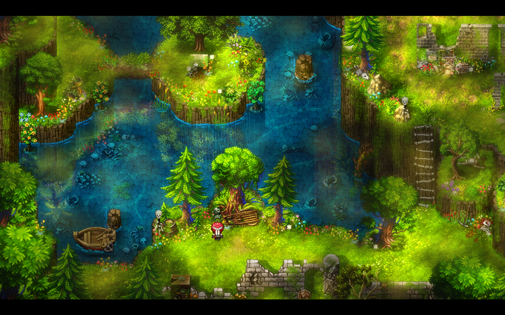
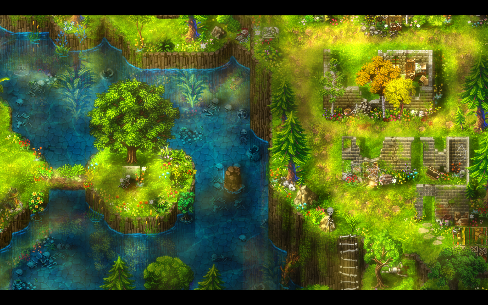
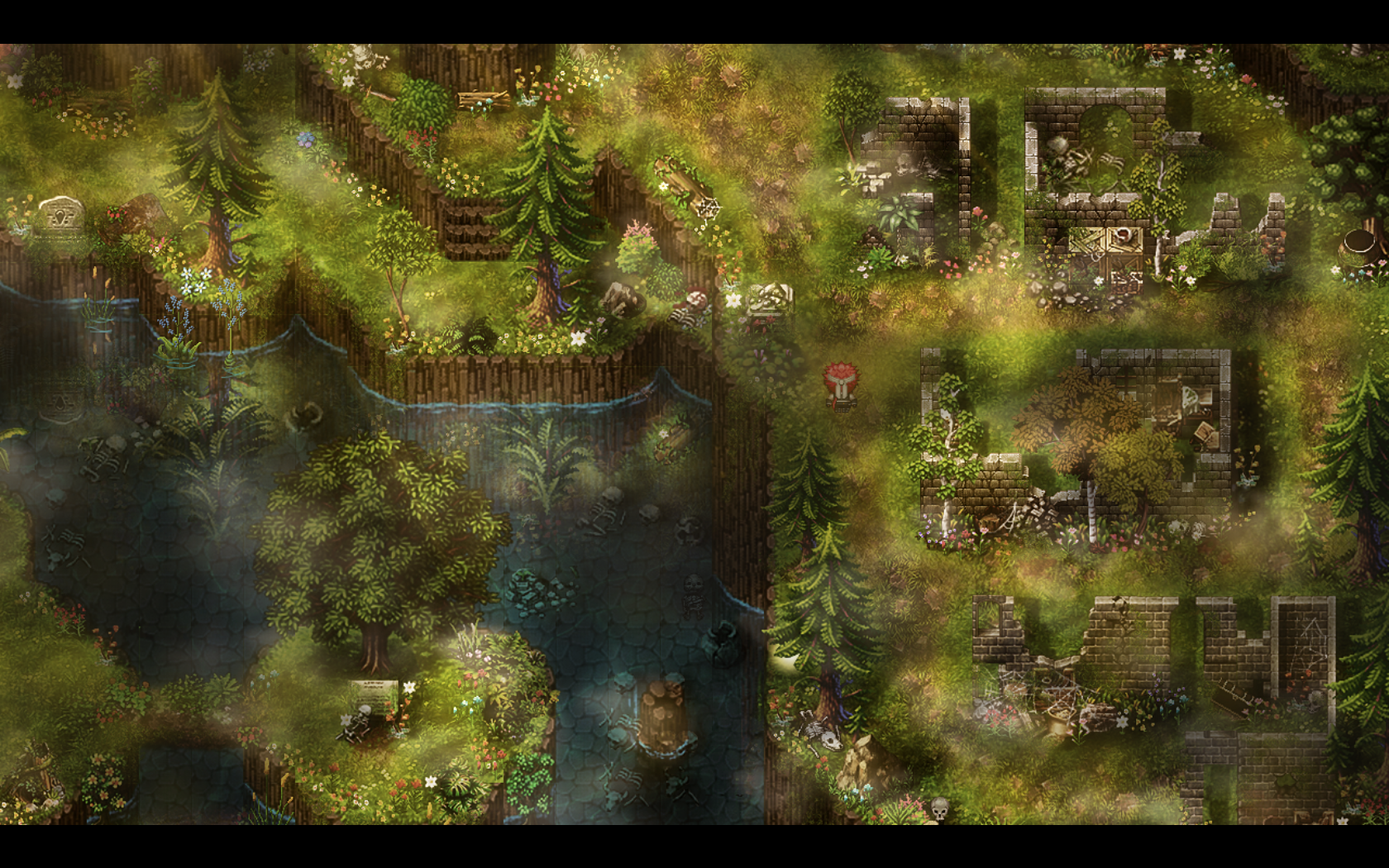
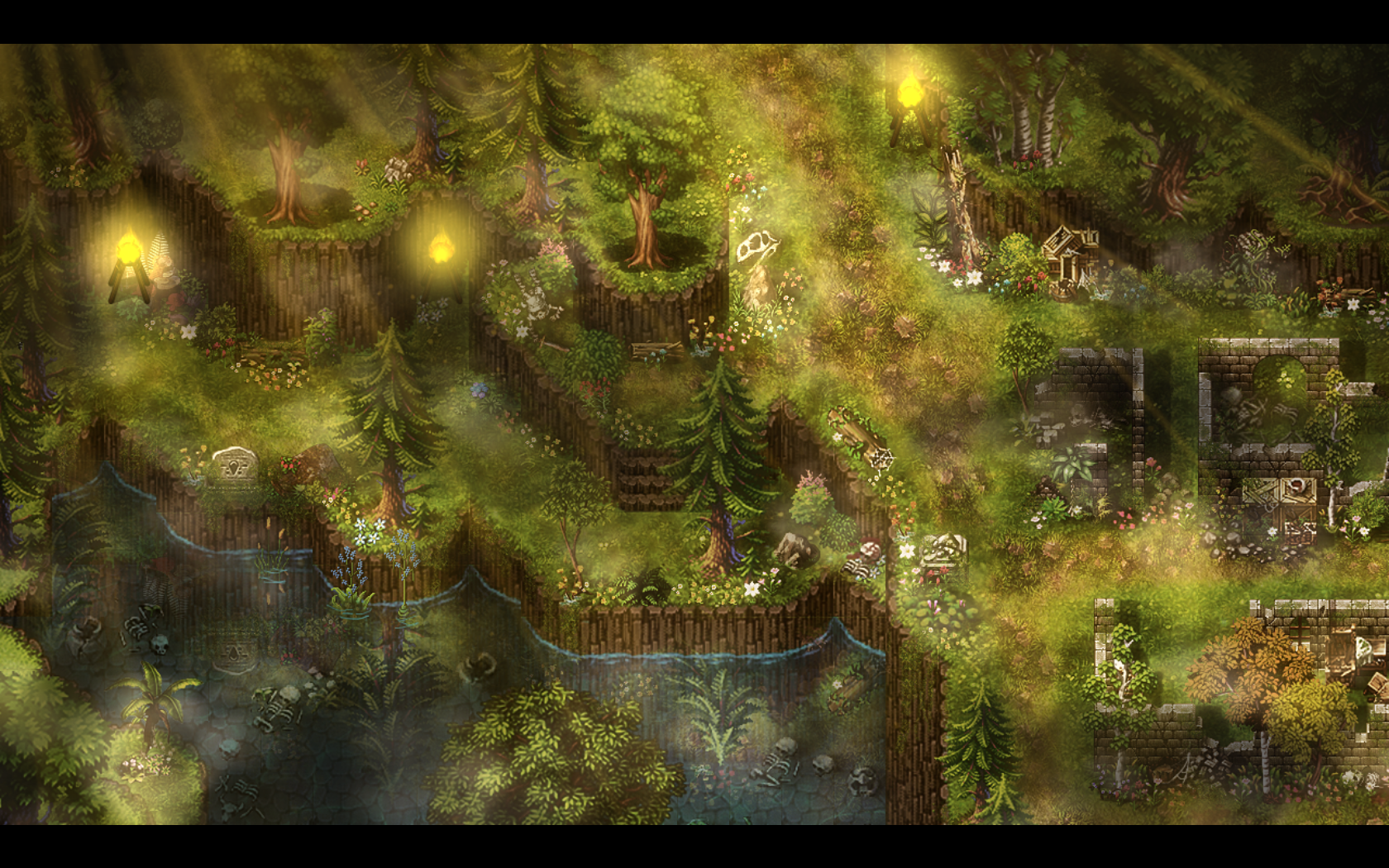
  9. Some screen from my ruin map
    Spoiler

    I2yfzb.png
    hyFuon.png
    M5YSGC.png
    MmfVU7.png
    vWOfRI.png
    4L6WzU.png
    IQALaG.png
    Yw20rV.png
  10. It looks really nice, a lot of details but the player still have a very nice path to follow.
    My only complain is that the first map is so shiny, I think you abused of the highlights there. Some parts of the grass looks like neon lights.
  11. @karraymalek When you have a lot or big maps, please put your maps inside of a spoiler, that's a lot of images to try and load all at once. They're very pretty and well done, but I do wonder if the mottled look would get tiring on the eyes after a while.
  12. I've been working on a church/chapel map, using an amazing prebuilt tileset from Haydeos. I couldn't really think of any decent ways to use the bottom half of the map, and I was struggling to fit any more custom tilesets for this map in, so I decided to cut it out and I think it looks a lot better.

    Spoiler
    Aubridor-Chapel.png
    Aubridor-Chapel-2.png
  13. @Ksi You were right, adding some more houses really improved the overall look of the map. I messed around with the paths as well, but I'm not sure if it looks better or not. Thoughts are appreciated. :)
    Spoiler
    sGSnA0f.png
  14. Yesterday was the 6th anniversary of our steampunk novel, Nimbus. So my partner and I released the first screenshot (still mega-early) of the follow-up RPG that we're working on. Here's an airship dock on the skyport Winglet.

    Spoiler
    QtgIUP7.jpg
  15. Decided to work on the inside of my new chapel. The first version felt really off, but I transformed it to better match the outside structure.

    Spoiler
    Untitled3.png
    Untitled2.png
  16. @karraymalek People are asked to use spoilers when there are a lot of images, especially if they are large. I have put your images into a spoiler for you this time, but please keep this in mind for future posts.
    Thanks.
  17. @SOC Oh, I like that layout! The walltop tile looks a little out of place though... Do you have room in the tileset for that map to add anything? A matching stone half-pipe or a bevel would frame the room better, although to have it match the lighting you'd need to have a mirror image pair of tilesets.

    I'm working on battlebacks and can't decide what pattern to put on the wall in this indoor scene:
    HELP???
    battleback potato quality.png
    The other tile type in the overworld is:
    fancy 2.png(...But uh, square?)

    ...so I'm trying to decide between using the floor tile, using the presented alt tile, or some third geometric pattern and just wing it.
  18. @Benevolentwanderer When transforming your floor to make a vanishing point, you need to take care how you have done the original tile. At the moment, not only do you have the tiles reducing to the vanishing point (fine, that's what they're supposed to do), the way the horizontal lines go, I get the visual impression that they form a shallow valley. Maybe it's the way you have made the side tiles longer than they are wide? Dunno, I'm not an artist. All I know is that the floor looks convex.
  19. @Benevolentwanderer to add on what @Kes says : it indeed looks like you're walking in a convex.
    If you look at the far point (red circle) you can see the pattern forming a near perfect circle and the floor angles in the start (green lines) are angled up rather strong. So the middle 3 lines are the 'flat' surface and the rest is more of a shallow, or that's the impression it leaves anyway.
    Of course this can be intentional in which case never mind :)

    battleback potato quality.png
  20. @Kes @Finnuval Oh yeah, haha, that was totally intentional. It's supposed to be a trippy location in a game that's already a little trippy to start with; geometric insanity is just par for the course. It's based on the effect you get with a fisheye lens, modified to be even a little bit more unnatural looking.

    (Besides, who cares about realism when you're coming up with funky geometric patterns? Not me, apparently :LZYwink: )