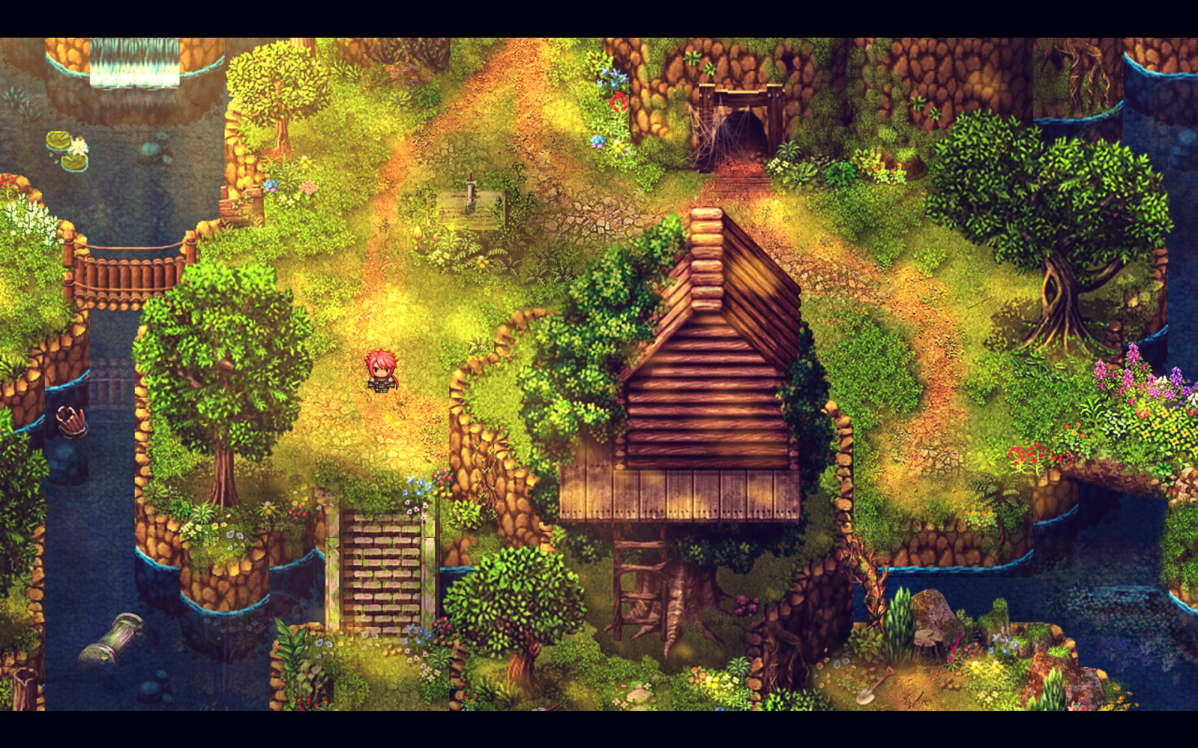
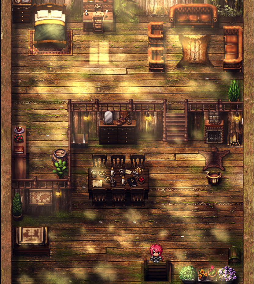
@Princess Bananabelle Thank you so much for your feedback, I corrected all the things you pointed out!
Regarding the shadows around the bridge, I've been trying to remove them for quite a while before giving up, they are added automatically by the fence-type tiles on top of the bridge, as well as by the tiles I used on the bottom; I've taken the latters from page B of the Outside tileset, I guess they are not meant to be used on page A's bridge (but rather page B's small bridges) but I liked how they "framed" the structure without being too large. If there isn't any other secret method like shift-clicking that could come in handy in this situation, I guess I will just put a wooden wall tile.
Thank you again, really appreciated!
Game & Map Screenshots 10
● ARCHIVED · READ-ONLY
-
-
@Dargor91 If you have gimp (or just about any other image editing software) you can easily edit the tiles to remove the shadow with the help of the color selection tool. Just select and erase. You'll want to create a new tileset with it, incase you want to use those parts somewhere else with the shadows.
-
Part of the hub.

-
...now I don't want to post my screenshot because your is so goddamn pretty, Lorenze. XD
I really like your style, and that scrolling background behind the door is pretty cool.

It's a cave, fairly bog standard, but I liked what I've done to is. I'm wondering if I should go a touch darker for the lighting, though - not fully dark because what's the use of mapping nicely if you're just going to shove black over the top so people can't see, but just... a touch.

Fowest. I've yet to get the anti-autoshadow script, but it's coming. -
They look impressive! It's a great use of parallax!
Where can I see more of your game?
Does this lip movement look okay?
Looks really good. ^^
Here's a couple of screenshots of my game, Monigote Fantasy.
The style is very simple like the one in 8-bit games. The graphics are fully custom made.
Hope you like them:
-
Ah, not parallax, actually. All just default mapping with tile edits. Thanks! I do have a gamepage on RMN for the game. I should probably make a topic here eventually, though.
A really like your stuff too. That Kraken looks terrifying! -
@Ksi: That looks great! I especially like the forest, it's very cozy and serene.
@BitBrosGames: The only gripe I have is the inconsistent pixel sizes, it looks really off in that first battle screen. Otherwise I like the style, I'm a sucker for anything NES-inspired. :)
Redid the overall look for my (space) forest area - thoughts?

-
The only gripe I have is the inconsistent pixel sizes, it looks really off in that first battle screen. Otherwise I like the style, I'm a sucker for anything NES-inspired. :)
The issue you mention is exclusive to that map. It's like a Gulliver world, that's why you fight chess pieces. :p
By the way, I like the style of the forest map, especially the animations. :) -
Hello guys!
I bought MV in January, read up a few things, and thought I share the first draft of my "starting village" in here, and I'd be glad to get some feedback about it. :)
Addition: I didn't add any shadows and light effects yet, as I found some more stuff to edit on the parallax map such as overlays etc.
-
@Ksi:
Redid the overall look for my (space) forest area - thoughts?
Look great and very old-style, especially on the use of colors. The only small (very small) issue I noticed it's about the sphere sprites moving around, the small ones I think are using higher resolution sprites (smaller -non duplicated?- pixels), and on the big ones the low res screen effect is lost because are rotating (and rotation engine uses smaller pixels too).
Anyway it's not a big issue, probably related to the engine itself, and I probably just ignore that if working on that resolution.
I specially like the trees that feels nice with only two colors. -
@Blackwolf89 Very impressive that you're already getting into parallax mapping considering you've bought the engine just this month! Already liking your mapping, especially the houses. I do think there's quite a clash of styles going on with your assets though. The houses, the floor and the trees all don't go too well with each other. I'd suggest trying to apply filters to the trees that make them look less realistic. I also believe that the grass, stone pavement and river could use some warmer colours to match the style of the houses. The map generally could use some flowers and bushes. Maybe also stones and rocks which in my opinion make most sense to be near cliffs or in the river. It's easy to have great looking partly-underwater-rocks by lowering the opacity of the part that's underwater. The paving leading up to the houses is a bit thin and inconsistent because for the house on the right side, the paving doesn't touch the house but on the left side it does. The last suggestion I have might be a bit nitpicky, but I'm not sure how much sense it makes to have a well right next to a river. Your mapping is really solid considering you've only just started using the engine! I personally don't do any parallax mapping because it's very time consuming.
I'd like to share a screenshot myself. We've extended the mountain in our game by 5 tiles on the y-axis. That way the camera doesn't stop moving along with the player on the southern parts of the mountain, further adding to the feeling that there are no artifical borders, only natural ones for the player.

This is a part of the southern end of the map. Only the northwestern and northeastern levels can be accessed by the player. The rest is to create the illusion that the world doesn't end here but extends endlessly. -
First attempt at making a forest in a couple of years, made some mistakes designing the map, but it's done for the most part aside from some touching up.

-
The intro cutscene to my game. The movement of the camera is shaky because I'm recording the screen, which impacted the sound quality and timing of the scene changes too. Any advice for how to improve it?
Intro Cutscene -
A little settlement
-
@Confederacy - The map looks good but it doesn't look anything like a forest. More like the entrance to a park, in all honesty. Maybe if we could see the actual forested area?
-
Here is my main project's initial testing.
-
@_elvenheart Looks great, reminds me of the old Zelda games, are you using a custom engine?
Topic:
Edit:New version:
Old version
Not cutting any corners on my remake, so I made some custom text scroller and also an animated faction selection. -
@Lihinel i am using rpg maker mv and moghunter's chrono abs
-
Hey, I've been creating maps of quite a size that have been building a huge world for several months. I almost managed to finish the desert island, which is 9600x12800 pixels in size and consists of 12 dimension maps 3200x3200 each. I do not create paralaxes, everything is done in the editor using graphics from RPG Maker XP, which are edited by me.
And here's how it all presents itself in reduced sizes :)
Desert Island
-
@Veres WOAH this is ... just WOW!
@_elvenheart I had legend of Zelda theme in head; is that normal? (it is nice BTW)