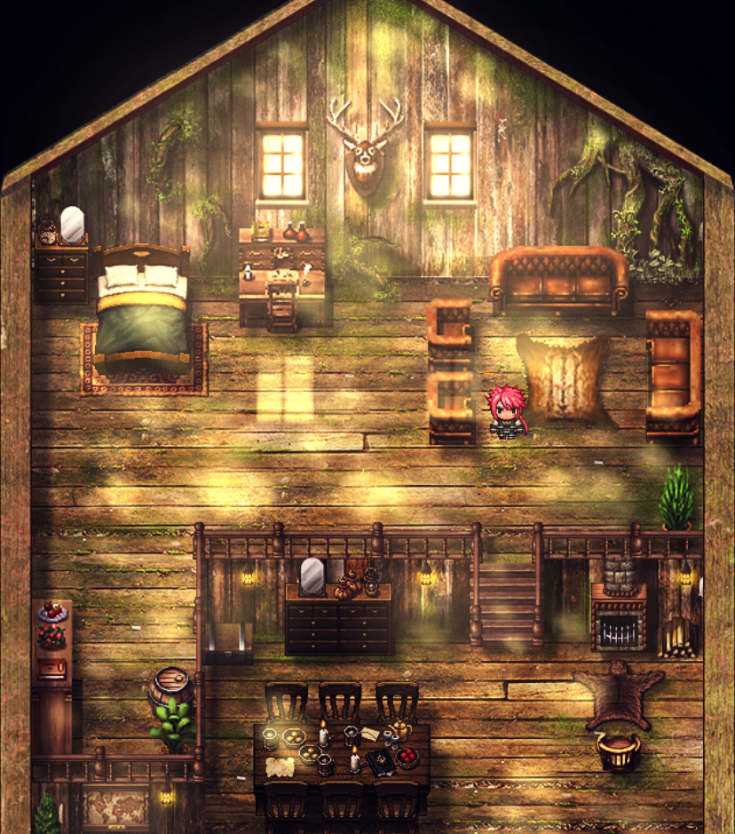
I went through old project, hoping for some inspiration, I found one of my locations, and man, it made me nostalgic for RMXP mapping possibilities ;(
Game & Map Screenshots 10
● ARCHIVED · READ-ONLY
-
-
A little gif of some elements from my game im developing called Roji's Room.
ps not actually plot, the dialogue is a joke.

.___. any feedback is welcomed. I also think you are amazing. -
This is so different, reminds me of Klei's best in RPGM form. :)
-
Decided to finally use the MV for more than generating Facesets for my main project and also lern Javascript.
For this purpose I opted to creade a remake of an old project I originally did to get familiar with the VXAce and RGSS3.
This time I want to use 100% legal resources instead of bad midi sounds and images taken from google searches. (Yeah, I know its bad, but back in the day I came from a community that mainly used Rips and other Copyrighted material, so I didn't really care about that.)
The Titlescreen is done. (Took me like 2 hours to figure out the basics of the plugin system and how to display a sprite. The rest didn't take nearly as long, though I still kinda hate the whole .addChild() instead of .z functionality, if anyone knows a different way to simulate a z index/priority for sprites, please let me know.)
-
Very original ^^ I like the confusion it might create.
-
@Marquise* As said, its a remake, as the originals gameplay was abysmal and had non legal resources. If you wanna know more, here is the prologue:
PrologueA long time ago in a galaxy far, far away...
The year is 20XX.
It's almost winter solstice again and the entire world prepares to celebrate the Happy Holidays.
Well, not entirely... One godly nation of meek Christians still holds out against the heathens.
And life is not easy for the evil communists occupying the bordering nations.
While Santa Karl and his helpers prepare, to spread joy and gayness with their annual present bombardment, High Priest O'Reilly and his followers get ready, to repel the attack and strike back at the heart of their enemy.
Join the Forces of God, in a selfless struggle to keep the Christ in Christmas or lead the Army of Darkness, in a mad attempt to celebrate Happy Holidays.
The fate of the Holy Night is in your hands. -
@Tuomo L I'd add intermediate pictures, with the mouth half-open (or half-closed :)) so that she doesn't look like a fish out of water.
-
The Ancient Dungeons set is so nice! :D
-
A picture of a "boneyard" of decommissioned military vehicles. The proceeding maps will be a maze to navigate and find pieces for your escape vehicle. Any comments to improve the look of this zone further are appreciated.Boneyard Image
-
@IguanaGuy Are these vehicles decommissioned properly or abandonned after a battle? When it's on purpose, people try to make them aligned so not to waste space. But if you're looking for a maze, making it an old battleground would be more fitting.
Also, it's a gameplay question but is your character able to walk under the tank's cannons? If not, it'd hurt the realism of the map. -
@cabfe - Good point on the boneyard versus battle site layout. I may change it to a "battleground area" in those regards. Yes the characters can walk under the tank cannons ( graphics are set to above characters for those.)
-
I'm working on an inn that was abandoned, however I'm starting to think I might have gone a little too crazy with the spider webs. There won't be any enemies in this place, so no giant spider battles. I know decorations are good for an interesting map, but what do you guys think? should I tone it down?
Spoiler -
@Princess Bananabelle It's not impossible to find that many spider webs, but it depends on the area and also for how long it's been abandonned.
Other than that, the table at the entrance looks too clean compared to the rest.
Not sure about the moss, though. -
@cabfe It's been abandoned for about 5 years, and near a forest, so that might excuse being overrun by spiders. I see what you mean about the table, I'll probably remove. I will remove the moss though, I can't think of any real reason to keep it. Thank you so much for your input.
-
Instead of the moss, you could liven up the map with a lot more cracks and holes in the floorboards. You've already done a good job showing decay with the walls and furniture, but the floor is too clean.
-
@Aoi Ninami Thanks for the advice.
So I took what I learned here and tried again, does this look better? I need to make sure the player has access to the beds, so I tried to put cracks where I couldn't put holes.
Spoiler -
Putting together a new battle system for my game and thought I'd share it here, even though it's still in the early stages.
I hope you guys like it ^^/
Battle Screen
-
some screen from my forest map
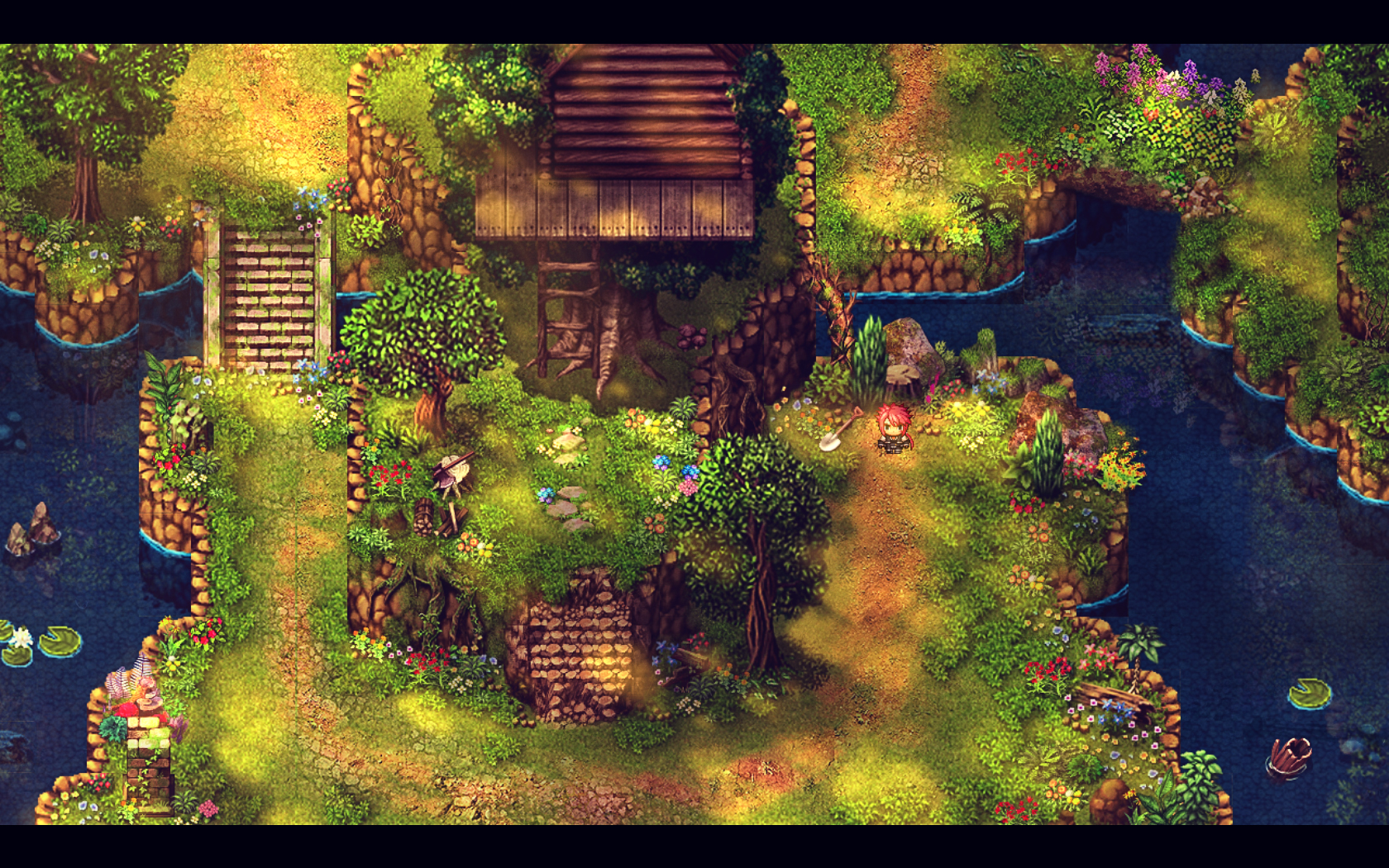
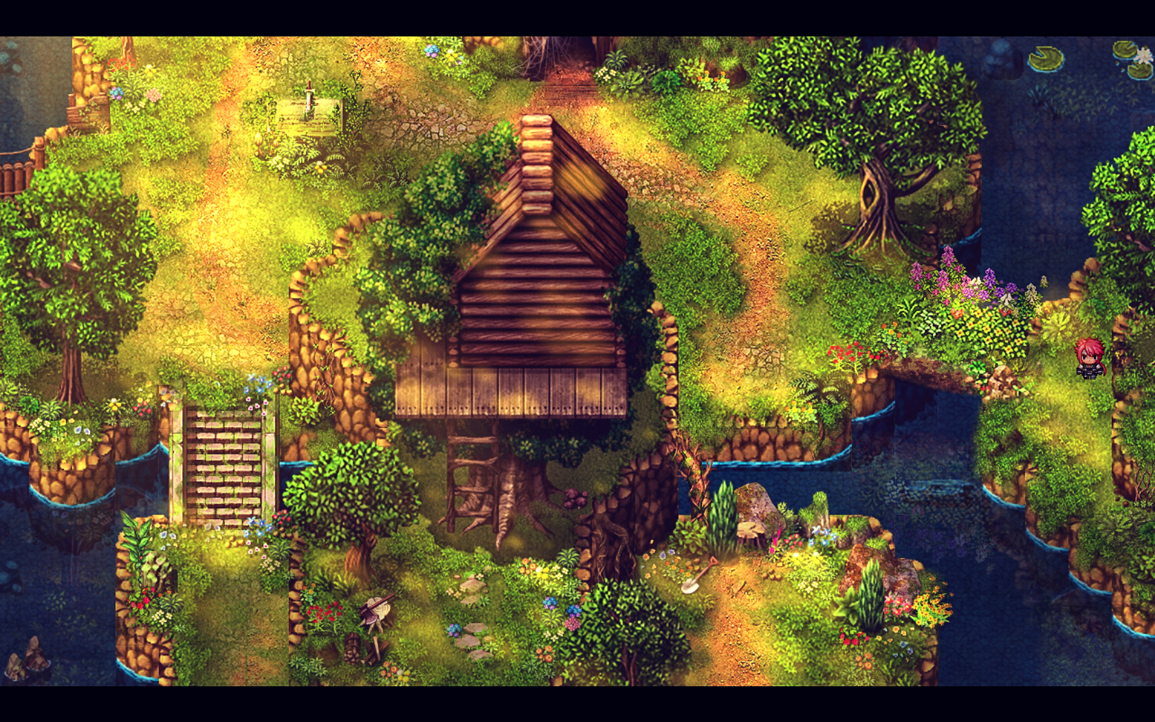
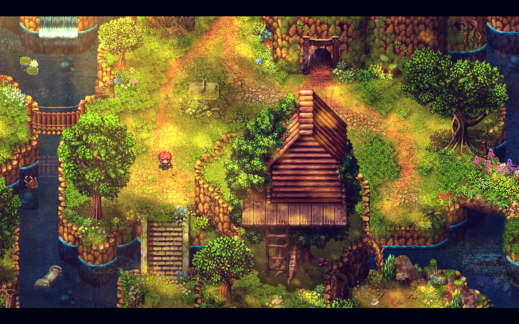
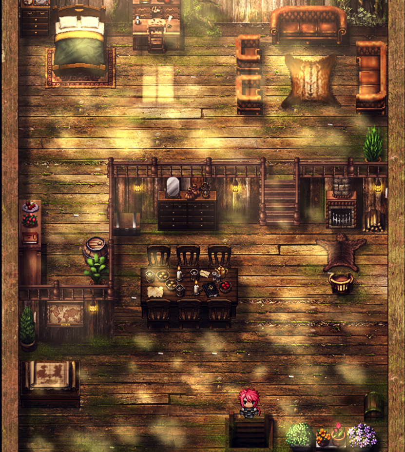
-
I'm really fascinated by your maps guys, you are all great!
I hope to learn parallax mapping one day, for now I'm trying to stick to RTP resources to master the basics and really get the feeling of the program (I started using it less than 2 weeks ago).
I will post 2 maps here, from the same zone, which represented the first mapping challenge to me. I really like doing indoor maps and I'm pretty satisfied with the results, but then I wanted to try making a big outdoor map and I regret that decision.
They are ugly but I'm interested to know if they "make sense" to you, regarding the perspective, the feeling of heigth etc.
Image 1: I tried my best to give it a certain triangle-ness, to make it feel like a mountain top:
Spoiler
Image 2: Wanted to make a winding path that circles down to the center:
Spoiler
Any suggestion will be much appreciated! -
@Dargor91 I noticed a few shadow issues that you'll want to look at. They may not be wrong, and just be me not recognizing the sloping in your map. Overall your maps look very nice, and I like the way you handled the sloping.
I've circled and numbered the shadow issues in the spoiler below
1. It looks to me like the floor needs shadows
2. You may want to shift-click a curved edge to that tile.
3. I'm not sure if this is your sloping or not, but I feel like the shadow should go further down.
4. This should be two wide to follow the rest of the map's pattern
You'll also want to remove the shadows around the bridge, it doesn't make sense for the bridge to cast a shadow onto air.
Finally, whenever you're making multi-elevation maps always keep in mind passability. Because the ground is all the same tile, when you have two elevations next to each other, by default the player can just walk right over the edge. I pointed out such an area at 5. I didn't see any issues in the second map, it looks good.
Spoiler