@Kim_Shyuen Under no circumstances can you use this thread to advertise for paid commissions. I have, therefore, removed that from your post. Please note that the only place where this is allowed is in the Commercial section.
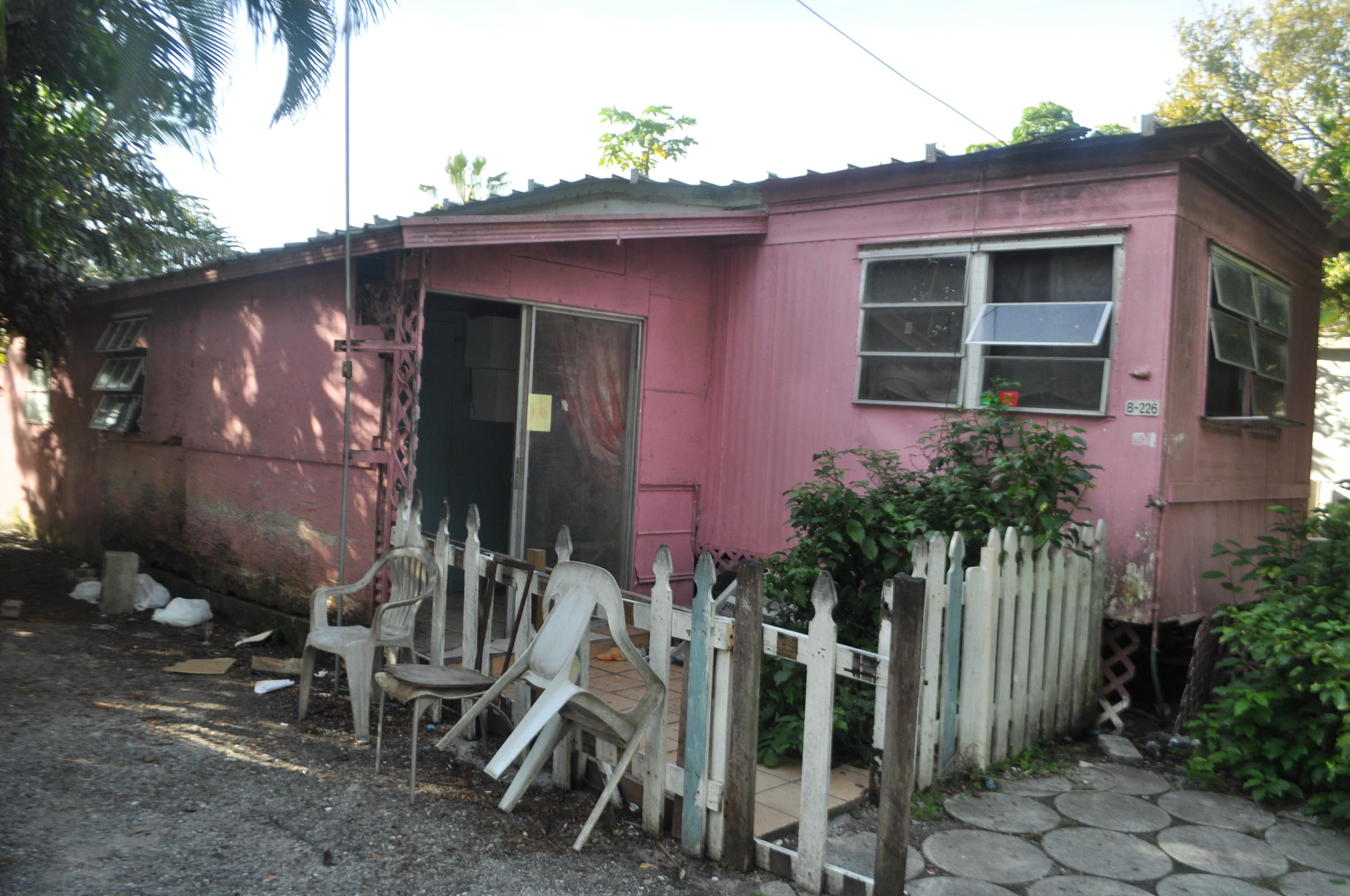
I'm having some troubles with the pop horror set. The characters are taller than MV characters so that throws me off a little bit. I'm trying to make a trailer park and something looks off but I can't figure out what I'm doing badly lol
I tried making the house taller than the characters but then it looked bigger than a mobile home.
Yeah, what Ksi. The front is 2 tiles high, and the side is 1 tile high, which would be fine, but the roof is a single part which makes the impossible. As you can see in my bad snipping tool screen shot in the spoilers.
A large city I've been working on. I'm doing small portions at a time, which is why certain areas (namely the left side) have a lot more events and stuff than the rest. The pic below is the crappy compressed one, the large one is here https://www.dropbox.com/s/9tr0fk0n3hv3hrs/Map109.png?dl=0
Yeah, what Ksi. The front is 2 tiles high, and the side is 1 tile high, which would be fine, but the roof is a single part which makes the impossible. As you can see in my bad snipping tool screen shot in the spoilers.
Why can't you just add the extra tile below the 1tile area? Like where the characters are standing?
Ksi already suggested that. I was more saying the reason it looks off is because of the height difference and the roof being a single tile. If they want to keep the side 1 tile then they will need to do something about the roof.
I added a porch and a foundation so that way the house could be taller, although now I think the porch looks kind of funny lol I guess it's not as much a mobile home anymore.
That's a big map and I can tell a lot of effort went into it. It would look really good if you just added some different building textures. Since almost all of the building tiles are the same it kind of looks unnatural-Unless this is a city set in the future or it's supposed to look uniform like a military base or something.
Ouh I see it is hard for me even (because of the angles) to be picturing the right way to tile/sprite that. Got an auntie that called hers that way but... yeah. Sorry I wasn't of any help (Now will have to search what a mobile home REALLY is)
I've decided to take a hand-painted looking approach to my MV project (not titled yet). Here are some testing shots:
Spoiler
Spoiler
The rug in the second shot is actually a modified photo of an old dirty carpet, so I can't take credit for the artwork. It was stock footage. I'm probably going to replace it with an actual painted carpet at some point.