@Ksi I really like your menu setup. I still have to get into making a custom menu myself, though I don't know anything about JS. Dodged that task by working on other things, but I think your video has motivated to finally look into it.
Game & Map Screenshots 10
● ARCHIVED · READ-ONLY
-
-
quick little forest town i made. thoughts?
Spoiler -
@jonthefox At first it was weird looking at the roofs, then I realized that they are flat. Personally, I wouldn't make the roofs flat. Maybe add a little variety to the elevation, you could make it a real valley by having the outside even higher. I think you're doing a good job spreading out the vegetation and having darker and lighter grass. Probably it would make sense if the path wasn't interrupted by grass. For the waterfalls you can make an event that shows animated white water, it's RTP actually you can find it in the !Other2 sheet. In my opinion it would also make sense not to have the dark water right next to the islands because the dark water indicates depth and it would make more sense for the deep parts of the lake to not be right next to land. Maybe events aren't shown on your screenshot (?) but you could add actual doors to the entrances of the houses. Also I'd personally add windows to the building on the right, the overall shape of that building looks a bit weird to me to be honest. It could potentially look better if the entrance was 1 tile further up, so that the yard in the middle is a bit bigger and the parts on the side stand out more. Back to the waterfalls: Their elevation doesn't make sense because the tiles next to them are flat grass. As I said I'd add a bit more elevation in general, it would make sense for the waterfalls at least. Especially for the part on the upper left - if it can't be accessed by the player anyway, you could add more layers of elevation there. You could also add some more details, right now I believe you don't have any stones or rocks and there is nothing manmande outside the houses. Maybe there could be a well in the middle of the village? And some barrels outside the houses? And maybe there's a grave or two somewhere where the inhabitants burried someone who has passed?
I know I just listed a lot of things that - in my opinion - could be improved, but I don't think any of that would be too complex to implement which is really good for your map because the basic layout of your map follows a solid idea.
I'd also like to share a screenshot, though I'm not sure I'd be willing to make any substantial changes to the map shown:
Spoiler
-
@jonthefox In addition, that roof tile doesn't seem to be one of the ones that's meant to be flat. (Usually A4 roof tiles are meant to look flat, but the A3 ones are usually for looking like an angled roof that's standing up.) That's why it looks fine for the left house and the middle one, but not quite for the right house.
And yeah, don't be afraid to make the differences between elevations a bit more dramatic. Maybe 3-5 tiles of the rock wall, depending on how you want the valley to look. With taller rock walls, you can also add other details to the walls - rocks jutting out, vines crawling up, maybe stairs if you want the player to access some places outside of where the houses are.
If you want, you can also have some animals wandering/flying around the map. Some birds, maybe some rabbits, maybe even a deer or two.
You could also do something to show a kind of gradient from village into forest. Have some more trees sprinkled around the area (if you don't wanna dabble in non-grid mapping/parallax mapping, then you could do as I've seen recommended on this site and edit a handful of trees into one tile and use that as one of the tileset graphics so you aren't limited in terms of layers; ditto for rocks/grass/flowers and such), grass getting thicker as you go further towards the forest, maybe even more animals wandering around as you get to the "forest" part. -
@FluffexStudios This thread is for game and map screenshots only. Please do not post your artwork here. If you want feedback on it, post in the WIP thread in Resource Support.
-
@Ksi I'm using MV, so would window_base be the same as rpg_windows.js?
-
Sorry I have no idea. I can edit scripts, I can't script stuff. I ended up getting help from a friend to fix my mistakes. ^.^;
That said, I used google to do a quick search of "changing window opacity in mv" and found some stuff in the first few hits. Google is your friend. -
@Phenax thank you so much for your comments. i am a HUGE fan of your mapping and i stare at the screenshots from dragon's hope all day for inspiration, so it really means a lot to get your advice. i always have trouble with roofs because i know in the past i've made my houses too square-samey and boring boxes, so i try to make different shapes even though the RTP roof tiles aren't really meant for that. I guess I should try using some of the angled roof edits people have made. Your point about the deep water in lake makes sense, and i also realized the elevation error with the waterfalls. ditto for the event with the waterfalls. i'll try making those changes and post again. thank you!
your map is gorgeous by the way, though that one tree sitting on the cliff bothers me. would love for you to considering doing some mapping tutorials, i feel like there aren't many good editor-mapping tutorials for MV.
@GameFire thank you yeah, i realized after making the map that only using one layer of elevation is kind of meh. towns are such a struggle for me...thank you for your comments, i'll try to work on it! -
@jonthefox That's just too much praise but thank you, reading that made my day :) I agree with the tree in my picture, I replaced it with some flowers. I'm really looking forward to seeing your updated map!
-
hello , this is my first post here, I hope you like it
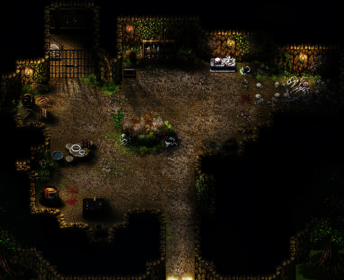
the base
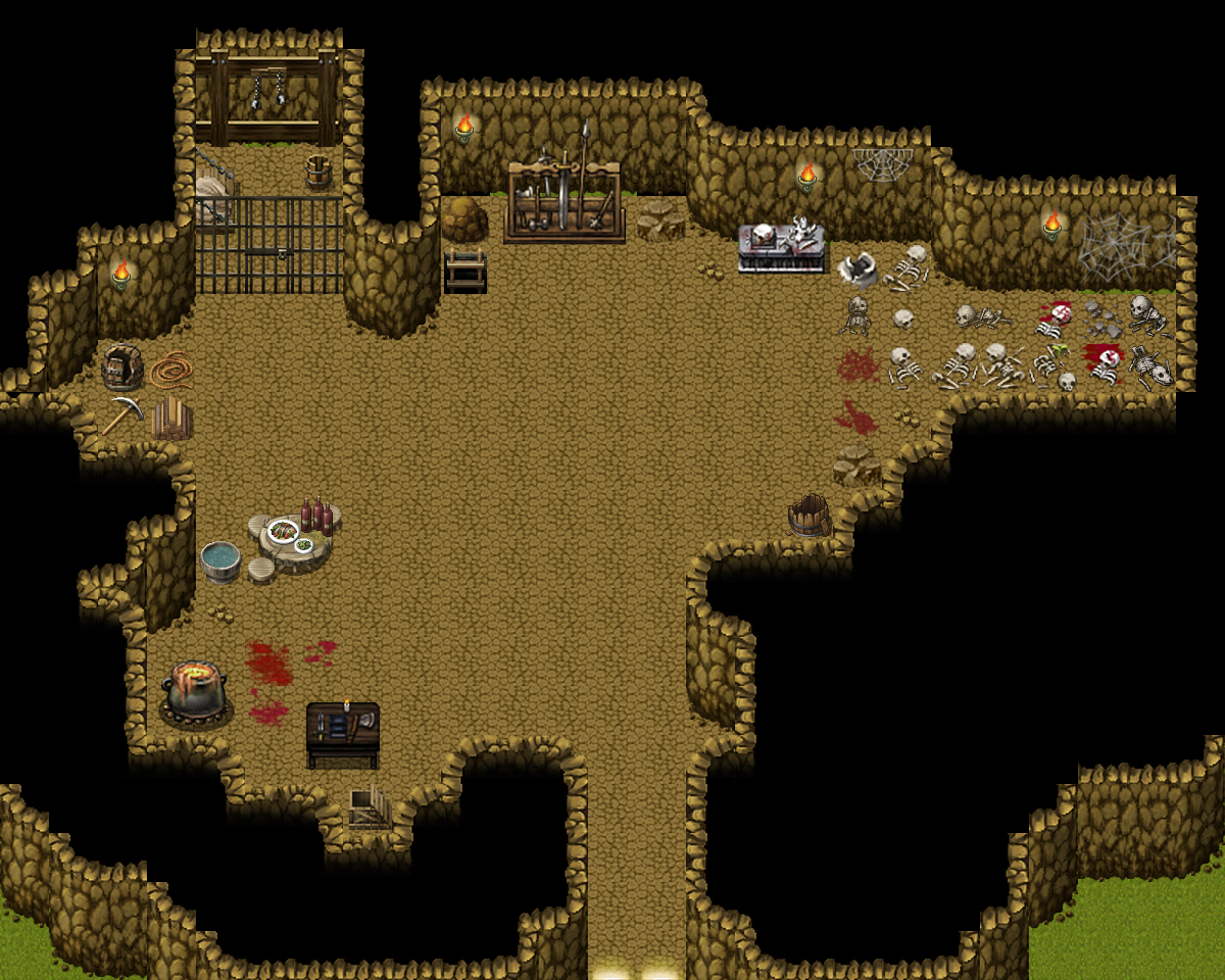
-
@karraymalek The lighting and shadows looks so real, I'm guessing this must be parallax mapped. Theres so much detail and texture. Amazing.
-
@karraymalek You need to make your shadows a bit more consistent. Almost everything has a shadow except the block at the top with skulls on. Sure, it has a light over it, but it would still throw a small'ish shadow forwards. Notice the angles of your shadows. The gates, for example, have an almost vertical shadow, the cauldron and rectangular table have shadows which imply a light source more top left - and given the position of the cauldron, I'm not sure why it has such a deep shadow anyway, as no light source would reach it because of the bit of wall sticking out behind it.
I prefer the top version, I find the lighting in the second one a bit harsh, and too white -
Ready to be farmers yet!

-
The last day of year. Okay, let's keep trying the next year. Progress of city design is half

List MAP
-
The Sacred Fountain Temple.

-
Happy new year!
These are my first attempt using FSM Town in the Beginning
-
@Neka Music In general I like it. With life added to the maps it should be pretty cool. I think there's an issue with the roof of some of the houses. Like the one on the bottom left in the second picture. I'm also not a fan of the wall and the super square shape of it and the connector. Maybe the gate could be at the connector? That's just how I would probably do it. And maybe a watchtower or two?
-
@Luke•° super pretty! Maybe a tad too green though? Perhaps have a few other colour tones in there to break it up.
-
This map has never been flashy, probably never will be. It's a small cave in the mountain and home of Theo the raccoon. Any suggestions on how it could be improved? Still struggling a bit with the maps that have soil as walls, roof and ground.

-
A bed or nest of some kind for him might be a good idea. Maybe some other personal touches like some poison stuff or whatever kind of things he likes. Make it a bit more personalised.