Game & Map Screenshots 10

● ARCHIVED · READ-ONLY
Started by Celianna 1970 posts Page 37 of 99 View original ↗
  1. Vexed said:
    Slowly working on something... very slowly...

    wGhl4hJ.png
    Clerk-Bot is eager to help!
    Hey @Vexed What tileset is this? I love it, looks like a POP! Sci-fi?
  2. @cabfe I do, to a certain extent. If something is not too noticeably bad then I guess I can probably overlook it.

    @Mystic_Enigma Overall, your maps are bad. Let's look at your interior maps. The windows are overlapped with the roof tiles. Have you seen any interior maps from other games or other people? The way you use tiles is also wrong. Are the walls made of two different tiles mashed together? Those phone and television tiles are meant to be put on a table. You put them on the wall like, it looks really weird.
    There's a teddy bear put next to a pot of plant.
    Three empty desks facing the wall with no chairs.
    Vastly empty space everywhere... I am quite confused about your exterior maps as well.

    I advise you to look at some sample maps, look up mapping tutorials, and actually learn how to combine tiles together.

    I am having an issue with windows in my maps. I am not sure which one to use. Currently, the exterior of the house has one type of window, and the interior has a different one. I think I should stick to using just one. :eek:

    Spoiler
    eeq5Z4S.png

    I9t3Xl9.png

    The first one seems more like it would fit better with the setting and the wall tiles. But the second one looks better when combining with other tiles like desks or kitchen top. :rolleyes:
  3. Arrgh! Really? Welp, looks like I have to scrap everything and start from scratch then. Back to the drawing board with me, and here I thought I was actually proud of all the time I spent!
  4. Mr. Detective said:
    I am having an issue with windows in my maps. I am not sure which one to use. Currently, the exterior of the house has one type of window, and the interior has a different one. I think I should stick to using just one. :eek:
    I think it's because in RPG games buildings are not 1:1 size in and out-side, and outside windows should be smaller than inside.
  5. @Mystic_Enigma What I suggest you do is start with posting just one map. It can be looked at in depth, and anything you learn from the feedback from that one can then be applied straight away to the next. It's a much more efficient way of using your time and learning how to map. And don't be disheartened by this. All of us started off in the same place and had to learn how to do it.
  6. Mystic_Enigma said:
    Heya there, folks! I thought I could post some of my maps, since everyone else is. They're a number of areas i'm using for my RPG, and would like to get a little feedback and suggestions on what to add to them. There are many of these so hang tight!

    I think most of your interiors look pretty okay, it's just the 1 tile wall (though i don't actually mind that too much since the characters are so small, you just need to use 1 tile windows i think) and also the massive size of the rooms.
    Let's take a bed as an example, a singlebed in rpgmaker is 2 tiles. How many single beds could you fit in the average room in real life? Say your bedroom, or kitchen.

    Your maps are also very boxy, don't be afraid to make shapes with your interiors, cut out sections so the house isn't an exact square inside.

    I like the bedroom in map 1, though it's a bit wide if it's not supposed to be a big bedroom. But the rest of the house is very big and empty. You'll want to fill that up somehow and probably make it smaller.

    I edited some of your interiors smaller real quick as an example.
    Interior Examples:
    map_4_by_mslilly-dcfhekz.png map15_by_mslilly-dcfhekc.png

    The exterior maps. Again, too big, too much empty space. Very Boxy.
    My advice is to smoosh those buildings together more, make the map smaller and maybe add some trees to fill in the empty space that's left.
    Map 6 Exterior Example
    map6b_by_mslilly-dcfhh8c.png You could also surround the map with trees instead of the fences to make it less square.

    The biggest problem here is map 11. I assume it's supposed to be a big city? And also that it's unfinished.
    In most areas of that map, the players screen is going to be entierly filled with the yellow tile, with a manhole to break it up now and then.
    You'll need to make the pathways smaller, maybe have a 2-3 tile road with 1 tile sidewalks or something?
    You'll want to place down lots of houses close together. (Like, right next to eachother) Not all houses need entrances in a town that big, you can have houses facing sideways or up to get out of putting in doors. Or have doors just for show.

    I can't comment much on the caves, since I'm pretty bad at those myself. But probably make them smaller if you don't have roaming events as enemies.

    The most important mapping tip I have for you is:
    Zoom in to 100% often, so you can see how the map will look for the player (though remember that the player will only see 13x17(iirc) tiles at a time unless you've changed the screensize). Also playtest a lot, so you can see how it is to actually walk around in the maps.

    EDIT: I... only just now noticed I left a plant blocking off the kitchen in one of the edits... Oops.
  7. Kes said:
    @GuiltySlug That is indeed an improvement. I'd like to suggest a couple of things.
    At the moment your steps have exactly the same number of tiles as the cliff face. That effectively makes them a ladder, as they would have to rise vertically to do that. You need to have the steps 'longer' than the cliff is high. Here is an example of a simple way that it can be done. All it is is making an indent so that there is an extra steps tile. [Used snipping tool, so a bit blurry.]
    So, something like this? Sorry, I'm not sure I understand 100%, even with the reference picture.
    sHuCJPw.png

    I did think I went a little heavy on the trees, not gonna lie. I thinned them out near the cliff edges and took them out behind that one house and I agree it does look better. I guess I was worried about there being too much emptiness along the cliffs.
  8. @GuiltySlug You could try putting in an extra steps tile at the bottom, so that the steps appear to be longer - that is why the top is indented back, to allow you the space to do that.
  9. You folks make mapping oodles easier than it is then, because it seems that it's another thing I have to work on...

    @Kes I guess I was a bit too hasty posting so many at once, huh? Alright then. I'll keep that in mind...

    @Elissiaro Ooh, okay! Thanks for the tips/edit suggestions, i'll definitely take these into consideration!
  10. Improving the equip menu from Vorum: (behance (it's in w.i.p))
    Vorum it's coming soon on english localization!

    jskJfPx.png
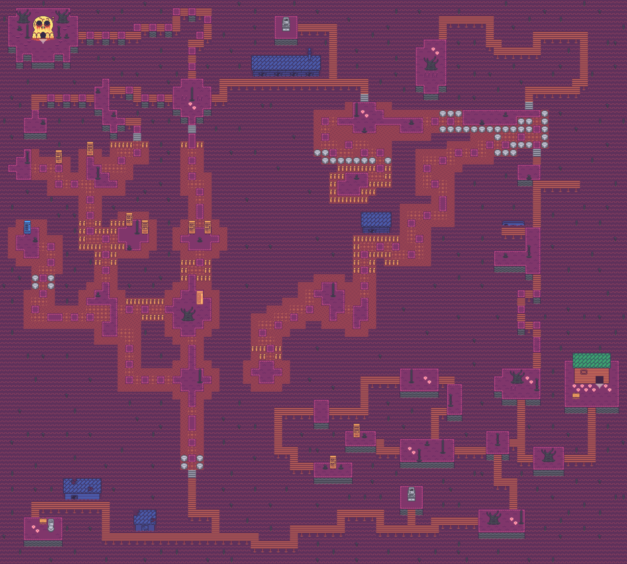
  11. Creating the last maps for my game XD Then I could finish the events in this project :kaoswt:
    Saustic Gulf.png
  12. fizzly said:
    I think it's because in RPG games buildings are not 1:1 size in and out-side, and outside windows should be smaller than inside.

    That minor size differences, I could overlook. But I am more concerned about consistency, as in the type of windows.
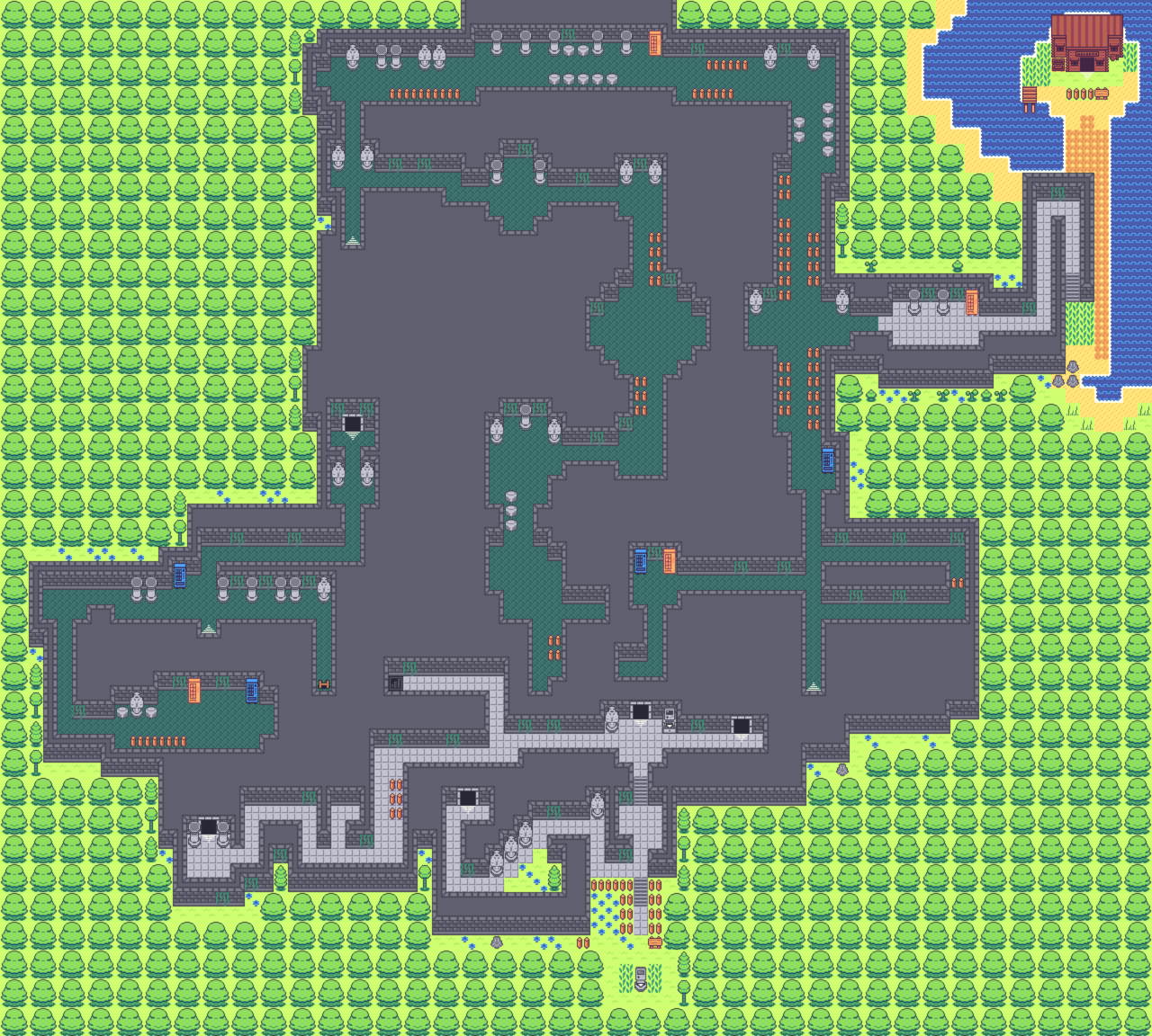
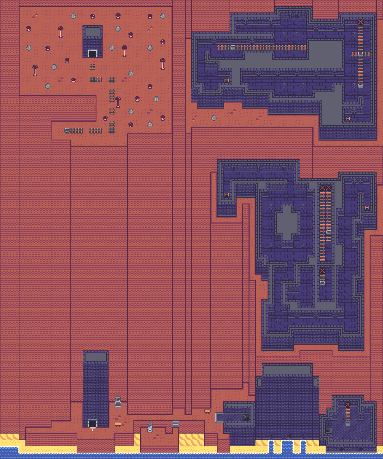
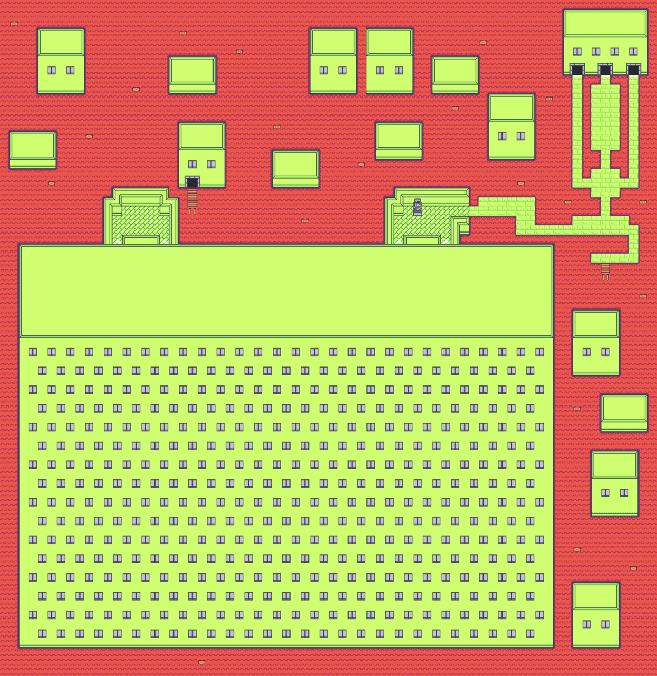
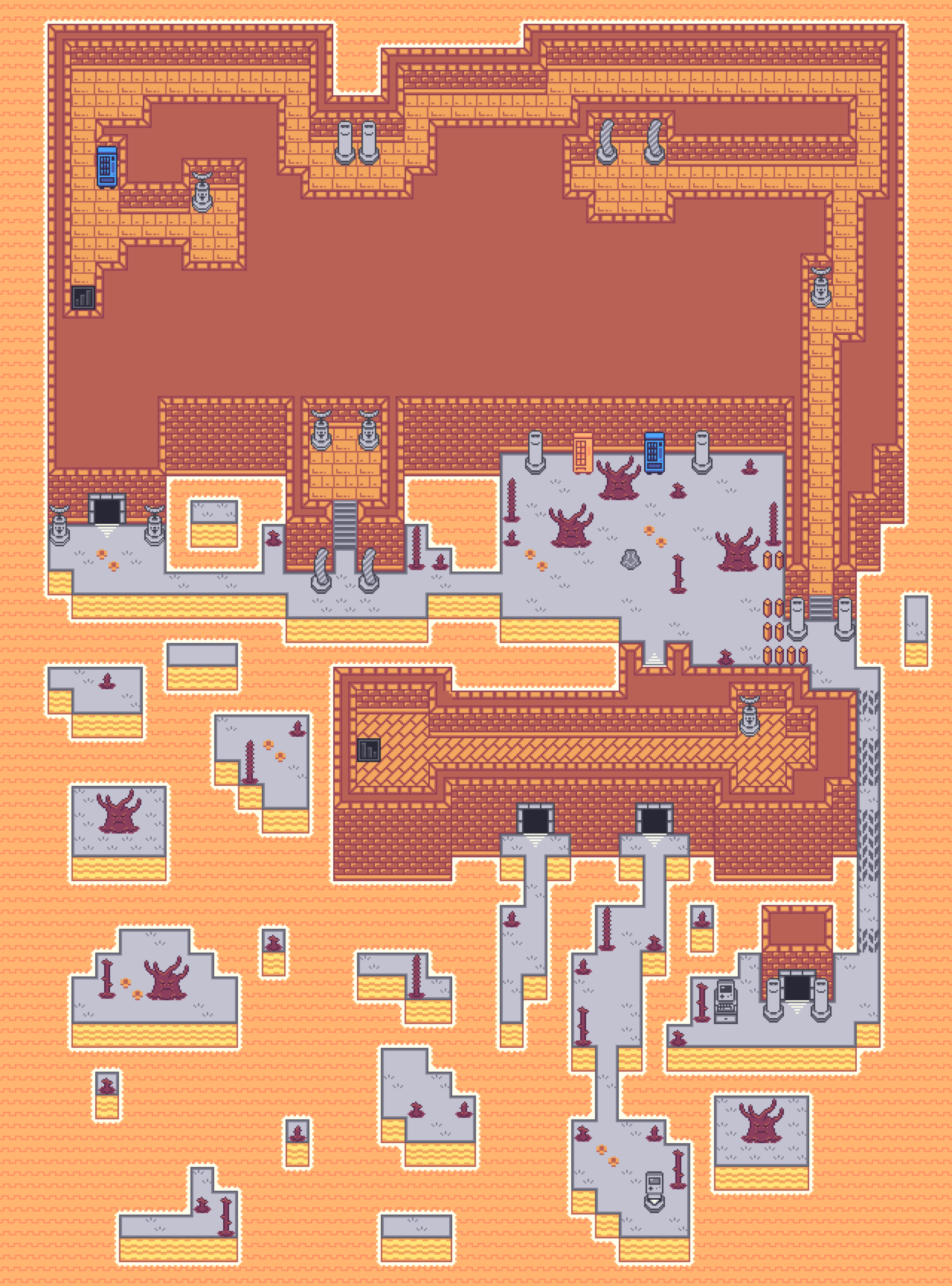
  13. I just finished mapping all of the dungeons for my game so I thought I would share all of the exteriors. Most are several floors. <3

    Spoiler
    tumblr_pb2lzuDH1c1w0wc2uo1_1280.png

    Spoiler
    tumblr_pb2lzuDH1c1w0wc2uo2_1280.png

    Spoiler
    tumblr_pb2lzuDH1c1w0wc2uo3_1280.png

    Spoiler
    tumblr_pb2lzuDH1c1w0wc2uo4_1280.png

    Spoiler
    tumblr_pb2lzuDH1c1w0wc2uo5_1280.png
  14. Those look really cool and the colors stand out, VisitorsofDreams. Is that a tileset you made yourself?
  15. @callmedan nice one mate! looks proper hot like fire fire! would add a chest or two? a cloud overlay possibly? or sunshine rays? :)
    More or less finshed this map? anything i have missed? hope a lot of you recognize this room :D
    Capture.PNG
  16. AmazingKazuki said:
    Those look really cool and the colors stand out, VisitorsofDreams. Is that a tileset you made yourself?

    Yup. Im a firm believer in engines just being a frame work. Everything but the source code and some plugins is by me or my composer. :)
  17. Mihe said:
    @SomaelCK Is that water a multiple parallel mapping?

    Sorry for late reply! Yes it is :)
  18. @SoSick. I like everything in that map except for one thing.
    The wall light looks like the support bracket is placed on top of the curtain. How does it come through the curtain so that it is attached to the wall?
  19. @Kes thanks man, glad you like it! :) and thanks for pointing that out lol the wall light is a doodads so I’ll have to go back and draw that behind the curtain or remove some of it.
  20. Just released a skill showcase video for my game, OHMIC

    [embedded media]

    Other than a few skill refinements planned for the future, I'm pretty happy with how everything came out~ hope ya'll enjoy!

    note: if this isn't the proper place for this kind of video, please let me know ^^