I finished making my first tileset. It's black and white. Being my first tileset I thought it was a good idea to use limited colours. Also I like the black and white style. Let me know what you think. I also finished the map animation tiles (doors, switches, spikes etc).
The Resource WIP Thread 3
● ARCHIVED · READ-ONLY
-
-
Is it meant to be a night time scene? If not, I don't think you should be using quite so much black, especially where the light would be hitting the most. Games for the original Gameboy would be a really good reference.
Limited colors is good when doing a first tileset but after a certain point the limitations are actually harder to get right and success depends a lot more strongly on your skills. A really good 4 color tileset depends a lot on a good understanding of positive/negative space, contrast, legibility, silhouettes, lighting, implying, and, oddly enough, color. I recommend going up to at least 16 colors, and you could go up to as high as 64 and maybe even more and still get the benefit of using a limited color palette. -
I'll take a look at some gameboy games.
-
There was an RPG Maker game released in '08 called OFF. Once you beat a level, you could go back and explore a monochrome version of it for extra loot. The game uses more white than black in these cases, might be worth looking at.
The famous 2d platformer game Limbo was done entirely in black and white, as well. This game has more black than white most of the time, leading to a dreary atmosphere.
I wish you luck! -
Thanks.
-
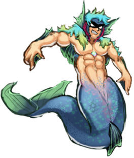
I've been staring at this for a few days. I'm just a few steps away from finalizing it. Just got to clean up some areas. But I think the underlight will have to go. I envisioned it underwater, but as a battler it'll more than likely get used on some kind of floor and will require a ground shadow. That's my main criticism.
I also wonder about giving it a weapon, like a harpoon or trident. And if I should do alternative designs, as in ranks or evolutions, that might make it more applicable to an RPG.
-
He looks really good to me. I agree that he needs a weapon, right now he looks like a rapper.
-
I had a thought. There is a large pixel change in the back between graphics 2 and 3 and since there's only 3 frames of movement, the graphics can't be that big. Perhaps you can only have big pixel shifts with a lot more frames so when the frames are limited, the graphics are smaller so it's less noticeable. I know that character movement with 3 frames limits the legs to being small so maybe the same thing applies to battler graphics. I saw a game with long legs and watching the character move, the leg movement was very noticeable.
I'm thinking with this kind of graphics, smaller art has always been used for a reason and when larger enemies are used as battlers it's usually a still graphic.
Pixel art veterans, let me know if I'm close or not. -
@FleshToDust , you've found something a lot of us found the same way: The increase of pixel size with the same 3 frames-per-movement is horrible for realistic proportions. It works good with super-deformed (chibi) or highly "abstract" (can't think of a better word... stylized?) type of art.
There's a few answers for how to manage that:
- Keep the image (pixel) size, look for ways of doing it more than 3 frames. The Dragonbones plugin may interest you, but anything that allows more frames per movement will do. The con? More frames = more work; or, in the Dragonbones case, the need to learn a new way of doing movement.
- Reduce image (pixel) size. My (eternal) project uses a 16 pixel-square as its base (instead of MV 48). This allows me to work with a more realistic but constrained art, since the small size reduces the amount of detail needed. The con? My game look like an old SSI GoldBox game.
- Change art style. This can be done by itself, just changing the art style to better suit the MV restrictions, or even with the above options. For example, Aekashics battlers have a particular art style that isn't realistic, but works really well with Dragonbone or Yanfly Animated Sideview Battlers.
-
Yeah, the battlers are 192x192 but I may have to lower them to 64x64.
Edit: I lowered them to 96x96 and the sword swing looks better. -
Hmm. I'd have to see it in motion but it looks like the third frame has no follow through. It's like it's being held forward; his body isn't committed to the swing. The distance between movements is part of the reason why it looks better smaller, but don't try to make the middle frame more in-between. That would mess up the timing. It's just that bigger needs more frames. I'm glad going smaller is working.
Honestly I think the main reason most games go smaller is because it's way less work, especially with pixels. -
Working hard on this one, 1965 mustang look alike for rpgm! Still looks to blocky though.
-
Oh, I like it. The shading isn't working though, it's making the top look dented outward. I suggest not using a gradient on any of the flat surfaces, instead have fun with the lighting on the edges of the flat surfaces. It's working on the car sides though.
-
I'm trying to make a 32x32 edit of Mack's ruins. Please give me some critique. Do you have any tips to make cracks btw?

-
What a lot of people don't know about Greek pillars is that they were actually just several sections stacked on one another. (As opposed to Egyptian Pillars, which were just as often carved whole as they were stacked together or made from blocks.)
http://c8.alamy.com/comp/EDTHFT/uns...-pillar-unbalanced-structure-black-EDTHFT.jpg
Perhaps showing some interior might make the damaged areas look better. However, pillars typically don't get damaged like that unless they were plastered; the fluting on the outside becomes fuzzy and eroded first. By the time they have damage like your pillars, they're ready to collapse.
Weathered Fluting: https://i.pinimg.com/736x/cb/20/02/...fbf9adc--ancient-greek-architecture-doric.jpg -
Oh, I like it. The shading isn't working though, it's making the top look dented outward. I suggest not using a gradient on any of the flat surfaces, instead have fun with the lighting on the edges of the flat surfaces. It's working on the car sides though.
Interesting, the gradient shade comes from the standard rtp car just edited it but I agree it has always looked strange but I assumed they were emulating sun light hitting the top or something. But I suppose the top looking gradient and the sides looking plain doesn't match so I agree now that you bring it up. -
@callmedan
Not a bad start!
If you make the wall behind the two pillars darker, it would give the entrance more depth. Right now the pillars and the wall clash a bit, which make the scattered bricks look... even more flat. To give the pile more depth, you could cut off some of the bricks laying on top of the pile, so that it looks like they are behind the pillars. More shadows may emphasize this effect.
Two other nitpicks:
Personally, I think it would look better if you would cut off one or two pixels from the part of the roof, which is further away. That would also add more depth to the roof.
The engraving above the door would still look good if it was a bit stronger/bigger/more exaggerated.
Regarding the cracks... Hm, not too experienced here, but if I were you, I'd just try my luck with a notably darker and a lighter color. Then, depending on how detailed you want to get, I'd try to imagine the cracks as if they were as grand as a canyon. That makes it easier to determine how to shade - in case you want one of the pillars to be stripped from a whole layer like Mack did with his. -
I agree with Lestroth's points above, with the exception of the cracks. (See my previous post.) I also think you could benefit from adding more shading as a whole; the entire thing is very light and the only dark coloring is in the entranceway.
-
@Robert-Character Creator @Lestroth Thank you! :) I'll try fixing it when I have enough time.
-
I've finally made some progress on my sprite, as well as figured out how to create a gif (though it's an absolute pain...)!
I was dissatisfied with her head and hair, so I redid them, again; I also reworked the legs, arms, and dress to be less bad. Everything's looking much better this time around, though I still have to shade the animated portion of the hair, as well as work on the lip area.
Here is an older version, for reference.
Space Saving Dropdown
Any critique, as always, is appreciated.