The Resource WIP Thread 3

● ARCHIVED · READ-ONLY
Started by Celianna 1568 posts Page 61 of 79 View original ↗
  1. 8FrameKaizerV2.gif

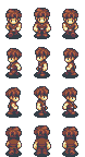
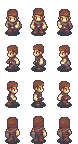
    I've been tinkering around with an 8-frame version of the Kaizer sprite for my game. I love the amount of detail in the sprite, and it tends to look good with most standard RM tiles, but the thing is so stiff-limbed that I thought it could use an update.

    I'm still a novice when it comes to sprites, and I want to improve the torso turn and forward arm part of the animation, but I think this is an improvement over the base.
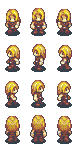
  2. @CosBlade, nice-looking motion, honey! The left leg looks too big tho, or maybe the right leg is too small...?
  3. I think you're right - the left leg should match the pose sheet but I had to do a bit of customizing on the right leg and it does look a bit narrow, I'll beef it up! Thanks!
  4. Girlswip .png
    K_run.gif
    After a very, veryyyy long hiatus w/RPG maker I’ve finally been hit with inspiration to make a game again, this time giving myself a timeline of ~1 year to put something together made with 100% original resources, since graphics are my favorite part of game making. I figure if I am unable to complete it I’ll at least have a large portfolio of materials left over.

    I used to hate making character sprites though, because creating a sprite base is time consuming in and of itself and then making characters from those bases… agh… they’d end up looking stiff and awkward so I’d never finish anything. I like giving my characters unique body language which isn’t very template-friendly. I understand the basics of animation and designing characters, and am at least proficient with pixel art.. so it was particularly frustrating to be struggling so much with such a “basic” and integral part of game graphics like character sprites.

    So I feel dumb for not trying this sooner, but pixel tracing over larger resolution drawings seems to work just as well for tiny sprites as it does for large sprites. Now I can finally have unique and varied poses for each character, which is good because I have 20 playables and need them to stand out from one another… but after a month of working I’m halfway done!
  5. Gore?
    Ghost.png
    GET THE SPRITE AWAY FROM ME
    1626721750571.png
  6. The sprite is creepy in a really cute way, but I tend to think creepy things are cute anyway. I love the shading around the void eyes and the little smile. The face sprite might need a little more detail. Being a bit excessive is good for horror, so maybe go for a more scarred look around the lips (thicken and highlight the skin around them) and some highlights for the blood?
  7. Thank you for the tips
  8. @alltheyuriz I've merged your thread with this one, the best place to get feedback on resources you are working on.
  9. noctiluca said:
    View attachment 194889

    I love the style! This is basically what i tried to make xD

    I dont know what pixel tracing is but if it makes making character easier then ill research it xD Im struggling with it too.

    I have a more simple style since I dont quite know what im doing yet.

    style1.png

    Clothes, hair and walking character sprites are the bane of my existence :p

    I also made a template and you're right about the issues but it also gives a nice consistency, unsure which way to go.
  10. noctiluca said:
    View attachment 194892

    That's a very good running animation indeed. Maybe the hair bounces to the front a bit too much in one of the frames.

    Well, my turn. I've been trying to make some generic charas for Time Fantasy.

    wec-chr01-A.pngwec-chr01-B.pngwec-chr01-C.png

    More info
    I think TF needs more NPCs in general... I would try to make more, but I'm not very good with sprite animation, so it takes me too much time. Also, while doing them it occurred to me a character generator set for TF could be useful, I don't think there's anything like that.
  11. Willibab said:
    I love the style! This is basically what i tried to make xD

    I dont know what pixel tracing is but if it makes making character easier then ill research it xD Im struggling with it too.

    I have a more simple style since I dont quite know what im doing yet.

    View attachment 195934

    Clothes, hair and walking character sprites are the bane of my existence :p

    I also made a template and you're right about the issues but it also gives a nice consistency, unsure which way to go.
    By pixel tracing I meant uploading a reference image layer. I'm not sure which pixel art programs/apps have this, but I at least know that Aseprite and Pixaki (on iPad) do since those are what I use.

    Basically, you can make a simple drawing of a character at a large resolution (or hand-draw and scan, or carefully take a photo, etc) and use that as a reference image to trace over. The reference layer can be sized however you want without losing details. It's extra steps, yes, but it ends up saving me a ton of time anyway because it's easier to really get the overall balance of hair/clothing/pose the way you want it to be, especially when it animates or when there are a lot of curves.

    If the program you're using doesn't have a reference layer feature, you can still do something like this by simply shrinking the high resolution file to pixel scale and trace that way. But a lot of the detail will be lost by resizing an image, and could become too blurry, so it will be harder to trace over. The smaller your sprites are the simpler you want your drawings to be.
  12. I think this is the right place. If not please lead the way!

    Long story short, I just started pixel art yesterday. I asked my wife and kids for weapon ideas. Created a simple 8 color palette and here is the result. Please fire away with criticism!

    My First Weapons
    My first sword.pngMy first B-axe.pngmy first bow.pngmy first arrow.pngMy first scythe.pngmy first club.pngmy first baseball bat with barbwire.png
  13. Just started huh? Welcome, glad you could join us! Here's a link to my favorite tutorial, the tutorial I used when I was starting out, and this is the best place to find all kinds of pixel art related resources. You don't have to use any of those links, of course, I know that not everyone who wants to improve has the intention of becoming a master. Still, good stuff if you're interested.

    I think the blue outline is interfering with the artwork. It's too dark of a color to be a glow, is too similar to the black to be there for readability on widely different backgrounds, and I don't see a reason for having the extra outline otherwise. The designs are fun, I like that you have a couple of non-standard styles in there. I suggest changing the yellow to something a little more yellow-orange or yellow-brown, gold isn't actually yellow and lemon yellow on weapons is very unusual. You can reuse that lighter grey color to add some shine to the blades, which will make the whole thing feel a little less flat. It's a very good start, I'm excited to see what you do next. :D
  14. Sharm said:
    Just started huh? Welcome, glad you could join us! Here's a link to my favorite tutorial, the tutorial I used when I was starting out, and this is the best place to find all kinds of pixel art related resources. You don't have to use any of those links, of course, I know that not everyone who wants to improve has the intention of becoming a master. Still, good stuff if you're interested.

    I think the blue outline is interfering with the artwork. It's too dark of a color to be a glow, is too similar to the black to be there for readability on widely different backgrounds, and I don't see a reason for having the extra outline otherwise. The designs are fun, I like that you have a couple of non-standard styles in there. I suggest changing the yellow to something a little more yellow-orange or yellow-brown, gold isn't actually yellow and lemon yellow on weapons is very unusual. You can reuse that lighter grey color to add some shine to the blades, which will make the whole thing feel a little less flat. It's a very good start, I'm excited to see what you do next. :D

    By just started I'm talking only pixel art lol. I've been dabbling with graffiti and photoshop since I was young. Thank you!! I will definitely check out those tutorials. I've been plastered to youtube/forums/anything I can study. So far I've really enjoyed Saultoons and Pixel Pete's tutorials. I'm trying to get a better understanding of hues/shading and start moving away from trying to solid outline everything(though I do like that style also, but not really what my goal is). Those Weapons will be getting overhauled numerous times, I'm sure. I appreciate you taking the time to look and comment with solid advice.

    Weapons were yesterday! Today I tried a sprite. I'm actually really happy with how it's turning out.
    The Concept
    Sprite idea1.png
    The Result... so far
    Rude Jude.png

    Also, do I always have to zoom ratio my exports in order for them to upload without blur? and yet they still blur...
    \v-_-v/ (maybe wrong place to ask)
  15. new-temp-joy6.gif

    Template in progress. Wanted something to work better with the MZ/MV FSM tiles, so wanted a 1.5-2 tile height sprite. Inspired by the old half-kaizer, but with more details and (hopefully) better three frame animations. Thoughts on this walk cycle and the general proportions?
  16. @Anigma The blur might be your browser, it's not happening on my end. Making them larger for the upload is appreciated though, it makes it easier to see since zooming on a browser isn't as clean or easy.

    That's a good sprite so far. If you're going to be animating it you'll want to bring the legs closer together.

    If you like youtube tutorials, check out AdamCYounis. He's a great artist, so you can learn a lot just by watching him work, but he has some actual tutorials too.

    @Joy Wow, not bad at all. Proportions are mostly good, though the feet might be a little big. Depends on what you're going for. I think you should reduce how much the front arm crosses the body and bend the knee of the back leg to make the walk a little more natural.
  17. @Sharm Funny you say that cause I was literally just messing around with the 2nd and 3rd walk frames....and well let's just say...ol' rude jude has some ahhh ...issues LOL. Instead of it looking like walking, looks like the sprite went from bowlegged to full left or right sprint. I feel today will be filled with lots of "wtf" and "sighing" XD.
    UPDATE!Rude Jude nude.gif looks a bit better

    @Joy Damn! way to rain on my parade. Love the height and style, I'm clearly nowhere near your level, but I would agree with Sharm about the feet. Nude they look to bulky, but maybe once they are fitted with footwear it wont look strange. Seeing yours helped me jot down some notes for mine. Keep up the good work can't wait to see the final product.
  18. Did some work to the legs a bit today, making them move a bit less woodenly. Still wanna adjust the shading on the shin as it bends, but I feel like the motion may be a bit better?
    new-temp-new-walk2.gif
  19. Hey guys, brand new here. I've been in the map painting phase of my game for a several weeks now and I think I finally have a style down that I love. I'm going for the bright, cutesy, rounded look :LZSblush:
    I have very few actual assets, as I kind of prefer to just paint an entire scene in aseprite and them parallax it into rpg. I know this takes longer, but I think it'll make every scene more unique and full of life. Plus I just love adding clutter, and you can't do that with a grid!


    I've got a few maps to share that are mostly done except for lighting and shadow effects and minus items that will be events.

    Map Wips
    the first map needs some editing but I wanted to include it:


    RR (1).png

    SO.png
    GL.png

    And this is what I'm working on today:
    CF1.png
  20. I can't see your attachments?