The Resource WIP Thread 3

● ARCHIVED · READ-ONLY
Started by Celianna 1568 posts Page 42 of 79 View original ↗
  1. battlescreen_screen.jpg

    Need a little feedback on the purple bat girl here. Does the sword read well?
  2. I'm in the process of making a soundtrack for my game and I could use some feedback, if it's not too much trouble. I had to use Youtube as I don't have a Soundcloud account.

    Just an FYI, in several of the songs there's a leitmotif - usually near the end - that I'm going to be removing sometime soon, as I think I've used it too much. Also, ignore Cloud, he's not going to be in the game.

    An Excursionary Ditty (Title)

    Dungeons Deep And Caverns Dark (Dungeon)

    Incidental Opposition (Battle)

    Bring Out The Big Guns (Boss)

    A Very Wrong Encounter (VS certain bosses)

    A Rogue's Gallery (I dunno...)

    Gears Of Revelation (Final area)

    It's Always Sunny In Springarria (Tutorial dungeon)

    Off The Charts! (Either "ultimate skill" or "panic", I'm not sure which...)

    Ode To Tragedy (Game over)
  3. I have to ask people, but which one is better?
    The one on the left? Or the one on the right?
    WilliamSprite.png WillasWalkSprite.png
  4. @Blizzero I've merged your post with this one.
  5. mlogan said:
    @Blizzero I've merged your post with this one.
    Wait a minute, wasn't there a poll that went with this?
  6. @Blizzero A poll would not be able to be moved over and apply to only your specific post - it would be a poll for the whole thread, which would not make sense. You don’t need a poll - people can still post stating which they like better.

    For example, I can say with the exception of the eyes, I prefer the right one.
  7. mlogan said:
    @Blizzero A poll would not be able to be moved over and apply to only your specific post - it would be a poll for the whole thread, which would not make sense. You don’t need a poll - people can still post stating which they like better.

    For example, I can say with the exception of the eyes, I prefer the right one.
    Oh, That's great to know, thanks. also, yeah i know they look ugly, I rushed the eyes.
  8. I had this enemy design in my head and I think I came out pretty awesome if I'm being honest. Would love some feedback and perhaps some ideas on what colors to use eventually and a name? Thanx in advance :D
    InsaneEnemy2.jpg
  9. @Finnuval As requested, I'm moving your post to the WIP thread.
  10. A few WIP Sprite Walk Animations. Also developing other directions and run animations. Concrit welcome!
    aramissprite___walk_by_aramis_ix-dctdksg.gif aramissprite_forward_walk__resize__by_aramis_ix-dcte1w6.gif
  11. Ooooh, very smooth. The steps have a nice bouncy snap to them too.
  12. @Aramis-IX: looks really nice! I love the animation on the arms and legs.

    I've been working on these trees for really dam long after a really long break from trying to make games. What do you guys think? Digging the style?
    TEST TREES1.png
  13. @c0sa I really like how you've shaded the bark, very natural looking. My only criticism is that the two larger trees both have a large swath of shading that took me like 5 minutes to realize was there, as it looks like just solid green to me. I would recommend using a slightly darker shade for the dither so it looks a bit more pronounced. Otherwise they look pretty sweet! :)
  14. Haven't been here in a while...
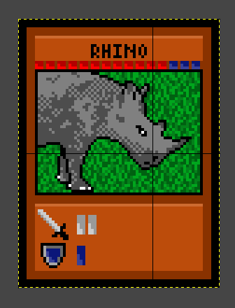
    I know I'm no artist but I made a card and am curious what you guys think of it, the information on the card and Ideas for improvement.
    Wondering if it looks flat...
    [Red squares represent HP and blue squares represent Level]
    001.png
  15. It does a bit. The dithering isn't helping. It doesn't look purposeful, more like what you get when you color reduce a photo. It's been a long time since I've seen a rhino, but I seem to remember a lot of distinct lines, like they were wearing armor plates (I know not all rhinos have them, but it was really cool looking). Instead of the dithering, you could use the darker grey to define those segments, to give it more volume. A highlight shade would also be helpful for making it feel three dimensional. A horizon line for the background could help too.

    For the card itself, the red and the background orange are too close I think. With a card you want that kind of information instantly seen and understood, it's more important than being pretty. Try a yellow instead for the HP, or change the orange to be less vibrant or less ruddy.
  16. Thanks for the tips @Sharm. The inner part of the rhino has been bothering me. I guess the red is a bit close to the card colour now looking at it. I'll see what I can do about that. Maybe I could add some sky in there too...
  17. Hi everyone. I haven't posted here in a while, because I felt bad about annoying Sharm in the past. Let's move right into the art. I'm working on a new design for my castle's interior, which is whitewashing with wainscotting.

    Example 9.png

    Zoomed Version
    Example 9 Zoom.png

    How does it look? I still want to add texture to the wood paneling, but I'm not sure how to yet.
  18. That's a silly reason not to post. If I get annoyed or tired or just want to do something else more, I can just stop replying. I can take responsibility for my own actions. Besides, there are lots of other people on this forum who also can and do respond to people here.

    It looks pretty good but I'm not sure where the tops of things start and the white part has some blurry looking pillow shading going on.
  19. Understood. I feel guilt about lots of silly things, so I'll try harder to argue with you less this time around. I don't handle social situations well, so I generally try to avoid the negative ones entirely.

    Tops of things? You mean the tops of the walls? That would be the grey bars. As for the pillow shading, I do dislike it actually. I thought it looked good at first but I'm liking it less and less.

    Edit: I've added a little texture to the wood and lazily whited out the pillow shading.

    Example 10.png
    Zoom
    Example 10 Zoom.png
  20. Really, don't worry about arguing with me, I can handle it and not think less of you for it. If I stick around long enough to argue with you either I care about you enough to stick around or it's a moderation problem, so count it as a good thing when I "fight" back. You have every right to do whatever you want with your own stuff, go right ahead and get on my case if I start being bossy. If you don't, how will I know to fix the problem? Seriously, the worst feeling I have ever felt towards you is mild frustration because I felt like you weren't listening. Which got solved to what I hoped was satisfactorily for everyone and I had forgotten until now, that's how little I was upset by it. You don't have to be afraid of me, I'm just as likely to be stressing about everyone hating me as you are.

    Yes, by tops I meant tops of the walls. The beams have no side to them, they're entirely one dimensional, which makes the perspective confusing. It's not necessarily wrong, but in this situation, without any other kind of visual cue to point out what's vertical and what's horizontal, the entire thing looks . . . like a folded up pop up book.