Game & Map Screenshots 12

● ARCHIVED · READ-ONLY
Started by slimmmeiske2 1772 posts Page 72 of 89 View original ↗
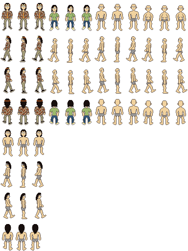
  1. My newest work on a new character sprite sheet for my post apocalyptic game.

    ikpg82.png
  2. Some stuff related to the school for a P2-esque game I want to make eventually. Not sure if I'm that satisfied with the school layout yet, though that game had a very basic school layout as well. Still might make adjustments though. Assets are pretty WIP, the exit especially since it's just windows for now.

    Classroom
    1723533094448.png
    School
    Illustration4.png
  3. @Zenagi This could just be personal preference, in which case ignore this, but that school room looks too big and empty. Would you consider reducing width of the aisles between the columns of desks by a tile?

    Similarly the school looks too big. No one expects it to conform to the size of the interior maps, so the 'rooms' could be made smaller. As players won't be able to see the whole map at one time, the major difference for them would be that there would be much less walking around doing nothing significant except going from A to B.
  4. Edit - Please ignore this because it was a reply to a different thread.
  5. Returning to maps after working on events and cutscenes.

    YcSNuWY.png
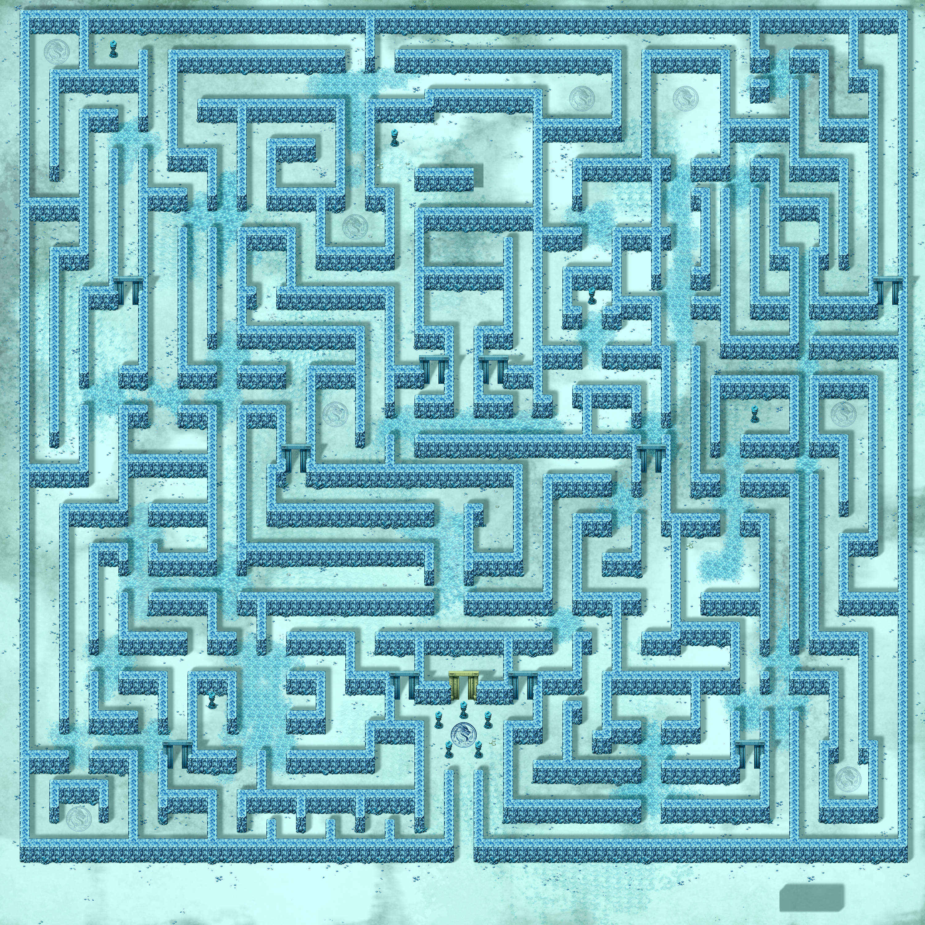
  6. Ice maze 3.jpg

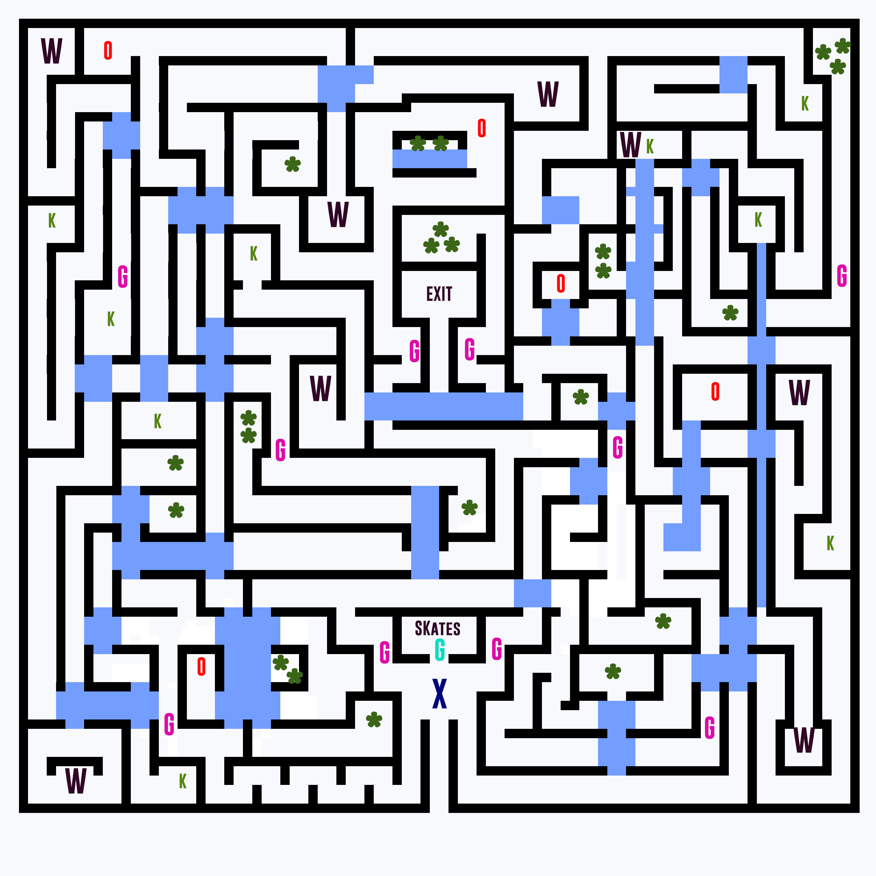
    Ice maze diagram.jpg
    So I had to completely redesign my ice maze, because I hadn't taken into the account the height of the walls (basically forced the map to be stretched on the Y axis and it became far too big).
    I've added warps to eliminate backtracking. Dead ends typically result in a reward for exploration.

    You enter the maze from the bottom centre, the goal is to get to the exit.

    Blue tiles represent ice. If the player stands on ice they will slip across the ice to the opposite side they entered from. So if you approach ice from the east you will slide across and exit west etc, etc.

    It is impossible to reach the exit because of the ice patch immediately to the south of it. In order to make the exit accessible you must collect the ice skates which prevent you slipping on the ice. Once collected you can walk freely on the blue tiles and turn in any direction at will.

    Unfortunately the skates are locked behind a special gate denoted by the Green G.

    The Green gate will only open when the five hidden orbs are collected. These are denoted by the red letter O's.

    Many of the maze routes are blocked by gates, represented by the Pink G's.
    The gates each require a key, represented by K's. Any key can open any gate, but once used a key must be discarded. Obviously you must approach a gate to unlock it and once unlocked it will stay unlocked permanently. There are 10 gates, but only 9 keys.

    There is treasure littered around the maze, denoted by *'s. Multiple stars grouped together represent better treasure. The really good stuff is at the 3 star locations.

    W's represent warps which will instantly jump you back to the start of the maze at the position marked by the X. These will save you time navigating the labyrinth.
  7. @Isaco1 Using the height of the door at the top as a reference for size - that is an astonishingly wide road for an urban area. There are no shadows between the houses, which makes things look rather flat. Finally (and I may be misinterpreting the visual clue) the mountain of rubbish at the end of the street suggests that the area is at least a bit run down. Perhaps make the tiles for the pavement (not sure of the US term for this. Sidewalk maybe?) a bit less clean and unmarked?
  8. Just wrote some canvas based filters for fun. I don't think I'll ever use them in actual games.

    1. Orignal screen
    2. smb nes palette
    3. smb nes palette with dithering (not accurate)
    4. gameboy palette
    5. gameboy palette with dithering
    FILTERS
    1724920243330.png1724920259940.png1724920266307.png1724920275962.png1724920285065.png
  9. Made a title screen, but might change it later on (also mispelled my own internet name xD)

    title.png

    Also trying out a new style of portraits.

    menu.png
  10. Very oldschool FF. I like it
  11. The world (more like area) map for the first Savage Lands module.

    1725067204743.png
  12. Some in game screenshots
    gamegame1.png
    gamegame2.png
    gamegame3.png
    gamegame4.png
  13. Before and after of a map. :)

    kguXs0f.pngnaQTr8L.png
  14. First iteration for the one of the tutorial area. Pretty simple.
    Spoiler
    Map008.png

    Tileset: PandaMaru, RTP
  15. Dead Jealous Screenshot.png

    End of chapter 7. Going over the aftermath of chapter 6.
  16. Some preview from my upcoming Dungeon tileset
    laboor.png
  17. I could in fact use some advice related to a WIP map. It looks too empty and I'm not quite sure what is wrong.

    This is a main path (leading to the left) and a side path (leading up). The problem is that I feel underwhelmed looking at it. It's supposed to be a simple path in the plains/mountainside with some snow, but it still looks underwhelming. Would more "guiding" trees help, even if that would put the "plains" under question, or would some fence bits and extra decor be enough? Or should I make the map smaller so the details pop a bit more? Any advice is appreciated, thank you!
    Spoiler
    Map015.png

    I have added an example of how it looks in-game for more visibility as to why it's underwhelming (lanterns are by hiddenone).
    Spoiler
    example.png

    Edit: Thank you both for the replies, I might end up redoing it from scratch, I think reshaping it to allow for more shapes, slopes and decor would improve it. Thank you for the example as well, it really helps to have it.
  18. @Madelinj more shrubbery and rocks strewn about could help. Also the odd abbandoned/lost wheel or crate depending in how often that path is travelled.

    Instead of full trees also consider rhe odd fallen tree or stump.