Game & Map Screenshots 12

● ARCHIVED · READ-ONLY
Started by slimmmeiske2 1772 posts Page 65 of 89 View original ↗
  1. Lomaxient said:
    The sound design makes this and when the kitty jumps into the river. *chef's kiss!!
    Thank you! Speaking of sound design...here is a bit more (in the test area...not actual in-game footage). Eating, hunting, fishing, sleeping etc. I personally recommend the sound design on the sleeping!

  2. ZombieKidzRule said:
    #1 Is that a clothesline in the upper left corner of the screen? If so, I think the line might be missing. At least I can't seem to see it.

    #2 It took me a bit to figure out the red things are barrels and they seem rather large compared to other assets, including door openings.
    1. The line is one pixel so it might not appear on the image. I tried to export map as an image, but I think something happened.
    2. Getting the size of stuff right is one of the things I'm struggling with. Wanted to make sure barrels are visible so I kinda went all the way
  3. Not sure if this'll help, but I thought the "red things" were mailboxes.
  4. StrawberryFlower said:
    Not sure if this'll help, but I thought the "red things" were mailboxes.
    Well, mailboxes are there too, they're just smaller, lol.
  5. Mac15001900 said:
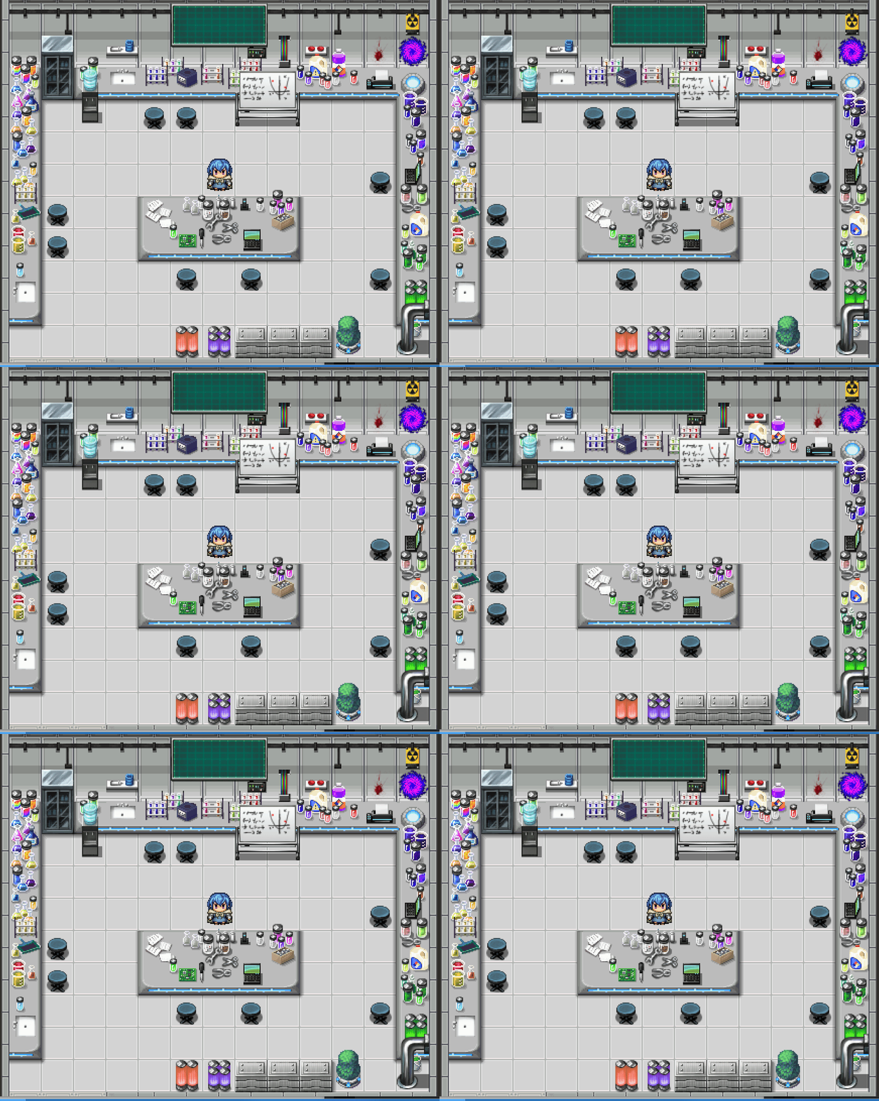
    I feel rather conflicted about this lab, so I'm curious about what do you guys think. It's meant to look cluttered and disorganised, but I feel like I might have potentially gone a bit too far with the amount of objects in it. Any feedback on the room as a whole, or specific objects would be appreciated :kaoluv:
    View attachment 301491
    I think it’s nicely cluttered and it serves its purpose, but just some food for thought from someone with lab experience… What kind of lab is this (as in, what is the facility housing this lab studying)?

    I would say that in general, there’s equipment and storage missing. It’s not like all the samples are brought into this room from the opening in the bottom left: there needs to be a freezer, cabinet and stuff.

    Also, the tables (counters) seem to be resting on the floor, because no table legs are showing. This is I think intentional, as in the counters being attached to the walls or something (which makes sense so as to minimize tripping hazards), but perhaps create a few shadow tiles to give visual clues to the player on the height of the counter.
  6. Thanks you very much @ZombieKidzRule and @werzaque, your feedback was really useful!
    Some changes I've made
    ZombieKidzRule said:
    I think one thing that might help is on the table in the middle, if maybe some of the objects overlapped. Like some things were set on top of other things. Right now they seem artificially too separate.
    Now that you pointed it out, I cannot unsee it. I've moved them around a bit so it seems less artificial.
    ZombieKidzRule said:
    And the 2 element type things in the upper left and right corners seem a little odd in the still image
    Now, I was very much on the fence on whether those should be animated or not, and you definitely pushed me over it ;) . The only problem was that I had no idea how to animate the fireball (I mean I can imagine how it'd look like, but my pixel art skills are not capable of doing it). Luckily this one isn't plot-relevant, so I've removed it. The other one is now happily spinning.
    werzaque said:
    What kind of lab is this (as in, what is the facility housing this lab studying)
    Bold of you to assume it's part of an organised facility :p It's more of a makeshift workshop ran by people who have access to plenty of high-tech resources, but don't entirely know what they're doing.
    werzaque said:
    I would say that in general, there’s equipment and storage missing.
    I agree with needing more equipment so much, there would be a lot more if I had some, but lab equipment sprites (other than mad-scientist style huge machines) seem impossible to find. The best I've got is Avery's gamecube icon that I've edited to be a centrifuge xD. My attempts at making other stuff haven't really worked out.

    Storage I can add more of though, I guess the crates aren't really practical enough. The one cabinet I did add now probably wouldn't be enough either, but I don't want to me it look too professional ;)
    I really like how it breaks up the symmetry now, which is a nice bonus.

    werzaque said:
    perhaps create a few shadow tiles to give visual clues to the player on the height of the counter
    So, I assume you didn't notice the shadows that are already present? That is definitely a good argument for them being too subtle xD. I've increase the intensity of all of them to the next one in the shadow tileset, though I am thinking of potentially making them a bit longer too.

    The current state of the lab:
    2024-04-12_16-59-51.gif
    Of course, any further feedback (from anyone) will always be welcome.
  7. I am trying to learn how to create a “good” map. Here is my very first map:
    Spoiler
    BEB1C06A-B790-4C9A-8DEF-0CCA08E32440.jpeg

    Please critique it. I know it’s not good.
  8. @A_Higher_Plane
    Is this a town map or just a small area with 2 buildings?

    If it's a town, it's really vacant of other houses and buildings. Maybe add some height variation with some cliffs, ledges, or hills.

    If it's just a small area, shrink the overall size of the map by half or more so the map will feel more alive and less sparse and then repopulate it.

    Personally, I like maps that are bordered by something, cliffs or trees, where the player can't walk. This way the path and transfer events stick out to the player better and at a glance the player will know exactly where to go.
  9. I've been working on a new project, this is part of the map for a forest!

    Spoiler
    Whispering Forest Screenshot-min.png
  10. @seangcrombie looks very harmonious, sweetie! :wub From what I can see, a very nice bit of map! The only thing I'm personally not fond of is havin' the pond with a one-tile-wide finger of sorts in the corner? I'd round it off wid another tile or cut it off altogether and see how it looks then!
  11. alice_gristle said:
    @seangcrombie looks very harmonious, sweetie! :wub From what I can see, a very nice bit of map! The only thing I'm personally not fond of is havin' the pond with a one-tile-wide finger of sorts in the corner? I'd round it off wid another tile or cut it off altogether and see how it looks then!
    You're right, it does look a bit weird! Thanks for pointing it out!
  12. It's been a while since I've posted anything. My tactic is to work on all my maps at the same time, so they all finish at a similar quality and style. That basically means nothing ever gets finished.

    I didn't think I would enjoy making this one, but it turned out to be much more fun than expected. I reckon this is about 90% done.
  13. @Lomaxient This looks really nice! Love the little details like the graffiti, the window lighting, and the gun sign to just name a few.

    I could be looking at this wrong, but one thing that seems a bit odd is there appears to be a stairway down in the lower left corner of the map that seems to indicate that area of the map is lower than the horizontal street above. But if you follow the street down and over to that area, it doesn’t appear lower. Not sure how you would actually show that on a top down map, but it makes that stairway seem a bit odd there.

    But maybe I am just looking at it wrong.
  14. ZombieKidzRule said:
    @Lomaxient This looks really nice! Love the little details like the graffiti, the window lighting, and the gun sign to just name a few.

    I could be looking at this wrong, but one thing that seems a bit odd is there appears to be a stairway down in the lower left corner of the map that seems to indicate that area of the map is lower than the horizontal street above. But if you follow the street down and over to that area, it doesn’t appear lower. Not sure how you would actually show that on a top down map, but it makes that stairway seem a bit odd there.

    But maybe I am just looking at it wrong.
    You are right. Darn it! The rooftop of that building is more-or-less level with the upper road. It's actually the building on the right of the screen that's wrong. I'll certainly take a look at this.
  15. SCREENSHOT
    verypeace.png
    VeryPeace, its shop, its Arcade of Worship, its VeryPeaceful music, its NeatKnight casern and, er *cough* smokey around here innit?
  16. Mapping, mapping, mapping. All I do is map...

    Snow levels today! Unfinished of course! I thought I'd share a couple of bits. Firstly my oriental/native American snow village. About 70% done I reckon.
    Snow Town Demo.jpg
    All the cliffs and lots of shadows need sorting.

    My second offering is a bit random, but thought it would be neat to share an image of a level in its earlier stages of creation. This is a snow level where the player slides involuntarily over ice patches and has to place blocks to navigate themselves to the hidden treasure and exit. Simple to program, but takes a lot of thought to construct.

    1715606490612.pngI'll share the completed version once it's looking nice, but thought it would be an interesting window into mad workings behind the scenes.
  17. @Lars Ulrika what's that shack wid the girl on top? And did she light it on fire? :kaoswt:
  18. @Lomaxient Very nice. Some very cool details on this map.
  19. Town
    Rossburg01.png

    I am not the biggest fan of mapping. Wouldn't say I am bad at it, but I just don't like it. Which is why most of my maps tend to be small. I especially dread towns, I am much more into dungeons.

    That being said, I am quite happy with how this turned out. I tried something different this time, heavily inspired by Monster Girl Quest Paradox. This town has many different buildings, but most aren't accessible. This allows me to design a town that feels pretty big, while also avoiding to design the inside of every house or have 2/3 of doors simply locked.

    As for the size of those houses, it's intentionally small, because every outside tile equals 3 inside tiles. So even a small house becomes very big once you go inside.
  20. @Marston I think it looks very nice. And I understand your feelings about mapping. Only I am sure you are better at it than I am.