Game & Map Screenshots 12

● ARCHIVED · READ-ONLY
Started by slimmmeiske2 1772 posts Page 11 of 89 View original ↗
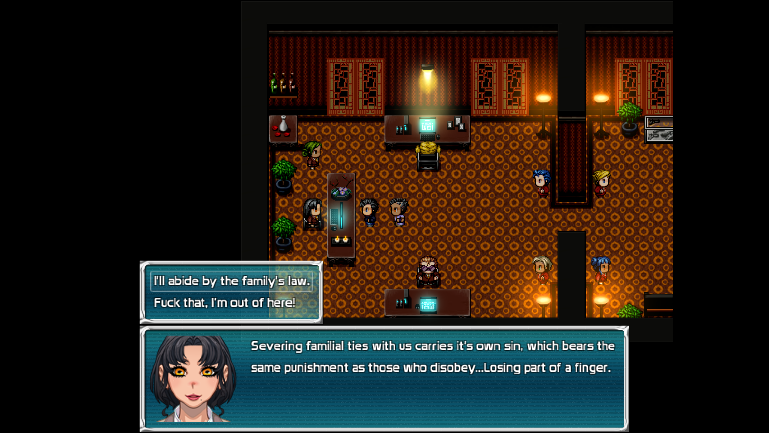
  1. Joining the Yakuza could result in losing some digits in the future... :kaoswt2:

    Warning: strong language
    Screenshot (142).png
  2. I'm starting to put together my interior tile set. Slow work. So many tiles to do, so many tiles to find, this is going to take forever.

    Here is a screenie of my first interior map showing the sort of style I'm going for. It's night time and our hero is being interogated by the man facing us. How I miss dynamic shadows! It may look a tad empty at the moment, but I have to leave enough space for a lot of people being there during the day.

    You'll have to click on the image and then choose zoom if you want to see things like the pattern on the wallpaper. I don't think it's necessary myself.

    interior 01.png
  3. Kes said:
    I think you'll find that those "ice pillars" are the default gushing fountain sprite. You'll find them on !Other2. They'll be animated in the game.
    Yeah.... im dumb sorry......
  4. Early teaser of my IGWC entry and its tutorial.

    screen1.jpg
  5. The Alveare Queen just needs to ask a few questions before you can begin Red Nova in earnest.

    Screenshot from 2022-07-10 12-13-15.png

    The fourth wall will not protect you.

    Screenshot from 2022-07-10 12-14-06.png
  6. This is a Map I made for a Map Contest one of my brazilian rpg maker groups. The theme is Lost Ancient Cities. I used Celianna for the first time in my life and I loved it. If I finish my IGMC game, this map is part of it.​

    ratanabadodovah.png
  7. @misterdovah That is a very nice map indeed.
    If I could make one suggestion, it would be to make this look more like a ruin. At the moment it's extremely neat and tidy.

    For example, you have a collapsed arch. Where is the debris? There should be odd bits of rubble around. iirc when I used that tile set I had to frankensprite some rubble, but it's worth it.

    Another example - the platform that the collapsed arch is on has no cracked or broken tiles. Or again, the grass is uniformly perfect, like a mowed lawn. Maybe some small weeds scattered around, some fallen leaves, a bit of rough grass, more vines growing up the ruins. All that sort of thing would help make this look much more like the site of a ruin.
  8. Kes said:
    iirc when I used that tile set I had to frankensprite some rubble, but it's worth
    Thank you, I guees I should do some editing. I did for the underwater building. Maybe a pos-work parallax should work. Thank yoh, Kes.
  9. Cabin in the Woods from my IGMC entry.

    screen2.jpg
  10. 546456456.png

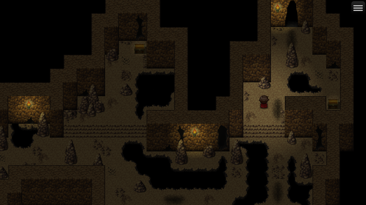
    I think when it comes to exploring dark maps, if it's too dark I find it actually becomes less fun trying to "stumble" around especially when looking for treasure and trying to keep a "mental map" in your head. I'm experimenting with putting lights on the chests just so the player knows where to go to pick them up and move on, while still providing branching paths throughout the map that makes the player consider the route through the darkness and light provided to be most efficient. I think the White light looks better than the torch lights on chests, but I may have to tone it down some since they kinda' overpower the torches and disrupt the atmosphere.
  11. @SOC Speaking as a player (and I may be in a minority here) I would want you to tone the chest light down a lot, so that it was no more than a faint glow. The reason for that is, if it were to be too obvious where the chests were, I would lose the sense of satisfaction in finding it through my skill in exploration. It would (for me, but maybe not for others) little more satisfying than finding all the chests lined up in a row and I just had to open them.
  12. The three bullies from my IGWC entry

    screen3.jpg
  13. Kes said:
    @SOC Speaking as a player (and I may be in a minority here) I would want you to tone the chest light down a lot, so that it was no more than a faint glow. The reason for that is, if it were to be too obvious where the chests were, I would lose the sense of satisfaction in finding it through my skill in exploration. It would (for me, but maybe not for others) little more satisfying than finding all the chests lined up in a row and I just had to open them.
    Yep, I agree, I was mostly experimenting with the idea and making adjustments.

    ertertertert.png

    Since I'm switching to MZ, I wasn't able to get Khaz' Ultra Lighting to work with Fossil on MZ, so I'm using Visustella's Lighting Effects instead. I've put very small and subtle lights on the unopened chests, it's not very easy to see when looking directly at it but your peripherial vision tends to catch it as you move along the map which I think feels very nice for exploration. If you move on a path away from the chest but see it, you can back and grab it and I think that's good.
  14. @SOC That seems a neat way of solving the issue.
    Like you I had hoped to be able to use Khas Ultra Lighting when I moved to MZ. Sad that it's not possible, as I much prefer the way he handled shadows from lights.
  15. Tuomo L said:
    The three bullies from my IGWC entry

    View attachment 234560

    I like your sprites and dialogue. I see English isn't your native language, so just a heads-up that the second sentence is grammatically incorrect. Delete "like" to fix it.
  16. tumsterfest said:
    I like your sprites and dialogue. I see English isn't your native language, so just a heads-up that the second sentence is grammatically incorrect. Delete "like" to fix it.

    Thanks, English is my third language. :rswt
  17. ~
  18. @Yumiowari I've merged your post with the Game & Map Screenshots thread.