Game & Map Screenshots 11

● ARCHIVED · READ-ONLY
Started by Celianna 2067 posts Page 77 of 104 View original ↗
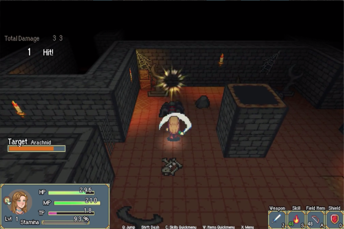
  1. Been working on this mini-dungeon for a sidequest. It's actually the last area I'm building before preparing the demo, which means lots of testing and finding beta testers soon. Stay put for a small video walkthrough of this mini-dungeon!

    Screenshot-2021-06-01-at-20-51-27.png
  2. RyanYe said:
    video:


    shop interior:
    View attachment 190792

    the screenshot is not all, take a look at the youtube video above.

    there are only city layouts and landscapes, no quests/game features/npcs.

    I don't understand the concept of the lights here, why is it there, when it's sunny outside, and why does it have different colors?

    Why does the character have a flashlight like lightning at the end?

    Why are there sound effects for when the character is walking on water but not anywhere else?

    A recommendation is to change the movement sound for when the character goes from 1 map to the other, because that sound is not only overused by annoying. I don't know where the RM guys got that sound and why they keep using it for steps, but that doesn't sound like a step sound to me.
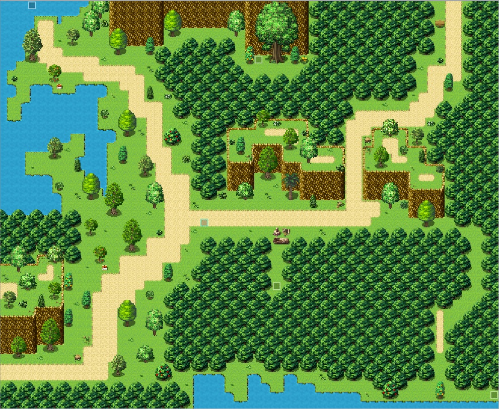
  3. What do you guys think of the small village that I made. It's located deep within a forest.
    Tileset credits to: Candacis, Avery, PandaMaru, and arcthemonkey.
    Small Forest Village
    Forest1.png
    Forest2.png
    Map065.png
  4. Pretty temped to give mapping the middle finger and just move on with other parts of the game. Really can't afford to spend so much time on just one map like this, lol. XD

    Spoiler
    Sorry for the small picture. XP

    Untitled22.jpg

    @CrocPirate Looks pretty good. Not sure if it's normal to have a well right next to a lake/river, but no big complains here.

    Edit: Maybe I should reupload...
  5. @gRaViJa

    Looks really good! I don't really have any complaints

    @CrocPirate
    This is a nice looking map! I can tell a lot of thought was put into the layout and it has a nice composition. I think the houses look pretty bad though. Do you plan on using taller sprites? The doors are humongous compaired to the default chibi sprites. It makes sense on the bigger house since it looks like its an important building or like it could be a place where people meet. The 1 tile windows are too small for these big houses. Also the windows being on the edges of the houses or right next to the door looks weird and ugly. I think it'd be a good idea to invest in making windows that fall between two tiles in a tileset somewhere, so you can avoid the edge window problem. I think also maybe making a bigger chimney for the big homes would be good, so that they can be proportionately sized.

    @Mr. Detective
    It looks nice to me, but it's hard to tell or give feedback with it super zoomed out.
  6. Draxus' new house! Any suggestions?

    Screenshot (357).png

    Screenshot (356).png
  7. @cthulhusquid

    Needs windows! and feels kind of sparce in some areas, other than that it looks nice.

    Edit: Oh they are on the left, i didn't notice haha. Nevermind.
  8. grimf said:
    @cthulhusquid

    Needs windows! and feels kind of sparce in some areas, other than that it looks nice.

    Edit: Oh they are on the left, i didn't notice haha. Nevermind.
    There are also windows on the bottom floor, but I can open those ones as well. They were closed because it's snowing outside, but that's a poor excuse with the top ones open. :rswt
  9. [embedded media]

    There's some small bugs too be fixed and the recording made the animations flinch out somehow a couple times, but getting there (both game developing-wise as finding a good way to record high quality videos). Looking forward to feedback and reactions :)
  10. I've restructured the downstairs some, and added extended sunbeams upstairs and downstairs. Much better now!

    Screenshot (358).png
  11. @cthulhusquid From the light coming from the windows, it's around midday.
    Why would you light torches inside when it's daylight?
    I can understand if you do it in the rooms farthest from the windows, but not everywhere.
  12. gRaViJa said:


    There's some small bugs too be fixed and the recording made the animations flinch out somehow a couple times, but getting there (both game developing-wise as finding a good way to record high quality videos). Looking forward to feedback and reactions :)

    This looks beautiful and really polished. The animations are great and looks super fun to play!

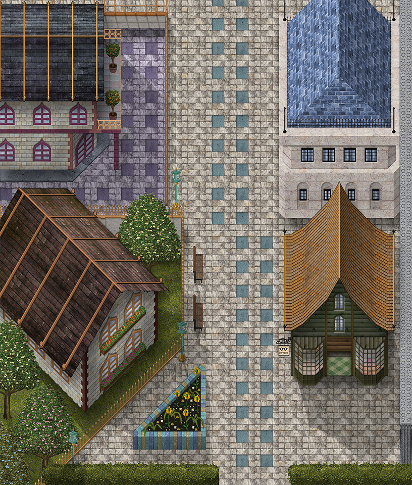
    I'm looking for advice on filling gaps in maps. My game is based in one city, so I want some semi-unique things to fills gaps in the maps. I want to avoid repetition of the same resources.

    In the below map, the bottom-right hand corner seems unnaturally empty, so does the upper middle part (between the house with purple windows and the building on the right with the blue roof).

    On other maps, I already have typical "towny" things like a large fountain and statue of the town's founder etc. So I want to avoid adding more statues/fountains as the ones I already have are sort of like landmarks. I added a flower planter in the bottom left to fill the space there, but don't want too many more plants on this map. I do have street markets/stalls in another part of the town, but as this district is quite posh/upmarket I don't think street vendors really belong here. I also have crates in other more industrial / port areas but again this area is too manicured to have stuff like that lying around.

    Any ideas for things to add to fill space? All suggestions welcome!

    WestAve.png
  13. @cthulhusquid I love it! Looks like a really cozy house. :)

    @Ophiucus Games I think your map looks great already. I think it will feel less empty when there are npcs walking around. Maybe you can add some street lamps or animals like birds or cats?
  14. @Ophiucus Games Thx! :) for your screenshot I also think the only thing really missing are the npc's. Maybe some crates, small plants and other objects and a stall or something to top it off.
  15. Been a while since I worked on RPG Maker. I am currenly mapping a new Ruin map and I kinda like it. Love the FSM tilesets. 1f642.png

    ruin_test.png
  16. @Ophiucus Games it already looks very good. However to give it some more life , besides what @dreamfall887 said, things that are evidence of day-to-day life ...
    So maybe a cart or a lost bag or a newspaper blown by the wind or some crates or a parked bycicle or even litter...

    Basically proof of life, things that are left in the wake of humans being and living there.
  17. Here's something I've been working on for Collector.

    Screenshot (79).png
  18. @Ninjakillzu

    It looks really good. I think it might look better with some stuff by the road. Maybe some street lamps or something, it feels very empty atm.
  19. grimf said:
    @Ninjakillzu

    It looks really good. I think it might look better with some stuff by the road. Maybe some street lamps or something, it feels very empty atm.
    That's because I haven't gotten around to making it yet. Don't worry, it'll have stuff later.
  20. Hello everyone,

    I decided to learn rpg maker a few weeks ago after seeing a youtube video. I know nothing about programing and design, but I feel I can manage to do something decent with this engine.

    I followed rmz built-in tutorial and some video lessons on basic techniques and I decided to have a go for parallax mapping. I start to understand how photoshop works, but there's always something that disturbs my eyes and leave me unsatisfied.

    I've been working on a house for a few days now, it's my first project and no matter what I change i'm not happy with it.

    Maybe an outside eye could lead me in the right direction?

    Sans titre.png