Game & Map Screenshots 11

● ARCHIVED · READ-ONLY
Started by Celianna 2067 posts Page 62 of 104 View original ↗
  1. Let the show begin!

    A gif of the game I'm working on. Got some audience spotlights going along with the other lighting. Currently working on resizing aaall of the characters to be tall sprites.


    RunwayHeroes.gif
  2. Hello, I was wondering which style of "treetop" is more visually appealing? Light/foliaged or dark/plain? In other words, the top half or bottom half?
    Starter Path.png
  3. @Frostorm Top for sure unless you want to get that deep, deep DEEP inside a forest feeling. But that's just my opinion xD
  4. I'd say it depends on the color theme of the game. The top one adds more details, but also takes some attention and due to the patterns and color contrasts. The bottom is darker and fades more out into a natural and relaxing background, going more unnoticed. When I just saw the top, I felt it sat quite nicely and natural, but after having seen the bottom, I guess I lean more towards the bottom. That said, it was only after comparing the two together, so if you run the top part from the get go, it'll go smoothly! :)
  5. Man, is it just me or does this river look...off? I can't seem to get it looking right.:kaoswt2:
    When I try to straighten it a bit, it looks too artificial, but when I don't it still looks unnatural... Suggestions?
    I've tried making it thinner, but that accentuates the blockiness, so I'm at a loss...
    Forest.png
  6. @Frostorm
    Yeah, it doesnt look right.
    I have the same problem with the entire forest, Im better with indoor maps.
    Look up some old Snes games how they did their rivers.
  7. What a coincidence, as my latest tutorial revolves around forests:
    Mapping Forests | The Official RPG Maker Blog
    My general tips would be:
    Try to look at the map from a player's perspective, how much do they see?
    You have dense forest and then giant gaps, try to make some holes in the closed forest "ceiling" and make the paths less wide and even to get a more natural look.
    The river looks kinda flat due to how the autotile looks like. Again, try to look at it from a player's perspective, the different screen size can make a huge difference. I would probably have the curve be not that sharp.
    In the end you can change a lot with the decoration, with reed and stones and maybe sandy parts around the river the look will be a different.
  8. @Frostorm Maybe it could help if you make the left part of the river end more towards the left and in more of a curve kinda like this? At least it would flow better. Might look different in the editor, but could be worth a try. ^^
  9. Thank you, I will take these suggestions to heart. It's still a WIP of course, so it will definitely not be as "open" once the map is done. But, I wanted to get the river's shape right before moving on. As far as player perspective goes, they'd only see 1/9th of the map on-screen. Basically, the entire forest is 60x33 while my resolution will only show 20x11.

    Edit: Ok, here's River 2.0! How's it looks? Anywhere I can make improvements?
    (just ignore the blank spaces for now, I'll fill them in later)
    Forest.png
    Thank you @Finnuval @Avery @Lucary for the feedback!

    Edit2: This is 1/9th of the above map. I just wanted a quick opinion of whether this is too busy or not:
    1610372044606.png
  10. Frostorm said:
    Thank you, I will take these suggestions to heart. It's still a WIP of course, so it will definitely not be as "open" once the map is done. But, I wanted to get the river's shape right before moving on. As far as player perspective goes, they'd only see 1/9th of the map on-screen. Basically, the entire forest is 60x33 while my resolution will only show 20x11.

    Edit: Ok, here's River 2.0! How's it looks? Anywhere I can make improvements?
    (just ignore the blank spaces for now, I'll fill them in later)
    View attachment 174772
    Thank you @Finnuval @Avery @Lucary for the feedback!

    Edit2: This is 1/9th of the above map. I just wanted a quick opinion of whether this is too busy or not:
    View attachment 175119
    That bottom one looks nice, the busier the better in my opinion if you are going for realism.
  11. -This Page-
    @Frostorm: that's very solid work, I like that tileset, namely its round edges and not everything being "squared off" (actually, good level of detail when zoomed in, too. To answer your question the zoomed in shot isn't too busy for me in the sense of being visually unappealing but it is definitely "busy enough" and then some, so I wonder if including that level of detail on the other 8/9ths of every map is practicable for you, but idk how many maps your game has and where you put your priorities is obviously up to you.

    I disagree with the person who said "the busier the better" full stop because there is definitely such a thing as too busy but you're not there yet, it's a very attractive level of detail.

    -Last Page-

    @Ninjakillzu the artwork is nice and clean, but presently playing Cyberpunk 2077 so I gotta say having level restrictions on perks/feats is really not a feature I've been enjoying, at least in this context. The breakpoints just feel really arbitrary, and it forces me to put perk points into stuff I don't care about while waiting to meet the prerequisites for the perks I actually want, and more generally, it seems to penalize being well-rounded and over-incentivize over-specialization.

    @cchmaster niiice action sequence! I've never had the patience for the trial & error involved in setting these up but they can accomplish some really neat looking skills. Love the flip.

    @Lucary simply amazing, love the spot lights...I actually need to separate a similar event for a bar/concert coming up in my project, mind sharing how you accomplished that?
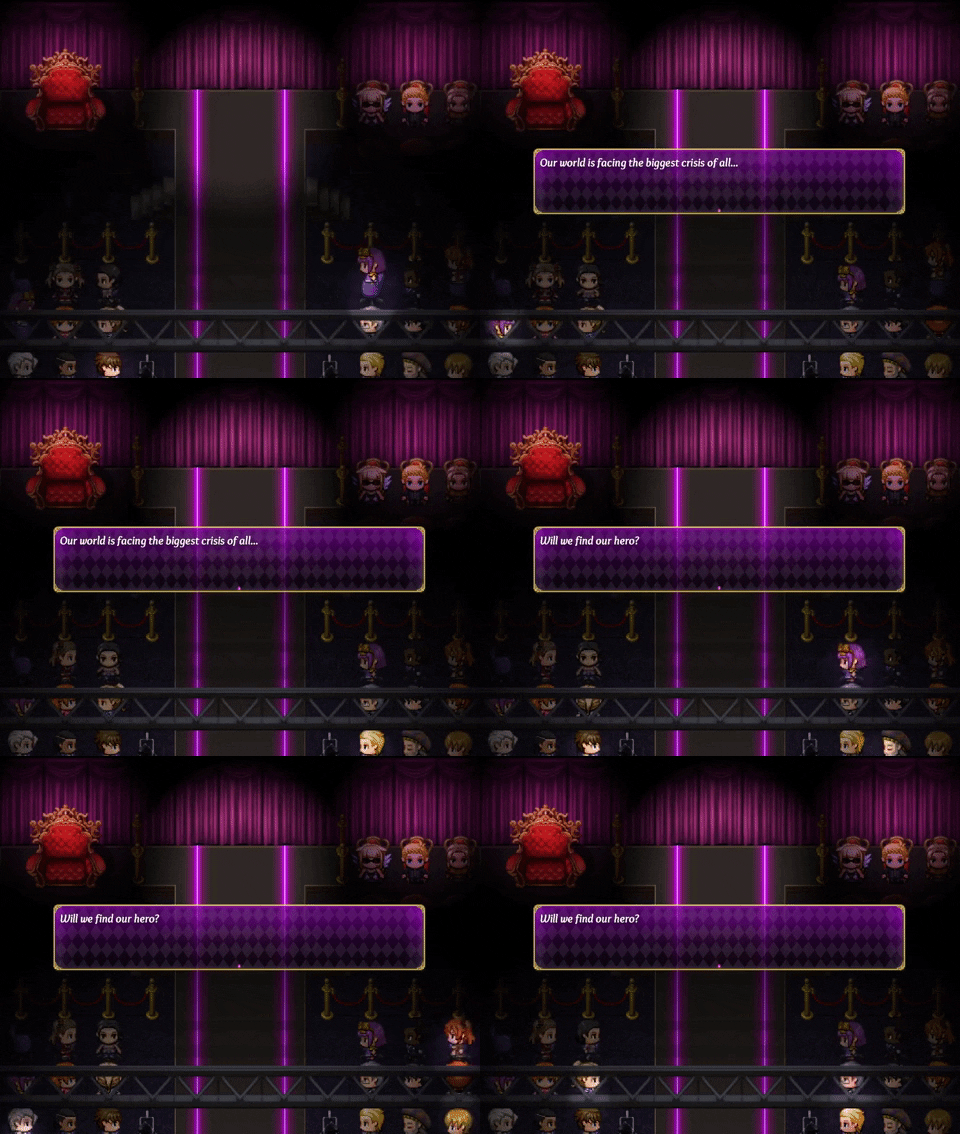
  12. @Frostorm I think it's perfect! Detailed forest maps look more real to me and I really like the tiles. What tileset is that by the way? Are the trees RTP?

    @TheGentlemanLoser Thanks! It's Terrax lighting on a randomly moving event
  13. @Lucary The tileset is FSM: Woods & Caves. You can also find it on Steam as well.
  14. Hello all a little screenshot of my wip on tilesets, doodads and game ;) byeCapture d’écran 2021-01-11 160206B.png
  15. good.jpg
    The dolls blink when you get close
  16. Hello everyone. I made this worldmap using photoshop. I really don't know this forum enough but i hope this is the place that i can share and read some feedback.
    Map
    !World-Map 1.png
  17. Hey all. I haven't done much RPG making since MV arrived quite some time ago, but I recently decided to download the trial for MZ. It's been fun working on writing a few plugins to customize the battle scene to my liking.

    MZ1.png
    MZ2.png
  18. I've recently revisited the very first map in my game: a post office. This is what it originally looked like, a single room for the sorting of mail and storing of supplies:

    Map006.png

    I raised the walls by 1 tile and decided to try adding some animation to the heater system (partly to have an excuse to add some ambient sound effects :D):

    GIF
    GIF 14-01-2021 20-39-08.gif

    I ended up feeling a bit weird just having the player teleport out and in of this back room, so I've been experimenting with creating the rest of the post office as well, with a reception hall and a dingy break room for the workers:

    Map075 - detail.png

    (Heavily indebted to bokou and dwys for many of the assets!)
  19. Revisiting a little passion project. (Week 1 of Development)

    RV01.pngRV02.png
  20. @CepCeph, I really like this style of world map! I'm hoping to make something similar for my game once I find the right tutorials. If I would change something, maybe I'd experiment with a little more variation in the hues and border regions of the different climate zones. Nothing drastic, but just to add a bit more realism -- climate is affected a lot by latitude, but also altitude, the presence of the ocean/sea currents, etc., so the separation between different climates can be a little more uneven. Googling satellite maps of earth gives an idea. But if it doesn't end up looking good that way, the current version is nice too!

    I did some more mapping today, this time a city street. This city has been causing me so much trouble for some reason - I want this city to be clearly distinguished from the main city (a vibrant, rural place). I've tried to keep the color palette more dull and have less natural greenery, to indicate that it's supposed to be a colder and more industrialised place. Not sure if I'm entirely happy yet, and this is my fifth(?) try from scratch :rswt Any feedback much appreciated!

    Problem city
    Map078.png
    (In-game I use a tint screen command to make it a bit more sepia-toned. The main points of interest are the post office in the centre and mansion to the left. The doors are evented.)

    Main city (partial image)
    Map026-2.png