Game & Map Screenshots 11

● ARCHIVED · READ-ONLY
Started by Celianna 2067 posts Page 45 of 104 View original ↗
  1. Working in some maps from my game today :)
    This is a lot bigger but I am just showing the top of the mountain because the rest is almost the same :pMAP to post.png
  2. @gabrieldiastche
    good start! But I would break up the mountain a bit, have some cliffs intersect further down. Right now, it looks very solid. I would also put a path from the stairs to the house, and maybe to the graveyard.
    The little farm right at the cliff seems like a dangerous spot :LZSgrin:

    I played around a bit with MZ. I only moved some stuff in the tileset around, so it looks more natural.
    Other than that I edited the wooden floorboards:

    inside_mz.png
  3. @Candacis A nice illustration of how a simple thing like re-arranging the tile sheets slightly can make a huge difference. I wish more people would move the tiles a bit.
  4. Candacis said:
    @gabrieldiastche
    good start! But I would break up the mountain a bit, have some cliffs intersect further down. Right now, it looks very solid. I would also put a path from the stairs to the house, and maybe to the graveyard.
    The little farm right at the cliff seems like a dangerous spot :LZSgrin:

    I played around a bit with MZ. I only moved some stuff in the tileset around, so it looks more natural.
    Other than that I edited the wooden floorboards:

    View attachment 158266
    Candacis Thank you for your feedback! :D

    Btw I loved your map, it looks so cute <3
  5. @Kes
    One thing missing in the rtp are more sideview versions of furniture to fill the sides and the middle of a room, but you can already achieve a lot by moving tiles around on the tilesheet.
  6. @gabrieldiastche I like the double doors, that's clever! :) The trees to the right overlapping, I don't think that's realistic.

    Here is a house I made, could I get feedback?
    map screenshot.png
  7. I really should have moved stuff around on the tileset too... But alas, I was too lazy, so instead I spend way more time disguising where the walls end and counters and beds begin.

    Screen Shot 3477.PNG

    @grimf It looks really good. Though I'm kinda missing something to keep the room separate from the black void, like a roof/ceiling tile. But that's just my sense of aesthetics.
  8. @Elissiaro Looks nice! I like the small details. But I see a tiny problem- the stairs to the bed is in front of a wall. Would be better to shift them down a little.
  9. @Hyouryuu-Na You're right it does look a bit awkward doesn't it. But if I move it down it'll block the entrance. :/
    Maybe I could edit out the bottom step so it's not completely flush to the wall... I do want to make another tileset page with sideways and back bookcases and stuff eventually, as people (or me) make them.
  10. That's just the downsides of grid based mapping I guess. Personally, whenever stuff like this happens I just turn that tile into an event and shift the graphic and the collider a few pixels. But yes, you could edit the stairs and remove one or two steps. That should look fine imo
  11. grimf said:
    @gabrieldiastche I like the double doors, that's clever! :) The trees to the right overlapping, I don't think that's realistic.

    Here is a house I made, could I get feedback?
    View attachment 158353
    @grimf thank you for your feedback, btw loved your house, but the only thing I didn't like was the door, you just could a shadow in that place to the player know that there is the exit, I think it looks better.
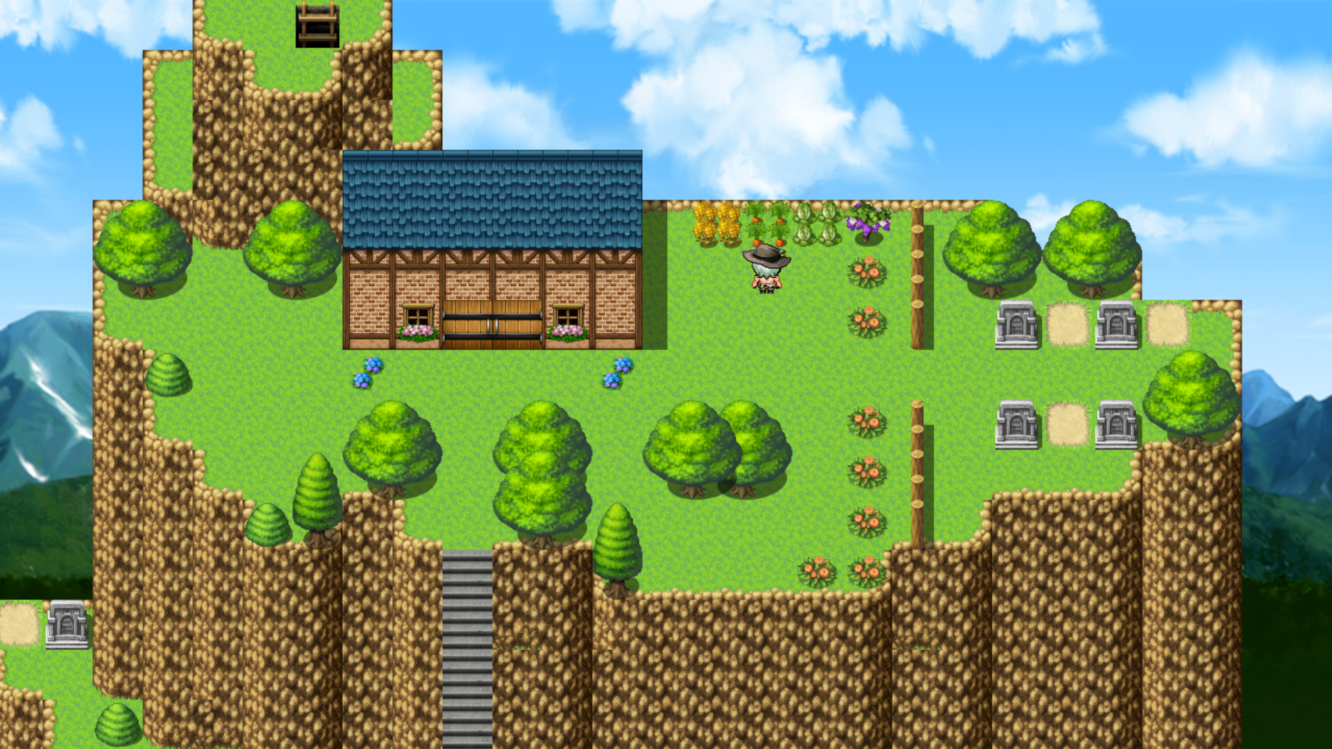
  12. @gabrieldiastche I'd like to make a couple of suggestions about your house.
    The height of your building+roof implies a house with some depth to it. However, you have placed it so close to the cliff edge behind that it looks like the back wall is on the very edge and could fall over it any moment. I think it needs to be at least one tile down, as no one would even be able to build a wall that close to the edge, let alone live there.

    The implied height of the house looks odd with windows only on one level. Would not a house of that size have an upstairs to it?

    We assume that the person has lived there for some time, as they have planted and grown crops. However, they have not walked any path into the grass. I'd add a path up to the door and a bit of scruffed up grass in front of the growing patch, and something into the graveyard section, unless no one ever goes there.

    Why have you used grey steps when the local rock is brown? Using grey implies that they have been brought in specially from somewhere else, (quite a feat of construction) instead of being carved into the cliff itself. I'd use the brown steps on the A5 tile sheet.

    Such elaborate grave stones imply a degree of wealth which sits oddly with what is otherwise a plain rural scene. Whose graves are they? Unless there is a story reason for them, I'd change them into simple crosses or similar, so that it looks like they could belong to the family who live(d) in that house.

    Always a problem for mountain-top dwellings. Where do they get their water from?

    All this might look like nit-picking, but a good map tells a story just on its own, and at the moment your story has contradictory bits to it.

    @Elissiaro Sorry, but I don't think your solution works. Lots of things, not just that bit of wall blocking the steps, look very awkward. Just one example - look at the way the back of the kitchen work surface and cupboards reach to the top of the fireplace. I think you will save a lot of time by fixing your tile set now. Not only would it make that map look much better, but it would also mean that you will have them ready to use on future maps.
    I wouldn't have a pile of boxes which goes higher than the walls - see how the top one breaches the ceiling tile.
  13. @grimf
    Cute house! I love the cat on the counter. A lot of really nice details!
    3 Things:
    Why do you have no roof pieces? Is it a stylistic choice? I have made A4 inside roof cutouts for MV (see link in my signature), so you only have a small corner around the walls. Maybe try that out?
    I'm also not a fan of the door in the middle of the room, it looks weird. As already said, a shadow in that spot might work better or you move the door 1 space down.
    3rd, the window on the right is in an awkward place on top of that wall beam. I would place it between the two beams like with the left window.

    @Elissiaro
    Kes has already pointed out what my feedback would have been, too.
    But I love your idea with the bed on top of the drawers! Such a neat idea.

    Here is a new interior map from me, some study. Nothing edited except the wooden floor. Right now I'm having fun with the layer mapping:


    inside_mz2.png
  14. @Candacis I love it! Only thing I'd change is the position of the grand piano. It looks like it's going into the wall.
  15. Kes said:
    @gabrieldiastche I'd like to make a couple of suggestions about your house.
    The height of your building+roof implies a house with some depth to it. However, you have placed it so close to the cliff edge behind that it looks like the back wall is on the very edge and could fall over it any moment. I think it needs to be at least one tile down, as no one would even be able to build a wall that close to the edge, let alone live there.

    The implied height of the house looks odd with windows only on one level. Would not a house of that size have an upstairs to it?

    We assume that the person has lived there for some time, as they have planted and grown crops. However, they have not walked any path into the grass. I'd add a path up to the door and a bit of scruffed up grass in front of the growing patch, and something into the graveyard section, unless no one ever goes there.

    Why have you used grey steps when the local rock is brown? Using grey implies that they have been brought in specially from somewhere else, (quite a feat of construction) instead of being carved into the cliff itself. I'd use the brown steps on the A5 tile sheet.

    Such elaborate grave stones imply a degree of wealth which sits oddly with what is otherwise a plain rural scene. Whose graves are they? Unless there is a story reason for them, I'd change them into simple crosses or similar, so that it looks like they could belong to the family who live(d) in that house.

    Always a problem for mountain-top dwellings. Where do they get their water from?

    All this might look like nit-picking, but a good map tells a story just on its own, and at the moment your story has contradictory bits to it.


    Thank you so much @Kes for the amazing feedback, I am still getting used to making maps in fact... My strong point never was things involving art hahahaha But it's good we have this forum so we can share our knowledge. I think everything you said is very valid, thank you so much! I am gonna add you in my friend list because I could use some more feedbacks like this :kaoluv:
  16. @Elissiaro I didn't really think about it until you brought it up, I think most people prefer a border so I'm glad I posted here cause I didn't know.

    @gabrieldiastche I thought it looked funny, I just wanted something to do with the space I guess. Thank you for pointing it out.

    @Candacis I don't know, I was just mapping one day and decided I didn't like them and than I never used them again. Now that I look at it again I think it looks better. You're map looks really nice

    Thank you to everyone for the feedback/compliments. It helps a lot.
  17. @Hyouryuu-Na @Kes @Candacis
    So I've taken your guys advice and started editing the tileset now.
    Does this look better?
    I dunno about the fireplace, should I move it down again so it matches the counters?

    Screen Shot 3489.PNG
  18. @Elissiaro Much improved. There are a few things though that you could look at.

    I think you are right that the fireplace needs to come down a bit. I would also put a stone floor tile in front of it, as fire with a wooden floor is dangerous and so they normally have one for the sake of safety.

    The bottle on the sink to the right of the fireplace is far too large. At the moment it sits precariously with less than half its base resting on the back edge and the rest hanging in mid air. Maybe hunt around for an icon of a bottle which you could put on your tile sheet as icons are much smaller. I recommend that for a lot of household items. That would also solve the problem of the open book on top of the cupboard which hangs over the back of the cupboard - except that logically it can't because there's a wall immediately behind it.

    The bottles on top of the cupboard at the base of the stairs go up as high as the wall - they are almost clipping into the ceiling tile. Maybe do the icon trick there as well?

    I'd edit out the drawer at the base of the set behind the bed. It is blocked by the steps and could never be used.

    If you moved your table bottom left down a bit on the tile sheet, when you used it the very bottom would appear to be 'under' the wall. That would also give the impression of some space between the table and the drawers under the bed so that the occupant could access those drawers.

    All those crates and sacks - seriously, who keeps that much in crates inside their home? It looks like they've been put there to fill the space. I would suggest using that space differently. At the moment you have no stove. Put one in next to the fireplace. That gives the idea that it's drawing its heat from there. That means you could move the work surface and cupboads left a tile. The remaining tile could have a food cupboard in it. You don't have to fill up the space in front of where the crates are with a huge pile of sacks. If you want something there you could put a bucket, a jar (move it slightly to the left side of the tile on the tile sheet so that it is more flush with the wall), or some other small household item that a family would actually want to have to hand.
  19. I've been revamping some of the maps in my post apocalyptic project, I'm really liking how this one is turning out so far. Too bad the lighting effects don't show up in the mapshot script...

  20. @Elissiaro
    Great improvement, this looks like a lovely home.
    As Kes already said, I would move the fireplace a bit down. I'm not so much bothered by the big household items, that's just the style of rtp. But I would replace the one bottle at the sink. Instead of an icon (great idea!), you could use one of the small bottles from inside a bookcase, just have to edit it a bit.
    About the drawers behind the stairs, yes, you could edit that out, or maybe one could slide the stairs under the bed to get to the storage?
    I would put down a different flooring under the kitchen, maybe stone or tiling.. You know section it a bit off from the rest of the living area.

    @cthulhusquid
    Wow, what a big map. Good atmosphere and you have a lot of little neat details in it. Love that outpost!

    I think, the hotel could do with some improvements. It's a very big wall with windows. I would make the narrow sections on the side and in the middle wider. And maybe give one of the upper floors another wall texture and a little ledge.
    You are using the same dead tree over and over again. A bit of variance could help. PandaMaru has some more dead trees (without the snow) in her winter tree set: https://forums.rpgmakerweb.com/index.php?threads/marus-mv-bits.46811/
    When you use the shadow tool at buildings, I would not go so far to the roof part. Maybe one less half-tile with the shadow tool, otherwise the building can look like it's nailed down to the floor.