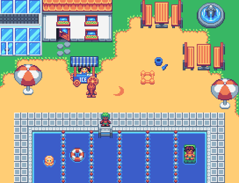
Making resources means you have to test them at some point, so here's a screen that is completly from scratch :3
Game & Map Screenshots 11
● ARCHIVED · READ-ONLY
-
-
@Avery I'm not the best at angles so maybe it's just me, but it looks like the benches and parasols have a different angle than the buildings and the ice stand.
-
More the ice stand than the parasols. Seems to miss a top view (but I realized it is there and... I think it has to do with the wheels.) and despite that we see the top working space, it still feel too crammed in there. But I cannot myself find how I'd fix it so I guess I shouldn't complain. ^^
-
Oooo it's been a long time since I last posted on here! Hope everybody is having a good Thursday and a good week!

-
Woooo Neat progression steps. So rare we do that. ^^ Nice to see how others works.
-
-
@Noobk Nice finished item. I do have one query, though.
The shadow at the front of the building indicates that the light source is slightly right of top left. In that case, I would have expected the shadow down the side to start further down from the top. -
@Kes I see what you're getting at, it's about a tile off, now that's attention to the small stuff! I got some other assets whipped up but I am yet to put time into shading and shadows. I'm still in the basic shapes phase of my tileset, I just took that particular building further than the others.
I think this screenshot is a bit more telling as to where I am at. I finally accomplished getting most of the set to work correctly in the editor and tiles lined up appropriately. Not much shading here :biggrin:

-
@Avery I love the pool!
-
Some screenies of my current project.


-
Outside of the miner looking like a hooded cultist and the quarry just being mountains (maybe you could draw a little ramp around it or something?) it looks pretty good @Tw0Face .
-
That looks cool, @twoface. Is it supposed to say "Population" twice? I feel like the different people icons would be easier to distinguish with a tiny bit of space between them? I like the frame around your crossed swords. ^_^
-
@empresskiova: Thanks for your comment. :) Well, I'll take another look at how I might find better icons for the miner and the quarry.
@xoferew: Thanks you as well. :) Yes, it's intentionally that there's "Population" twice. In general, I could try to group the right and left columns with one single headline centered in the middle. To get it right: Do you mean more space between each line or more space between icon and text? -
I meant vertical space so the feet of one person weren't touching the head of the one underneath. Like, if the icons were one pixel shorter. But not a big deal, it looks good as is too. ^_^
-
Hello,
Very long time I did not post something.
I bought the great Vexed Member Plus pack, that includes DS styles tiles for churchs.
And a try I did with it:
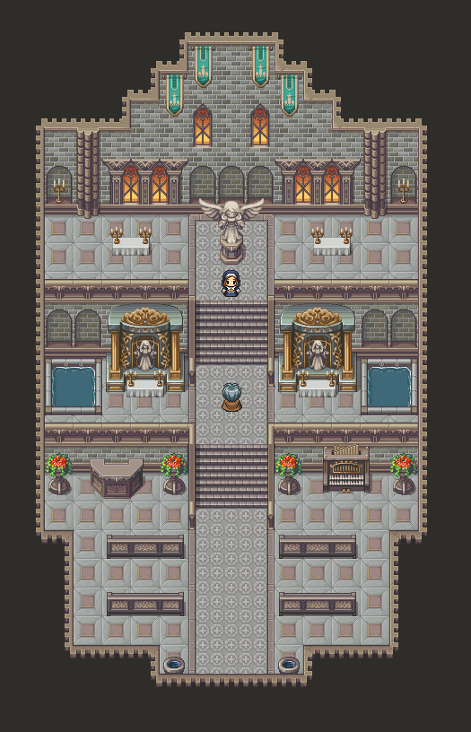
I'm looking for pictures / sample maps using the outside tiles of this pack, as I cannot find a good way to exploit it.
Does anyone have examples of the use of the outside tiles from this pack?
Thanks! -
Looking for some feedback on my opening maps. Tileset by The Mighty Hand, edited by me. This is mostly just a fly-by section, that first room has stuff to interact with but the second is just a cutscene.
-
@dsiver144 that map and the tileset are gorgeous and super cute.
-
I'm trying to get the effect of a blood sigil that pulses with light on a dark cave wall... I tried one version with yellowish glow and one with bluish. The two pics show the different light levels of the step animation. Is there a more effective way I could draw it, or does this do the job? Thanks!
-
Bob is back, now on MV. (Or not, its more of a fallback project, for times I am not otherwise occupied)
Also tried to draw some monster girls (Slimes and Monstergirls, what could possibly go wrong?), but that didn't work out too well.
So I'll stick to normal monster sprites for now, and might replace them later on if I can. -
@Lorenze That's cool, it looks like scratch art.
