@Kes
It makes sense, I never thought about something as detailed as this. But the city's a labor city after all.
Game & Map Screenshots 11
● ARCHIVED · READ-ONLY
-
-
@Neka Music It's a good way to make your towns distinct from each other, which helps in world building and avoiding the one generic town after another.
-
Does this make sense as a room?
It's a kind of lobby, in between the walls of the castle. It'll be where you can attempt to enter the castle bit not quite make it.

This is the interior to this which just collapses away:

-
I really like your maping! It looks nice and clean.Just a part of the city of a not so serious practice project.
Created with POP DLC.
Maybe it turns even in a full game, who knows.
View attachment 140498
Ps. There is a glitch witch bench graphic near water. -
Just me casually hanging out in the town in my life simulation game
I've spent many hours just doing the middle part of town center and putting up the fences!
Credit to Cyanide for the Lovely fountain
-
Hello! no details or objects yet (except for my little skull enemies), but before I Progress I wanted to know if the basic tileset looks good. Have I made any mistakes? Do the shadows look okay? I would love some opinions and advice.
-
Been trying to think of ways to give menus more pop, and decided the best bet would be animations. After some work, I've got a system to easily pan things in and out and the like.
Screenshots/previews:


I want to do something more interesting with the root battle menu (Attack/etc). I considered tying Attack to one button and everything else to another+menu scroll (mockup), but I wasn't sure if it would be intuitive, so I've left it out for now.
... should probably finish implementing battle sprites. -
@mightyckf That's a nice looking town area! I appreciate the small extra of the two stands having different items on display. The top left area looks a little empty, however. If it's a town center, I'd suggest putting some benches there. It both makes sense (people always want places to sit) and it removes the dead space. Also, your character sprite is great; did you draw it yourself or use a larger sprite generator?
@Eloise First, those skulls are adorable. Probably not the word you want people to use to describe skulls, though they are precious to me. I'd say you have a very good tileset there! My only criticism is, your shadows confuse me a bit. They seem to come off both north and west walls. You always have to consider where your light sources are going to be coming from. I wish I could offer more insight, but I'm the person who just erases shadows and has done with it...
@Tayruu Your skills UI is super pleasing. Simple and neatly organized. It tells me everything I'd want to know without my eyes having to desperately dart across the screen. -
Got a recent like on this thread and realized I still had my "ugly" old maps on here. My new randomly generated maps are much better. :LZSwink:
-
@Cythera yeah it's still a little empty because I run out of idea what to put there and the map is not finished.I probably will spend a lot more time to improve the area because it's where the player will spend most of the time.I made the sprite from Tonbi tall sprite which can be found here in the forum.
As for the clothes I draw them myself -
Thank you, Im really glad you like my tileset! I am slightly confused about where the shadows look wrong, as far as i can see they are all coming from the left and back walls. Am I missing something?@mightyckf That's a nice looking town area! I appreciate the small extra of the two stands having different items on display. The top left area looks a little empty, however. If it's a town center, I'd suggest putting some benches there. It both makes sense (people always want places to sit) and it removes the dead space. Also, your character sprite is great; did you draw it yourself or use a larger sprite generator?
@Eloise First, those skulls are adorable. Probably not the word you want people to use to describe skulls, though they are precious to me. I'd say you have a very good tileset there! My only criticism is, your shadows confuse me a bit. They seem to come off both north and west walls. You always have to consider where your light sources are going to be coming from. I wish I could offer more insight, but I'm the person who just erases shadows and has done with it...
@Tayruu Your skills UI is super pleasing. Simple and neatly organized. It tells me everything I'd want to know without my eyes having to desperately dart across the screen. -
@ImaginaryVillain: I'll be honest, this kind of map just looks like noise in screenshot form. In-game and animated it will look nazzy, but from a screencap it's hard to make our anything. I'm sure it looks great live though!
I need to work out how I am going to show choices. "Out the box" looks like this:

If I'm happy with that for now I'll move on. But somehow I'm not sure. -
@Ellie Jane I appreciate the feedback and it's entirely fair. I'm marketing towards those people looking for a surrealistic "dark Alice in Wonderland" vibe. So I expect the screenshots to only appeal to a very specific group. Actually counting on it. :LZSexcite:
The game's still early on, but you can always see how it is currently by checking out the YouTube video in my signature. :LZSwink: -
Hey guys, just wondering your opinions. Do you think that my sprites are too brightly colored compared to the map? [embedded media]
-
@KawaiiKid it kinda depends what you are aiming for as your atmosphere but if you are going for the 'standard' (J)RPG feel then nope, not too bright.
Only if you are aiming for a depressed, gritty feel... Then they are too bright.
Thats my two cents anyway xD -
A common hospital room, with a small halloween ornament. All drawn from sketch! some feedback?
-
@Kato-A like the style en brightness of this xD
@Ellie Jane perhaps if the textbox was a little less bright white? That's what bugs me about it anyway lol -
I'm still a newbie at making maps, this is my first floor for my first dungeon.
-
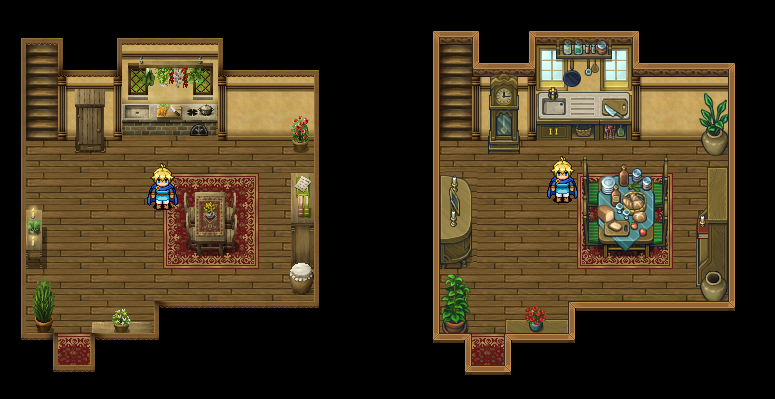
Thought I'd fiddle around with a new tileset, see if I'd like it.
Left is old, right is new tiles.
-
Ooh, I love those new tiles! Which ones are you using? Loving the plants.Thought I'd fiddle around with a new tileset, see if I'd like it.
Left is old, right is new tiles.