Game & Map Screenshots 11

● ARCHIVED · READ-ONLY
Started by Celianna 2067 posts Page 11 of 104 View original ↗
  1. Kes said:
    EDIT
    Just seen your second shot. Roots of what?
    It's a tree
  2. @Oddball tbh, I would never have guessed and even though you've now told me I still don't see a tree. I think you need to find different tiles. Avery made some nice ones for Ace, but I don't know if she redid them for MV.
  3. giphy.gif

    Starting a new CBS
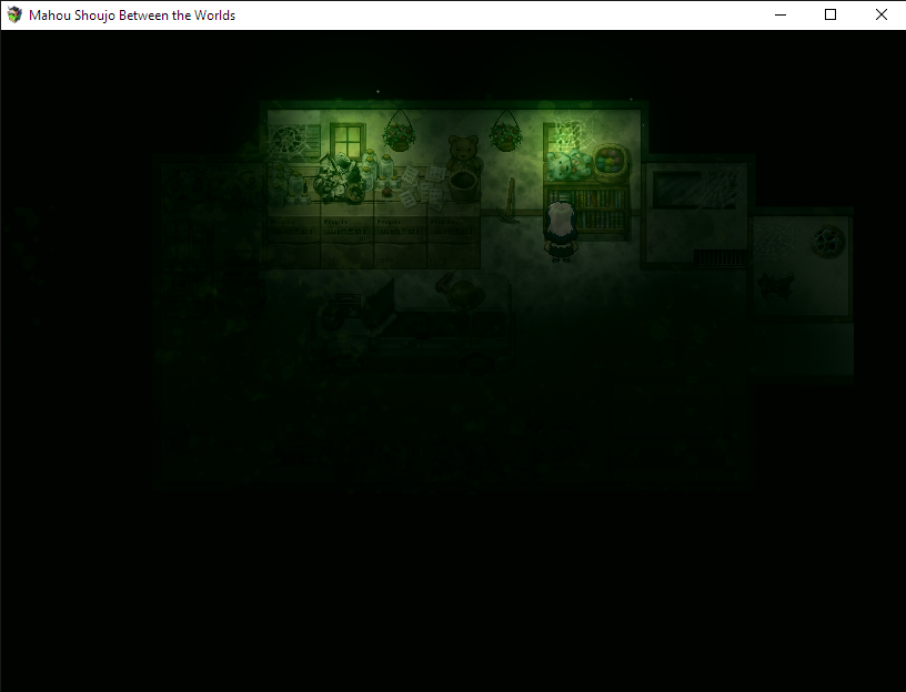
  4. The Old Garage.
    Nobody's been here since her father died.

  5. This is supposed to be a town that's in harmony with nature

    Map.png
  6. @Oddball - it reminds me of early final fantasy towns. I like it. Think it's good use of the RTP, though of course the default RTP tends to be rather blocky (did you purposely you use the A5 tile for the dirt path, instead of the A2 tile, to give it a more retro style?). The brown shrub tiles you use on the top left kind of sticks out for me, not sure if that's the best way to use them.
  7. @Kouske, the scene is too dark to appreciate any creepy props one might see.

    @Oddball, it does have a tranquil laid back vibe to it.
    As for harmony, I guess it depends on how the relationship between people and environment is explained in game. My impression would be that unless they have some "Giving Tree" arrangement they used a lot of wood to build stuff.

    World building considerations: What's the purpose for the surrounding fence? If they don't keep livestock, is it for protection from outside forces, animals, etc? Is it just a map framing device?
    Why cut trees down to make fence when they could instead nurture dense tree lines, and/or stone walls. Similar to their buildings, use more stone in construction, or perhaps even have structures built into the cliff face?
  8. Finally getting into my remake of Storm Twins. Was playing with some different tilesets, Celiannas ancient dungeons and Candacis Orc military tiles, because I needed something that would make my village more barbarian like as it is populated by Cannibal Cattai, a race of dragonlike beings that have a taste for only flesh.
    I'm rather enjoying getting back into mapping. Love mapping so much, and really enjoying going back to update an old unfinished game!
  9. Ok. Revision
    Edit: After posting this, i added more trees around the river, I was like "Oh crap! flooding!"

    Map.png
  10. Okay, first things first, it's far too large. You could make a map 1/4 of the size and still have everything in it that you have in the current one. The paths are missing the proper edting. There are dead bushes in the river. The cliffs are all straight lines. With the chimney, I'd recommend having a small cliff that's up higher. The fence makes no sense for existing since it seems not at all like a town. Is there really enough people living there to require a smithy, inn and item shop? There's only three houses.

    I recommend taking a look at some other towns people have made. Googling 'rpgmaker town map' will come up with all kinds of results for you to look at. Also, here's a useful video.
  11. @Ksi
    1. Map too large? I'll add more gardens
    2. Paths are missing editing? What do you mean?
    3. The "Dead bushes" were supposed to be aquatic plants. It's the grass-like tile with the feathery tops. You think i should remove them? What should i put in it's place? The stream looks empty without them
    Dead bush.png
    4. I agree with you on the cliffs
    5. The fence doesn't make sense? If i add a large garden it could look like a farm. Then it would make sense
    6. I could make the town a series of tunnles underground and the three "houses" could be entrances to those tunnles. I only made maps for the Shop, the Smithy and the INN so far anyway
  12. @Oddball

    I agree with @Ksi , your map is too large. If making town area I always limit myself to a 20x20 map. (If you look at the map above yours it’s one of mine and 20x20.) I have a lot in there but it isn’t overcrowded, and if a player walked in they could see where everything in the area is pretty quick.

    with your map it’s very spread out, and speaking from a players POV I wouldn’t want to be traipsing all over the place to reach the other side of the town. I would suggest you make your map size smaller instead of trying to fill dead space.

    that’s my two cents anyway!
  13. @MadRamDesigns
    It's not too dark in the game . Unfortunately this comes from the screenshot quality.
    But we can use a Flashlight ingame, so it's no problem.
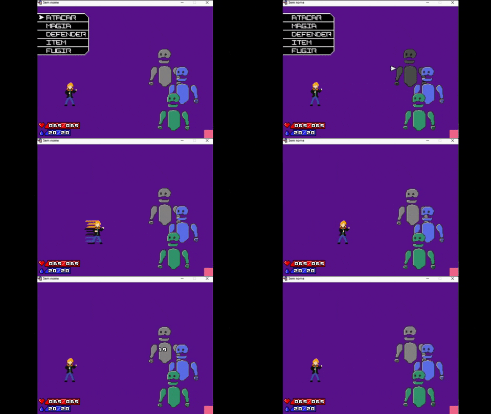
  14. Happy Friday y'all. I have been working on some party and weapons interfaces and menus today as a byproduct of working on the combat system. I'm to the point of combat so it was time to install the guns... Still some bugs too v_v But it's all in its infancy right now.

    PbVJSih.gif
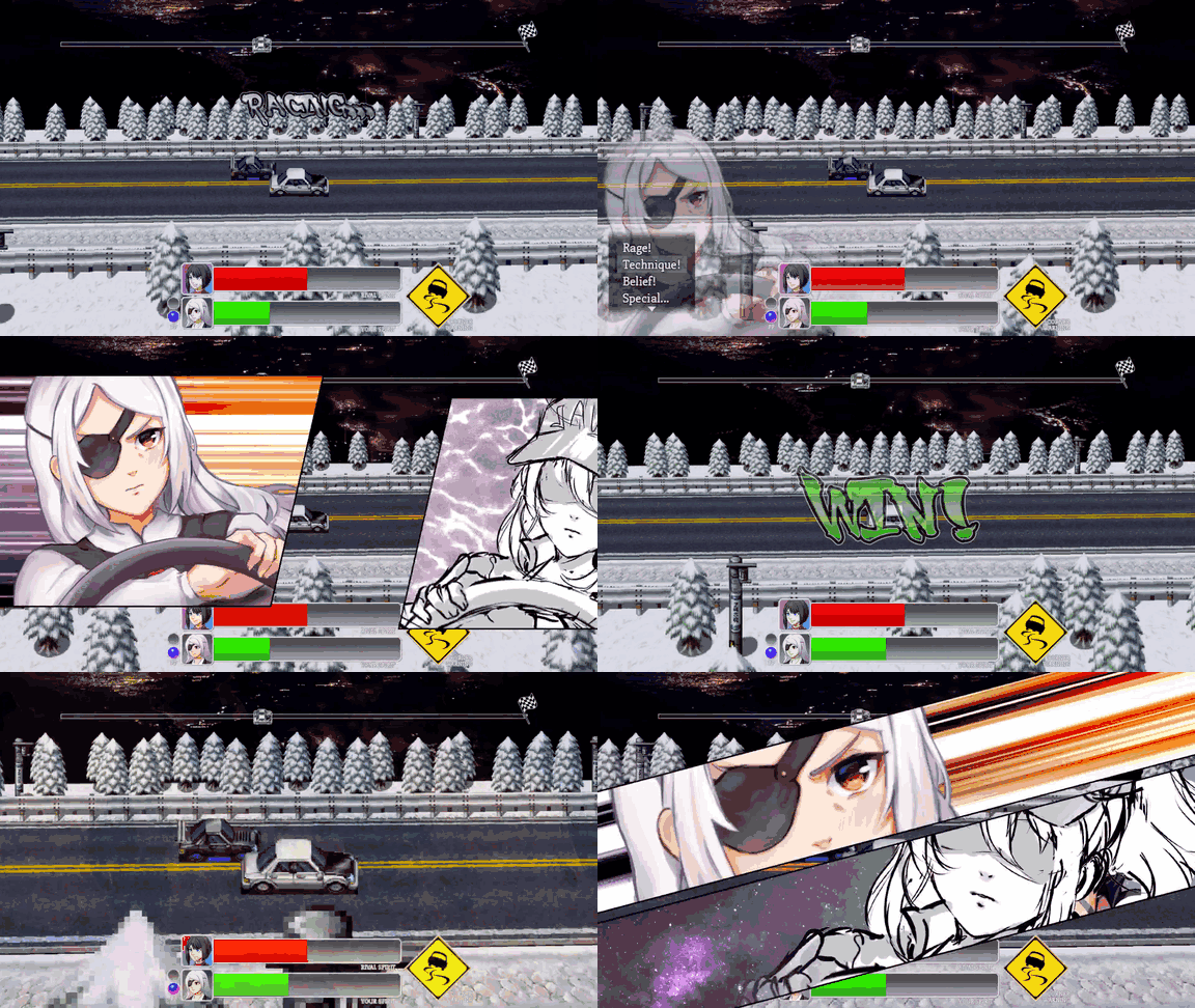
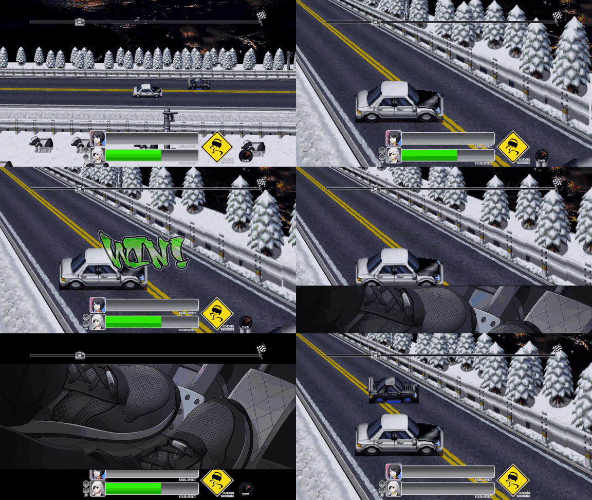
  15. Do gifs count? :ahappy:

    4CmmVO.gif

    kJs72y.gif

    These are from Chapter III of my game, which I've just announced as in development (now that the racing sub-game is practically finished, so I can be sure it's do-able). It's mostly done with regular eventing, though Blizzard's UltraMode7 plugin helps a lot!

    There's more info here if anyone's interested.
  16. I've never done maps via photoshop before, so I wanted to try it. Everything except the ceiling/walls is done in photoshop. I got rid of all the original shadows from any tiles that had them in photoshop and then redid them myself. It took me two hours to do this because I couldn't decide what images to pull from for objects, and I spent forever on the shadows. I kept using a soft-brush on shadows after creating them, I did this twice for everything until I finally realized that most of the shadows needed hard edges. Even though it doesn't look like much, I'm just glad to know that I understand how it is done.
    Aq84zCp.png
  17. There's no bathroom?
  18. cabfe said:
    There's no bathroom?
    Bathrooms were not in homes during that period. We've only been including those in homes on a regular basis for just over one-hundred years.
  19. @Princess I am curious why the bookcase in the left hand room is so far from the wall. Would anyone waste the space like that? Wouldn't it be in alignment with the desk?
  20. Kes said:
    @Princess I am curious why the bookcase in the left hand room is so far from the wall. Would anyone waste the space like that? Wouldn't it be in alignment with the desk?
    Do you mean the shelf? That is a silly way to phrase that; "Would anyone waste the space like that?" The shelf obviously wasn't done that way on purpose. I was primarily focused on shadows, hence why there is so little in the room, and so I didn't realize the width of the shelf was slightly smaller than the counter; meaning the shelf needs to be slightly further back (or the counter needs to be brought slightly forward). When I normally use photoshop I tend to stay at 33%, so missing something like the width difference would likely be common for me. That was my first time ever using photoshop for a map though, I'll just make sure to zoom in next time.

    I'll try to fix it. The door was also aligned one pixel wrong on the y-tile. I noticed it when in-game. I realigned the door and the shelf, though funnily enough, the shelf looks even more out of place when closer to the wall. The width of it when closer to the wall makes it seem too much like the counter is actually in front of it. At least, that's how it looks to me.