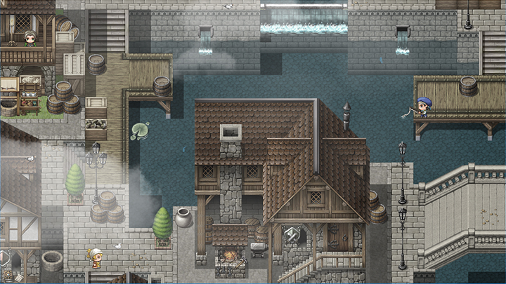
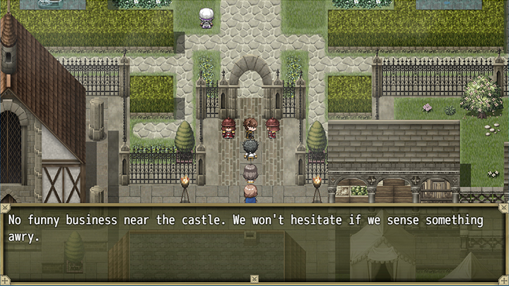
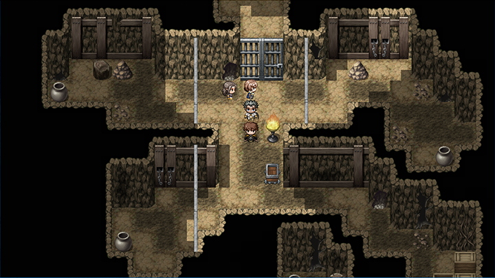
I finished my first castle-map today. still missing are details like banners, decorations, etc. but i would be interested, what you guys think about the general design of the map, before I go into details. thank you! :)
https://ibb.co/THTzFPn

https://ibb.co/THTzFPn
I think the colors and the style of it is pretty solid, but I'm confused on why its so asymmetrical? It seems like its on purpose, but is there some story reason or anything? because otherwise it just seems odd. Castle forts and big stone walls like that are usually quite planned out so its weird so see one so "messy." maybe just make it more square and have the gate line up.
Besides that, I'd suggest either making the castle and walls a lot bigger, or making the buildings on the ground smaller. possibly both, because that tall house on the right looks like its about 2/3rds the size of the entire castle, and I'm assuming thats not quite accurate. The castle should be the centerpiece of the map. A big stone castle usually towers over little houses and taverns and stuff like that.
Also, you should mix up your color pallets a bit. the castle itself can all be stone, but maybe the smaller buildings can have some wood or plants around them. That also makes the castle stand out.
Again, im quite new, so please correct me if im wrong!
edit: also the two towers at the bottom are different styles and its driving me mad lmaoo