@cabfe
Thanks for your feedback.
What about the lighting? Its sort of simplified with the filter but I think I might use the normal look and use a show picture for a more opaque lighting effect.
The icons are all GameBoy green, I'm also thinking of recoloring them or maybe it looks fine.
Game & Map Screenshots 10
● ARCHIVED · READ-ONLY
-
-
@Emanzi It's a bit bright, but if everything is like this, it's consistent and not a problem.
I'd make it darker, but I'm not a fan of bright colors anyway. It also depends on your game's style/genre/gameplay type. -
I'm looking for a cartoony retro look.
-
@Dama
I don't know what this "dungeon generator" is, since it seems different from the default one in RPG Maker MV, but they certainly look way better! It looks more like a proper maze and for a game that focuses on mazes with perhaps secret locations for boss fights or treasure chests, that may be simple but actually work.
@Ksi
I love your verison of it too, but in a different way. It's more narrow, but that works well with the detail you add to it! It can be like finding hidden locations and places.
Don't see anything wrong with either of these myself. Just depend where and what you do to them next and your game theory plans. In @Ksi case that's more clear but in @Dama case you could still make something more simple as mentioned above, with those wider paths. -
@Ksi
I have a small optional town like the one you have but most of my maps as you said are empty and low on details.
@atoms
I used the MV's default one and made some changes on it, I don't know exactly what was its raw form, because it has been past 2 years.
It has multiple entries but there's only one that connects to sides of the jungle. I want that player trying to find the main entry that's why I didn't want it to be simple and used dungeon generator. On the other hand finding main entry may be difficult causing the player to give up. Of course there's a hint somewhere but finding that hint can be missable.
@Emanzi
I like the one with more colours. -
Before and after spending an afternoon on trying to improve this map/room type. Context: The player is inside a giant tree. Any suggestions on how it could be further improved?
Spoiler
-
Phenax: that is less the player is inside a giant tree and more the player is inside a giant treehouse. The addition of creeper vines, ivy, grass, tall grass, plants and flowers of all kinds, really ANY FOLIAGE AT ALL would make it more tree-like. That said, the second screenshot IS a big improvement on the first.
Emanzi: I definitely prefer the one with no filter. In any case, awesome game title and really stylin' graphics.
Tuomo: I like the maido on the left. Not sure what else to say, not knowing if you drew these ladies or if they come from a VN graphics pack.
Lorenze: holy goddamn that is ing awesome. Pardon my french.
From Road To Paradise: The Staircase:


-
@Phenax I think it starts to look great. I think being inside of the tree makes less light to grow leaves in the hollow trunk. But if you could go a bit parrallaxy or adding a layer on top and create kinda cracks on the edges of the walls to follow the wood cracks from the image below, it might help. Also maybe mushrooms, moss things, sap concentration and maybe lil insects as internal fauna. But I get the idea and I was wondering if each square with doors were new homes.
-
The highly advanced blackjack system from Adventures of Dragon upcoming full release. Just gotta finish up the background for it and polish up the texts and it's all good.
I'm a crazy person so it has stuff like doubling, blackjack, surrendering and insurances among with face cards and almost everything else that you'd expect from actual Blackjack, aside splitting which would have been just insanely hard to bring in. -
I thought I would post this and hopefully get a chuckle from others:
I think someone likes those pipes too much and let them go to his head. lol -
It's been 3000 years...
But *phew* finally making dungeon progress. I'd save myself so much time if I would just... remember to reuse my older assets omg.
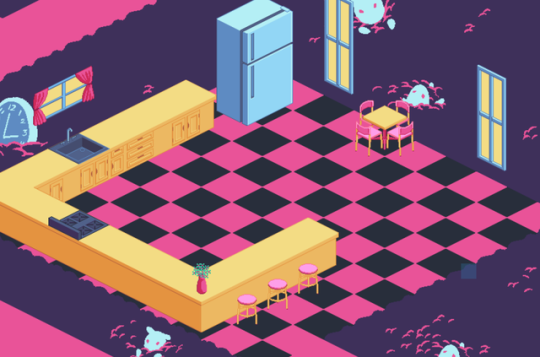
@Phenax I dunno about those wall tiles for a tree... It looks more like a civil war army fort than a tree. I think making the map less square and picking a vertical grain would be really impactful. Also seconding the addition of some foliage or vines. In the spoiler is a screencap from inside a tree in Golden Sun.
Spoiler
@Emanzi I actually like the filter more. Maybe a different filter that's not quite as washed out would be good, but I think the filter really helps tie all the colors together and makes the graphics feel like they belong together more. -
It's been a while since I have posted something here. Here is a test of something small I've been working on :)

(also wanted to try my recording software :p) -
@Marquise* @ashikai Thank you both for the feedback. I wish I could make the room less boxy, but there is a reason for it. The player has to distribute mail to the rooms. He has to deposit the correct mail into the boxes that are in front of the rooms. The signs next to them say the name of the person that lives in that room. The name itself is a hint, for example the spoon has to be distributed to "Tasty Squirrel". So I'm not sure how to make it less square. I'll definitely keep in mind the suggestions made, just gonna first make the game playable from start to finish.
I tried to make the storage room (which is beneath the tree) less boxy and overall more interesting. In this room nuts appear at random locations, for a random duration and at a random interval. It's one of the ways for the dragon to collect the nuts he needs.
-
@Phenax Ahh, that video was pretty much what I meant by less boxy. Just making the overall shape of the map not square like the one in the video is a pretty big difference already. :)
-
@ashikai
The problem with the filter is that it’s hard controlling the shading, it sort of looks ugly and you can’t differntiate skin tone or small differences in color but It’s also consistent and helps in forcing the lighting effects and compass to work with the rest of the graphics.
@CrowStorm
Thanks, just between us the clouds are ripped from dragon warriors title. I might have to make my own clouds but I really like how the title looks just like that.
@Dama
More colors is nice but it might break the whole 8bit theme, I think it looks more SNES like with the colors. My only issue is the lighting and semi transparent menu, there a bit too smooth for an 8bit retro look.
However majority rules, so no filter it is. Thanks for your feedback! -
So now that I've got some time off over Christmas I'm back to working on my project (which is slowly just turning into a demo for what's becoming an RTP's worth of custom tiles). With that in mind I've finally finished this small library map.
I'm not entirely sure that my bookshelves are diverse enough or that the library really looks as destroyed as I'd like it to be, so any thoughts are appreciated. :)Spoiler
Pay no attention to anything that's there from the RTP, it's just there as a placeholder while I'm drawing tiles to replace it. -
@shadefoundry I really like the custom tiles and the map overall. I could imagine that the library would look more destroyed if the books on the ground shared the colour of the books in the bookshelf. And maybe a little less books overall inside the bookshelves to make them seem more destroyed alongside with those on the ground. You seem to have lamps, I personally prefer not to have the standard shadows on the left side in that case. It could be me but I'm having a bit of a hard time imagening the elevation which the stairs suggest. Possibly adding railing could work, not sure though. It's an overall good map though and I'm sure it will look amazing once finished, especially if you add lighting.
-
@Weremole Oh my he reminds me of Thundercats (anyone remember that 80's cartoon?) like 'm though :)
@Emanzi I personally prefer the normal filter.
@shadefoundry I would prefer some more variation in book colors... easy enough to do (just more work lol). I also agree with Phenax on the points made. Plus, if you're going for a 'ruined' look: why not have one of the bookcases fallen over? -
A really really early screenshot of a project I've yet to give a name.
-
@Phenax @Finnuval Thank you both! I've taken some time to add some additional tiles and details to hopefully get across the ruined library look I'm trying for a bit better.
Spoiler
I'm not sure if removing the shadows from the stairs was the right decision, but the elevation does feel a bit more clear. I'll probably keep the shadows by the walls for now though at least until I decide on how I want to handle lighting. As for a fallen over bookcase, it'd be nice to have one on the left near the entrance, but I'm a terrible artist who struggles with perspective so it'll probably take me a while to do that. :p